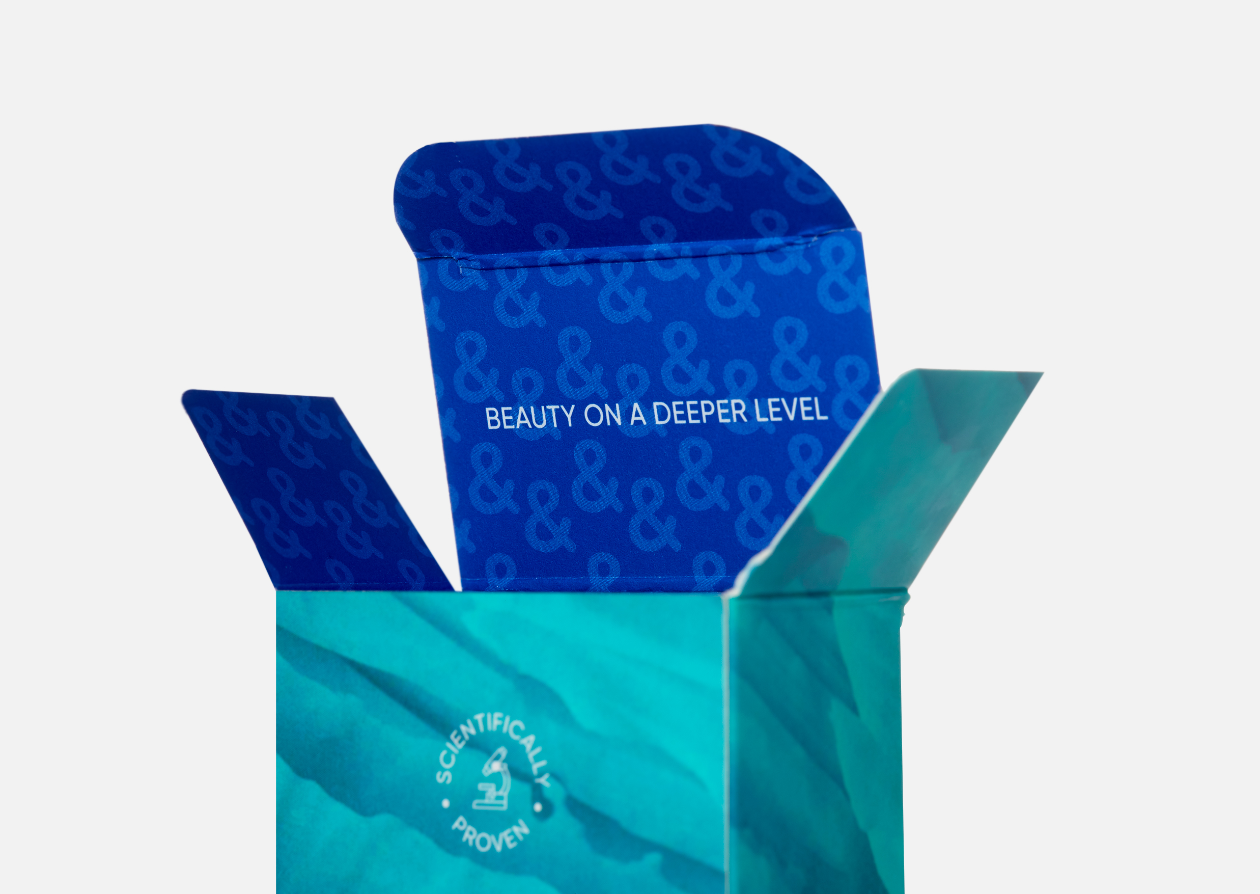
The purity of the Subantarctic waters and the pristine Southern Alps, provide environments for Sub&Tarctic to wild harvest and source unique natural ingredients for their skincare formulations.
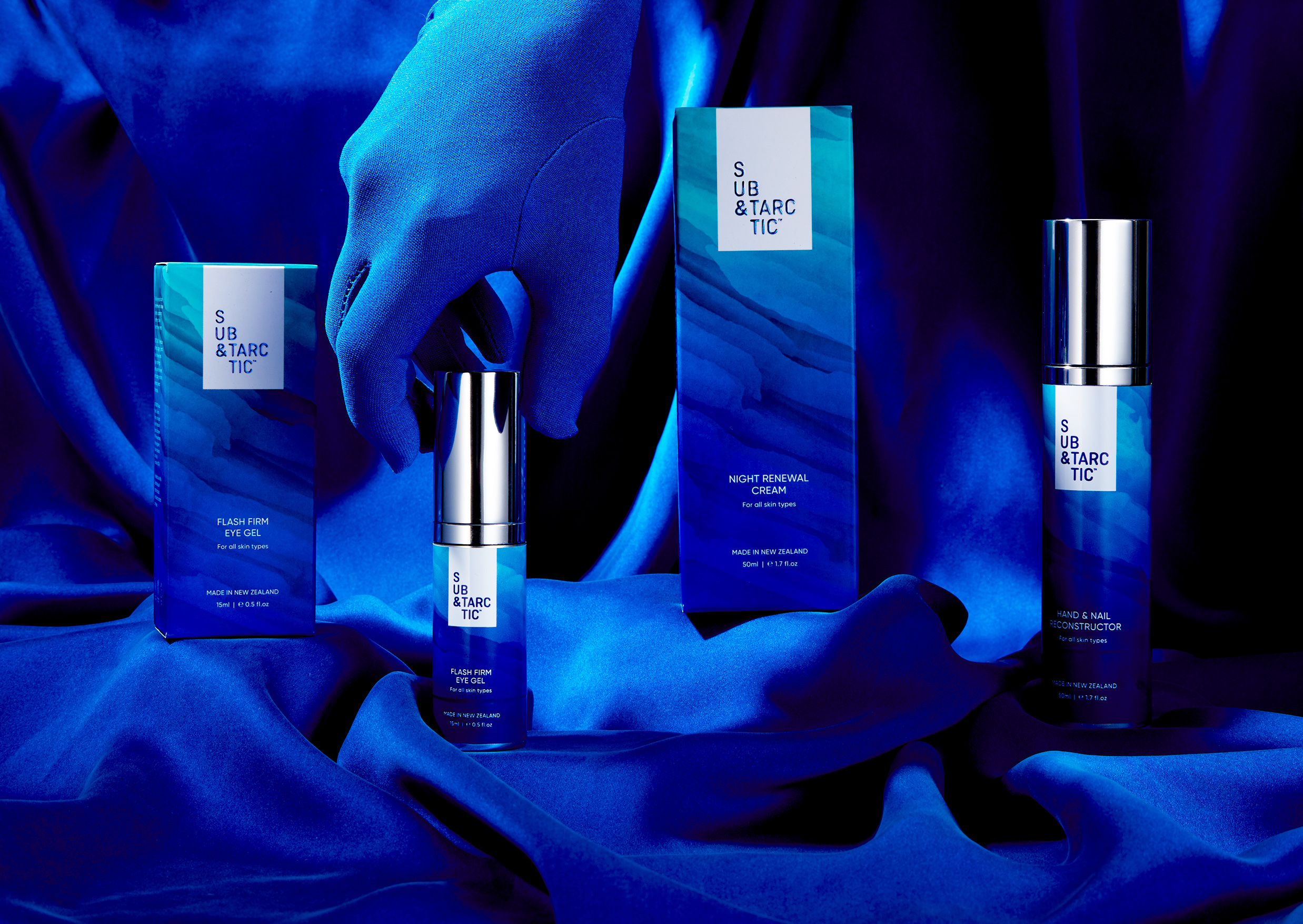
Sub&Tarctic approached us to refresh their brand identity and packaging design with ambitions to enter the US and Asian markets. They wanted their brand identity to be contemporary, and packaging to uniquely reflect the purity of their ingredients, have “pop” and colour for shelf presence.
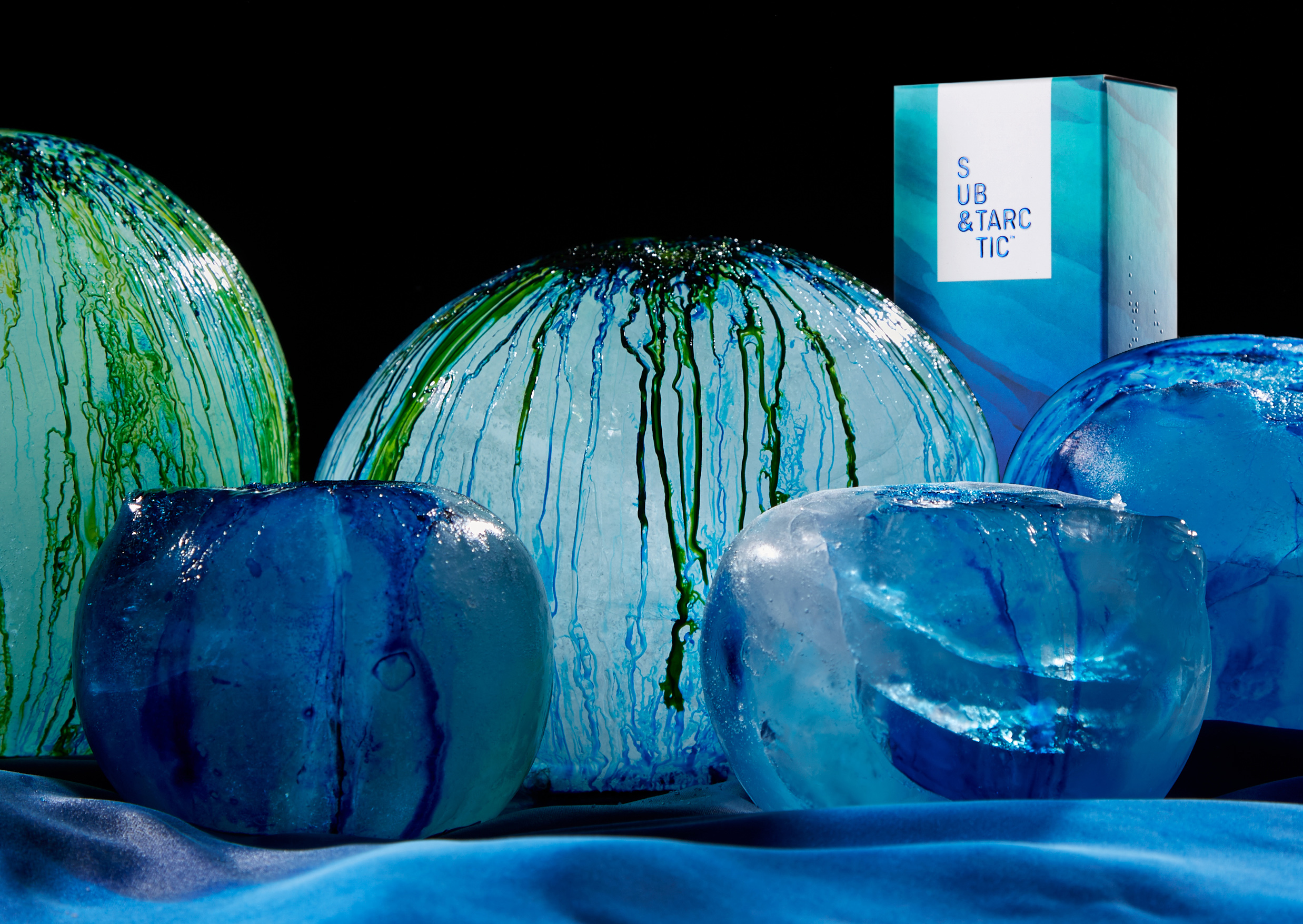
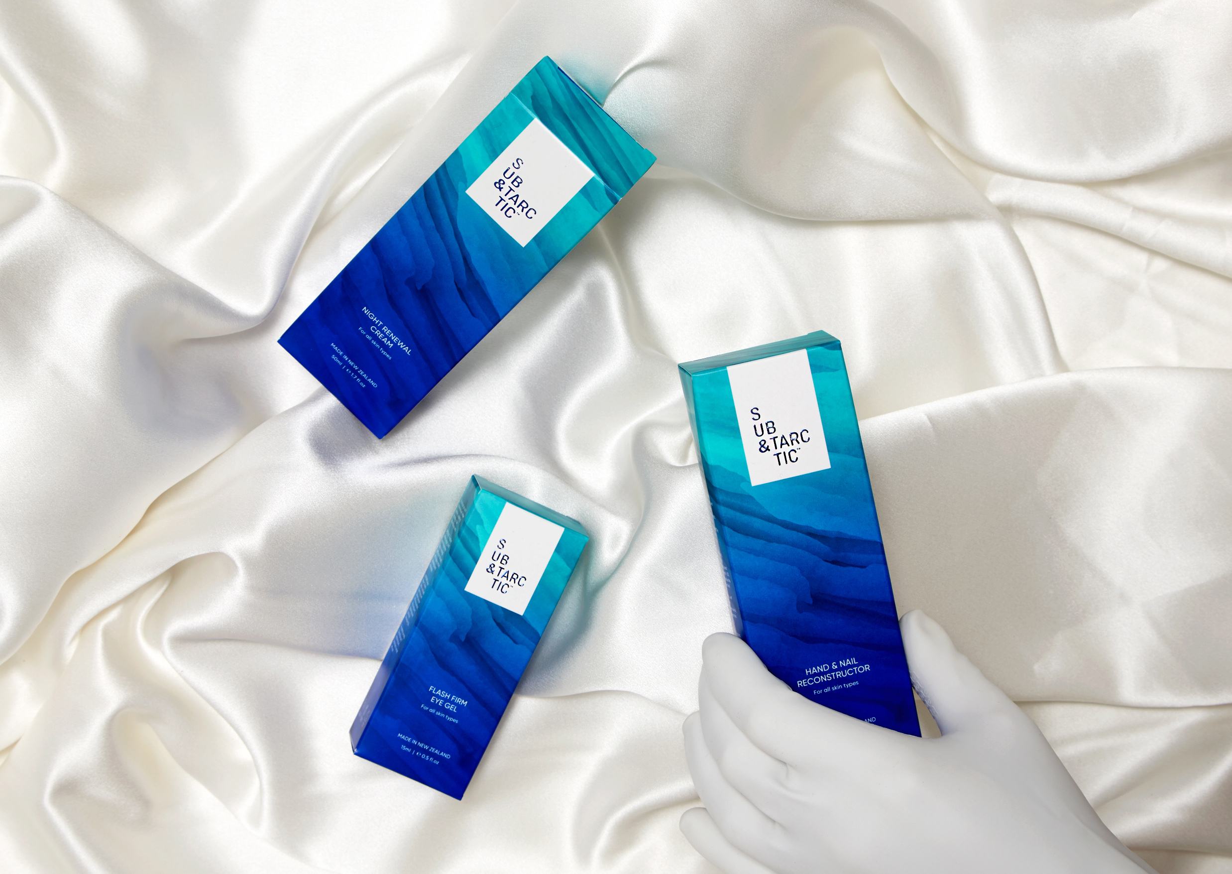
Using their name as the key driver behind our design execution, we crafted a design system around an iceberg formation.
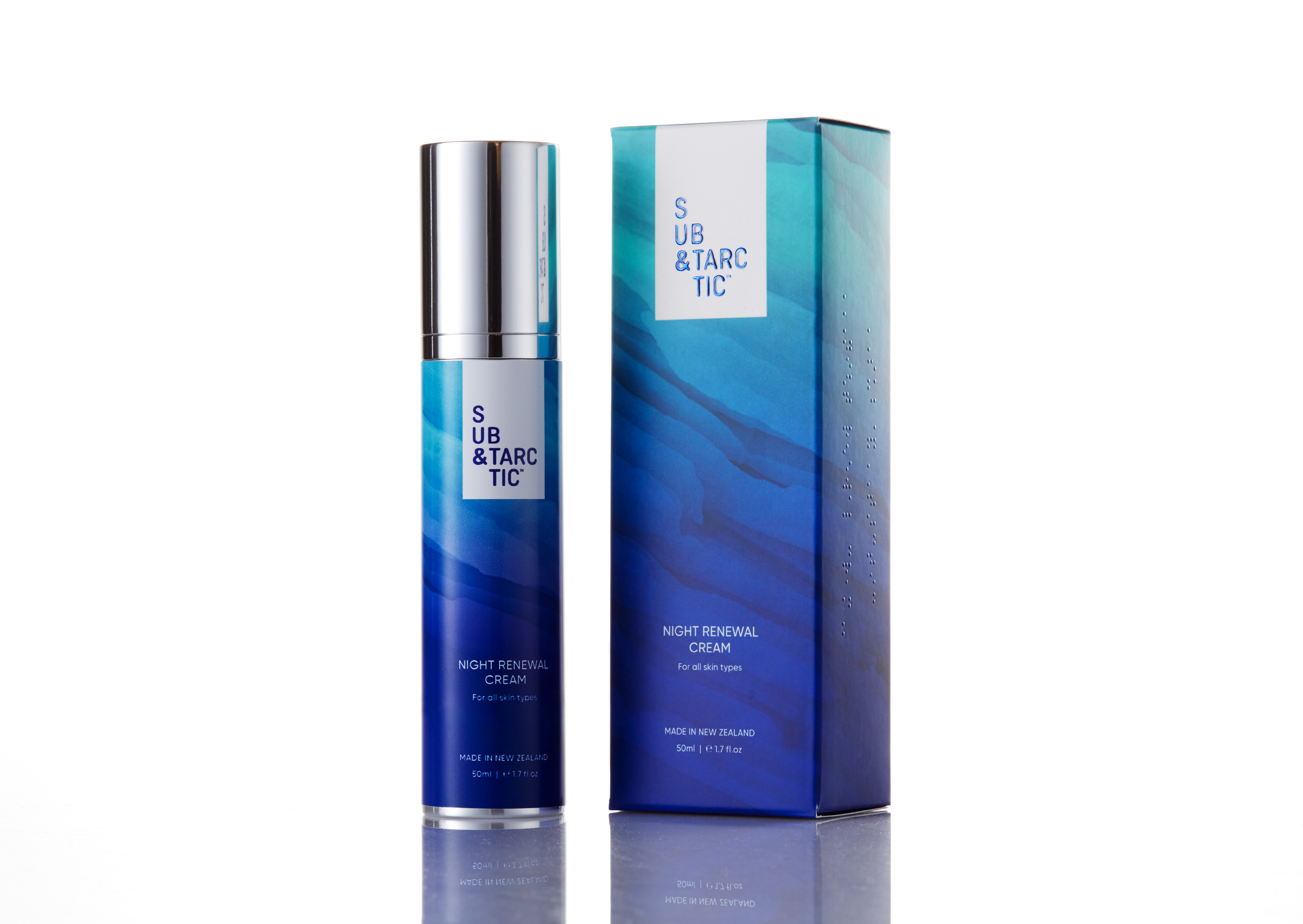
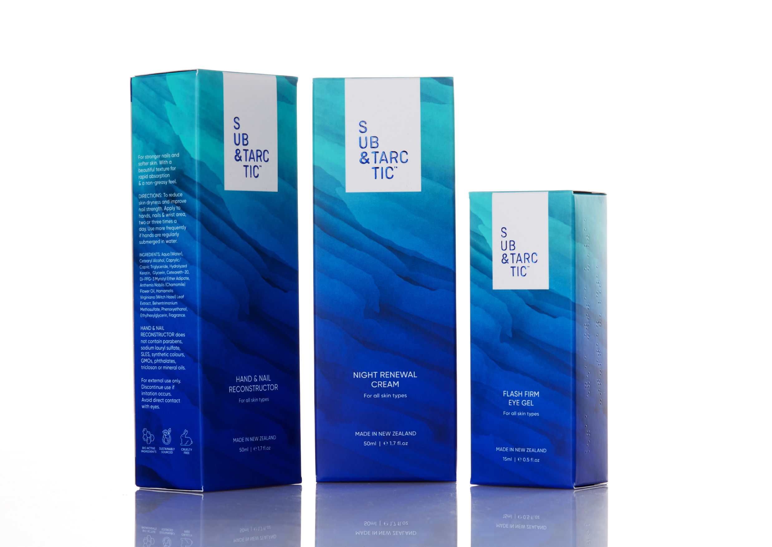
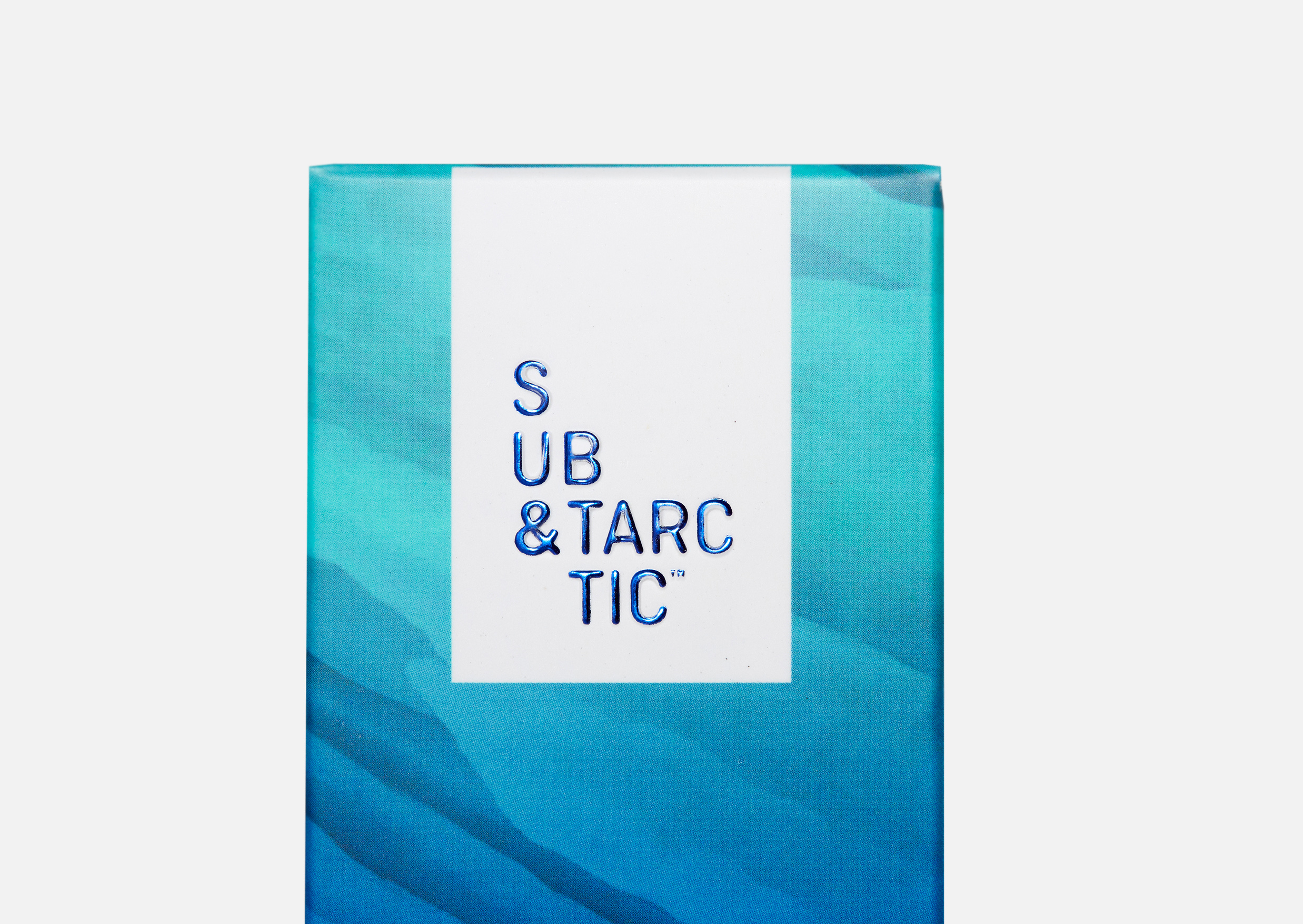
The new brand identity is layered, and stacks into a white “iceberg” lock up. It has texture and reflects light by using foiling and embossing in the print finish – simulating light reflections you would see in nature.
With a core brand value of inclusivity – we added Braille to make our packaging accessible for the visually impaired. This tactile element added to our overall proposition – inclusivity in beauty.
The packaging design pops with vibrance of the natural palette surrounding an iceberg – with layers and shades of greens and blues which darkens as it travels down the pack, providing a platform for our product naming and details.
The overall impact reflects purity and pristine nature – but with boldness and colour, and without the use of traditional natural colour palettes seen in many competitor brands in the market.
CREDIT
- Agency/Creative: Redfire
- Article Title: Redfire Design Inclusivity in Beauty for Sub&Tarctic
- Organisation/Entity: Agency, Published Commercial Design
- Project Type: Packaging
- Agency/Creative Country: New Zealand
- Market Region: Oceania
- Project Deliverables: Brand Architecture, Brand Creation, Brand Identity, Brand Redesign, Brand Strategy, Branding, Graphic Design, Identity System, Packaging Design, Photography, Product Architecture, Product Naming, Research, Structural Design, Tone of Voice
- Format: Bottle, Box, Tube
- Substrate: Glass Bottle, Plastic, Pulp Paper


