Ruavieja is a Spanish traditional spirit brand that since 1889 represents special social moments between friends and family. At Morillas, we had the chance to redesign its packaging and visual identity to increase the connection with the target, while reinforcing its positioning and the connection with its territory.
We were commissioned to align brand language to the packaging. Our challenge? To maintain Ruavieja’s essence, updating and giving the range a contemporary look. There was a gap between the brand’s communication, focused on sharing moments with friends and family, building stronger and closer human connections, and the brand’s visual identity, which was perceived as traditional and outdated. Therefore, Morillas was entrusted to rethink the brand’s visual identity and packaging by giving coherence and globality to the portfolio, transforming the consumer experience into a more premium and sophisticated one.
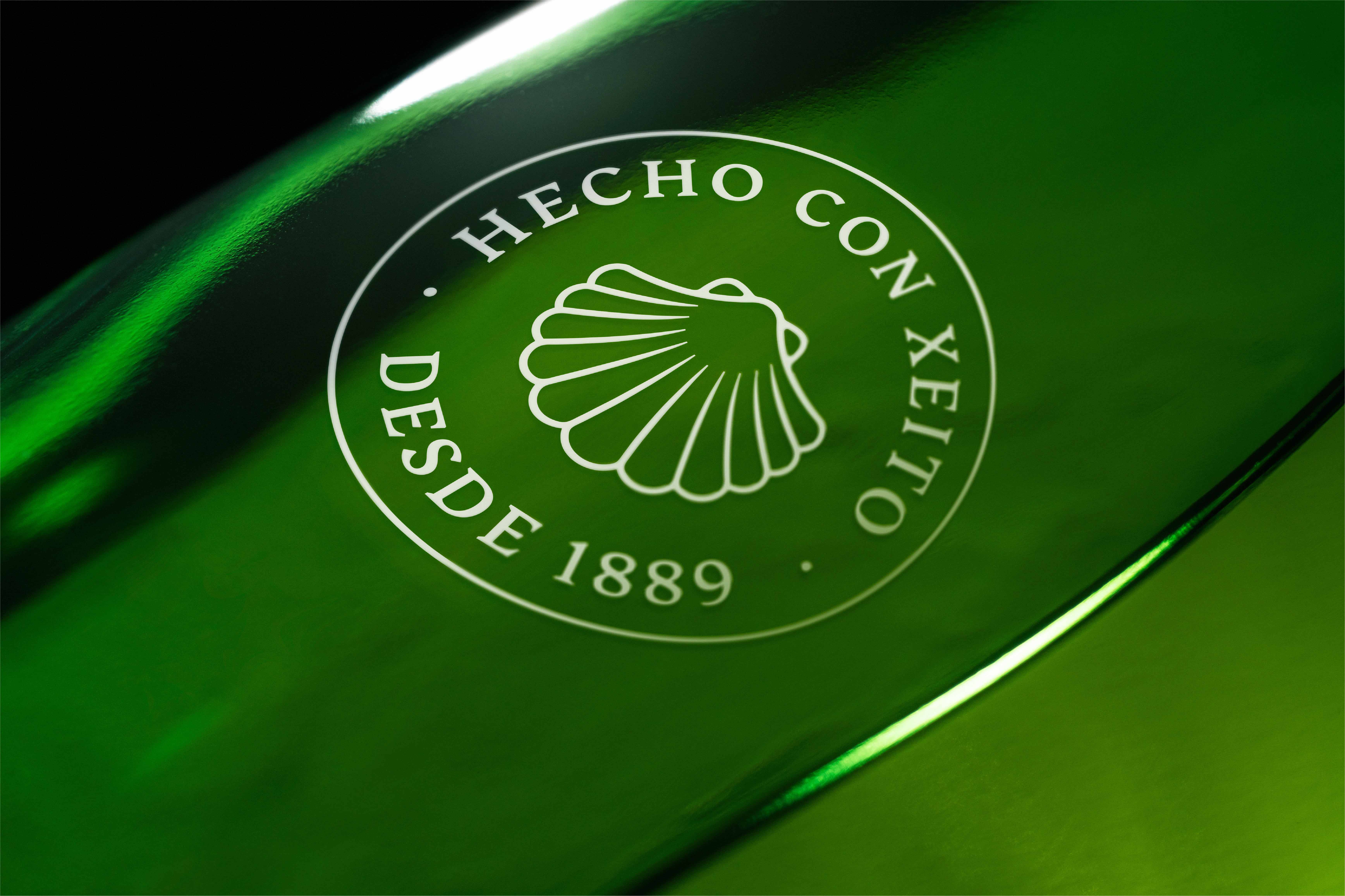
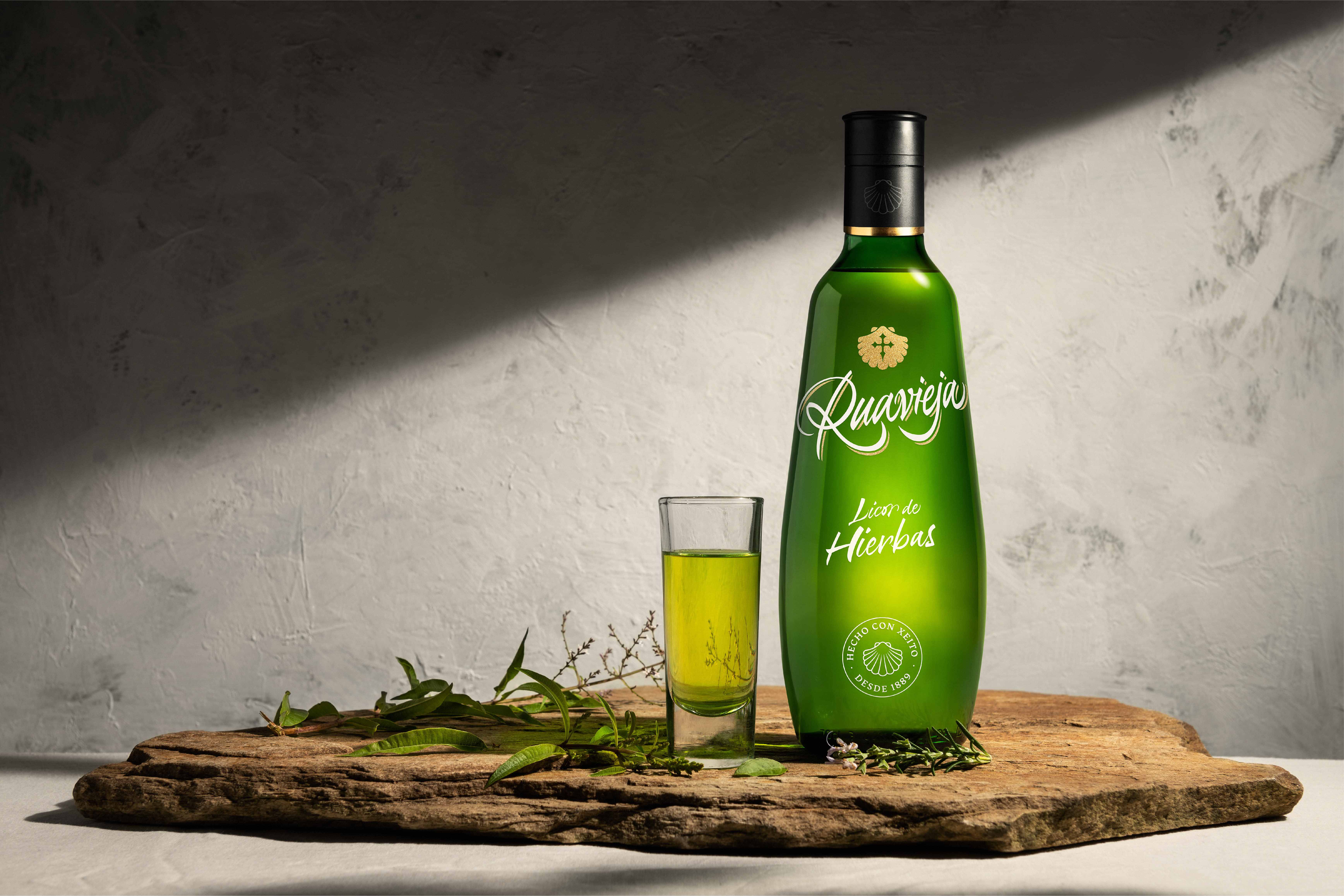
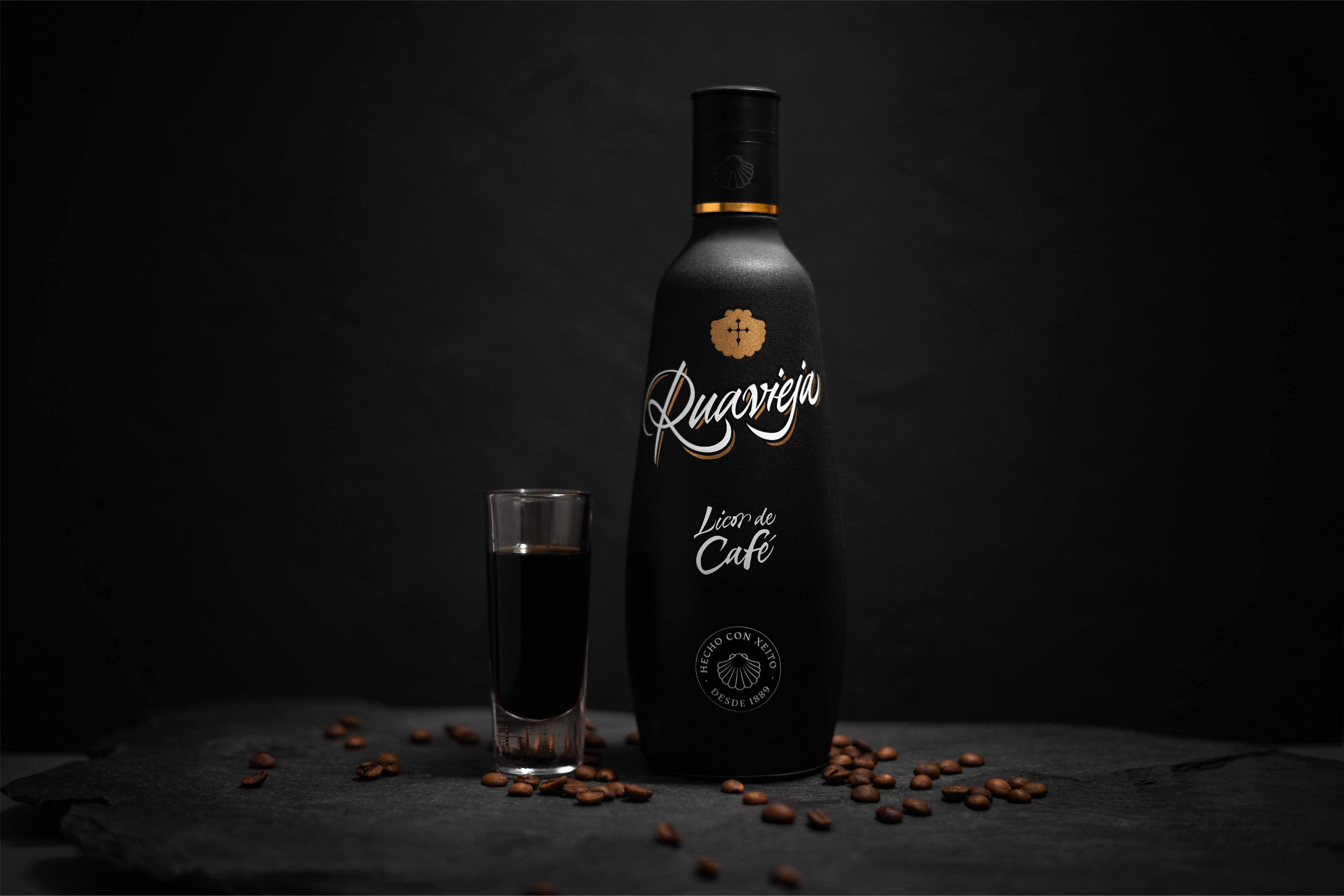
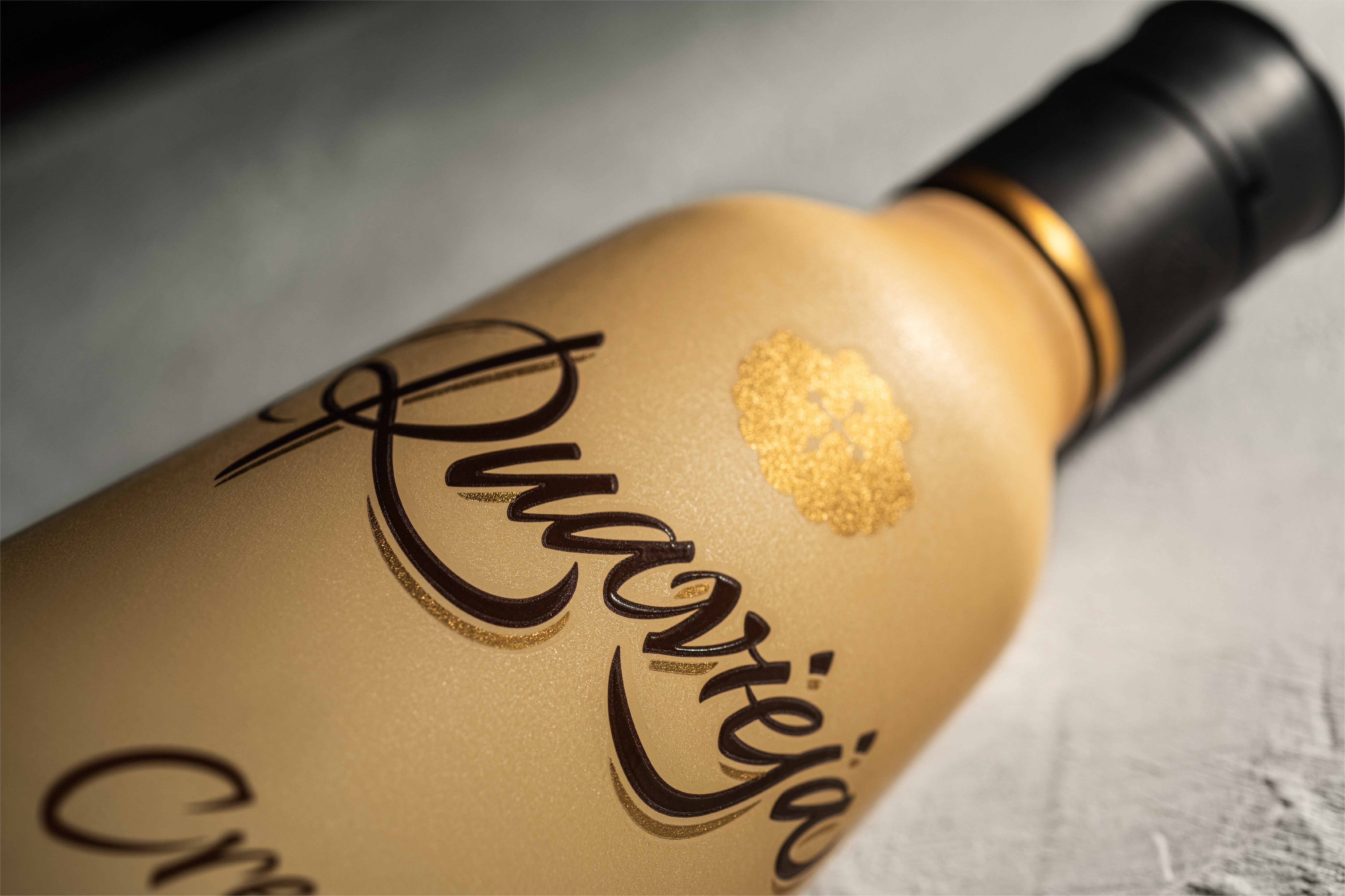
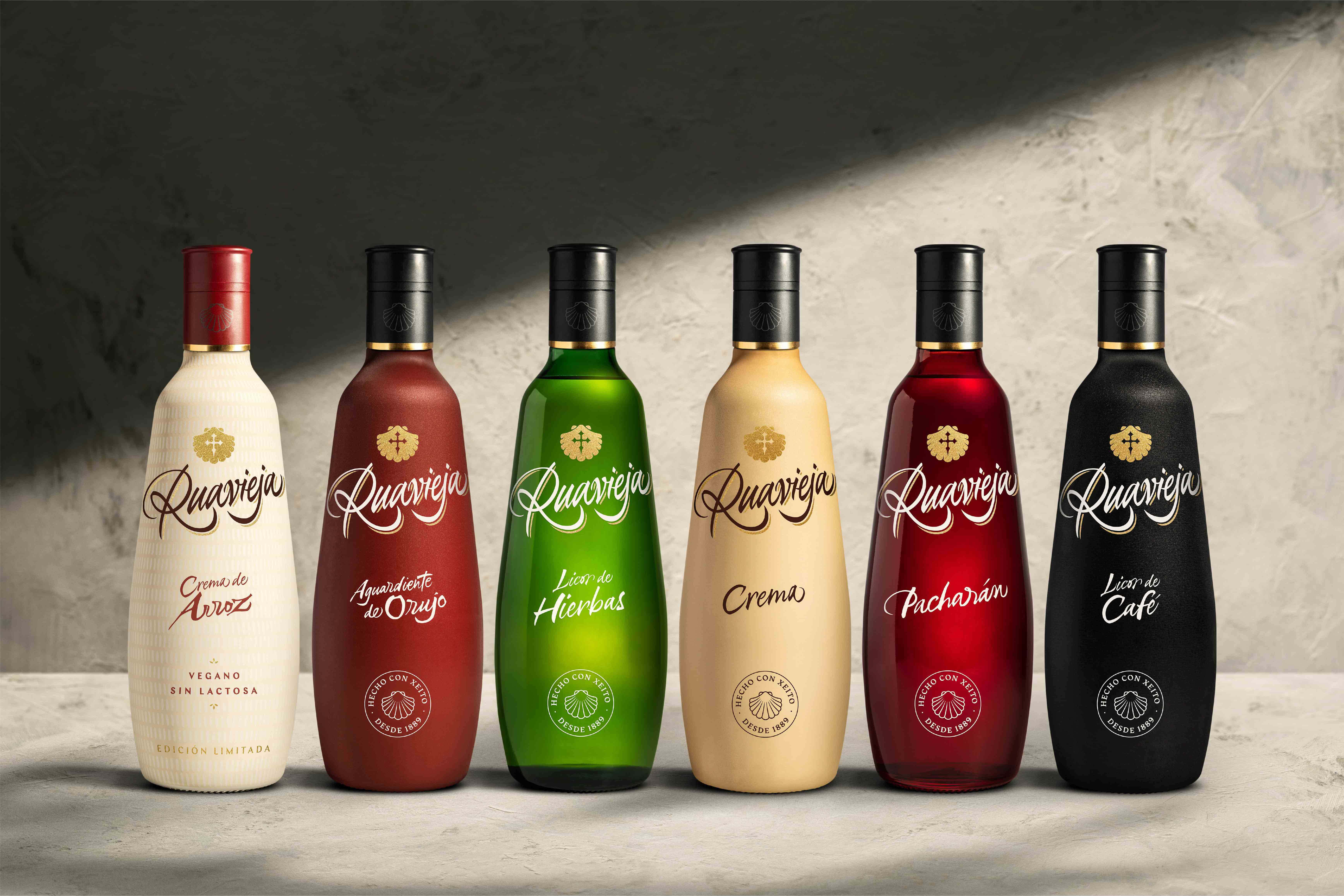
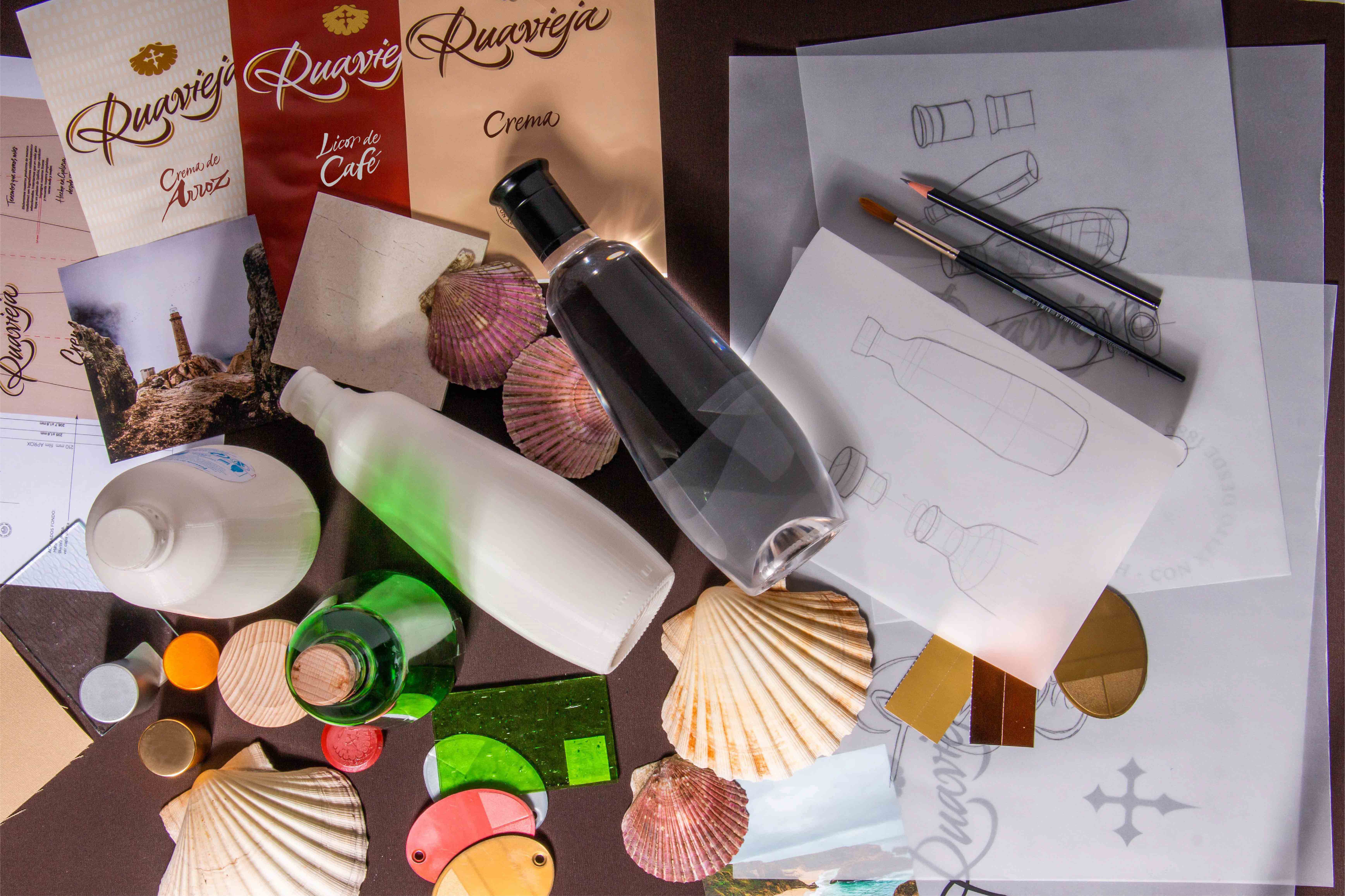
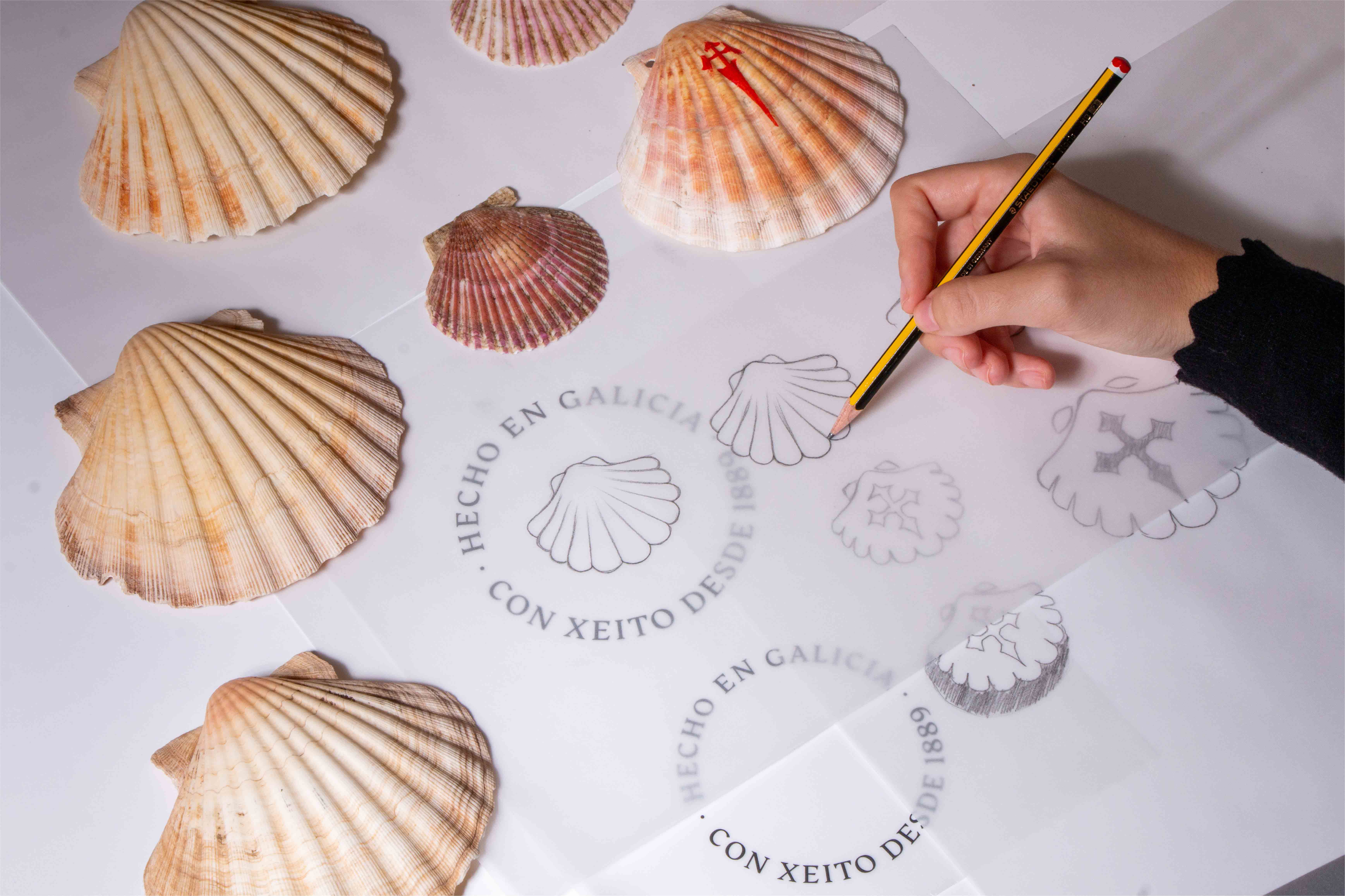
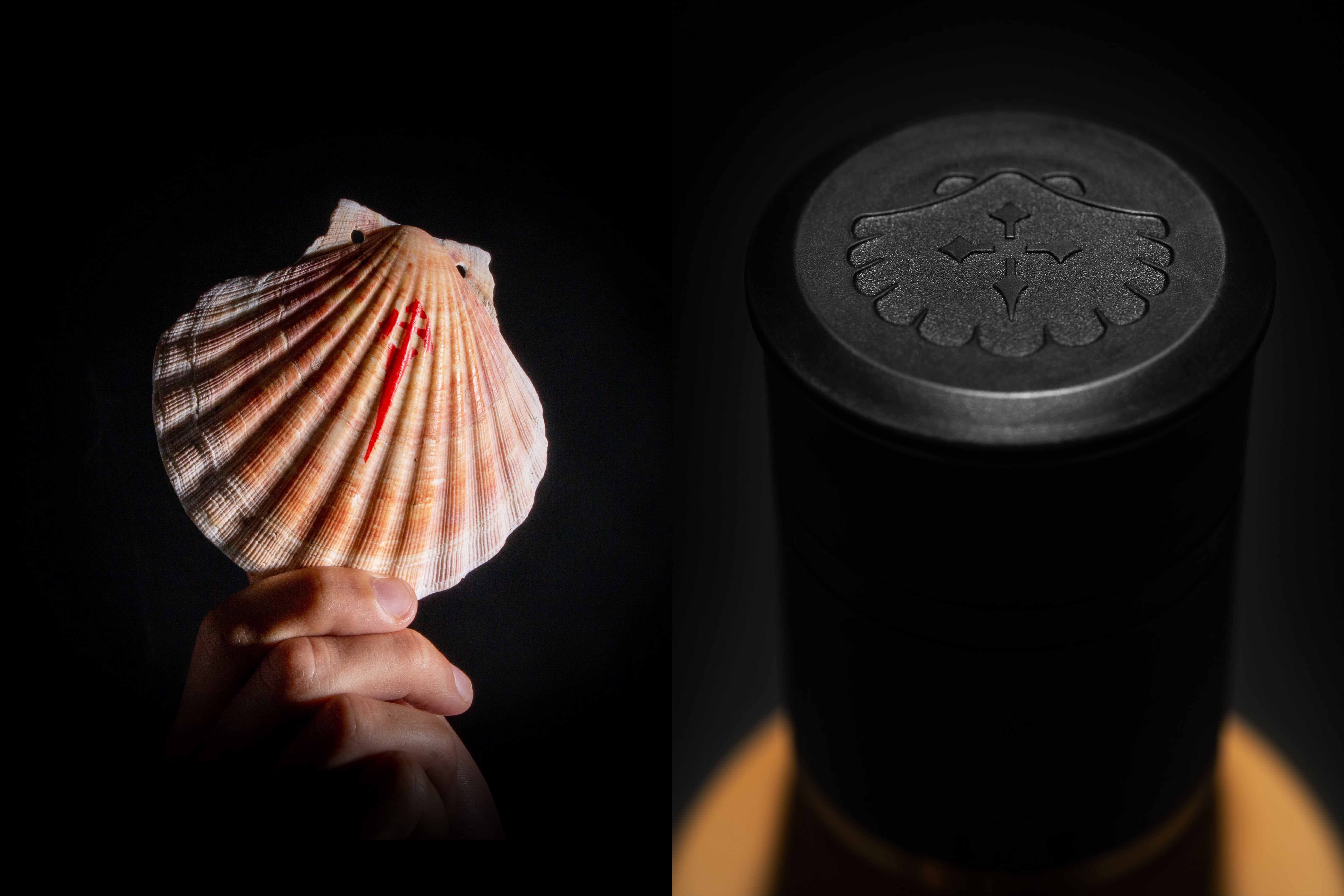
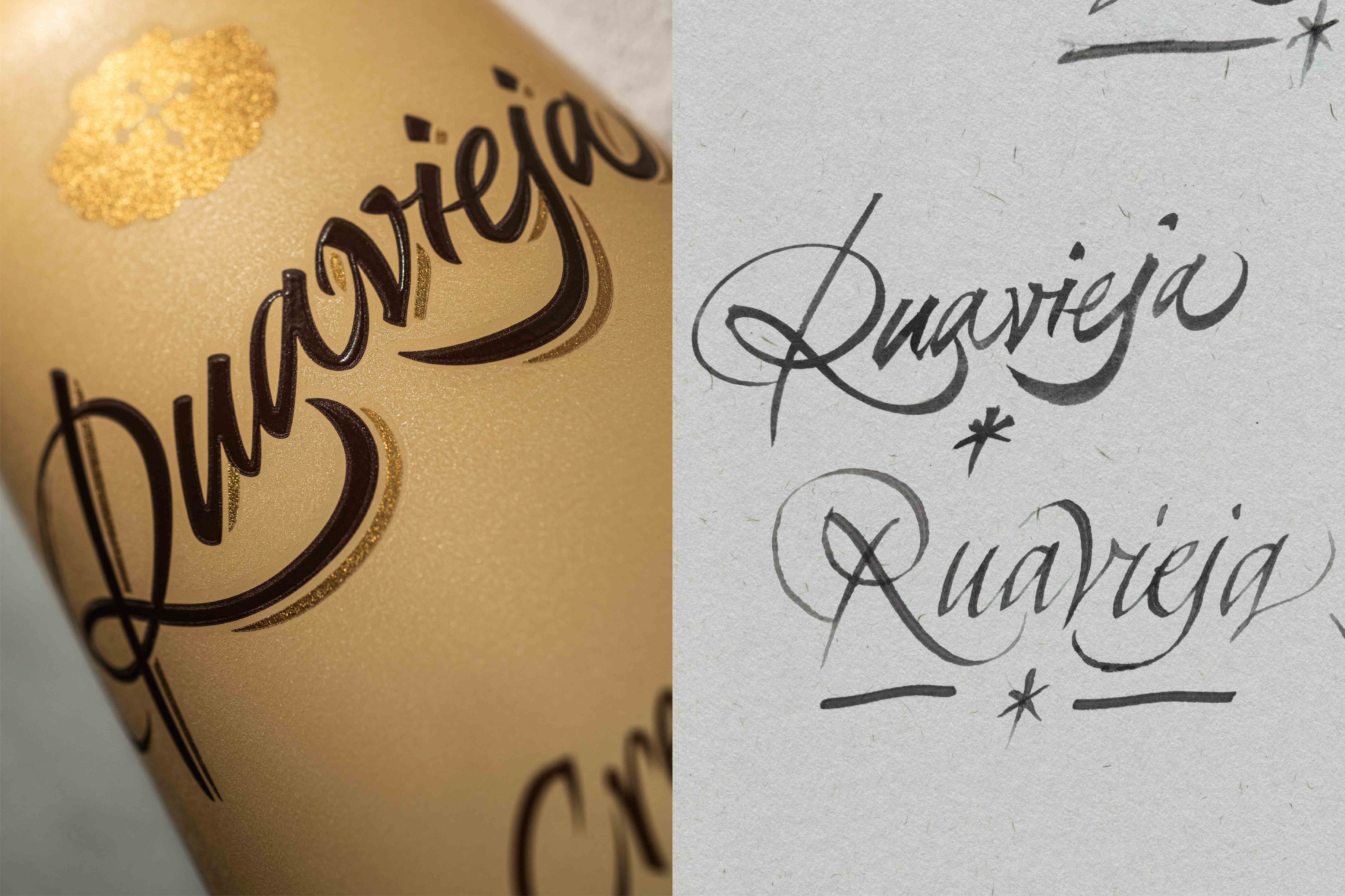
Our first step was to reimagine the brand’s logo and visual assets and unify them under the same visual criteria. Thus, we create a fresh, and neat identity which helps to convey sophistication and origin in a contemporary way. In the process of creation, we had the chance to create a custom-made calligraphy made by Oriol Miró; a more contemporary lettering made by brush to construct a proprietary identity while keeping the brand soul. He composed a brand redrawing the “r” and “j” in a more harmonious and close way, unifying them into the logotype, and underlying these letters with an ornamental gold fine line, offering elegance, dynamism, and refinement while elevating the perception of quality and modernity. We also reconnect the brand with its territory, transferring the Galician values through a proprietary identity. Thus, we reinterpreted the region symbols, maintaining the iconic images but with a fresh approach. We performed the iconic Ruavieja shield, the shell, and we incorporated “made with xeito”, an expression that reflects the most authentic Galician spirit: the ultimate know-how, the optimal combination of skill and class. In the same way, we introduced the Cross of Santiago through an up-to-date representation.
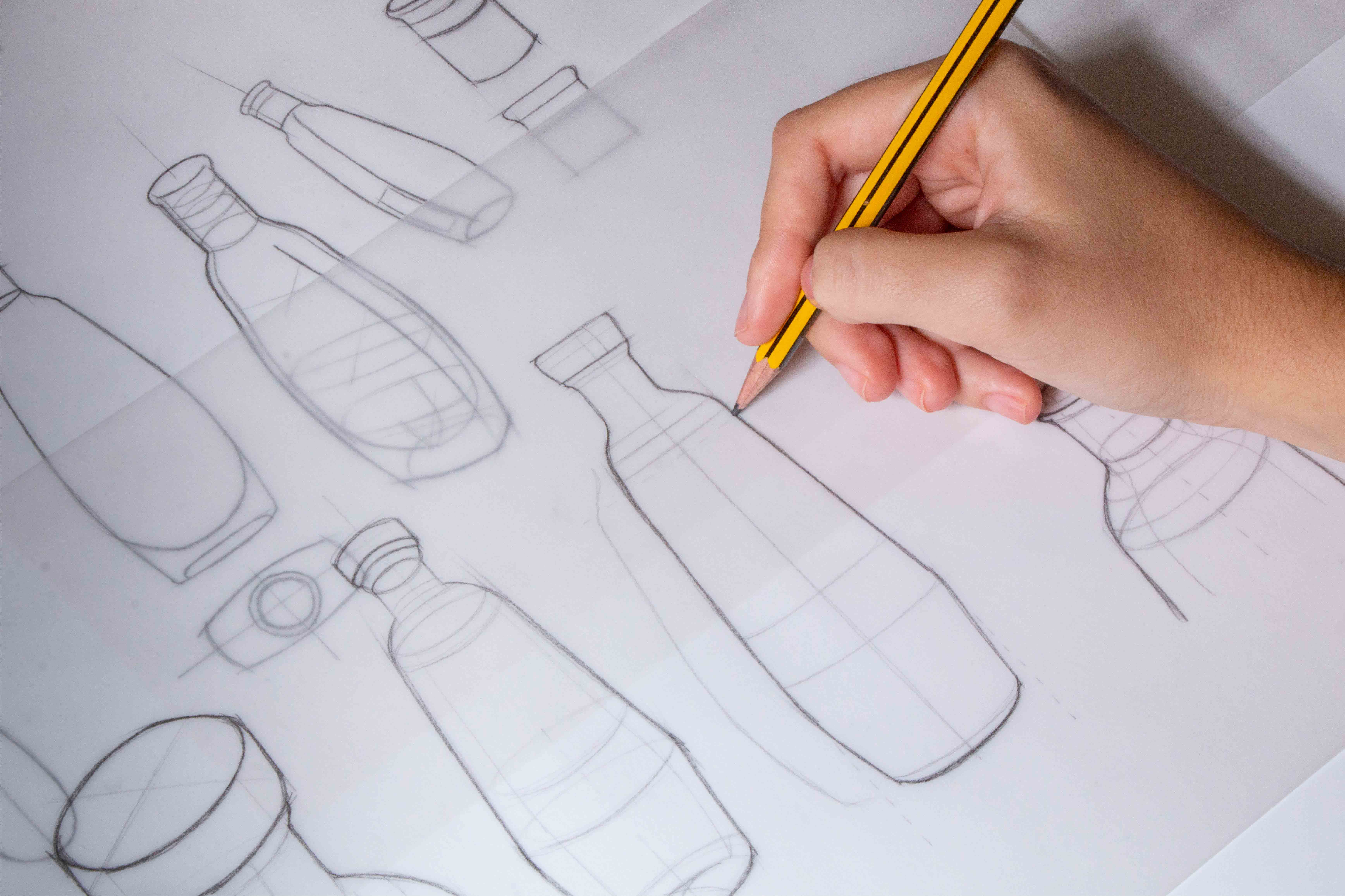
In addition, to boost the brand to an aspirational level, we got into the packaging redefinition, creating a new bottle with a more svelte and sophisticated identity. Hence, keeping the original essence of the iconic pack, we slenderize the packaging using less glass, giving it a light appearance, and reducing the production of materials, energy, and other resources. Moreover, adapting
to the market and environmental needs, we removed – in most packaging- the color of the glass to introduce it into the sleeve. We also came up with a state-of-the-art recyclable sleeve, with an effortless removal, that simplifies pickup and recycling processes. A way to update brands and adapt to sustainable needs without losing the essence that distinguishes them.
Sophistication, simplicity, and neatness. The perfect way to make evident the singularity of a brand and cherish the value of its origin using a contemporary language.
CREDIT
- Agency/Creative: Morillas Branding
- Article Title: Redesigning of Tradition Spirit Brand Ruavieja by Morillas Branding
- Organisation/Entity: Agency
- Project Type: Packaging
- Project Status: Published
- Agency/Creative Country: Spain
- Agency/Creative City: Morillas Brand Design
- Market Region: Europe
- Project Deliverables: Brand Identity, Brand Redesign, Brand Strategy, Packaging Design
- Format: Bottle
- Substrate: Glass
- Industry: Food/Beverage
- Keywords: #redesign #visualidentity #morillas #createsomethingextraordinary #ruavieja #liquor #packaging #productdesign #industrialdesign #design #logo #typeface #calligraphy #graphicdesign #galicia #sustainability #sustainablesleeve
-
Credits:
Calligraphy: Oriol Miró
Photography: Xaime Aneiros


