


Task
The popcorn market is rather conservative in Russia. However, a consumer expects relevant visual standards from the category. Understanding of this process led the company “Eurofoods” to a solution of renewing the package of their key brand.
Solution
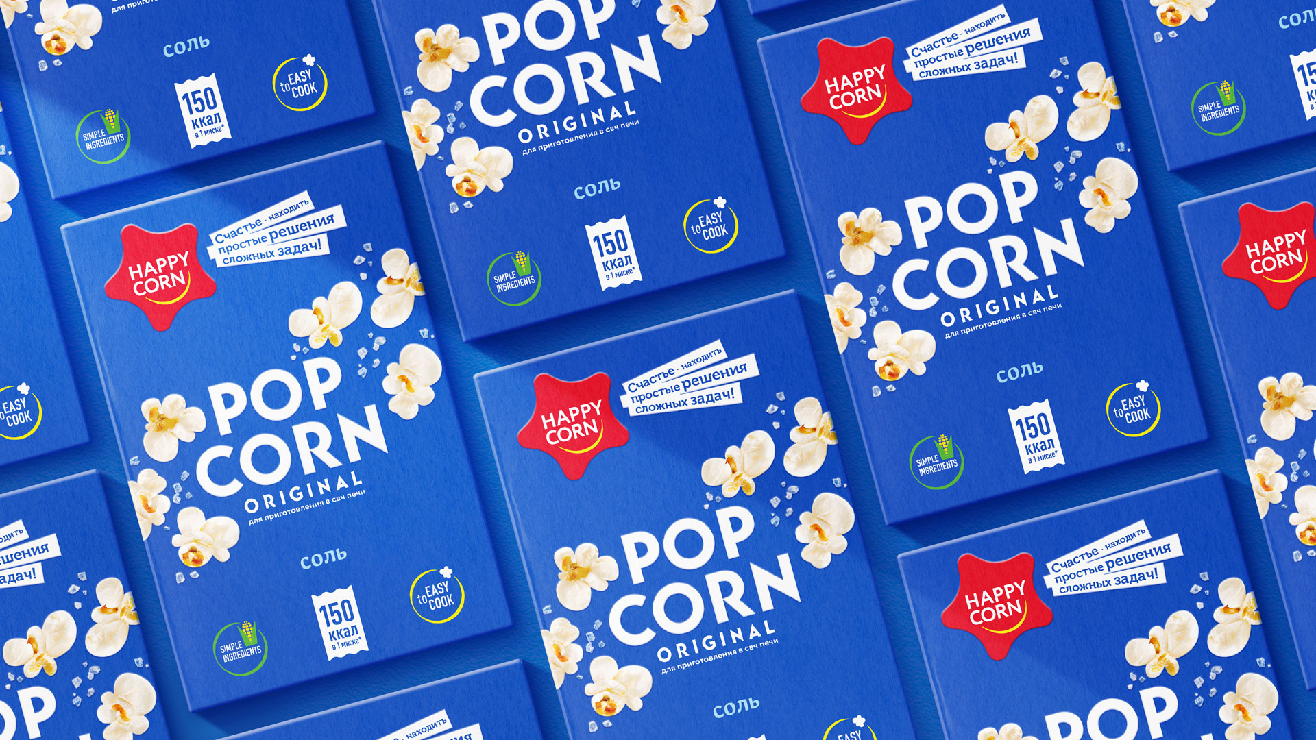
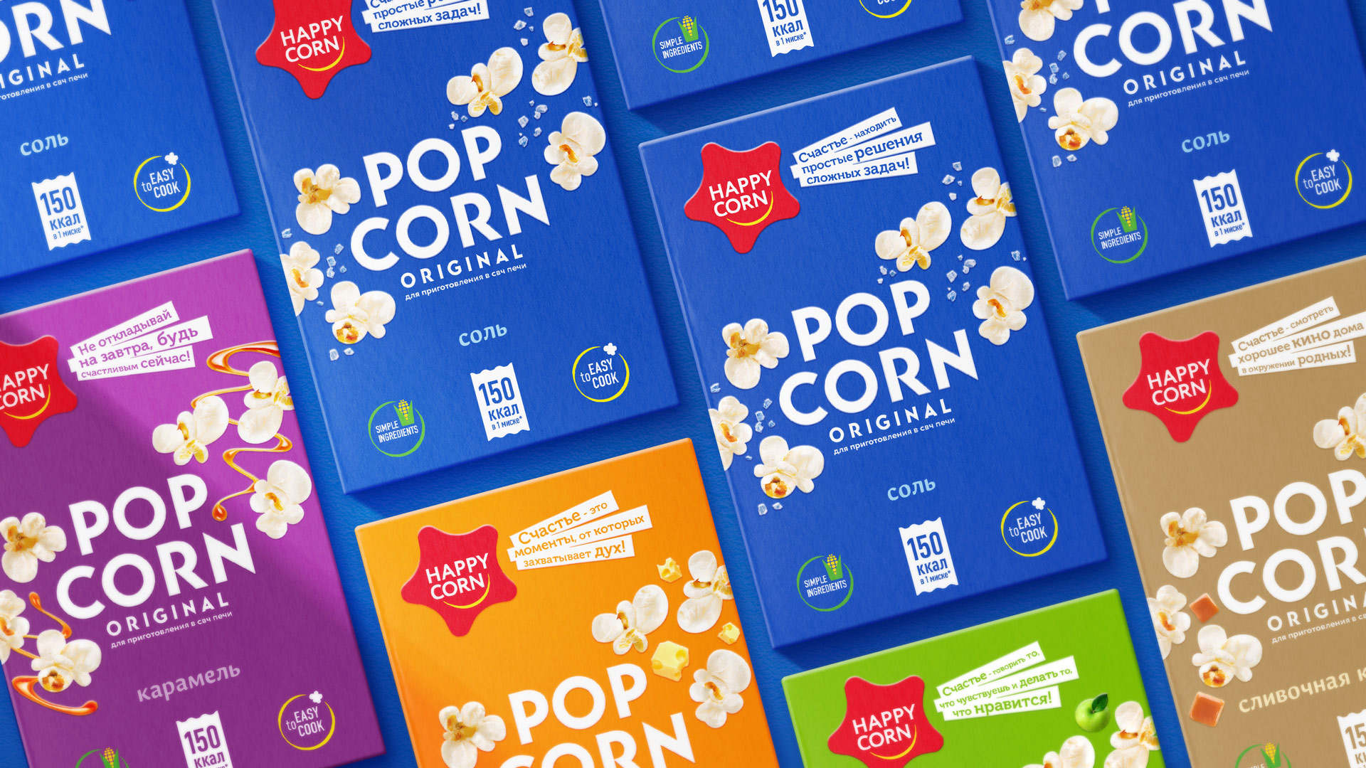
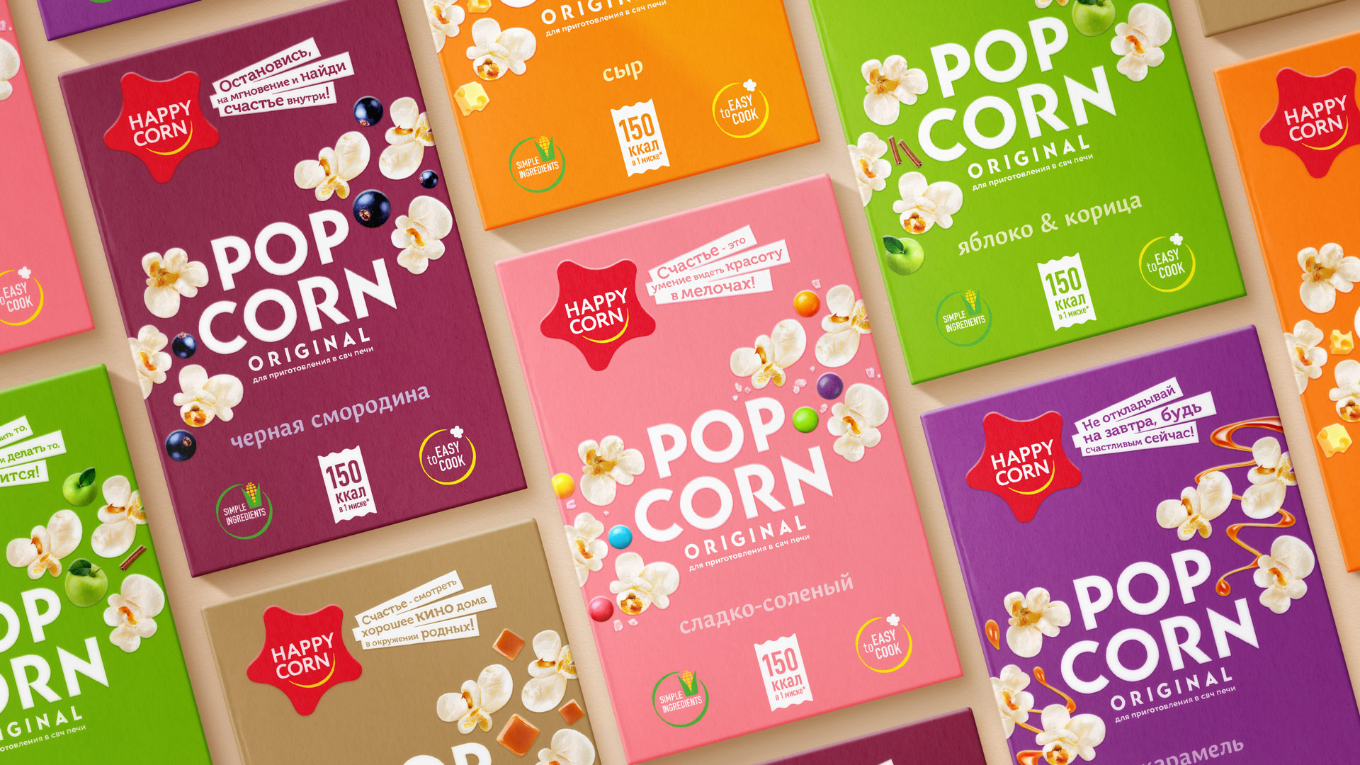
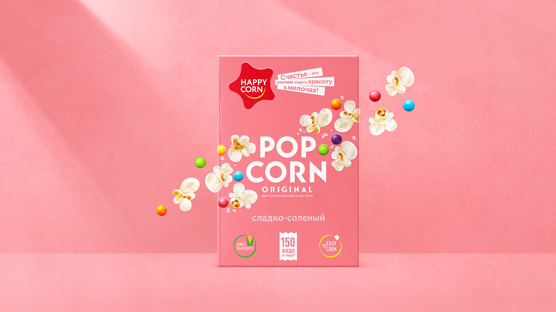
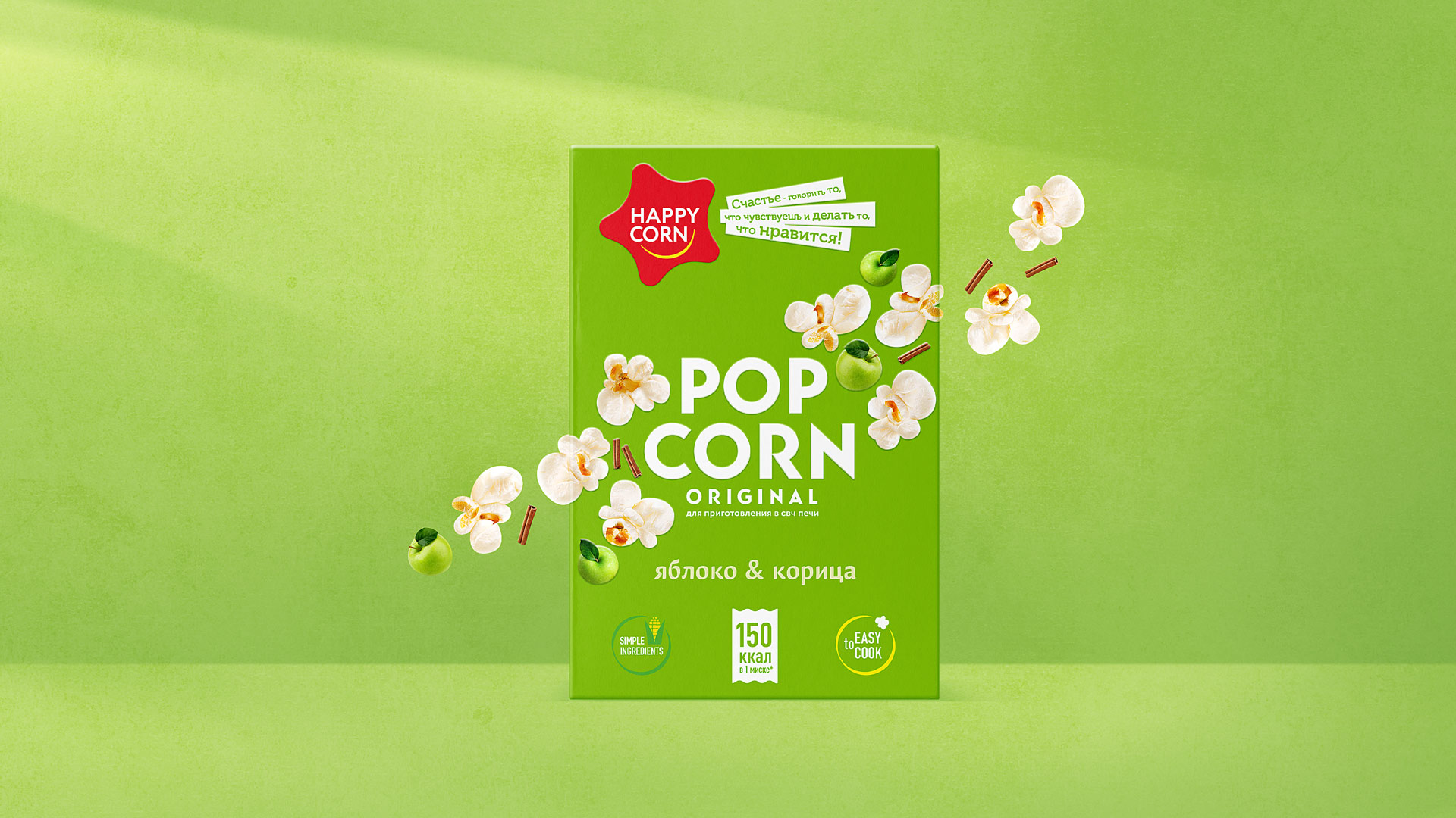
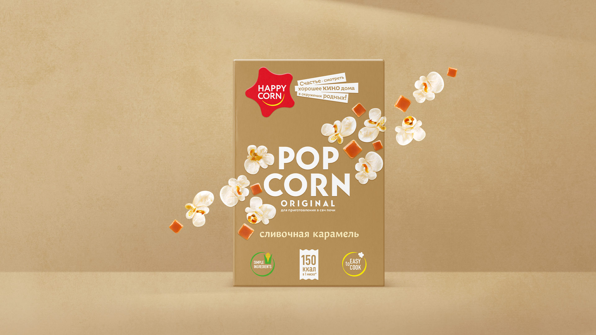
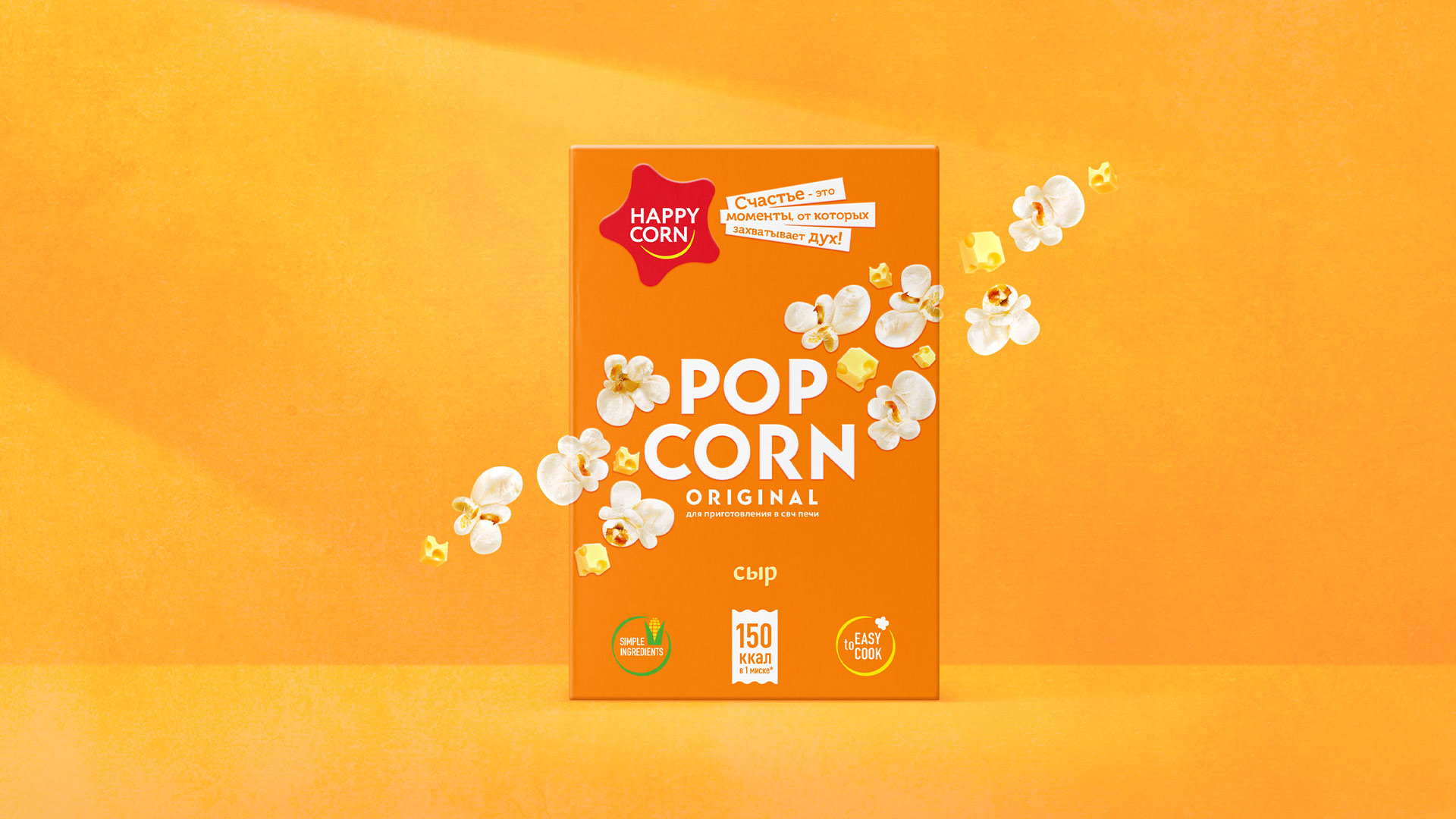
The major driver for purchase of popcorn is an emotional desire to spend time in heart-warming atmosphere among relatives and friends, forgetting about the rash and day-do-day cares for a while. Bright and positive design of the package is a great way to attract attention of this target audience.
Star-shaped logo block with emotional slogans broadcasts the idea of happiness. This very idea underpins the brand. Diagonal placement of delicious product zone forms a structural element, allowing the package to stand out in a shelf. Contrast background colours solve a task of tastes’ differentiation well. This also helps to simplify the navigation over the assortment matrix.

CREDIT
- Agency/Creative: PROFSOYUZ
- Article Title: Redesign of the Popcorn Package Design Happy Corn
- Organisation/Entity: Agency, Published Commercial Design
- Project Type: Packaging
- Agency/Creative Country: Russia
- Market Region: Multiple Regions
- Project Deliverables: Brand Strategy, Branding, Packaging Design
- Format: Box
- Substrate: Pulp Carton


