Just Design – Bain’s Cape Mountain Whisky
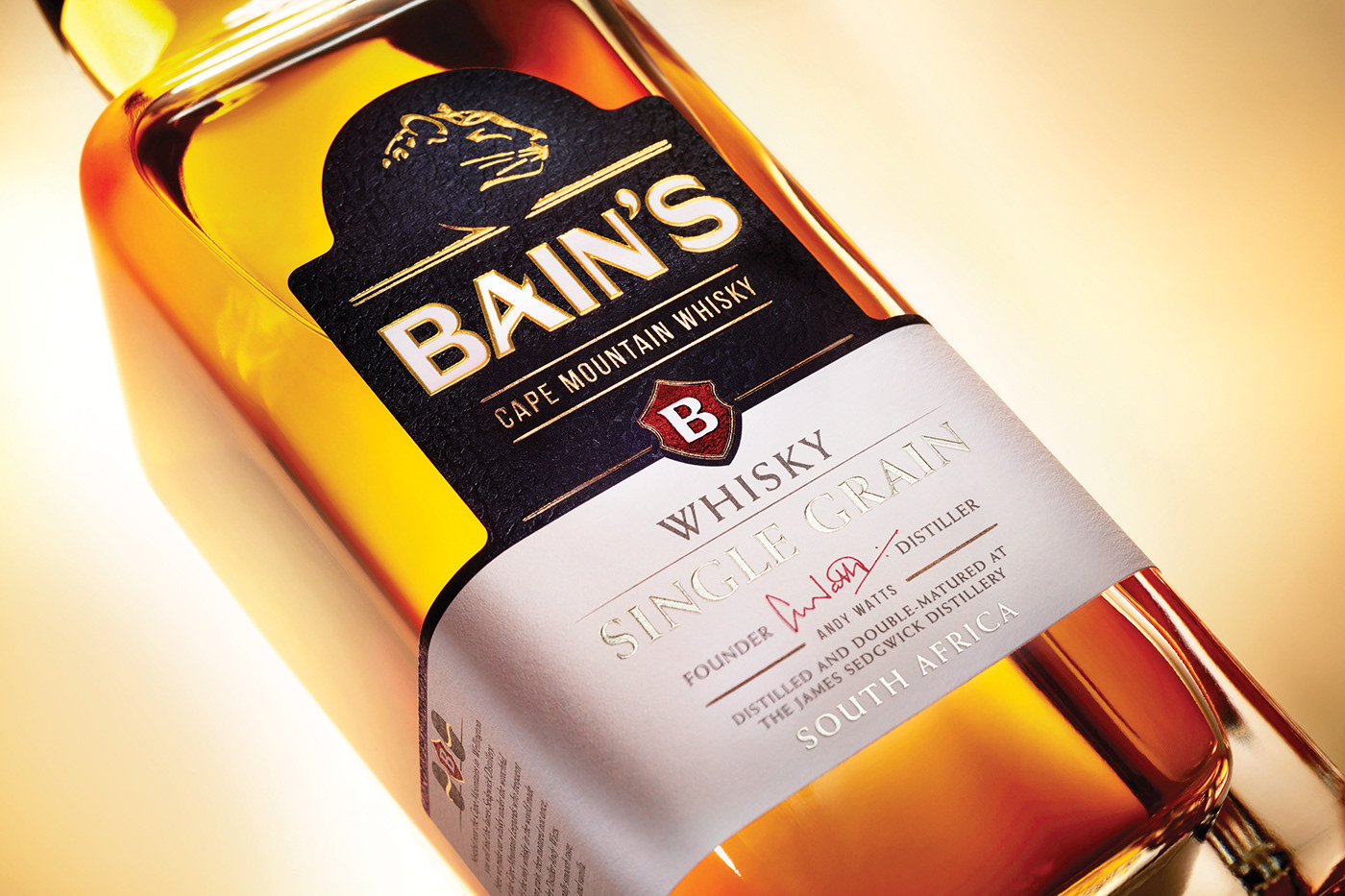
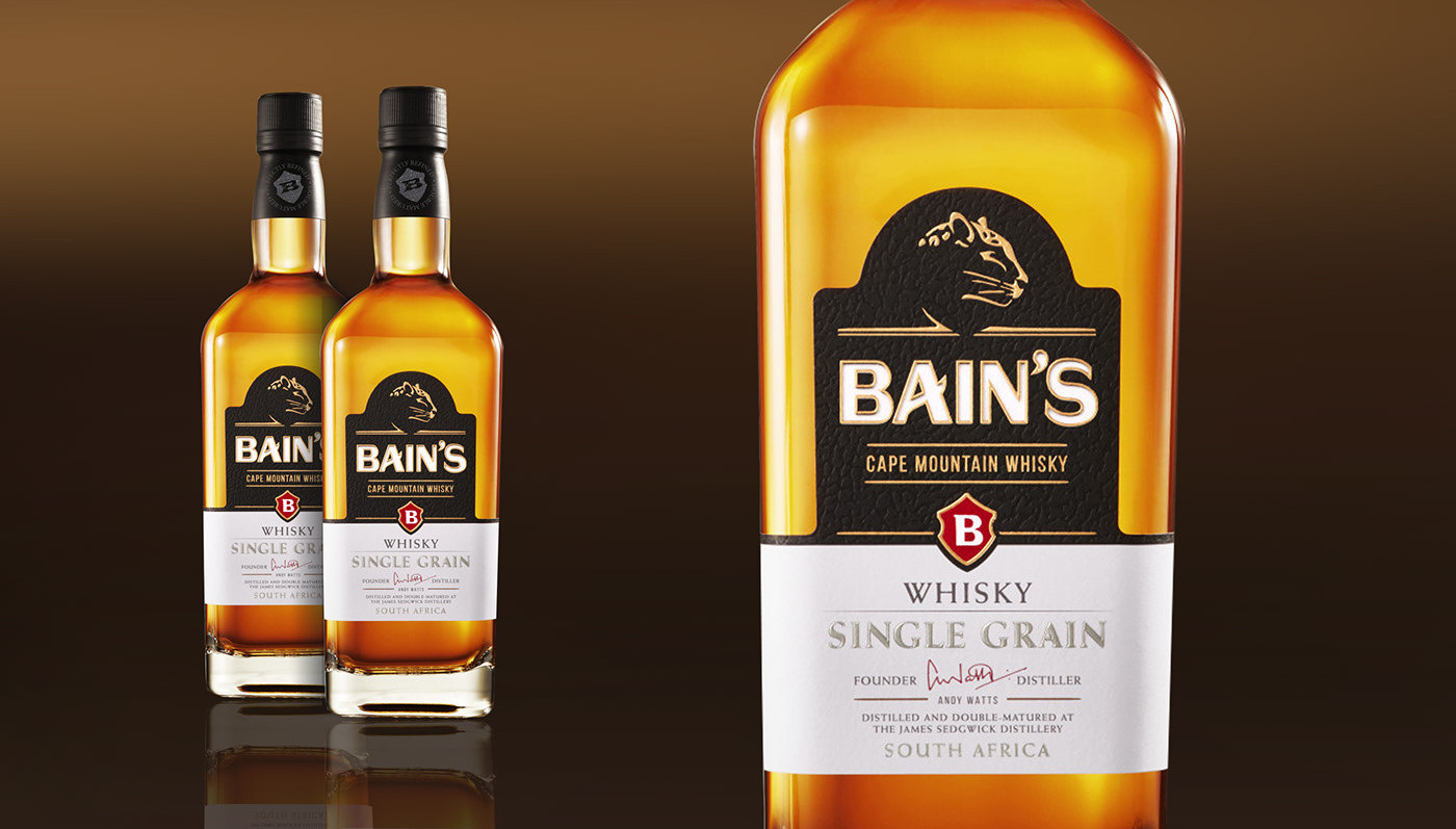
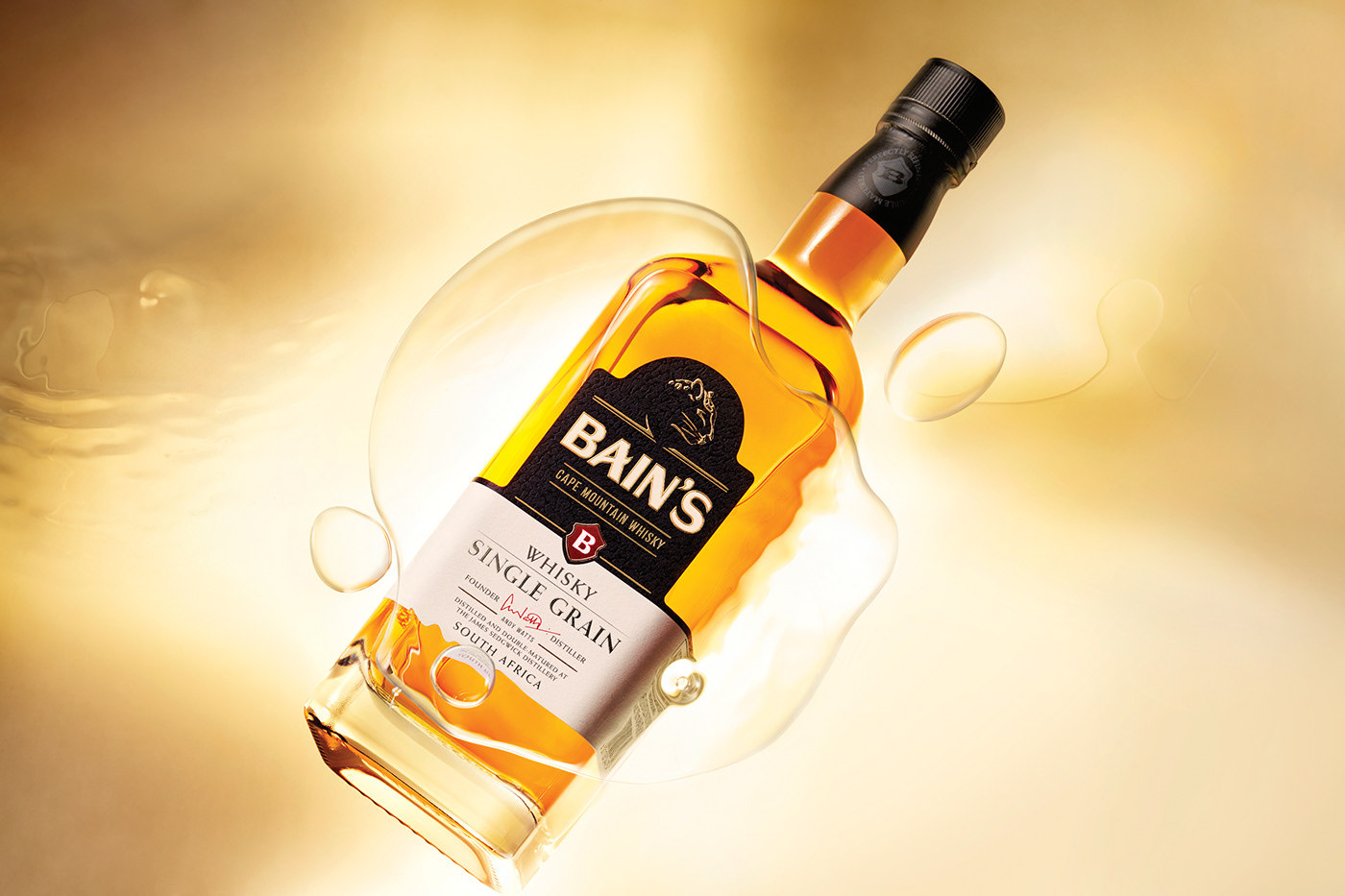
As Bain’s Cape Mountain Whisky assumes its hard-won place as the world’s most awarded single grain whisky, it is time for the brand’s identity to more influentially take on the whisky landscape as a leader and brand of substance. To do this, packaging experts Just Design first optimised the brand’s existing strengths, taking inspiration from Bain’s Kloof valley and the endemic mountain leopard. Giving more importance to the aspects that make the brand unique. The leopard was relooked as a single eye-catching headshot, modernised and stylised to have a greater presence on pack. Next the studio introduced more credible whisky cues such as uncoated paper, buff colouring, layered typography and the added embellishment of a signature – that of award-winning Master Distiller, Andy Watts. The typeface was redesigned to be more own-able and all the other elements were refined, while still maintaining strong ties to the original design to retain existing drinkers. The restructured wrap-around label adds to the overall distinctiveness, and the single grain whisky claim and key point of difference is now strongly highlighted to stand out better on pack.The upgrade has given significant gravitas to a brand that is redefining the world of whisky, ensuring that it is seen as an enduring player with all the credentials to take on any traditional offering. Look out for the updated Bain’s Cape Mountain Whisky – first-class single grain whisky, now with the stature to match.


CREDIT
- Agency/Creative: Just Design
- Article Title: Redesign of Bain’s Cape Mountain Whisky
- Organisation/Entity: Agency, Published Commercial Design
- Project Type: Packaging
- Agency/Creative Country: South Africa
- Market Region: Global
- Format: Bottle
- Substrate: Glass


