


mousegraphics – Volvic
The briefing: “We need to redesign a very popular tea infusion brand”
The target consumer: international market
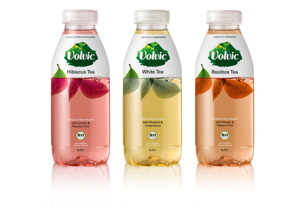
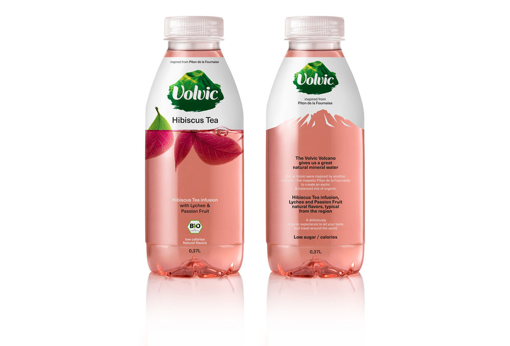
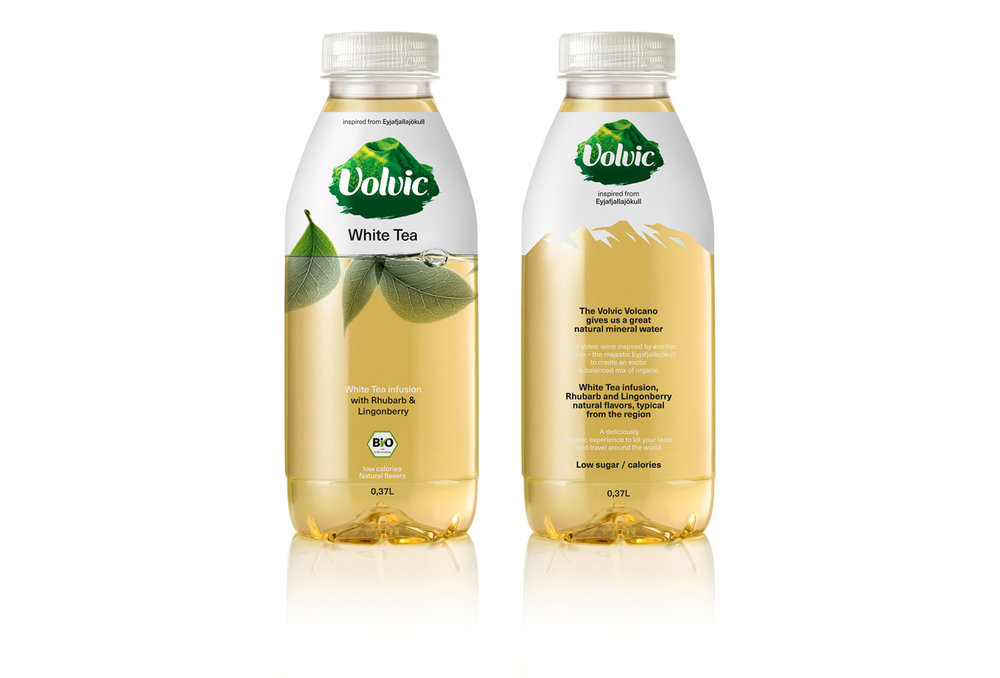
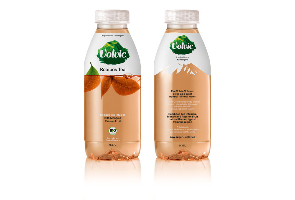
The design: Our client specified that we needed to preserve the existing brand logo and redesign the packaging in a way that would renew the brand identity while retaining its familiarity. We cleared the logo in such a way that the brand story (relation to Volvic volcano region) could emerge both in image (front surface) and text (back). Color white, already used in the brand name, gained in importance, both visually and conceptually: it signals areas and forms the outlines of mountain tops on the back packaging surfaces; its very transparency is further explored on the front, as information and leaf shapes are ‘carried’ by it in order to convey the illusion of floating substances. The natural flavor colors (mango & passion fruit / rhubarb & lingonberry / lychee & passion fruit) emerge clear and true via this transparency, and their liquidity is in harmony with the suggested materiality of tea plants and volcanic heights.
CREDIT
- Agency/Creative: mousegraphics
- Article Title: Redesign of a Popular Tea Infusion Brand for International Markets
- Project Type: Packaging
- Agency/Creative Country: Cyprus
- Format: Bottle
- Substrate: Plastic


