


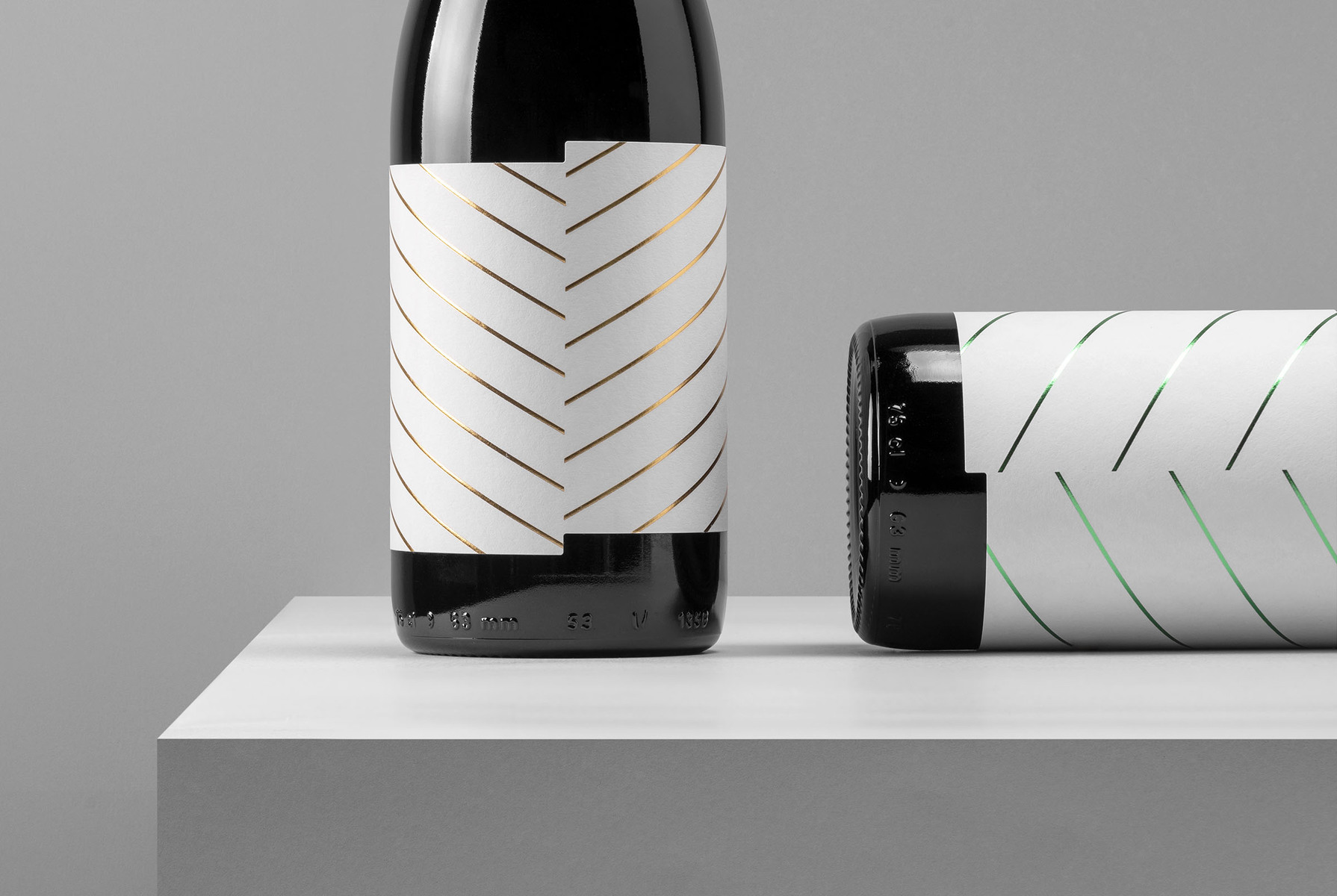
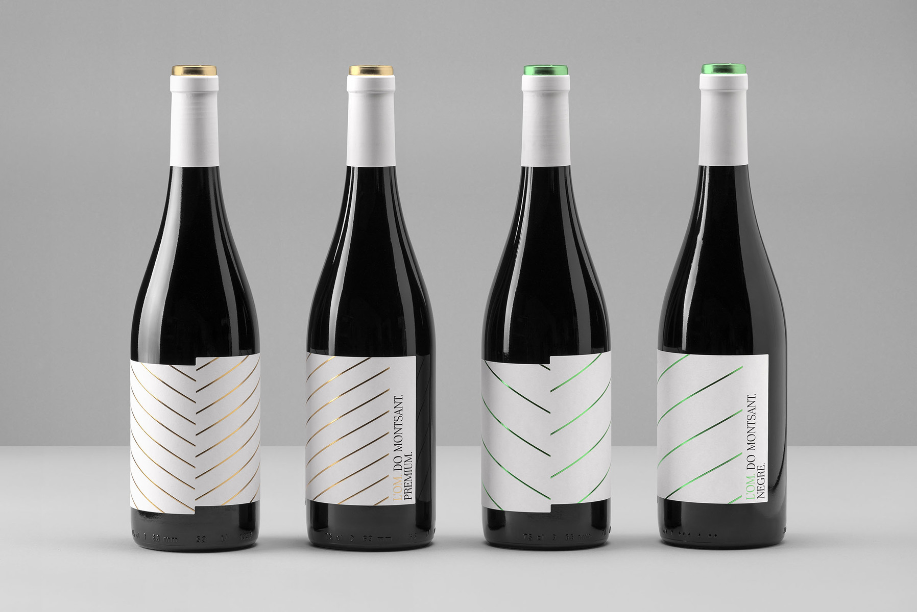
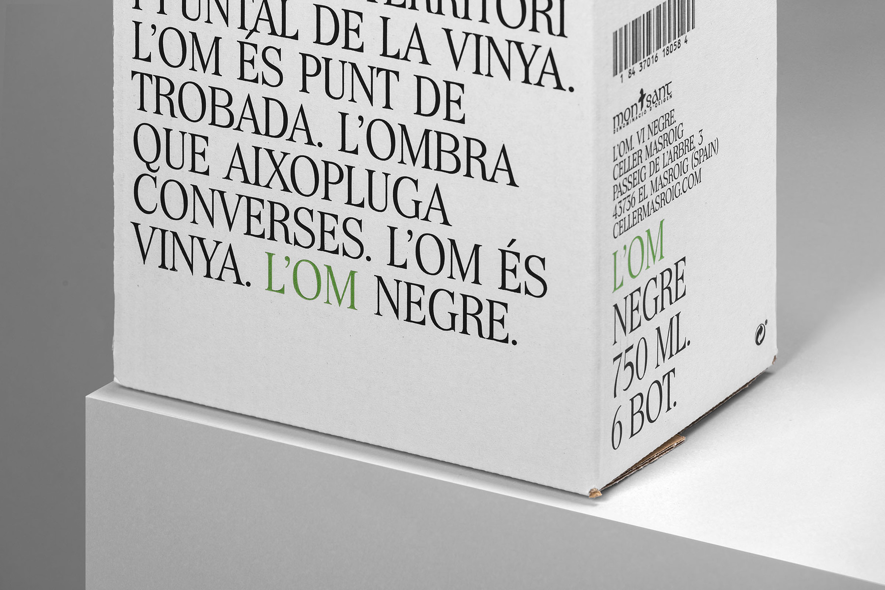
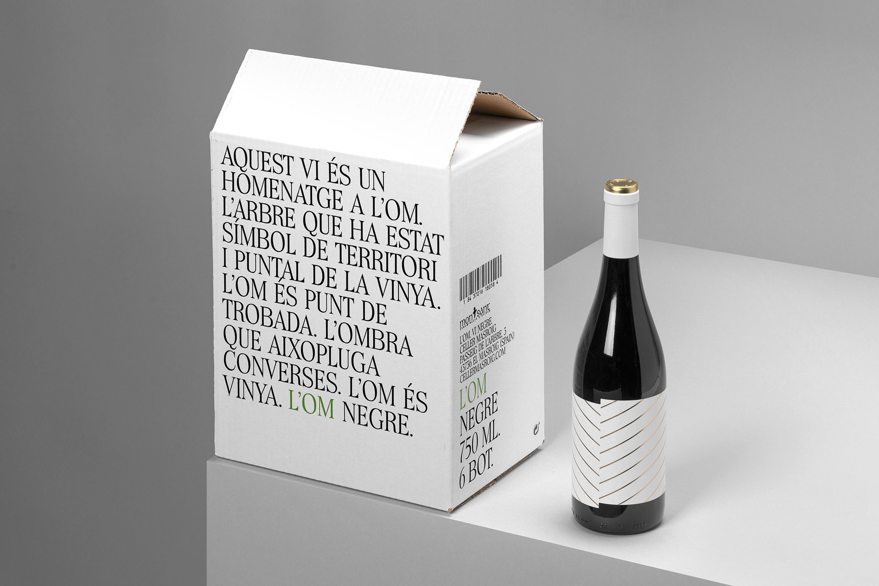
Redesign for L’Om wine. A tribute to the elm. A tree that has been a symbol of the territory and a landmark of the vineyard. A tree that has been the shadow of thousands of conversations. A tree as special as the asymmetrical architecture of its leaves, which have helped as inspiration for the label’s redesign.
CREDIT
- Agency/Creative: Atipus
- Article Title: Redesign for l’Om wine
- Organisation/Entity: Agency, Published Commercial Design
- Project Type: Packaging
- Agency/Creative Country: Spain
- Market Region: Europe
- Project Deliverables: Graphic Design, Packaging Design, Product Architecture
- Format: Bottle, Box
- Substrate: Glass, Pulp Carton, Pulp Paper
FEEDBACK
Relevance: Solution/idea in relation to brand, product or service
Implementation: Attention, detailing and finishing of final solution
Presentation: Text, visualisation and quality of the presentation


