


Blindtiger Design – Diamond Knot Brewing Co.
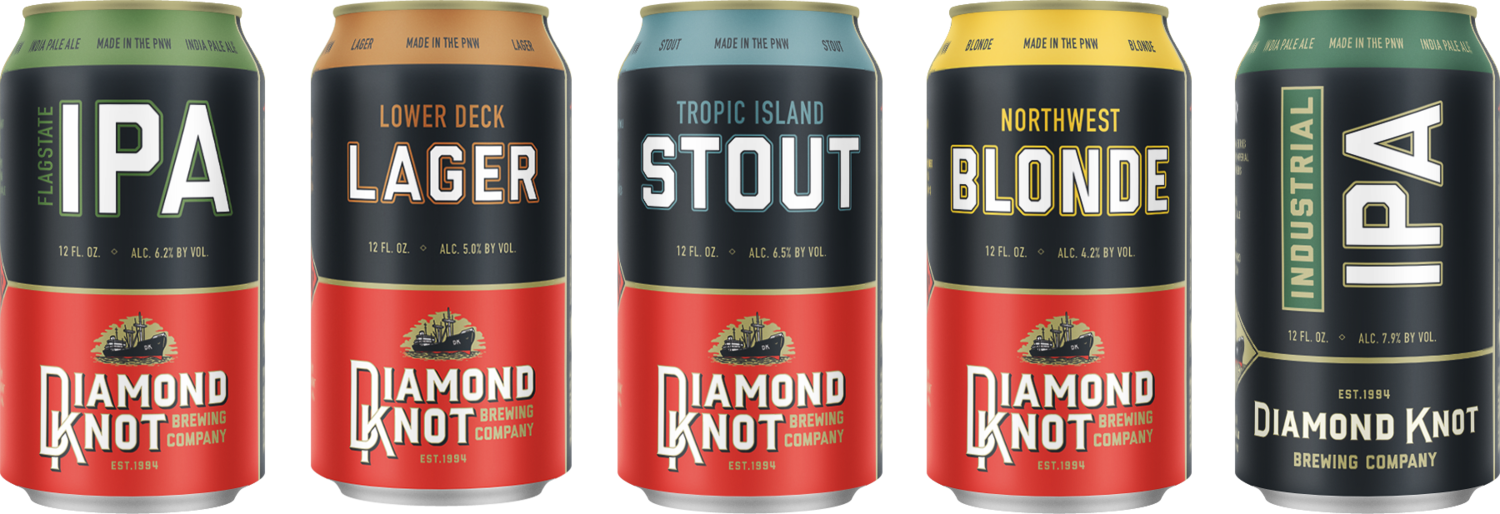
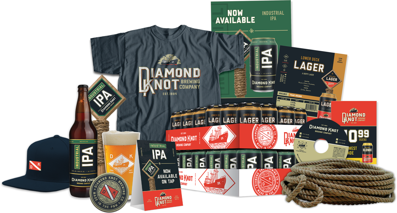
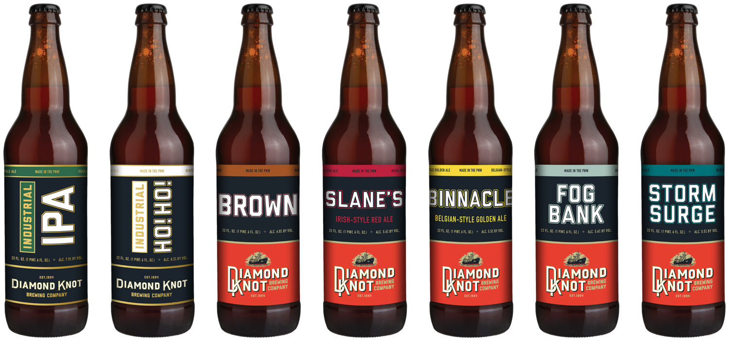
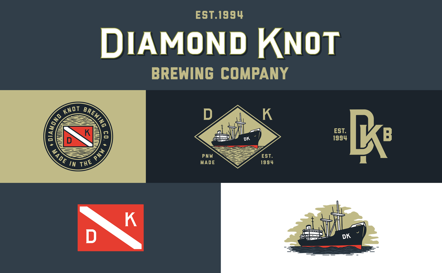
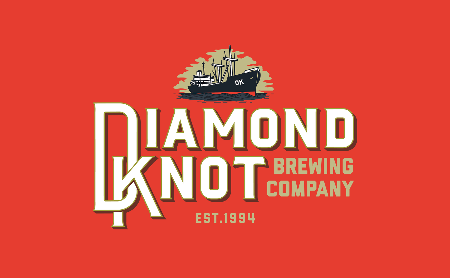
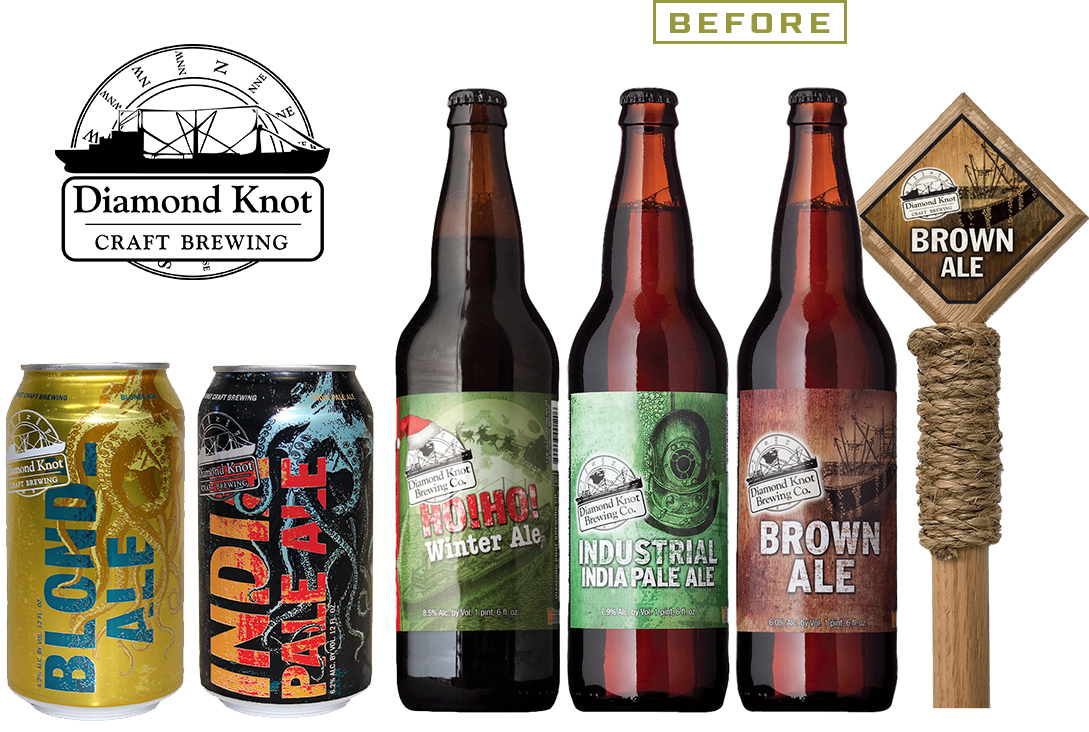
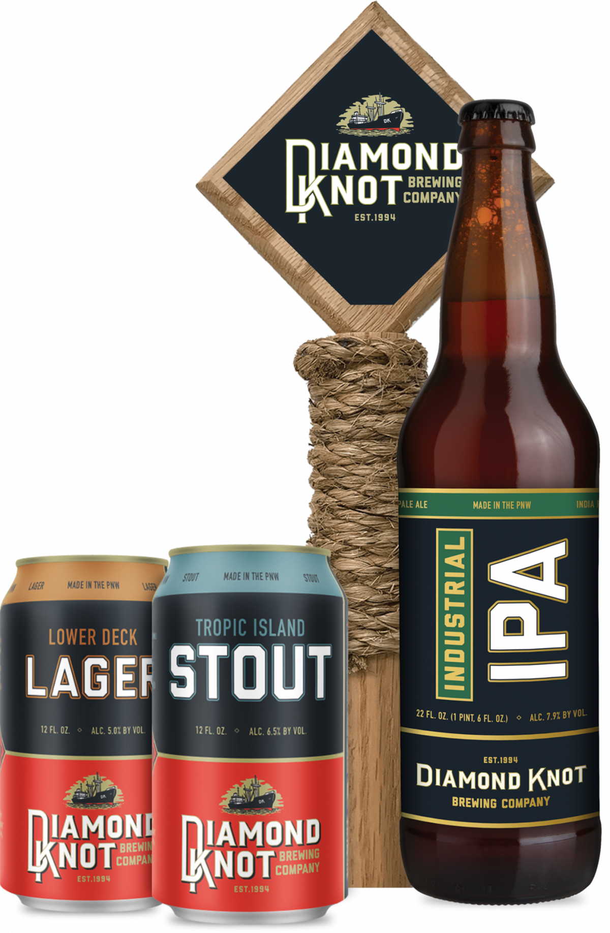
In their 25 year history, Diamond Knot Brewing Co. has developed a loyal following, two very successful brewpubs and a production brewery. During that quarter century the market was evolving, and their branding and packaging was not. Their visuals had become stale and ineffective while competitors were making updates that kept consumers and distributors excited. We relaunched the brand with packaging and brand visuals that modernized Diamond Knot, while also better communicating their brand story.Just having one logo presented a number of challenges for the Diamond Knot team. Using it across the board became repetitive, and the circular logo was an imperfect answer for a lot of applications. The rebrand brought them a full logo system, giving them answers to all potential branding needs.Clarity was also brought to the packaging. Beer naming conventions were established as existing beers were renamed and new offerings were created. The previously scattered lineup was made more cohesive. Can and bottles were decluttered to fit Diamond Knot’s no-nonsense consumers.
CREDIT
- Agency/Creative: Blindtiger Design
- Article Title: Redesign for Diamond Knot Brewing’s 25th Anniversary
- Organisation/Entity: Agency, Published Commercial Design
- Project Type: Packaging
- Agency/Creative Country: United States America
- Market Region: North America
- Format: Bottle, Can
- Substrate: Glass, Metal


