Ohmybrand – Food Spa
The “Food Spa” company creates detox programs for weight loss and body cleansing and offers a wide range of juices, smoothies, soups and healthy sweets without flour. Products have a short shelf life, so for the moment the company sells its products in Moscow and in the Moscow region using only online channels.
Due to the increased competition in the detox category and the intention to enter shopping centers with the company’s own corners, the decision was made to change the design. Our task was to create a new visual language that distinguishes the company from its competitors, taking into account that the brand is going offline.
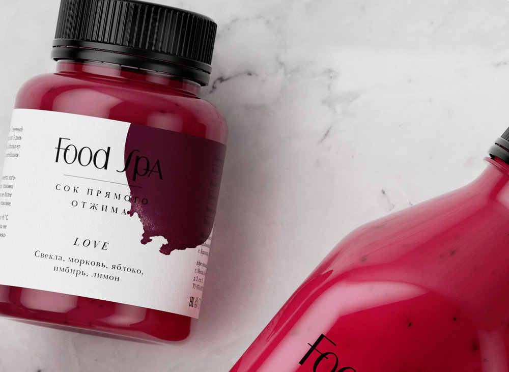
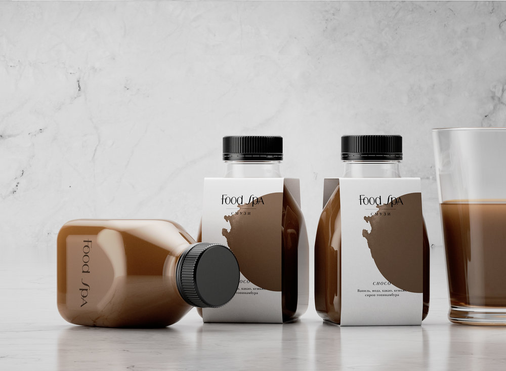
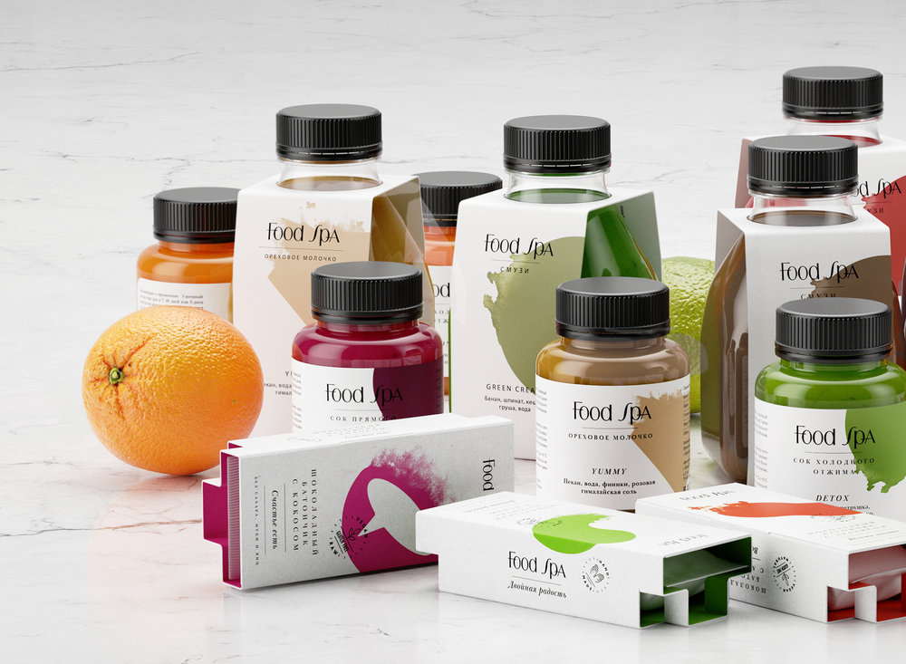
The first step the “Food Spa” team made to create a visual difference from competitors was to change the shape of the bottle – from the classic rectangular shape to the trapezoidal shape.
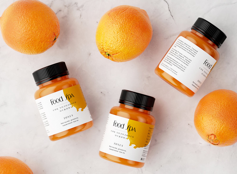
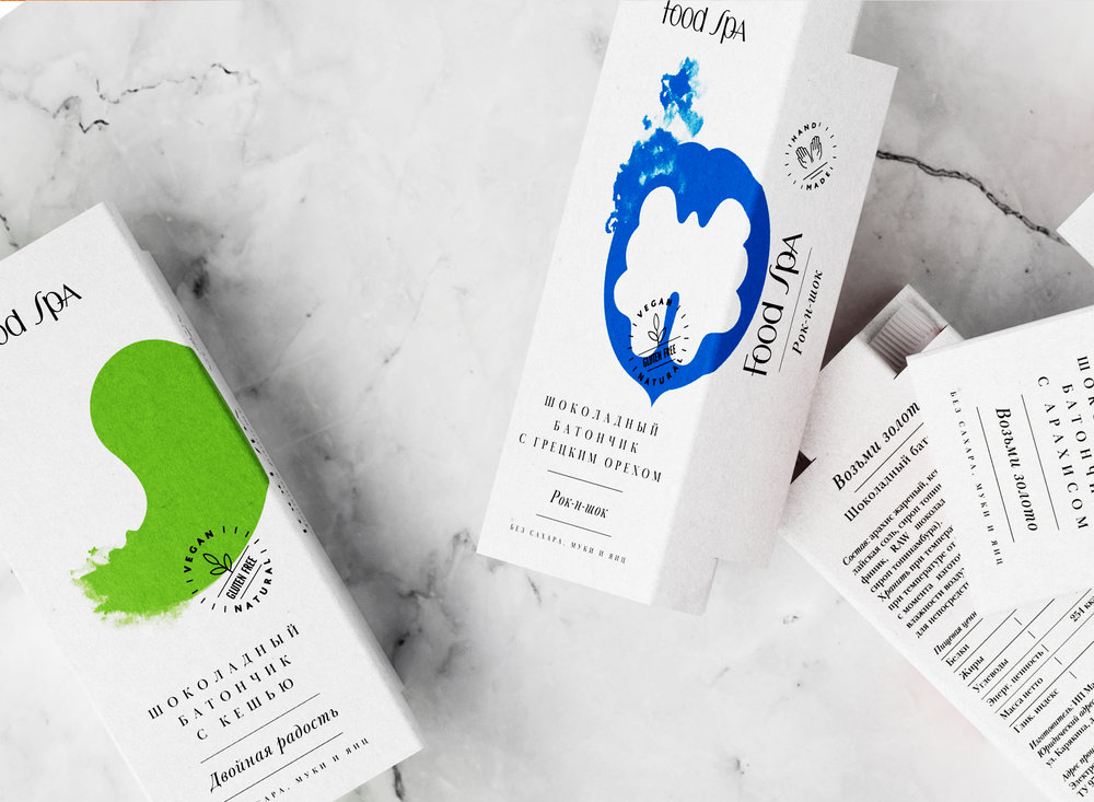
The brand that has a logo but no style elements perfectly lived in the digital environment, but offline sales follow other rules. Therefore, we have created a visual system of shapes for six product categories – the color scheme shoes the taste while the texts tell about the product. A set of brand elements allows to easily manage the brand: to start new lines or tastes under the main brand of “Food Spa”.
Analyzing the posts on Instagram, we realized that for buyers of premium products a beautiful bottle with minimalist design is an important attribute of demonstrating their healthy lifestyle. As a result, we have developed a sleeve for bottles – it contains all the important information but can be removed for a photo shoot. On the front side there are recognizable shapes and on the inside – the instructions how to prepare for a detox program.
Moreover, we have developed a group package for sets of six juices or smoothies and a branded bag with the slogan “All you need is juice”.

