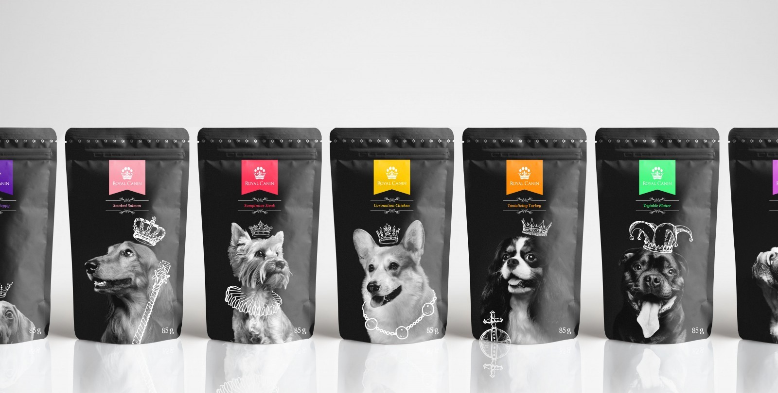
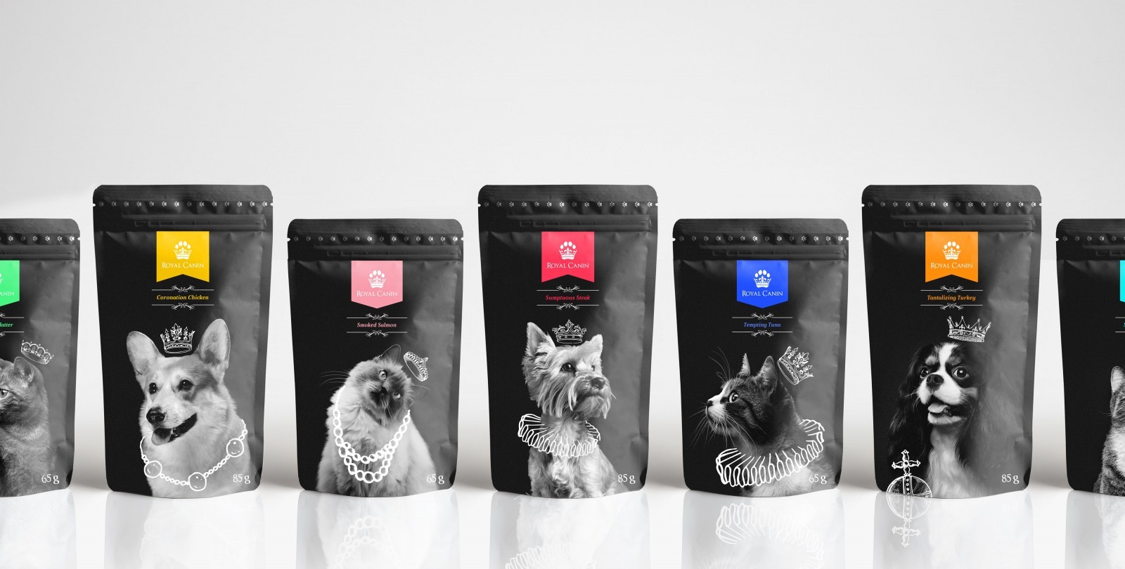
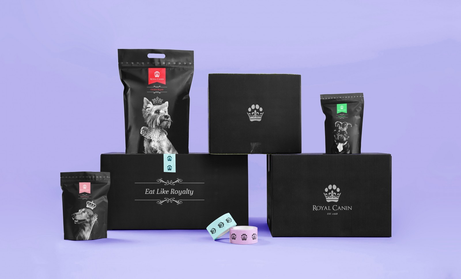
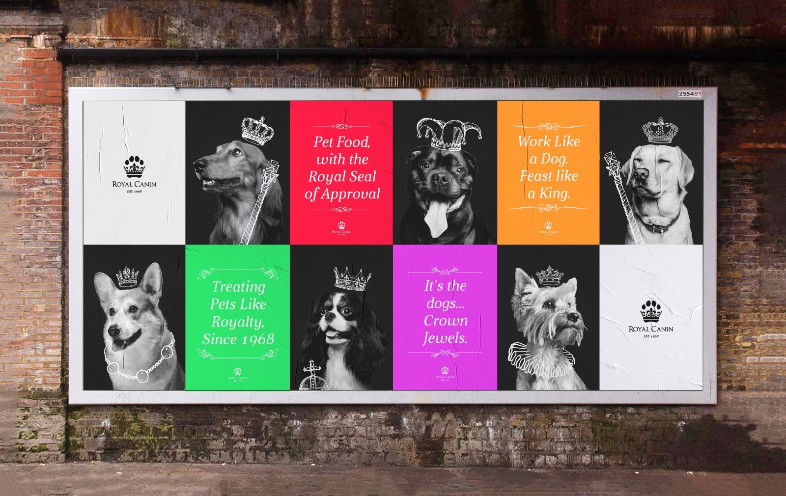
The Royal Canin Rebrand was centred around the element of luxury. By incorporating a paw and crown within the brands logo to communicate a luxurious brand, with a high quality aspect, related through royal elements. Completed with personal touches such as the body copy and hand illustrated elements within the packaging designs.
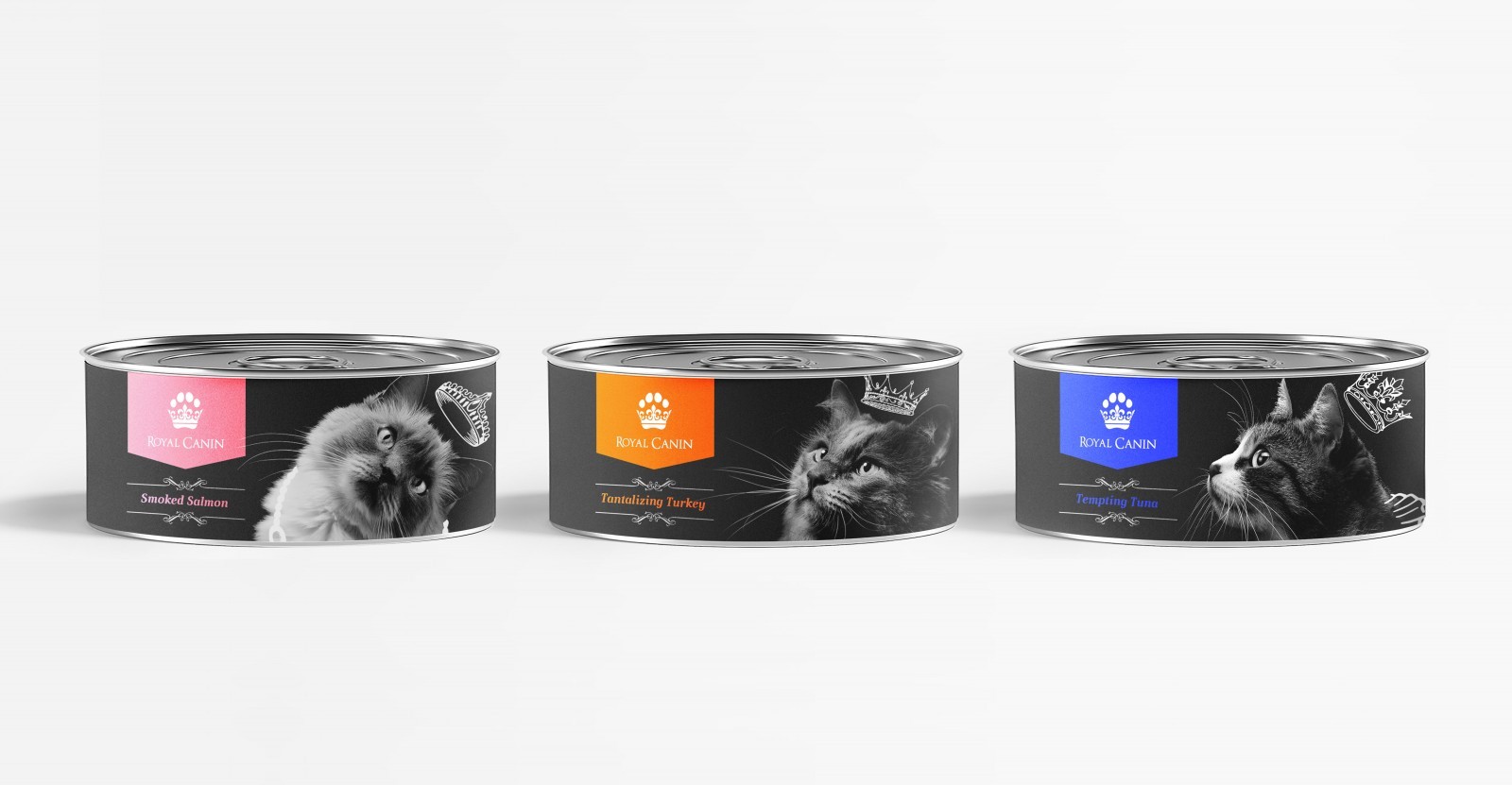
The illustrated royal elements included within the packaging design features crowns, tiaras, staffs, orbs and ruffs. This hadn’t drawn elements creates a personal feel to the brand, a unique feature in contrast to other animal food brands. With imagery of dogs featured in a portrait manor, relating back to the element of ‘Royal’ found within the brand name and luxury aspect which the rebrand was created around.
The packaging was completed in monochrome colours to create a sense of quality associated with the brand. The black and white imagery makes colour co-ordinating the different types of dog and cat food clear and simple, so consumers know exactly what they’re buying for their animals. The different colours representing the different types of food sit on medieval flag shapes, used by royalty in the past with the Royal Canin logo on it, incorporated as pose to the regular methods of a normal shape to add more personality to the brand. Each packaging design features an image of a different bread of dog, making differentiation between the different types of dog food even clearer while adding a stronger sense of personality within the brand. Featuring iconic dogs related to royalty, such as Corgis and King Charles Spaniels.
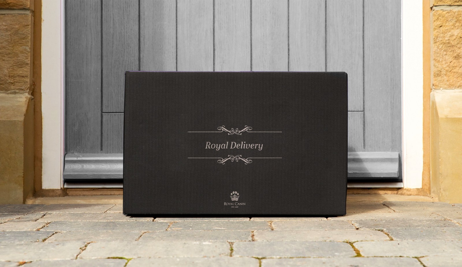
People care so much about their pets, so naturally they want the best for their animals, so creating a personal brand to relate to the consumer was vital. As a result, creating a unique personality within the brand was important to make it stand apart from its competitors, and give the consumer a brand which they can trust. With a brand identity that spreads out from the packaging, through into external elements such as food bowls and mats designed with a royal feel and quality finish.
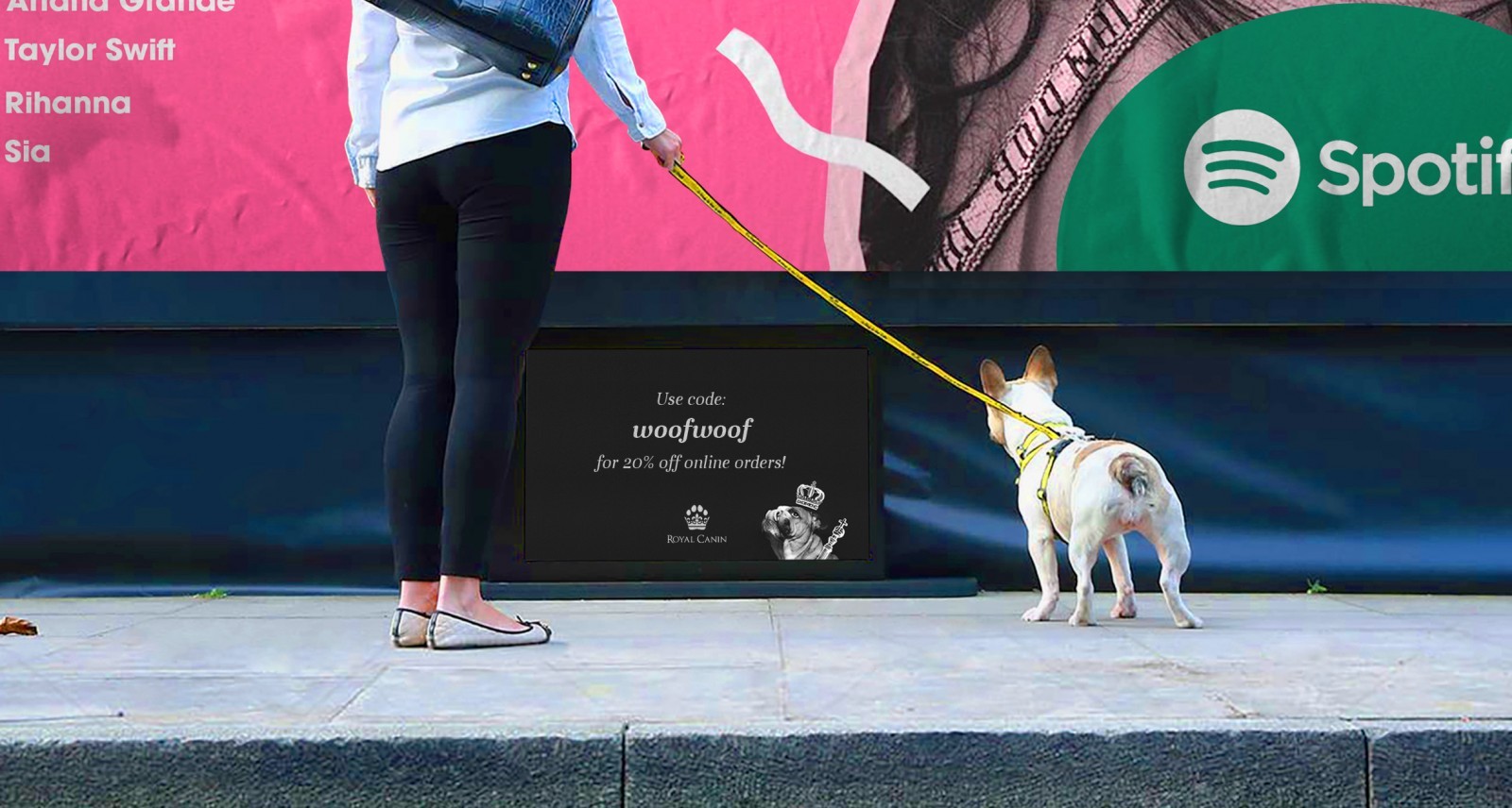
Promotional designs were create not just for the pet owners to appreciate, be advertising on a dogs level too! By doing this, adding an element of fun and originally to the brand while at the sometime showing that the brand cares about its real customers! By creating interactive advertising deigns to assist pet owners and the actual pets themselves, the brand establishes itself as one that cares about its consumers and goes the extra miles to provide these royal services.
CREDIT
- Agency/Creative: Thomas Hardwick - Norwich University of the Arts
- Article Title: Redesign Concept for Royal Canin Pet Food Brand by Thomas Hardwick
- Organisation/Entity: Conceptual Work - Identity - Brand Redesign
- Project Type: Packaging
- Project Status: Published
- Keywords: WBDS Student Design Awards 2020/21


