


Design Weekend is an educational mission of the Russian design community, which is implemented in the format of field design conferences and workshops in various regions of Russia.
The main differences between the event and competitors are:
1. Regional venues. Since the organizers want to make design in Russia better and raise the level of design in the regions;
2. Completely non-commercial basis. The project is based on an open and voluntary exchange of knowledge, so neither the participants pay for tickets, nor the speakers receive remuneration for their performance;
3. High concentration of design professionals.
The rebranding was done not with the aim of completely changing the project, but in order to improve its visual image, while maintaining the current base.
Current style issues:
1. Difficult recognition. Of the constants, there is only a logo, a color palette and the principle of working with photos;
2. Non-scalability. There are no branded graphics or other visual elements that could be used in media
3. The inconsistency of the elaboration of the style with the status of the event. A fairly large design project should be appropriately designed.
Visual image
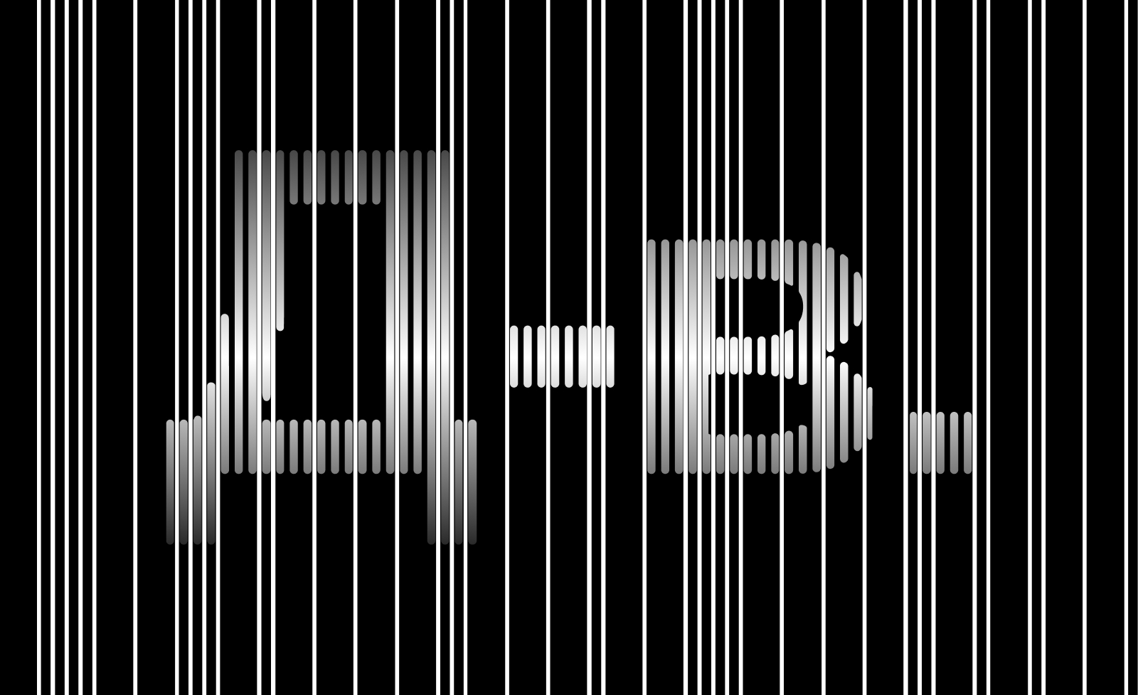
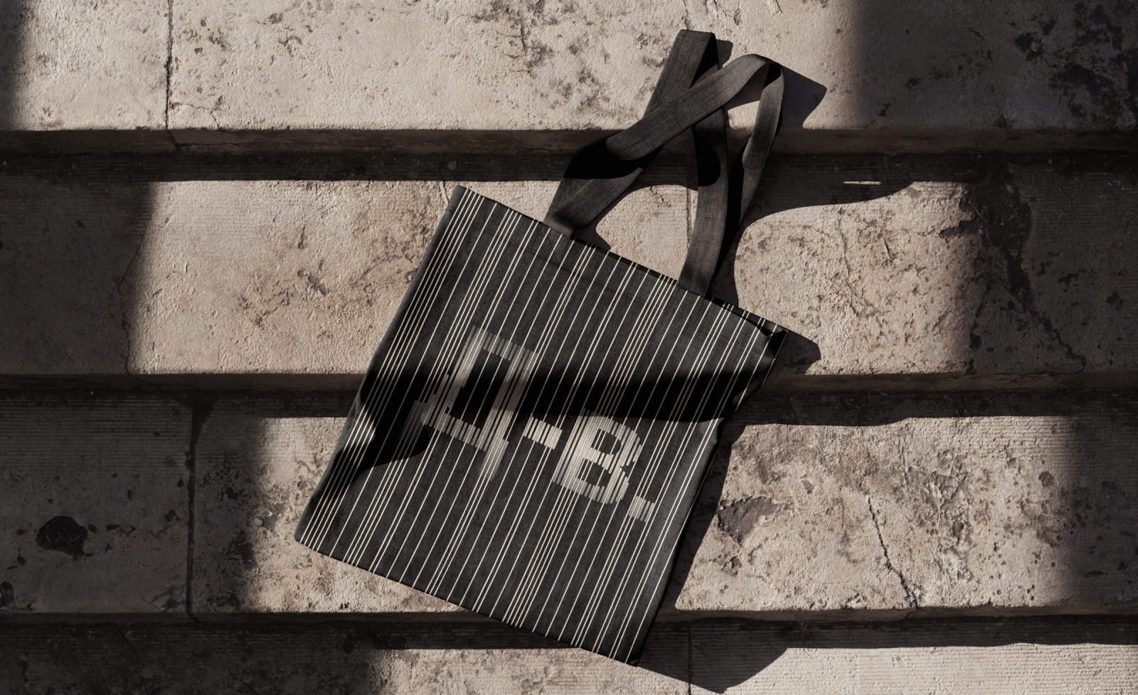
The “dot” from the current logo was taken as the basis of the visual image. “Dot” is a designer who got acquainted with the project and came to the event. Then he improves his knowledge and grows upwards, turning into a line. Design Weekend gathers designers on the same site, so they join together in a community and develop together, get to know each other, launch joint projects. And the last point of creating a style is the division of designers into teams, that is, employment.
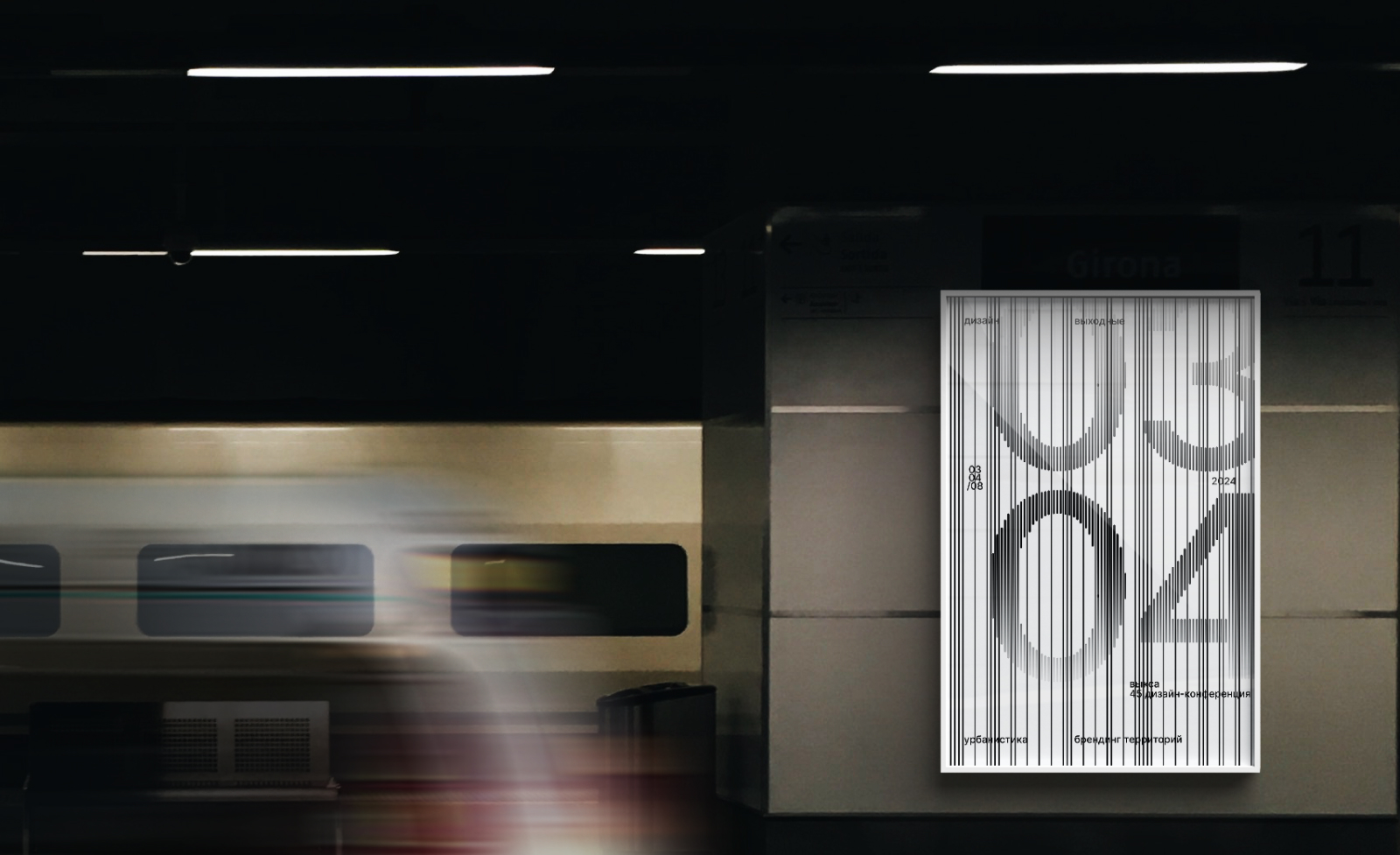
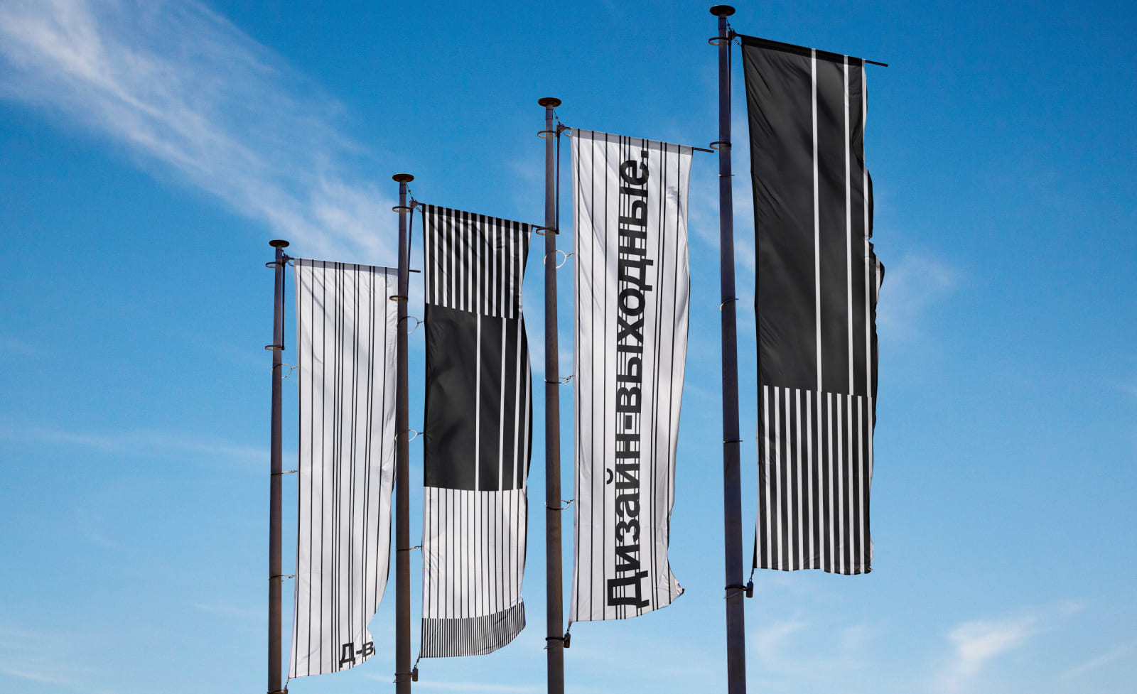
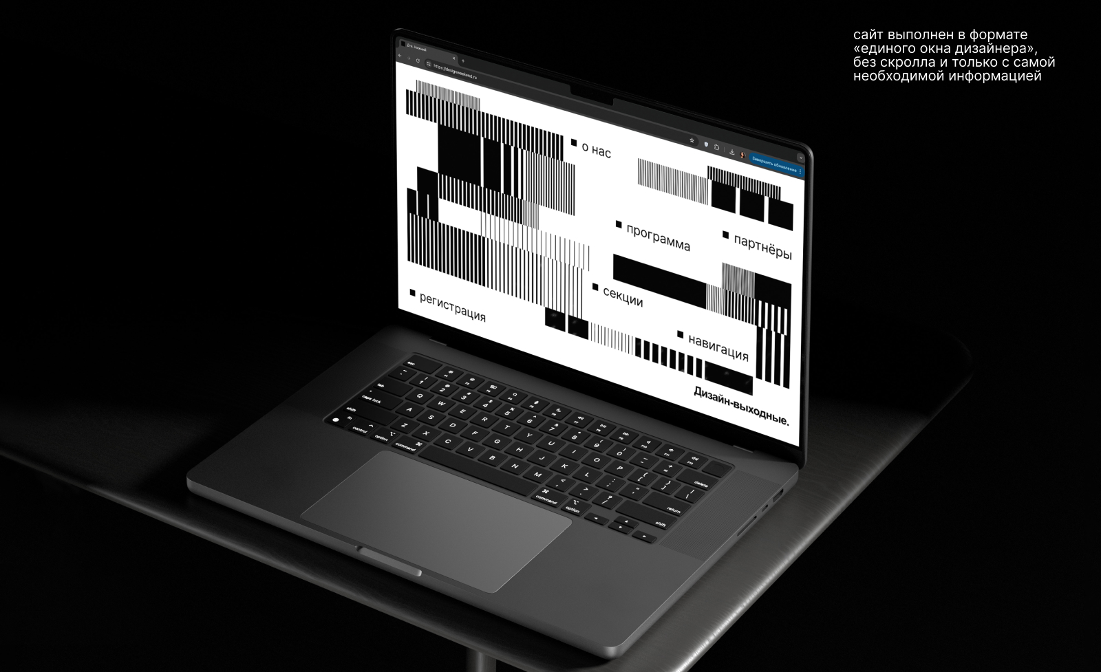
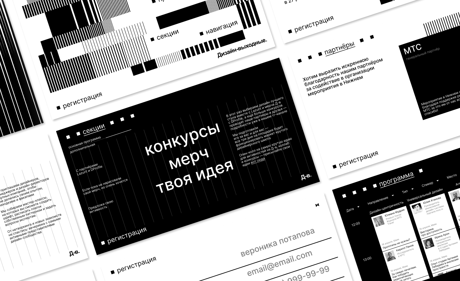
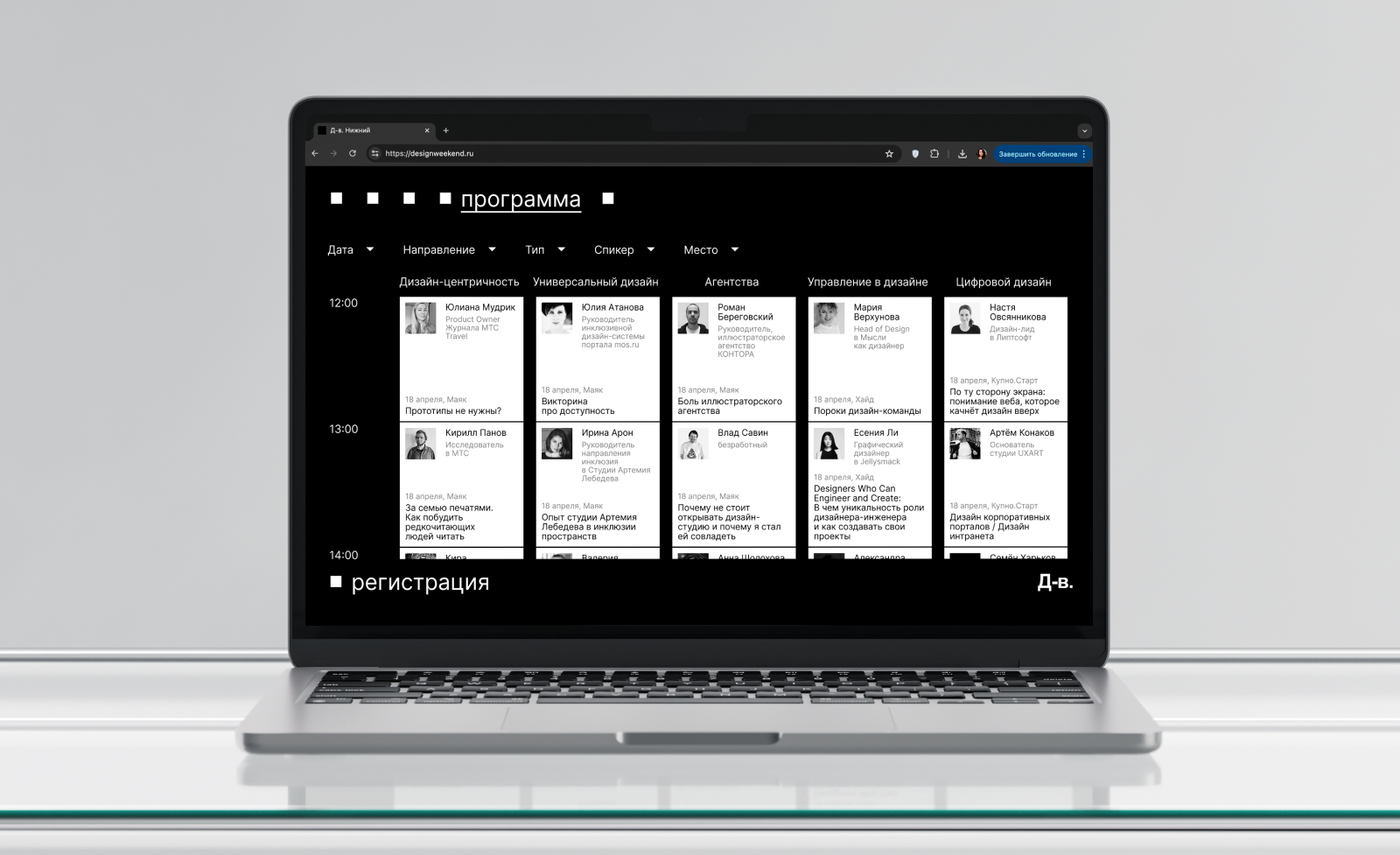
This visual technique is convenient to use in rectangular media or on a website. An algorithmic grid was designed for the site, which refers to the flexibility of the design profession, and from the point of view of corporate graphics, it helps to systematize its application in adaptive versions.
As an additional technique for more diverse media, the “manifestation” of images (numbers, objects) is used through the resulting community — how meanings manifest themselves when creating a design.
Typography
Inter — neo-grotesque was chosen as the main headset, which looks equally good both in identity and on the web. This font is quite functional, and it lacks intrusive details.
The color palette
The palette is based on black and white colors — classic for the design field, they also help the project stand out from competitors who use a wide range of different shades in their branding. Gradient versions of the main palette have been developed to add the effect of “manifestation” and “glow”.
CREDIT
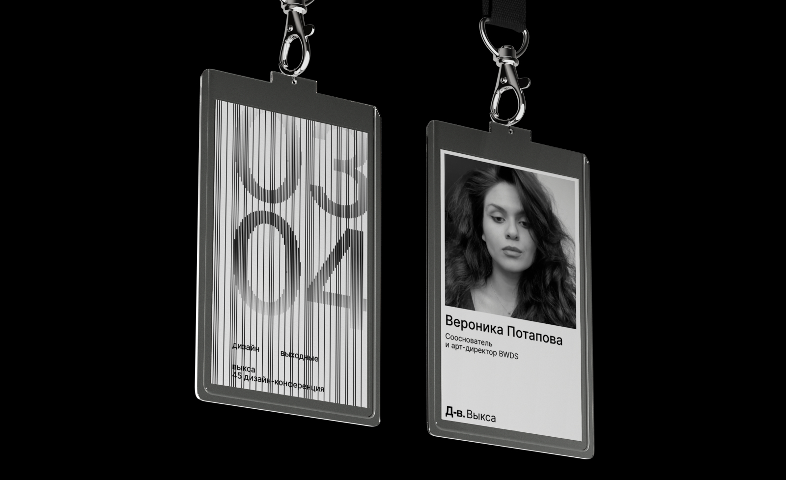
- Agency/Creative: Veronika Potapova
- Article Title: Redesign and Website for Design Weekend by Student Veronika Potapova
- Organisation/Entity: Student
- Project Type: Identity
- Project Status: Published
- Agency/Creative Country: Russia
- Agency/Creative City: Moscow
- Market Region: Global
- Project Deliverables: Art Direction, Brand Design, Brand Identity, Identity System, Rebranding, Web Design
- Industry: Education
- Keywords: branding, brand identity, rebranding, website, ux/ui
-
Credits:
Educational Institution: HSE Art and Design School
Curator: Gleb Kachalkin


