


White Bear creates new brand identity for Thrift +
Thrift + want to end fashion waste by making secondhand seamless. By building a platform for consumers to sell and buy in the circular economy, they’re helping redefine the fashion industry.
Thrift+ wanted to lead the way as the mainstream embraces second-hand clothing. They recognised that their brand lacked standout, personality and meaning, and needed to work harder to help gain traction with a wider retail consumer base and to attract partners with first-hand retailers.
The creative team was inspired by the “vision of creating a secondhand brand that crosses into the mainstream and fundamentally changes buyer behaviours towards secondhand”, according to Creative Director Kelly Mackenzie.
Challenge
Out of the 100 billion items of clothing produced each year, 70% is sent to landfill or burnt. In other words, we’re overproducing and under-using.
But second hand had a problem. We still saw secondhand as fusty. Musty. Dusty. A lot of fuzzy photos and confusing sizing. Stroppy sellers and bossy buyers. Slow fashion? Yes, please. Slow Post Office queues? No thank you.
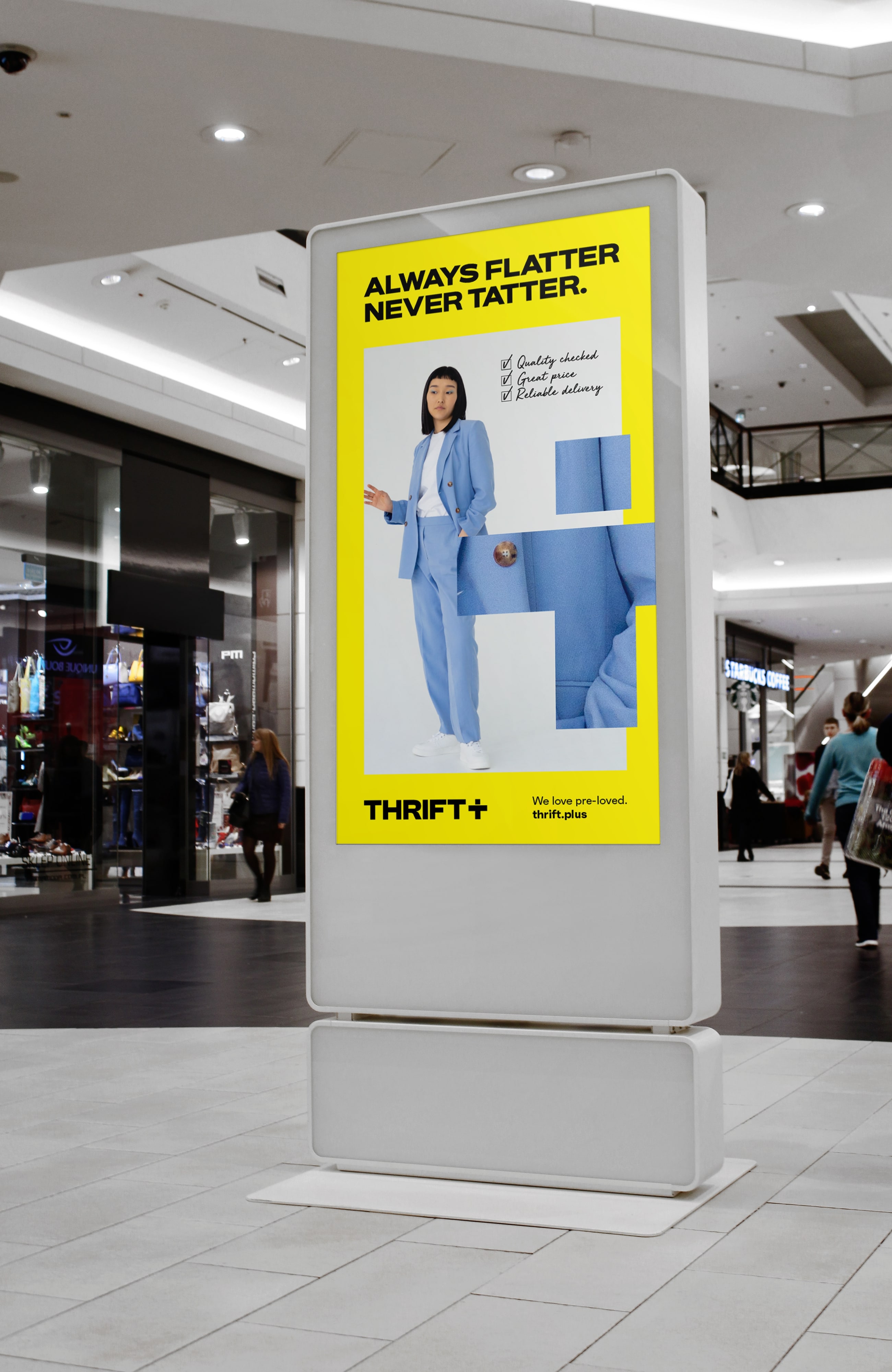
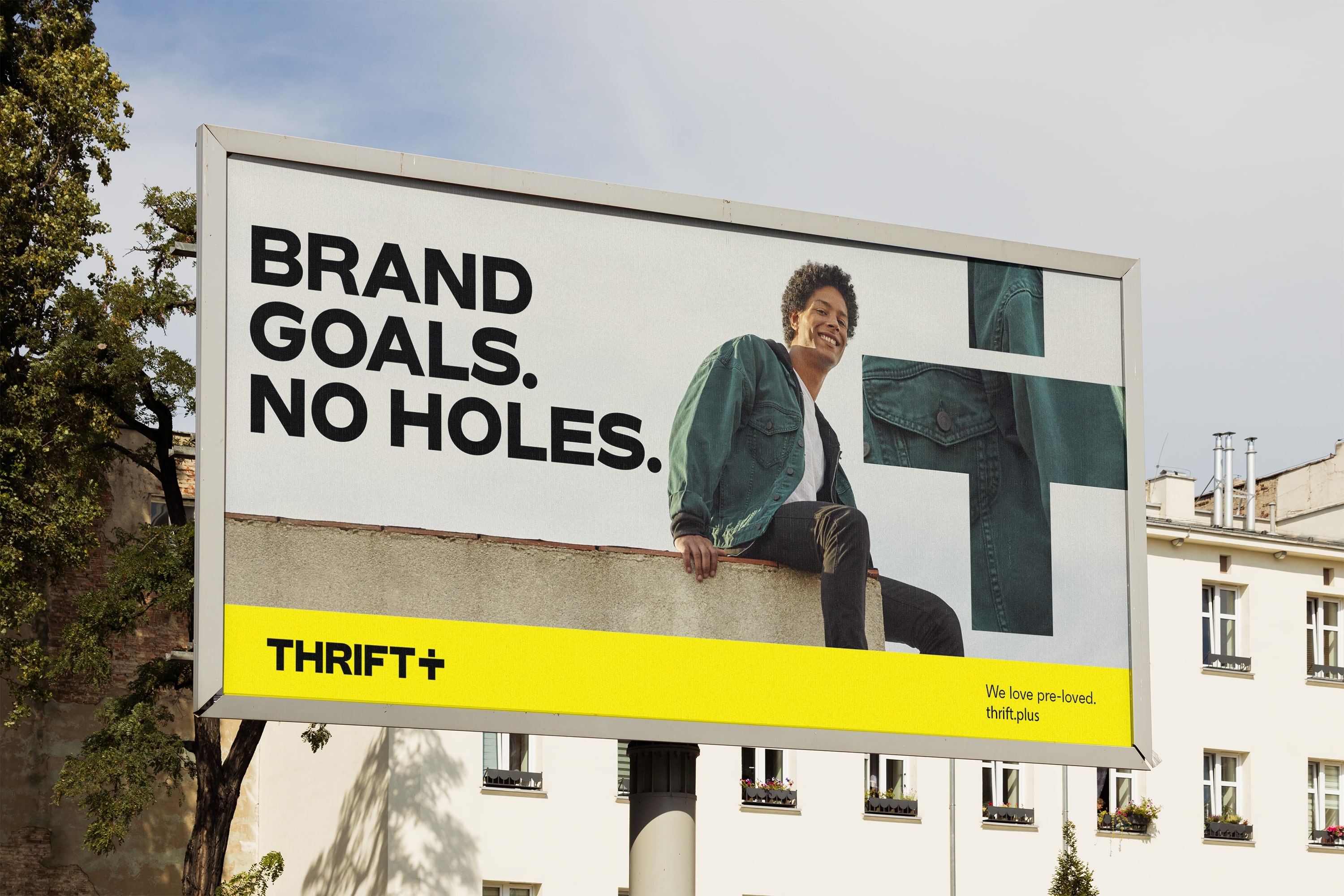
Always Flatter. Never Tatter.
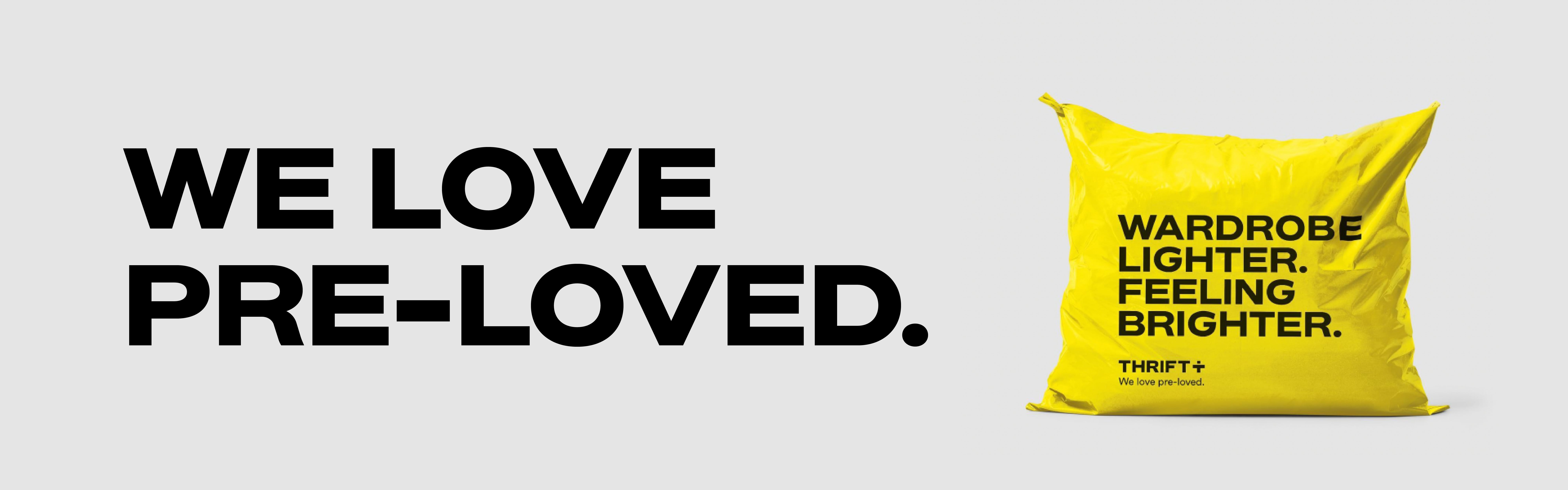
Thrift+’s founder Joe, had an idea. Make secondhand smarter. To make it easier to buy and sell pre-owned clothes. To look after every item on its journey from one wardrobe to the next. To turn secondhand into pre-loved. Pack away peer-to-peer.
This identity helps bring Thrift + and preloved into the mainstream, attracting a broader mainstream audience to preloved – from consumers to partnerships.
Type and Tone of Voice
Mackenzie adds: “Our typography and tone of voice are purposefully bold, confident and energising.
Thrift+ are challenging the secondhand status quo, so we built a tone of voice that demonstrated their confidence in their service, that wasn’t apologetic about being ‘second hand’, and that energised and empowered shoppers to buy and sell pre-loved with confidence. This is represented with a friendly yet frank, straight talking, tone of voice.
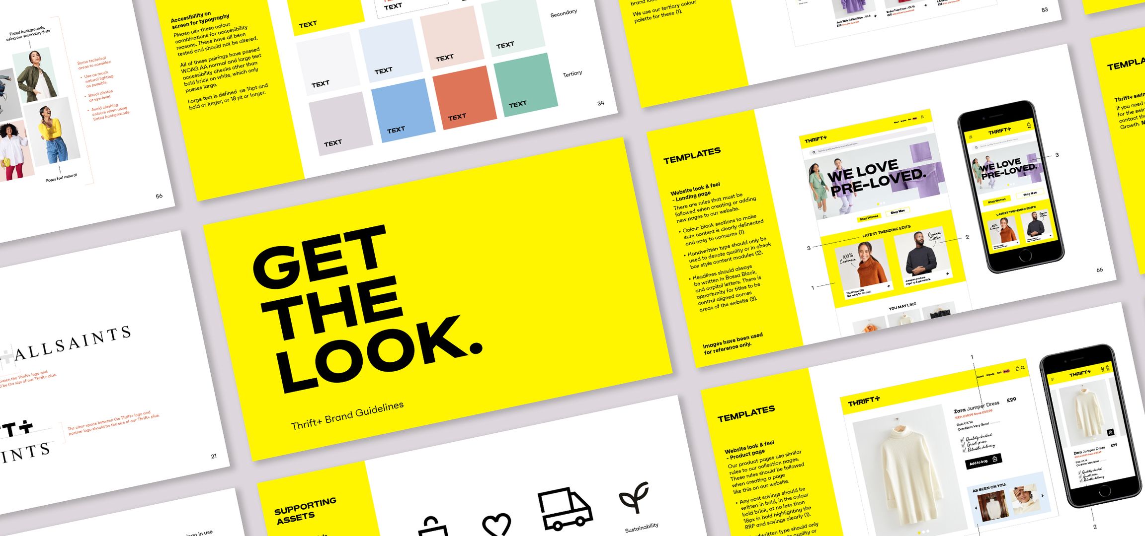
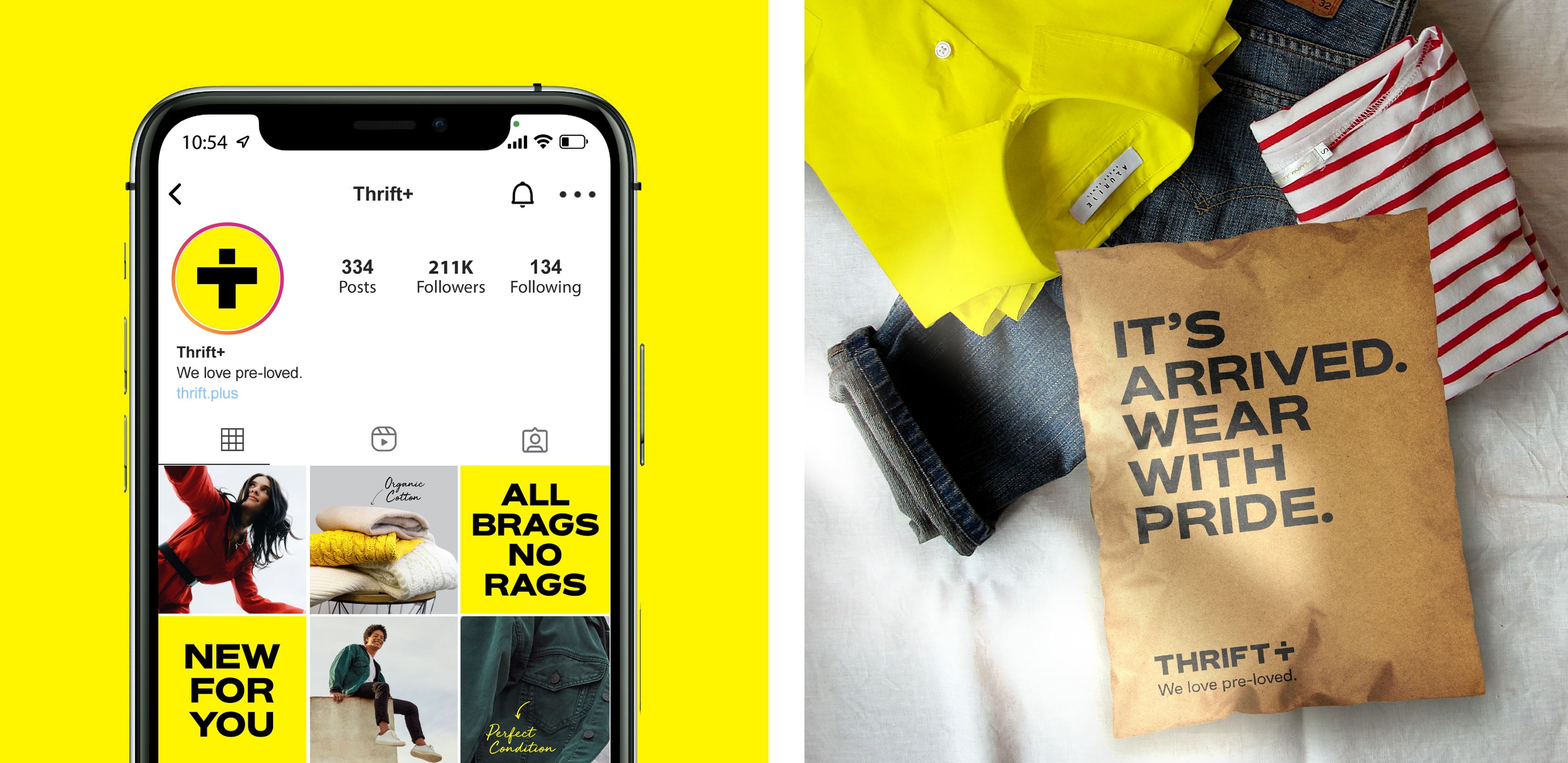
We visually underpinned this with bold uppercase typography that stood out from competitors. Our hand-drawn secondary typeface delivers the quality promise message, direct from the business it is used to open a direct conversation between Thrift+ and their Thrifters”
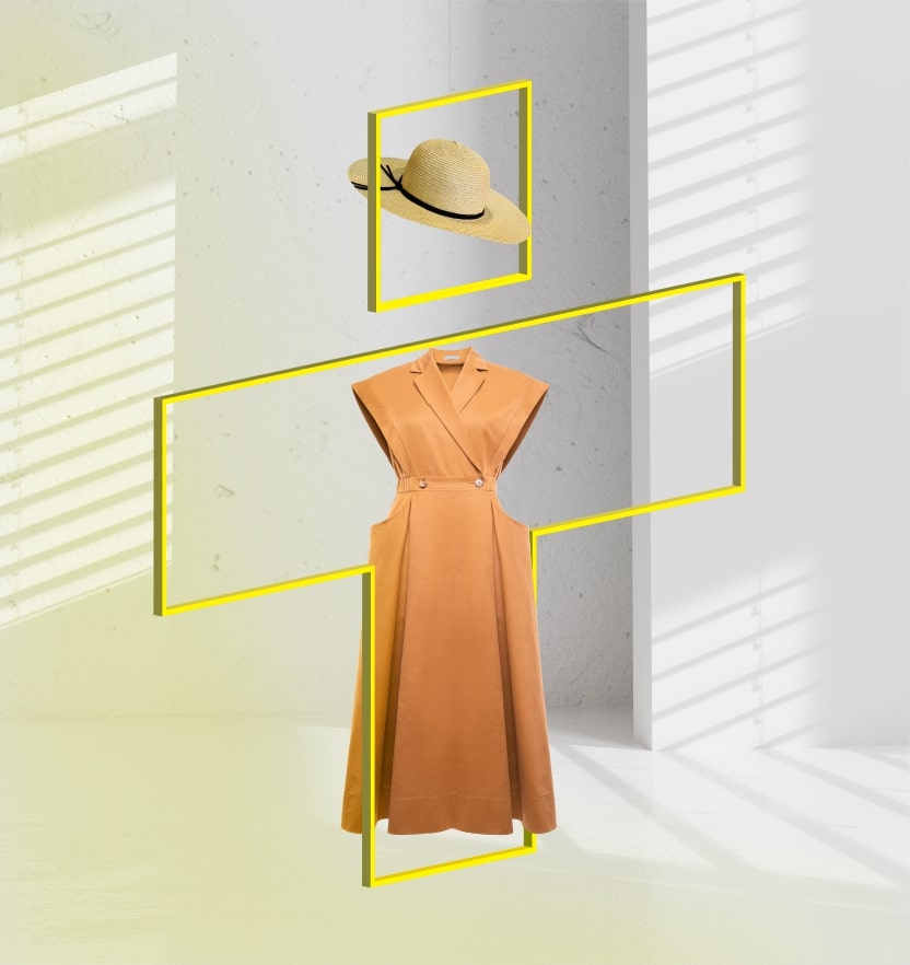
The Plus Device
The plus device can is inspired by the Thrift community, and can be used for multiple purposes, according to Mackenzie: “The plus device doubles up as a representation of a person, and is flexible enough to showcase individualism and self expression. It can also highlight the collective coming together of ‘Thrifters’ to support circular fashion.
Additionally the plus communicates how the business over delivers on value, quality, and ease of service.
We loved the idea of using the plus as a window into the Thrift + world – be it as a zoom in device to highlight the quality of the clothes, or a keyline to showcase particular elements of a product.”
From the vibrant yellow to the bold typography and tone of voice, Thrift+ communicates with confidence and helps overcome some of the key consumer barriers to buying secondhand.
Our hero yellow is the international colour of optimism (for the future) and the colour of value, and our + plus device represents a community of Thrifters who are doing their bit for the planet.
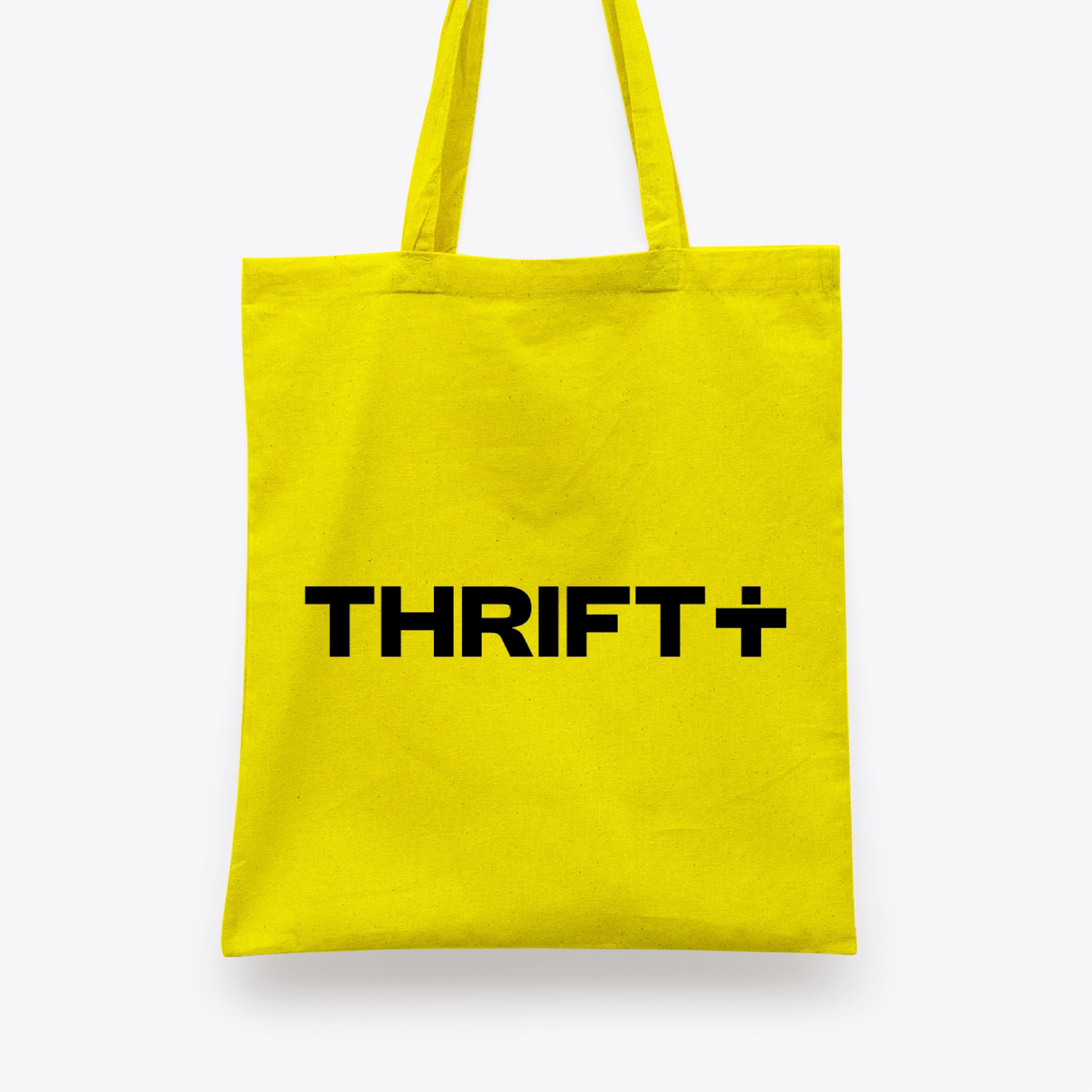
We’re Thrift +. We love pre-loved.
CREDIT
- Agency/Creative: White Bear
- Article Title: Redefining the Second Hand Clothes Market – Thrift+ Rebrand by White Bear
- Organisation/Entity: Agency
- Project Type: Identity
- Project Status: Published
- Agency/Creative Country: United Kingdom
- Agency/Creative City: London
- Market Region: Europe
- Project Deliverables: Brand Creation, Brand Guidelines, Brand Identity, Brand Redesign, Brand Strategy, Copywriting, Packaging Design
- Industry: Fashion
- Keywords: Fashion, Second Hand, Branding, Rebrand
-
Credits:
Creative Director: Kelly Mackenzie
Account Director: Kiara de Vries


