


Carlton Draught, one of the nation’s most iconic beers, has been enjoyed by Australians for over 150 years. Originally brewed under the name Carlton Ale back in 1864 the Carlton brand has stood the test of time. When WCN_ were tasked with redesigning Carlton Draught we wanted to ensure that we redefined it for today’s audience whilst respecting the heritage from which it came.
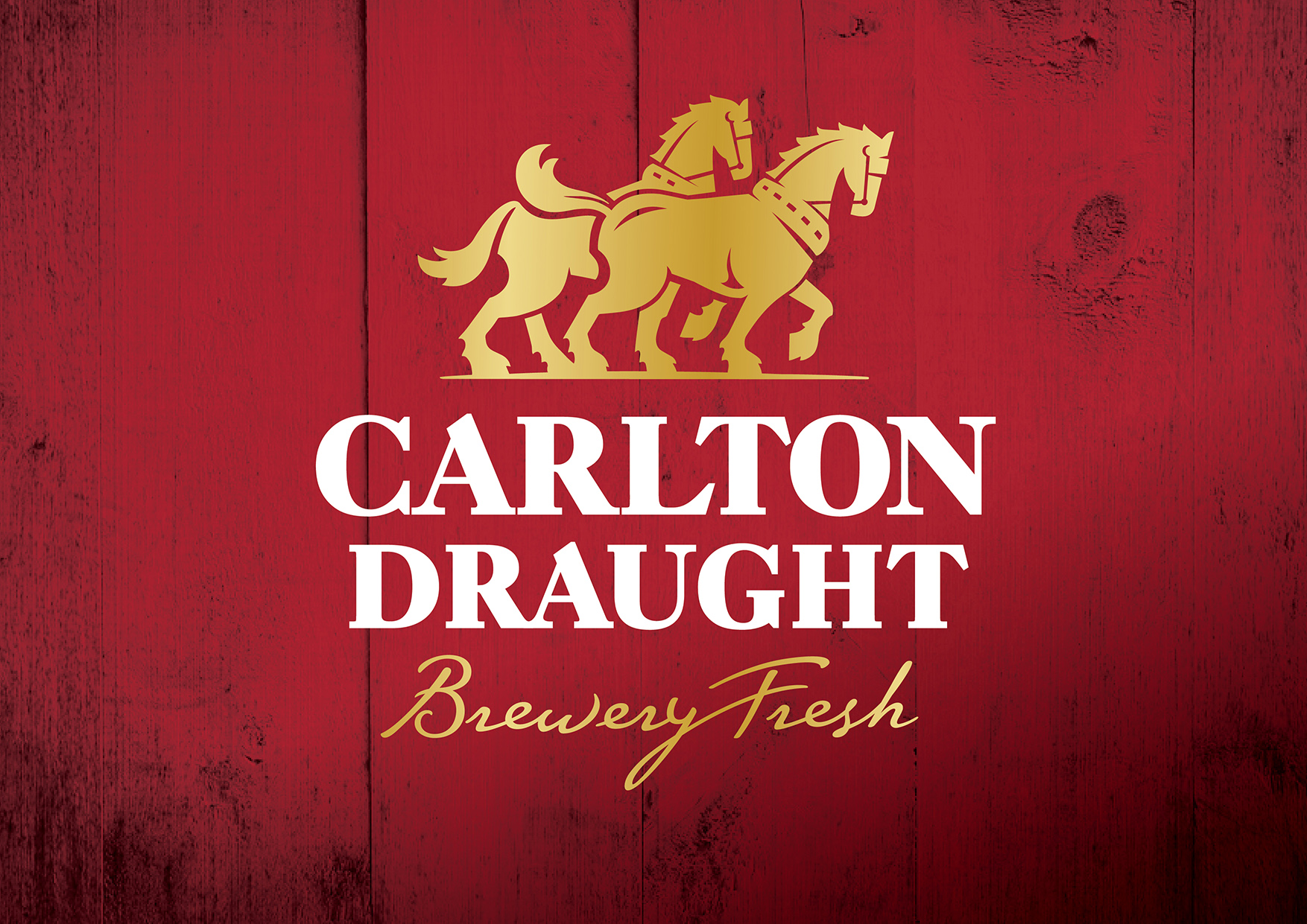
Having such a rich and emotive past it was important to capture and respect it within the visual iconography of the brand. Since the 19th Century Clydesdales horses transported Carlton beer through the streets of Melbourne, quickly becoming synonymous with the brewery; their photos still hang on the pub walls across the nation. With that in mind, we set about creating an icon based on them and putting it at the heart of the brand.
There was a need to modernise the brand to ensure it could remain in the hearts and minds of the next generation of Australian drinkers. The creation of a timeless identity that embued quality, coupled with traditional cues allowed the Carlton identity to sit comfortably within the classic beer portfolio. To allow the brand to remain relevant WCN_ redefined a tone for brand communications through typography and content that could be expressed confidently to standout within the market.
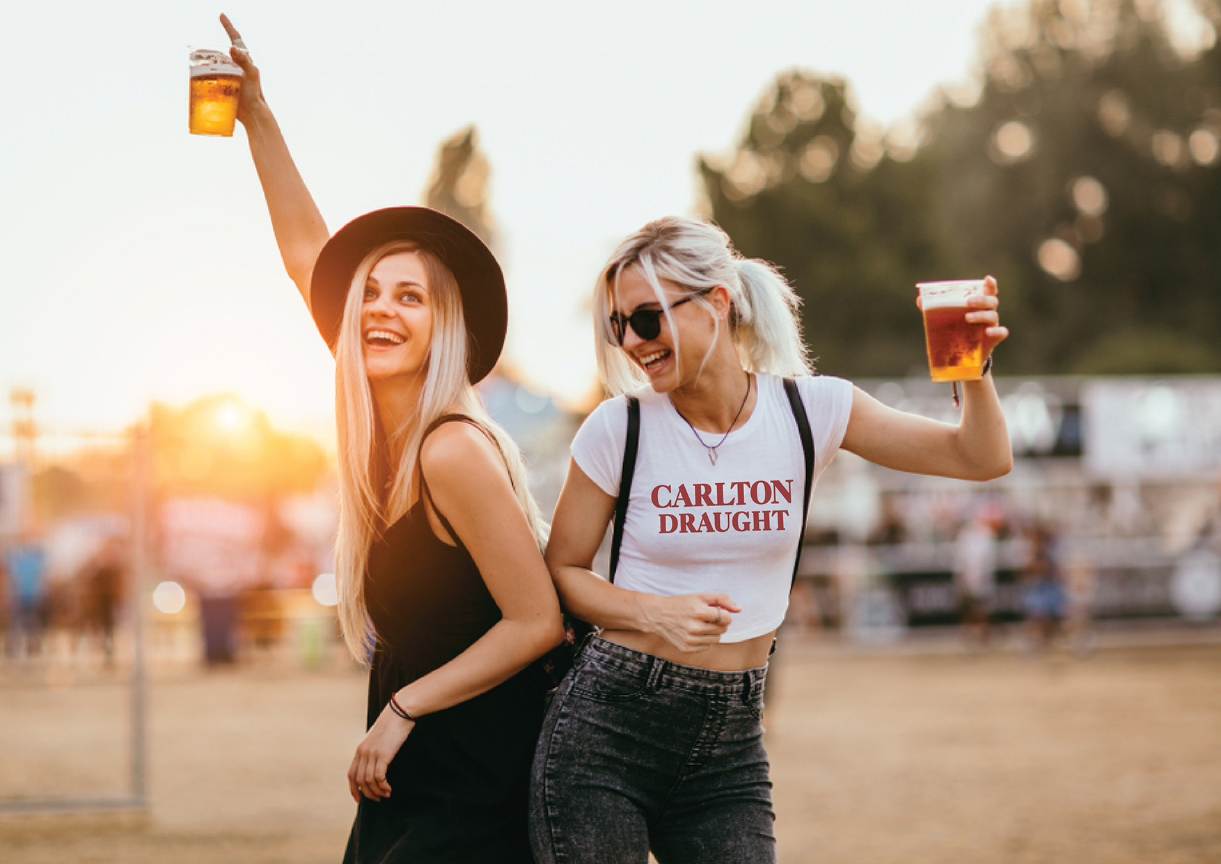
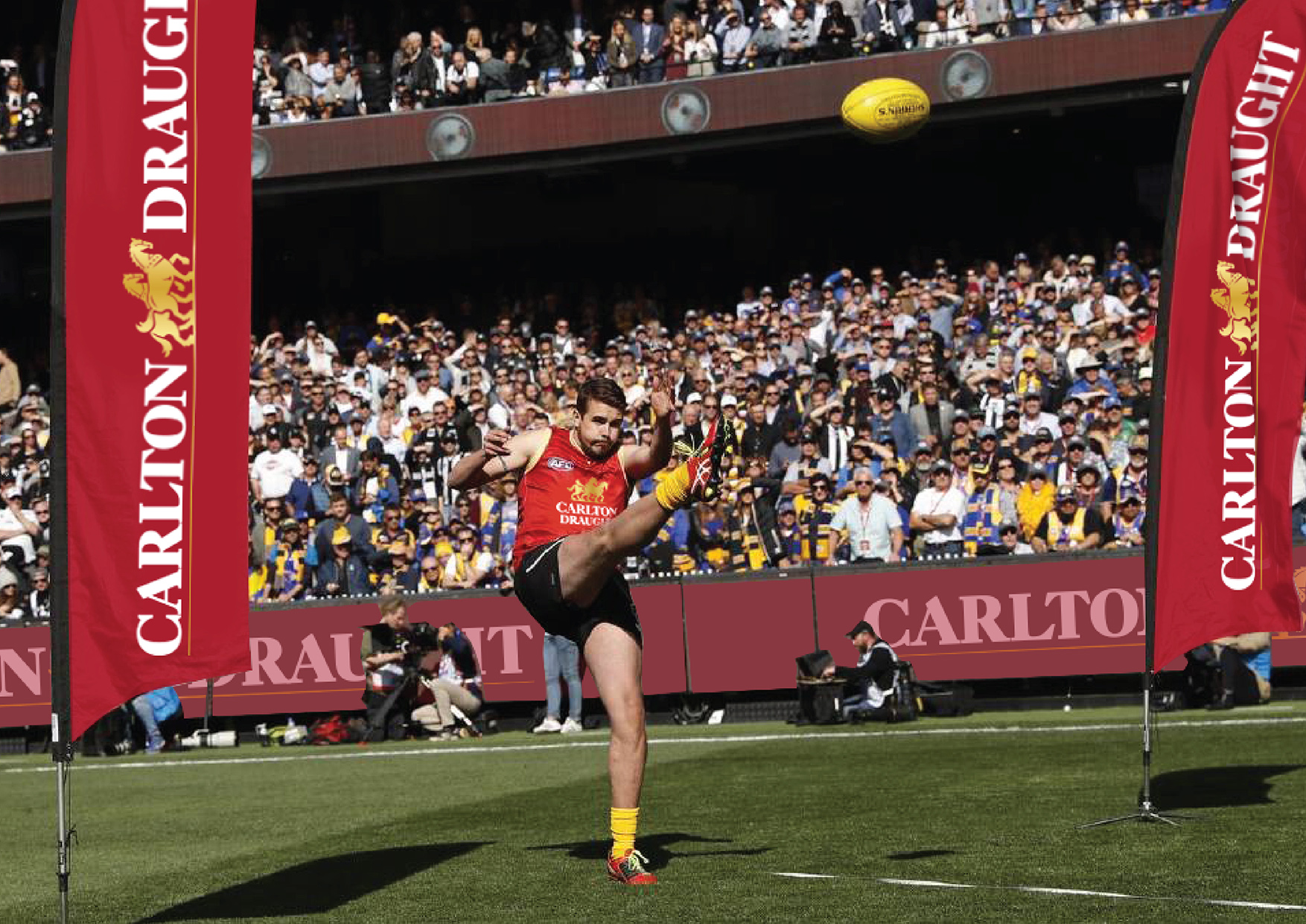
The Carlton brand has close ties with the AFL and needed to proudly cut through within stadiums and team focused, targeted activations. Since the redesign Carlton Draught has had the ability to be ‘remixed’ without losing its identity, allowing the brand to be embraced with passion by the fans.
With a brand that is so entrenched within the fabric of Australian culture it needed to intelligently evolve, ensuring that it could attract the next generation without losing those who have grown up with it. The Carlton brand is now ready to face the next chapter of history with pride.
CREDIT
- Agency/Creative: WhatCameNext_
- Article Title: Redefining Carlton Draught
- Organisation/Entity: Agency, Published Commercial Design
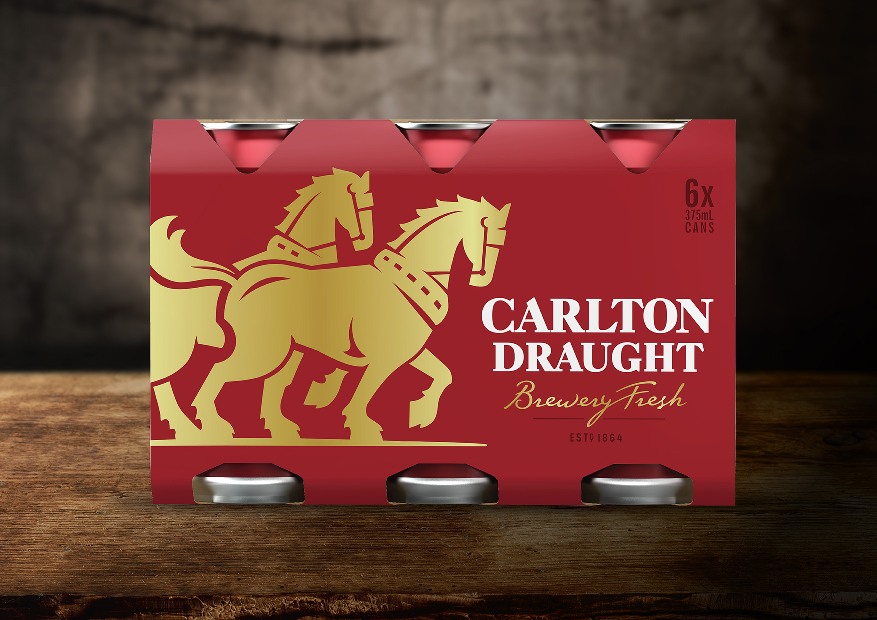
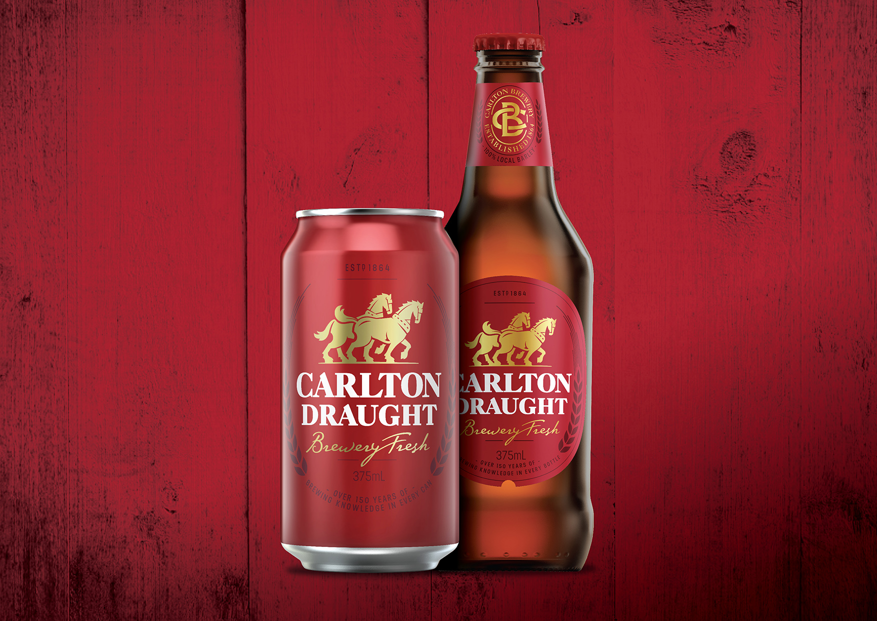
- Project Type: Packaging
- Agency/Creative Country: Australia
- Market Region: Oceania
- Project Deliverables: Brand Guidelines, Brand Identity, Brand Redesign, Brand Refinement, Brand Rejuvenation, Brand Strategy, Branding, Graphic Design, Illustration, Packaging Design, Rebranding, Tone of Voice
- Format: Bottle, Box, Can, Case, Sleeve
- Substrate: Glass Bottle, Metal, Pulp Carton, Pulp Paper


