Founded in 2001, UE is a world-renowned high-tech enterprise integrating innovative research and development, intelligent manufacturing, and global sales. It is also the first listed company in the Chinese chair industry. It has 5 major production bases internationally, with more than 5,000 employees. Its products are exported to 82 countries and regions around the world, and it has ranked first in global sales for three consecutive years.
Pocca was commissioned by UE to develop a new retail market based on its 22 years of B-end industry accumulation. We completed multi-sections from user and consumer research, brand and product strategy, to visual identity system design, art direction, and e-commerce system planning and design.
After sorting out the history and accumulation of the brand, summarizing its manufacturing technology, and interviewing and insights into its users and consumers, we found that using technology as the carrier and user experience as the core is the key to product claims, so the core user value of the brand is positioned as “support”. We condensed the new brand value of UE “Master the Core Supporting Technology”. On the one hand, it highlights the uniqueness of the brand’s own strength and value; on the other hand, it also uses the concept of “Supporting Chair” to further differentiate UE’s products from similar products on the market.
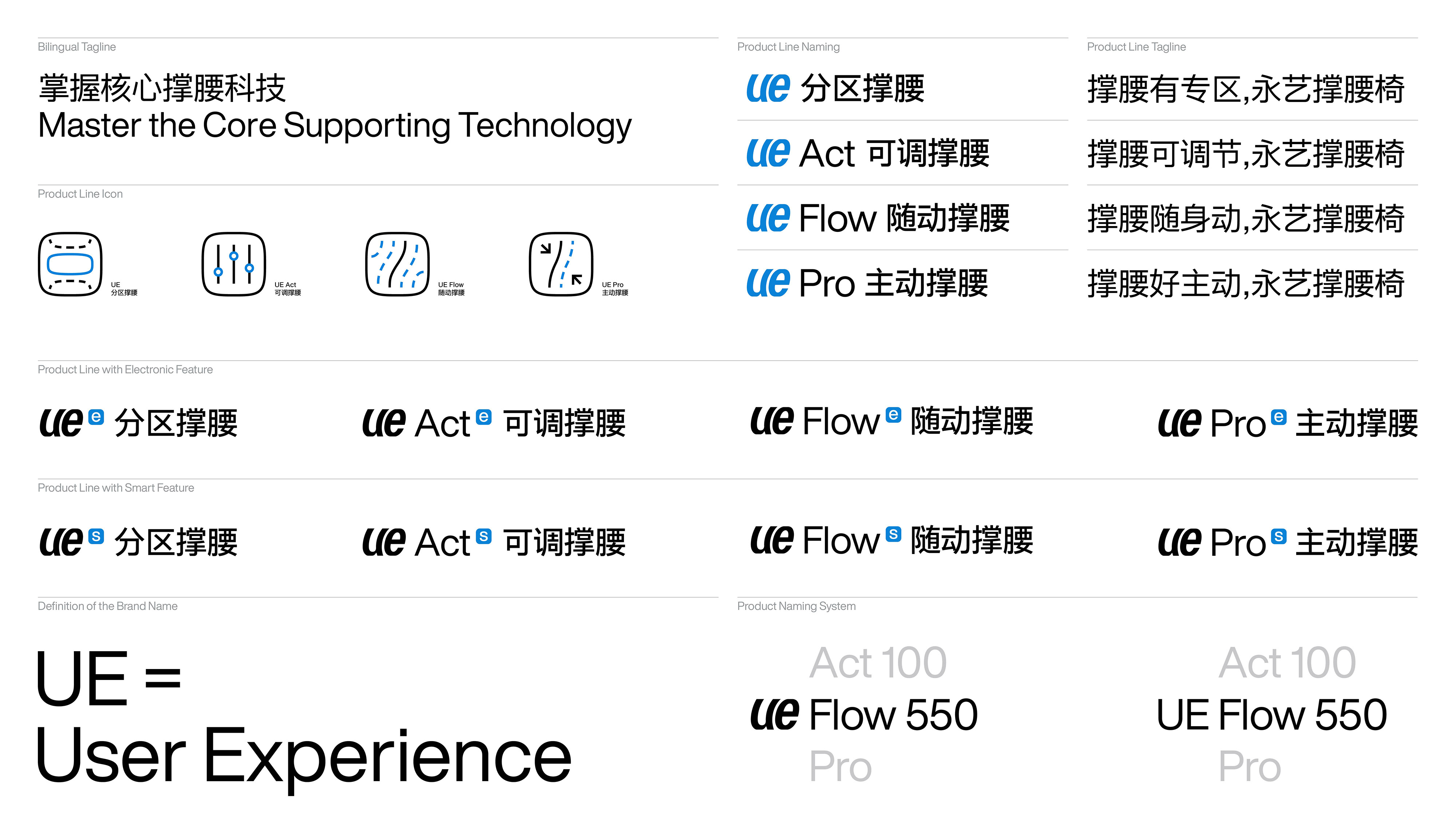
Based on the new definition of brand value, we have reorganized and planned the product line classification for the brand and consumers, so that the user’s consumption decision-making can change from choosing a chair to the support required for choosing, allowing the support to further pass product lines convey a unified brand narrative:UE, UE Act, UE Flow, and UE Pro. Help enterprises form a coherent and unified concept and effective output of value from brand to product. At the same time, through product slogan creation, product naming system, copywriting, from brand to product lines and from product lines to products, complex information content is deleted and simplified, effective information is refined, and efficient understanding is promoted.
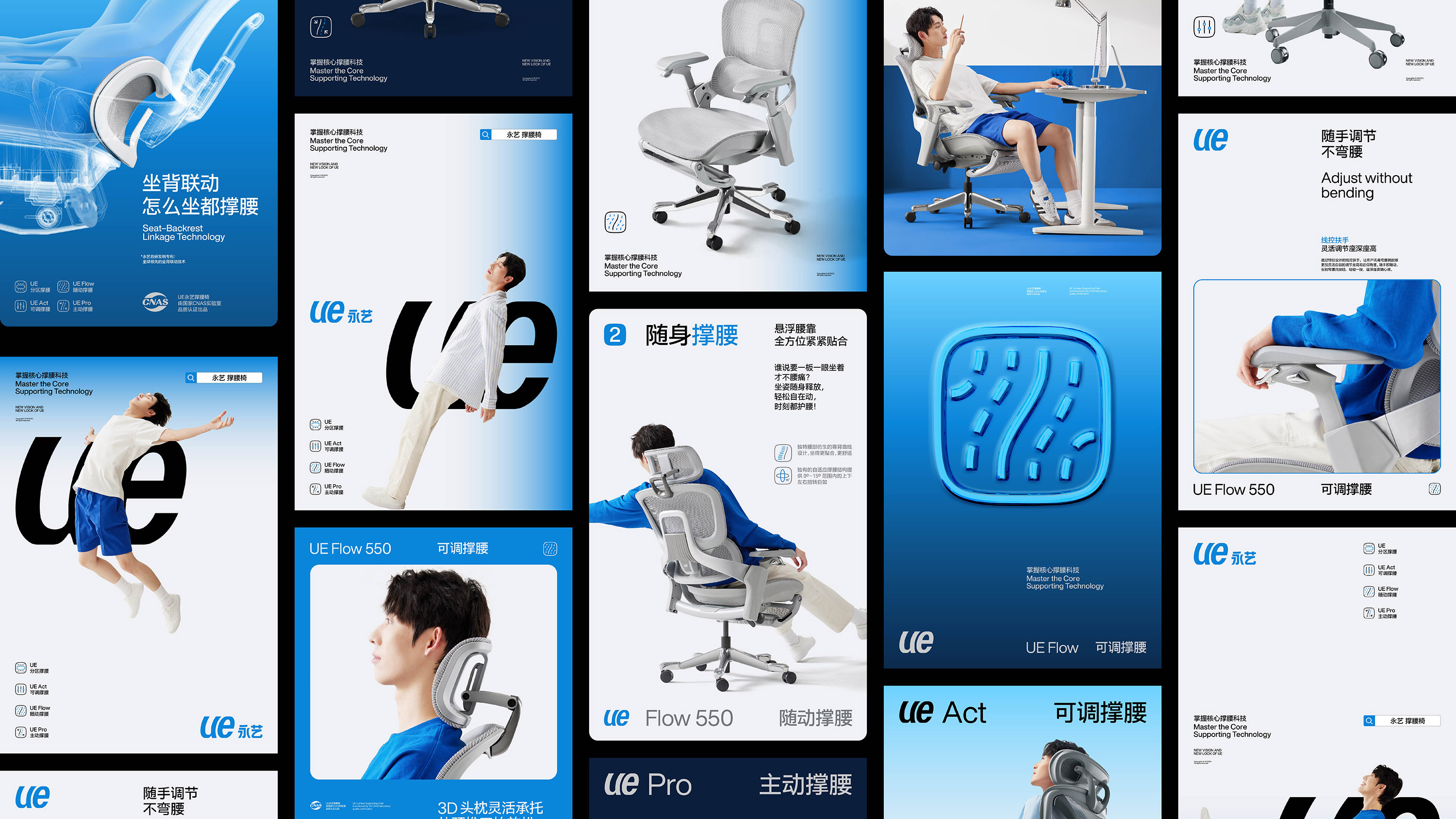
The new visual identity system of UE aims to be based on the brand value and product characteristics of “Master the Core Supporting Technology” as its core, injecting a younger and distinctive brand personality and feelings into the brand, and subtly establishing a clear and lasting relationship with its consumers with the emotional identification and conceptual connection of “support”.
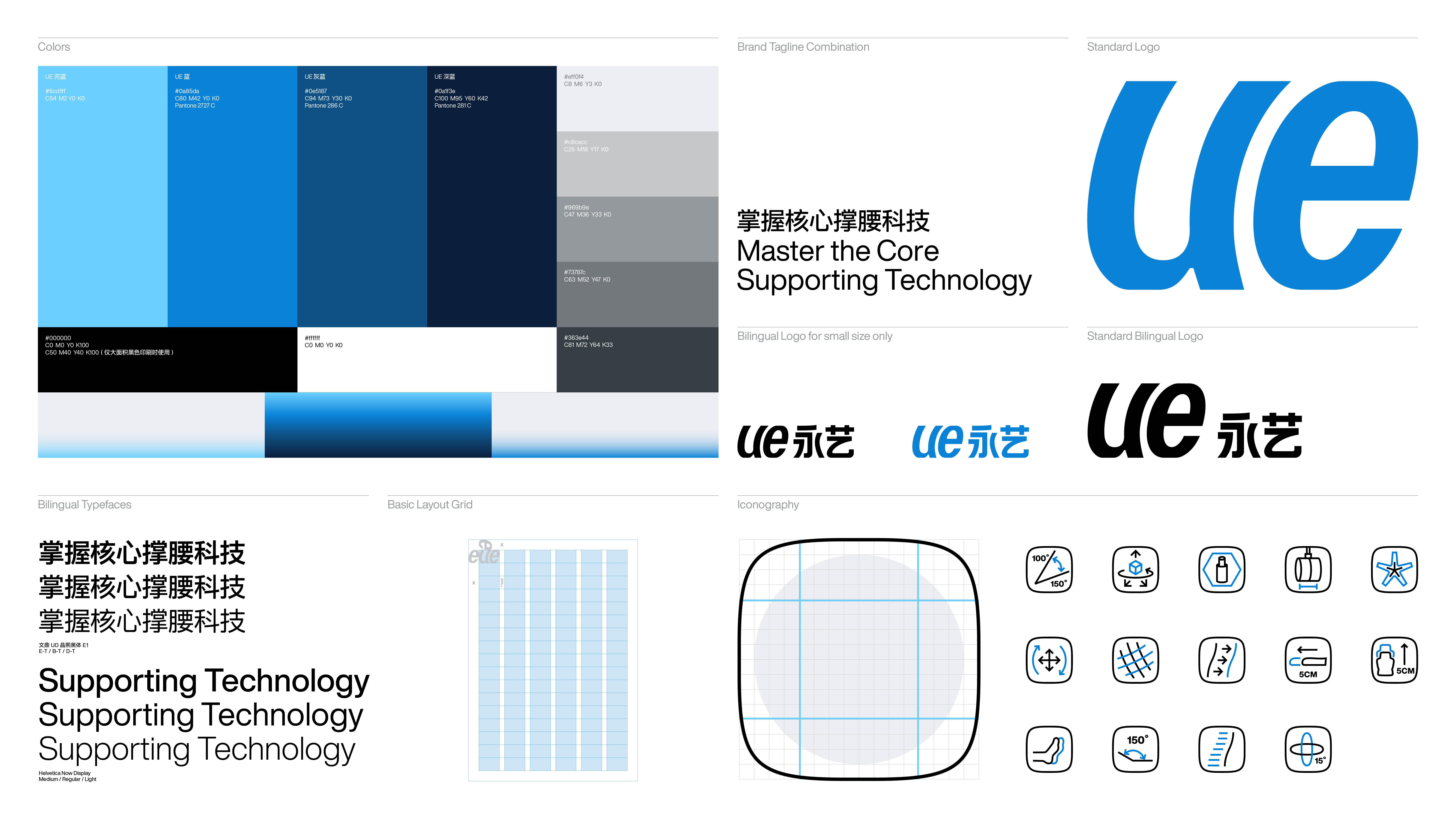
Based on the rare simplicity of the brand’s English name UE itself and the shape of the letterforms, we made a subversive change to the brand’s original Chinese and English logotype with strong attributes of a manufacturing enterprise: the original all-capital UE was transformed into All lowercase, through the letterforms of the character, it can instantly put a fashionable and friendly communication attitude in front of consumers; and then through the tilt processing of the ue character, it creates a stronger uniqueness for “ue” to be both a mark and a logotype, and also makes it a visual translation of the feeling of “support” by balancing abstraction and concreteness.
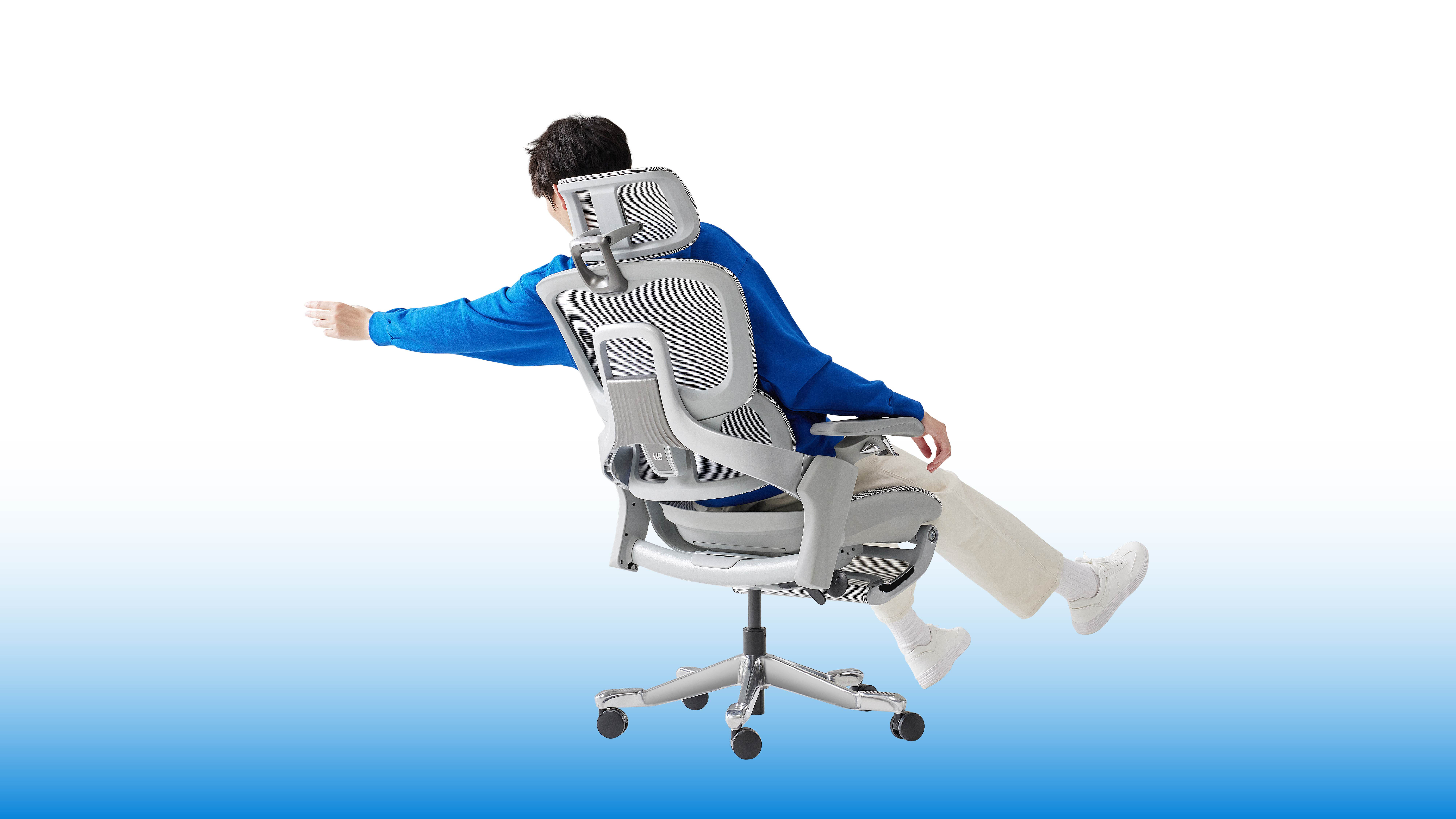
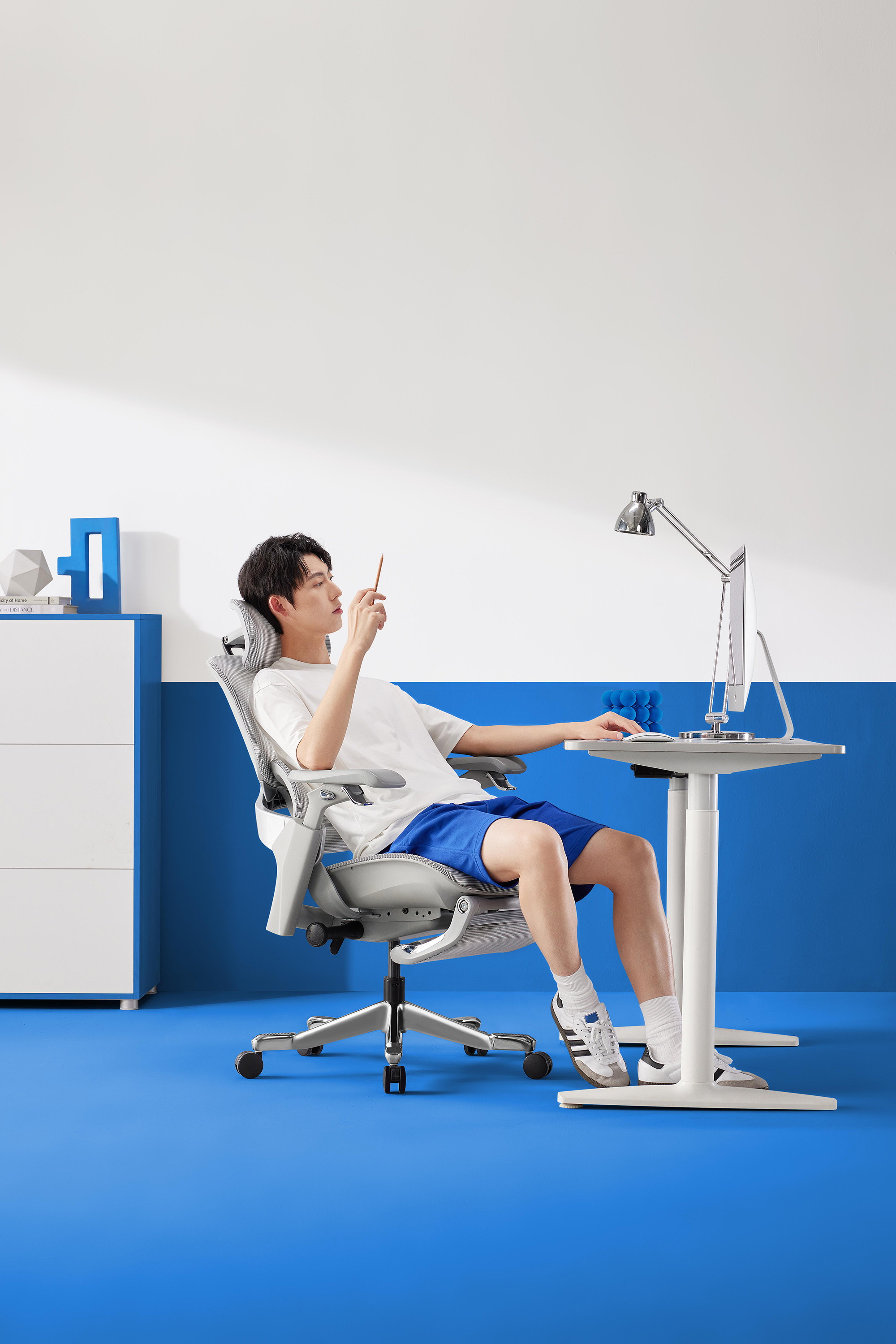
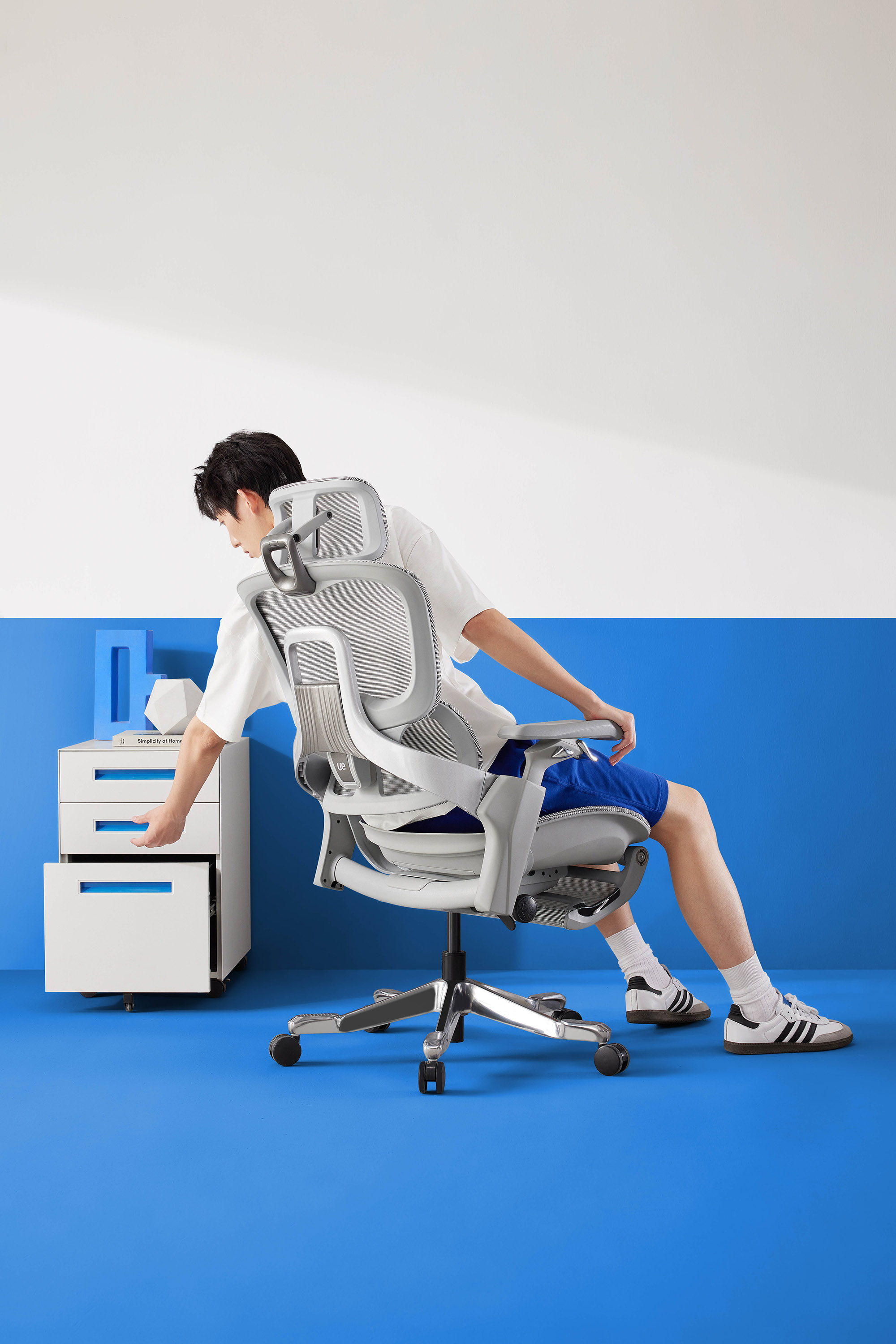
We also redefined the photography and image style used to present products and core brand style output based on the new brand value and visual identity system for UE. It aims to eliminate unnecessary exaggeration and excessive decorative elements, and instead present in the current retail market environment with abundant information through images that are appealing, realistic, focused on products and the interaction between people and products, rigorous and concise.
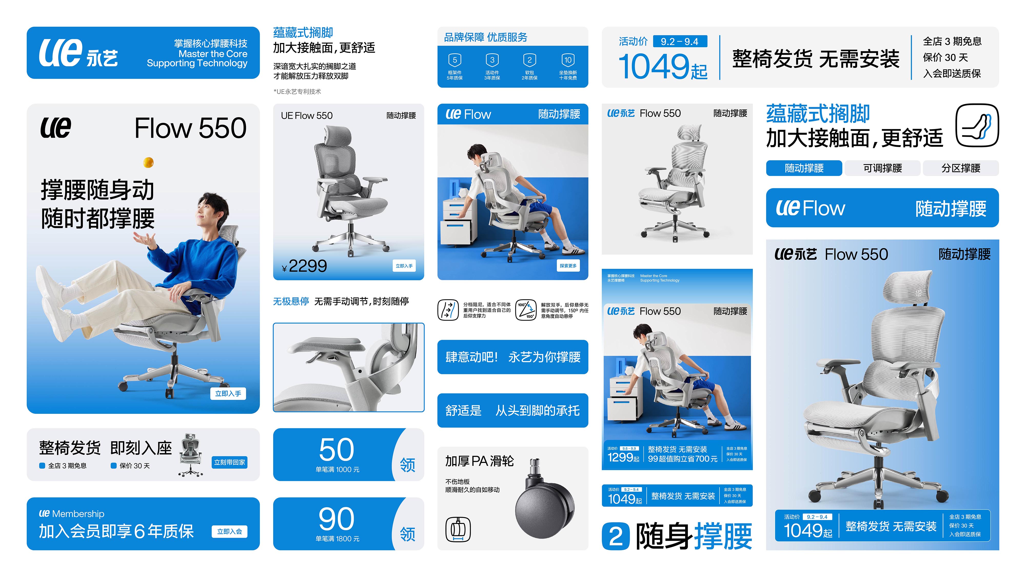
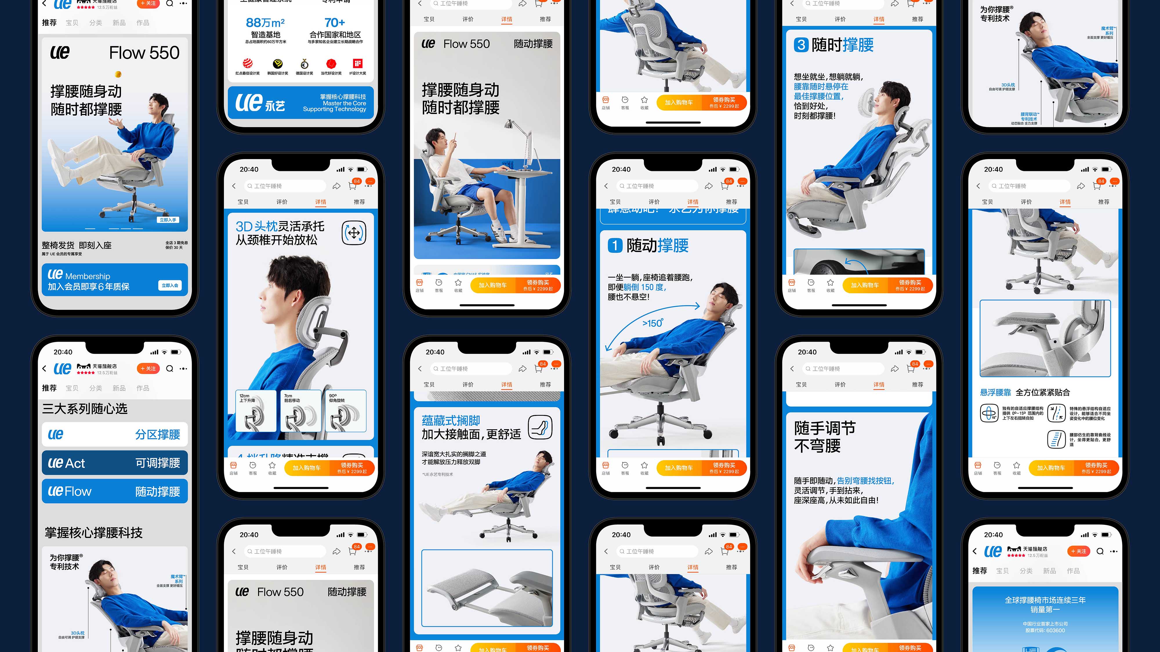
In the construction of each section of the visual system: Based on the brand’s long-standing brand color recognition accumulation of blue tones, we created a new brand color palette for UE to help the brand establish a new vibe that is both trustworthy and full of vitality; Tough, concise and neutral Chinese and English fonts can help the brand communicate more appropriately; standardized iconography system can help the brand unify auxiliary icons with different styles to form a coherent and unified visual style and reduce unnecessary reading Interference; and the responsive grid system suitable for different layout ratios and media can finally arrange all visual elements and information in a unified style and clear information hierarchy, helping brands to output information efficiently and more powerfully, while also allowing consumers and users can be more involved in the brand’s vibe and easily focus on the information composed of images and text.
CREDIT
- Agency/Creative: Pocca
- Article Title: Redefining Brand Identity and Design for the Future of High-Tech Chair Manufacturing UE
- Organisation/Entity: Agency
- Project Type: Identity
- Project Status: Published
- Agency/Creative Country: China
- Agency/Creative City: Shanghai
- Market Region: Asia, Global
- Project Deliverables: Art Direction, Brand Architecture, Brand Design, Brand Guidelines, Brand Identity, Brand Strategy, Brand Tone of Voice, Graphic Design, Logo Design, Motion Graphics, Photography Styling, Product Naming, Rebranding, Research, Type Design, Typography
- Industry: Manufacturing
- Keywords: Chair, ergonomic chair
-
Credits:
Strategy Director: Jiacheng Zhang
Design Director: Zhihua Duan
Designer: Keyun Wang
Designer: Qiuting Yu


