Red Mane is a conceptual limited edition spirits brand developed to explore how illustration-led branding can translate cultural symbolism into a contemporary, scalable brand system. Rooted in the visual and narrative traditions surrounding Chinese Baijiu, the project centres on the 2026 Year of the Horse within the Chinese zodiac, using this moment as both a cultural anchor and a strategic storytelling device.
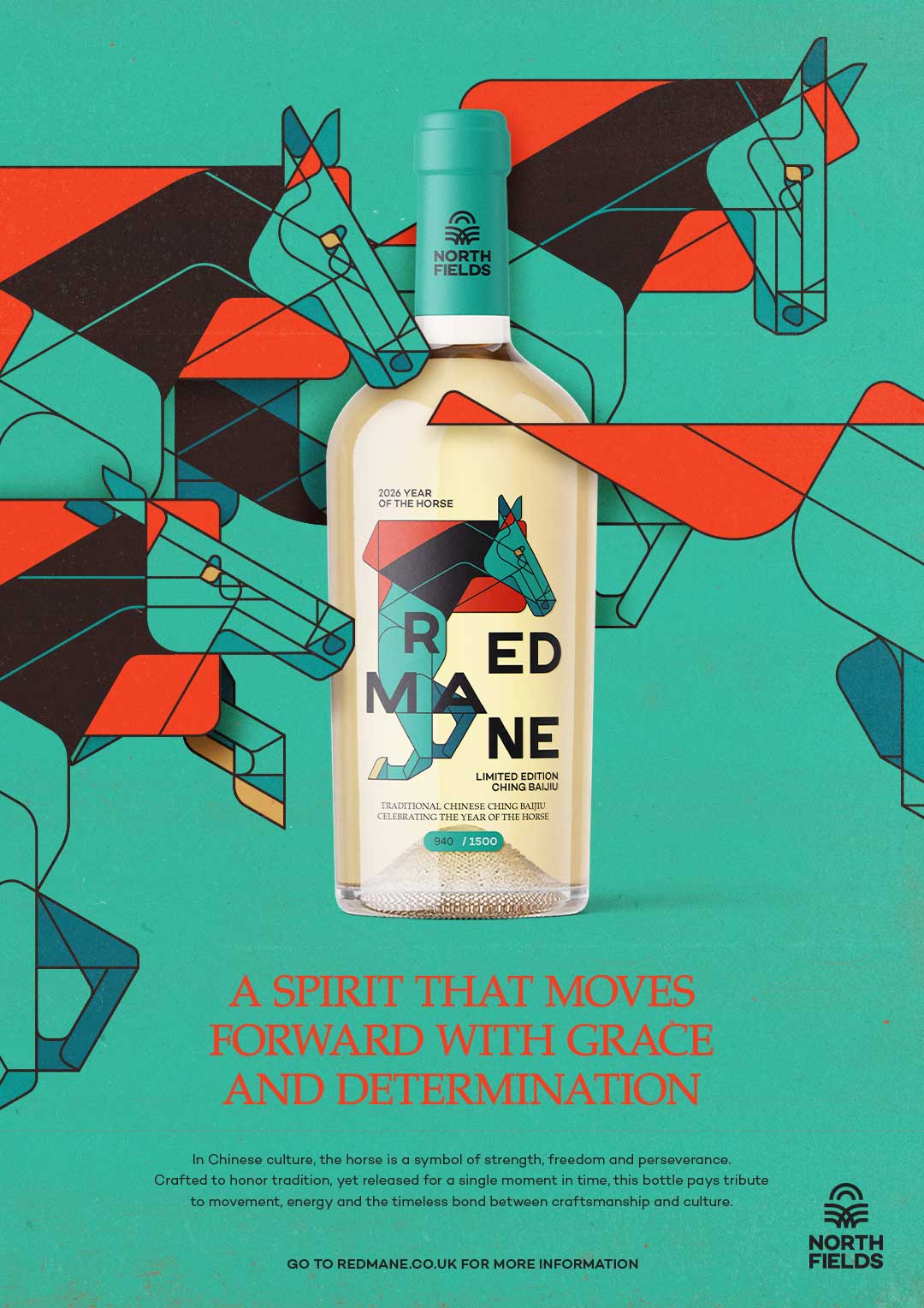
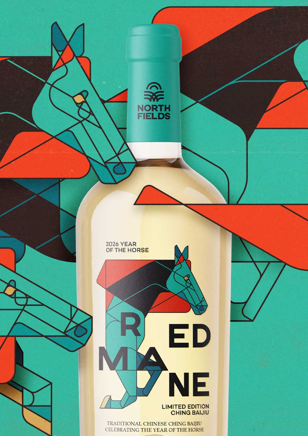
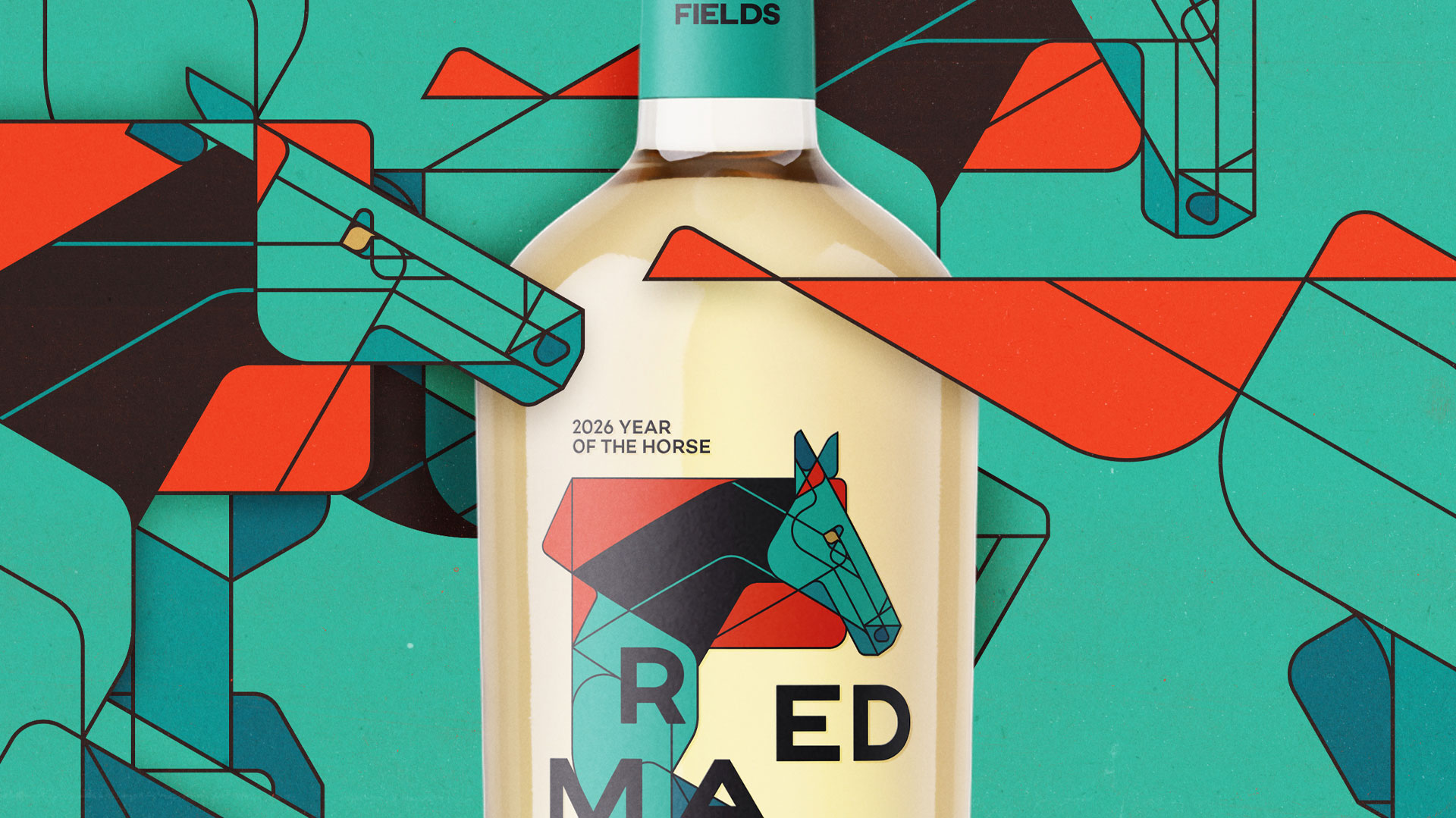
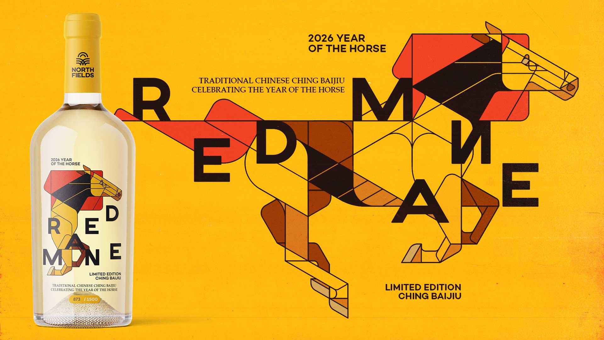
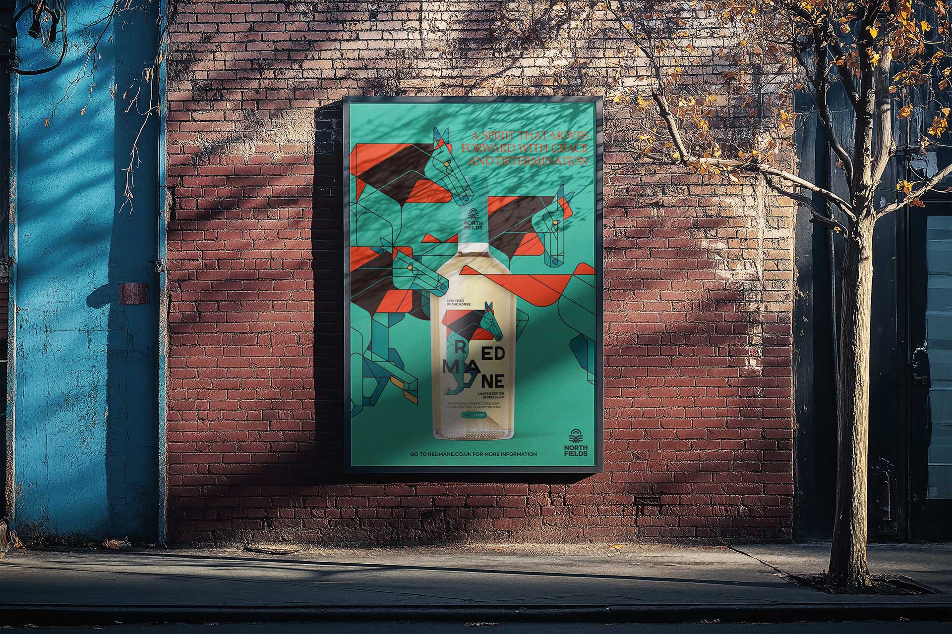
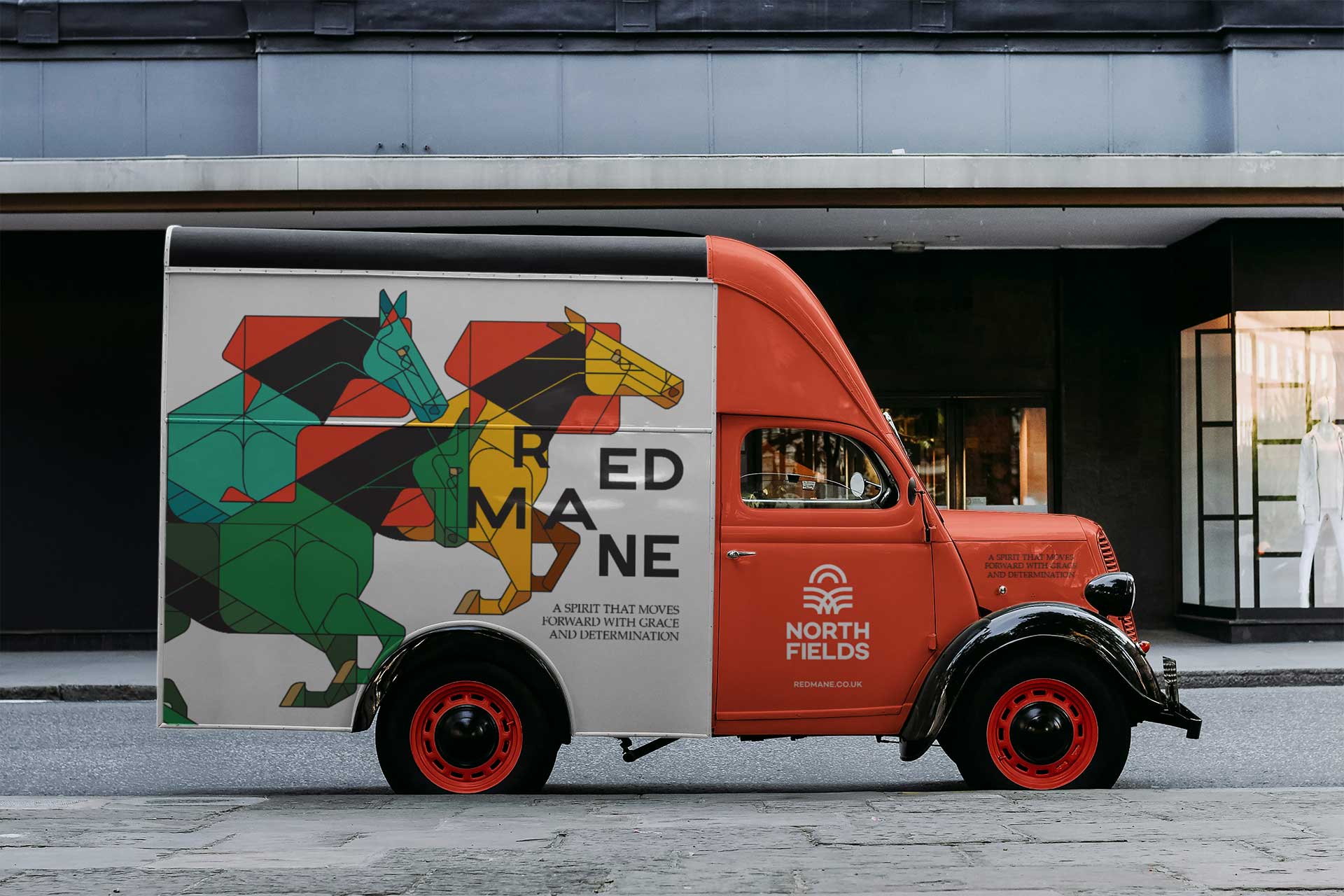
The visual identity is built around a series of custom geometric horse illustrations. Each illustration represents key attributes associated with the horse such as: strength, elegance, resilience and forward motion while also reflecting the layered complexity of Baijiu itself. Rather than functioning as decorative elements, the illustrations were conceived as core brand assets, forming the foundation of the entire visual system.
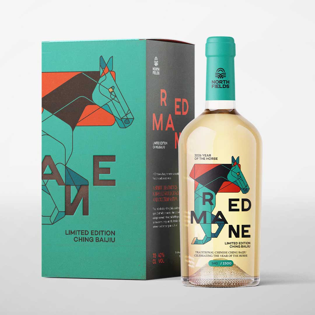
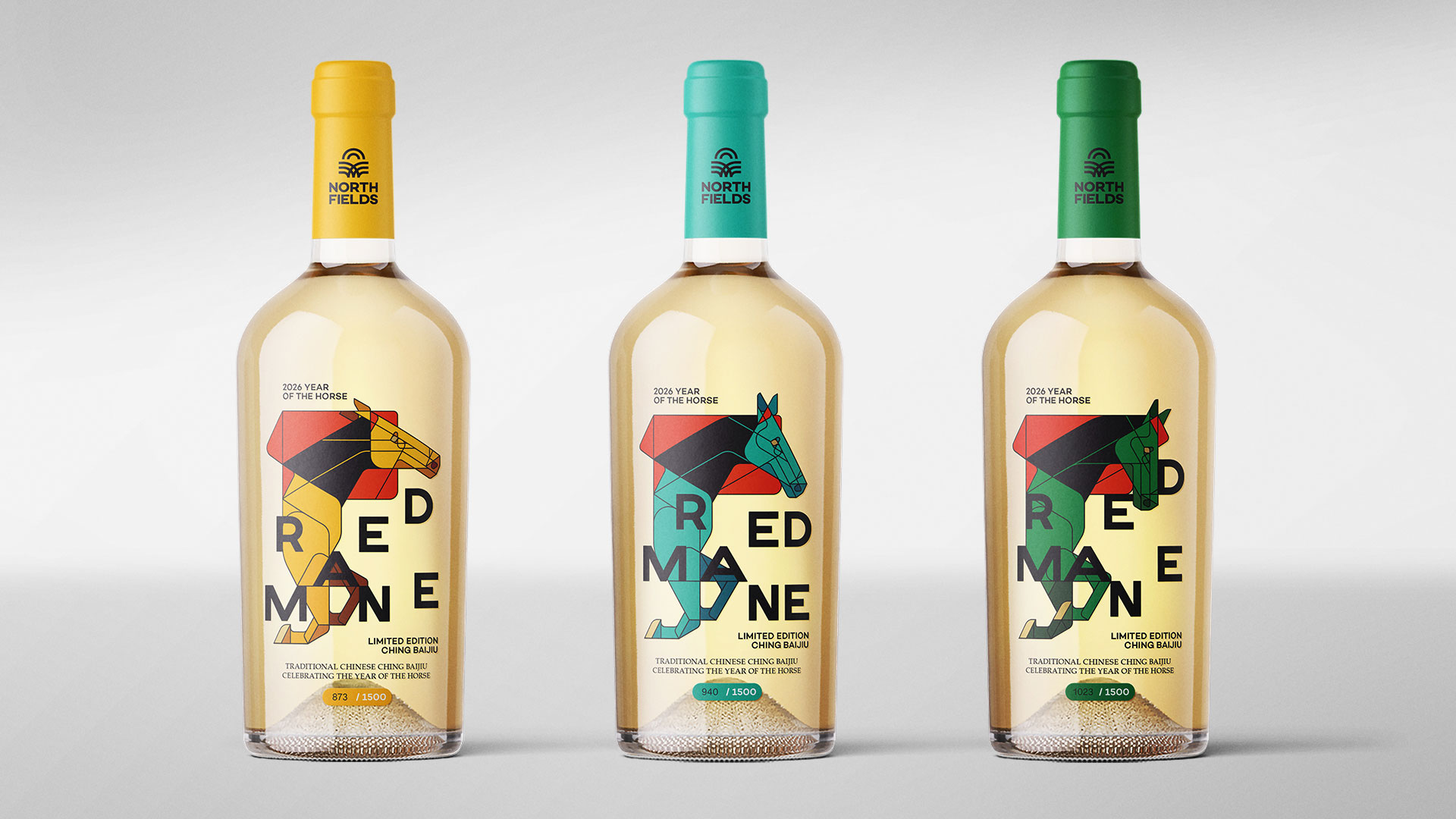
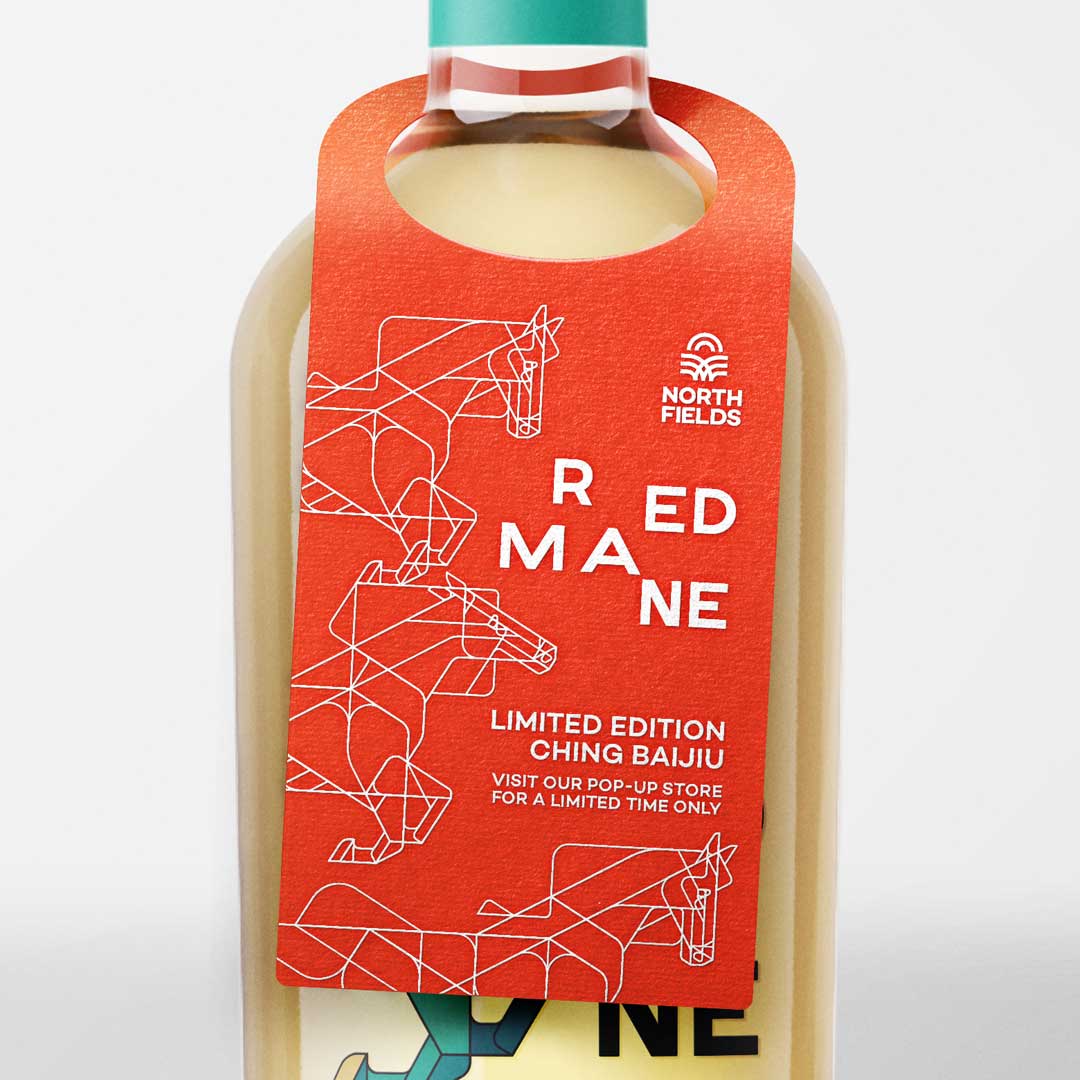
Three distinct bottle variants were designed, each paired with its own horse illustration and colour composition. This approach reinforces collectability while maintaining brand consistency through shared structure, typography and layout principles. The packaging extends beyond the bottle to include a premium gift box, neck tags and supporting print elements, all developed within the same modular framework.
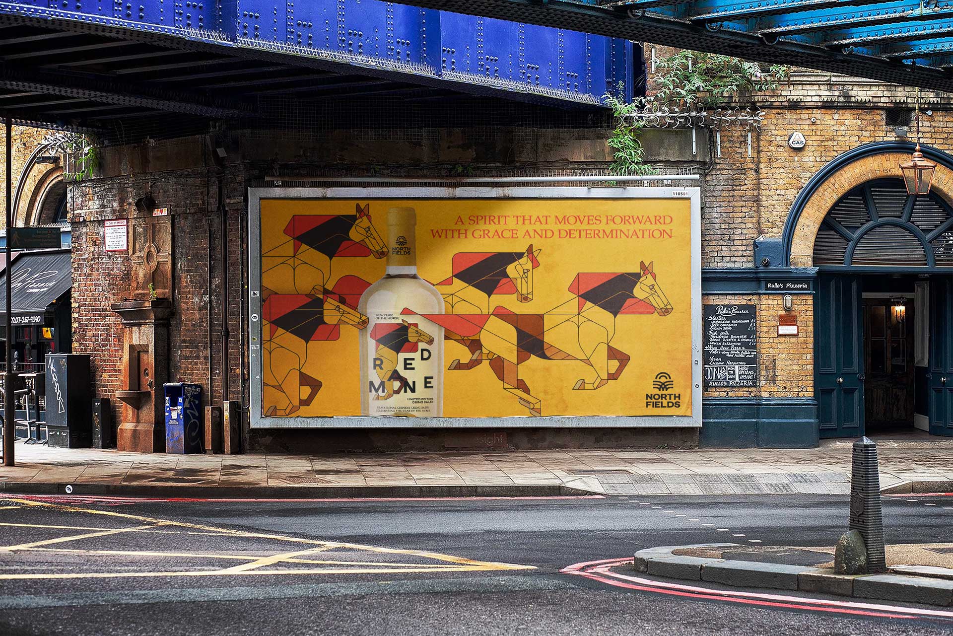
Beyond packaging, the Red Mane identity was applied across a wider campaign ecosystem, including outdoor advertising, posters, mobile brand activations and promotional vehicles. Every touchpoint was designed to feel cohesive, recognisable and adaptable, demonstrating how a strong concept can remain intact across vastly different formats and scales.
Red Mane reflects my approach to branding as a strategic process rather than a purely aesthetic exercise. Illustration, layout and storytelling are treated as interconnected tools, used to build meaning, hierarchy and memorability. The project highlights my focus on concept-driven design, system thinking and visual consistency—key elements in creating brands that are both culturally grounded and commercially relevant.
Although fictional, Red Mane was developed with real-world constraints and production considerations in mind, making it a credible case study for premium spirits, packaging design and illustration-led brand identities.
CREDIT
- Agency/Creative: 3rd Floor
- Article Title: Red Mane Conceptual Branding and Packaging Design Inspired by the Year of the Horse by 3rd Floor
- Organisation/Entity: Freelance
- Project Type: Campaign
- Project Status: Non Published
- Agency/Creative Country: Netherlands
- Agency/Creative City: Breda
- Market Region: Europe
- Project Deliverables: 2D Design, Advertising, Branding, Design, Digital Art, Graphic Design, Illustration, Packaging Design
- Industry: Food/Beverage
- Keywords: Baijiu, spirit, drinks, horse, 2026, Chinese,
-
Credits:
art direction, graphic design & illustration: 3rd Floor (Bart De Keyzer)


