


Introduction: A Brand Born from Silence and Persistence
Red Heart is more than a fashion identity project. It is a study of resilience, emotional branding, and the power of simplicity in contemporary streetwear culture. The brand originated from a deeply personal journey a series of three failed startups that pushed the founder to the edge of surrender. For most people, three attempts would be enough to stop dreaming altogether. But for Red Heart, the turning point wasn’t failure it was silence.
In the quietest moment, when ambition seemed to dissolve and no noise remained, the founder recognized something fundamental: as long as the heart still beats, passion remains alive. This realization became the philosophical seed that later shaped the entire design direction.
Red Heart carries this philosophy into every element from its geometric logo to its calming visual system. It explores a quieter interpretation of streetwear, one that stands in contrast to the loud, rebellious imagery traditionally associated with the category. Instead, Red Heart embraces stillness, inner fire, and timeless simplicity, inviting wearers to move slowly, breathe deeply, and live intentionally.
This project encapsulates the complete conceptualization and execution of the brand identity system. Through minimal forms, structured geometry, and emotional depth, Red Heart aims to present a new perspective on how streetwear can feel not noisy, not aggressive, but quiet yet burning.
Brand Concept: Quiet Passion as a Visual Language
While traditional streetwear often leans into bold typography, complex graffiti-inspired graphics, and high-energy visuals, Red Heart proposes an alternative. It introduces a design style driven by emotional clarity, calm energy, and purposeful minimalism.
The core concept is built around three pillars:
Quiet Yet Passionate
The brand embodies a paradox calm from the outside, but deeply passionate internally. Instead of expressing rebellion through noise, Red Heart expresses power through the quiet determination of its forms. This emotional framework allows the brand to stand out in a crowded category filled with visual intensity.
Simple Yet Timeless
Fashion is cyclical, and trends come and go quickly. Red Heart avoids trend dependency by committing to simplicity — not emptiness, but meaningful reduction. Every line, curve, and proportion is intentional. The brand prioritizes longevity in both visual identity and apparel design.
Geometry as Soul
The brand leans heavily into geometric construction, using clean shapes and thick strokes to form a signature heart symbol. This decision isn’t merely aesthetic; geometry reflects structure, discipline, and inner stability — qualities aligned with the founder’s journey of rebuilding after failure.
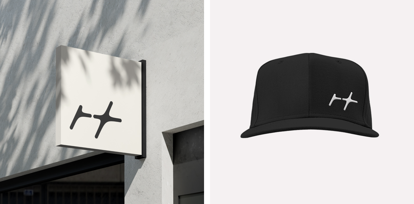
The Logo: A Heart Reconstructed from Geometry
At the center of the identity is the original Red Heart logo — a modern, structured, geometric heart.
Design Intent
Instead of using a typical heart shape, the design explores how geometry can transform a universal symbol into a contemporary brandmark suited for streetwear. The heart shape is reconstructed using:
– Bold line thickness to reflect strength and contemporary street aesthetics.
– Clean angles and geometric intersections to portray precision and clarity.
– Symmetrical balance to symbolize emotional steadiness and inner alignment.
– A modular construction approach that allows the symbol to evolve into patterns, badges, and apparel graphics.
The result is a heart shape that feels modern, minimal, and gender-neutral — perfectly aligned with Red Heart’s market positioning.
Structure & Grid System
A balanced grid system was applied to ensure that every proportion feels intentional. The shape is developed using:
– A foundational square grid to maintain consistent geometry
– A central axis for symmetry
– Repeated line segments to create rhythm and harmony
– Proportional constraints to maintain scalability
The grid system ensures that whether the logo appears on a small apparel tag or a large billboard, it retains clarity, strength, and visual integrity.
Emotional Interpretation
Beyond form, the heart symbol carries deep emotional meaning. The thick, steady lines reflect the founder’s resilience. The geometric construction represents rebuilding life and identity from structure. The minimal style reflects the calmness discovered after failure.
The logo is not only a symbol of the brand; it’s a manifestation of the brand’s story — a heart that was broken, reforged, and reborn as something stronger.
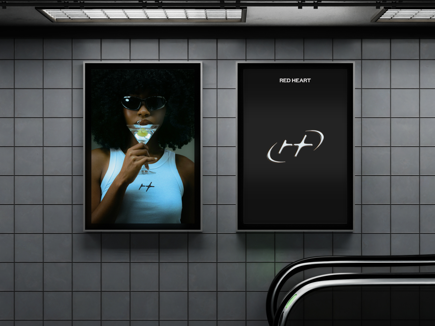
Color Palette: Monochrome Stillness with a Bold Red Accent
The brand employs a primarily monochrome palette to maintain simplicity and timelessness. The dominant tones include:
• Black — representing depth, grounding, and contemporary streetwear aesthetics
• White — symbolizing clarity, space, and minimalism
• Neutral greys — providing a calm, balanced backdrop
The hero color is, naturally, Red. But instead of using a vibrant, neon red, the palette leans toward a deeper, emotionally richer shade. It evokes warmth, passion, and a controlled intensity — capturing the spirit of “quiet fire” that defines Red Heart.
The red is used sparingly but strategically, ensuring it retains impact and emotional significance. It appears in the logo, highlight accents, signature patterns, and limited-edition graphics.
Typography: Strength in Simplicity
Typography plays a significant role in grounding the brand’s minimal yet expressive personality.
Typeface Selection
The type system uses:
– A bold, geometric sans-serif for headings
– A clean grotesk sans serif for body text
This combination creates contrast in weight and structure while maintaining cohesiveness. The bold type pairs well with the logo’s thick strokes, reinforcing strength and modernity. The body type remains neutral and unobtrusive, supporting Red Heart’s minimalist approach.
Tone of Typography
Typography is not just a visual tool; it’s a voice. The tone is:
– Confident but not aggressive
– Minimal but not silent
– Functional but expressive
This balance ensures that written messaging aligns with both the emotional and visual identity of the brand.
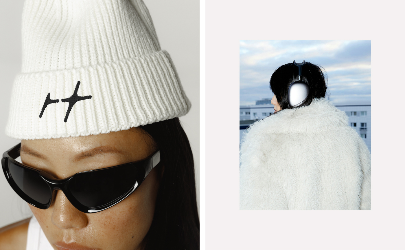
Visual System: Modular, Scalable, and Pattern-Ready
A significant part of the Red Heart identity lies in its adaptability. The system was designed to evolve over time, allowing the brand to scale across various apparel categories and digital platforms.
Modular Elements
The geometric heart logo breaks down into smaller components, creating:
– Pattern tiles
– Iconography
– Apparel graphics
– Social media frames
– Label elements
– Packaging motifs
These modules ensure visual consistency while providing creative flexibility for collections and campaigns.
Pattern System
The pattern system plays a crucial role in apparel and packaging applications.
Patterns are constructed from:
– Repeated segments of the heart symbol
– Balanced alignment
– Variable line thickness
The patterns maintain minimalism but introduce rhythm and energy — a visual interpretation of the heartbeat itself.
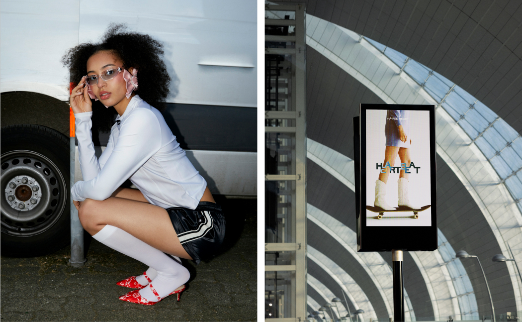
Photography Direction
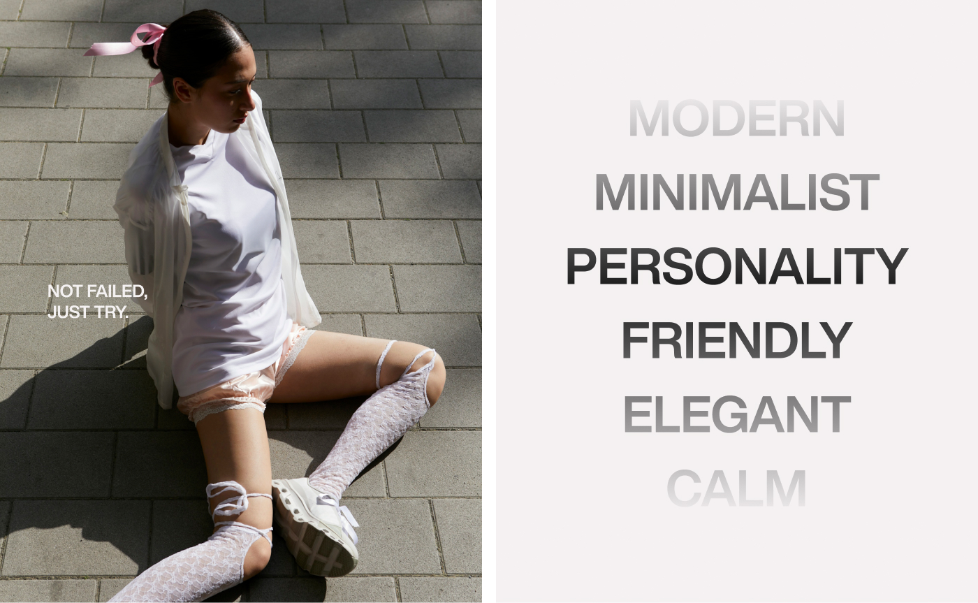
The visual tone for lifestyle photography emphasizes:
– Natural light
– Calm compositions
– Unposed, authentic human presence
-Slow, intentional movement
This supports the brand’s “quiet but burning” philosophy.
Brand Personality: Calm, Intentional, Modern
Red Heart’s personality is expressed through specific emotional cues.
Calm Energy
The brand speaks softly but confidently. It does not shout. It does not provoke. It invites contemplation and presence.
Inner Fire
Despite the calmness, Red Heart carries intensity. This duality creates depth, complexity, and emotional resonance with audiences seeking more meaningful fashion choices.
Gender-Neutral Approach
Every design element from the logo to the apparel silhouettes — is crafted to be inclusive. Red Heart doesn’t design “for men” or “for women”; it designs for humans with inner passion.


CREDIT
- Agency/Creative: Chefthai Creative
- Article Title: Red Heart: Crafting Quiet Passion into Minimal Streetwear Identity by Chefthai Creative
- Organisation/Entity: Freelance
- Project Type: Identity
- Project Status: Published
- Agency/Creative Country: Vietnam
- Agency/Creative City: Hanoi
- Market Region: Asia, Europe, Global
- Project Deliverables: 2D Design, Art Direction, Brand Creation, Brand Design, Brand Identity, Brand Mark, Brand Redesign, Brand Strategy, Brand Tone of Voice, Branding, Creative Direction, Logo Design
- Industry: Fashion
- Keywords: Apparel branding, Lifestyle imagery, Fashion branding, Brand identity, Brand concept, Minimal streetwear, Logo Design
-
Credits:
Branding Studio: Chefthai Creative
Creative Director/ Brand Designer: Chef Thai


