


DUSK was not introduced as just another product entering an already saturated market. It was conceived as a deliberate, strategic move — a bold and unapologetic brand designed to break through a category defined by repetition and visual noise.
Red Flare DDA was commissioned to build DUSK from the ground up, approaching it not merely as a design task, but as a complete brand creation process. Every layer of the brand was crafted with intention — from strategic positioning and identity design to packaging systems, cinematic 3D content, and scalable visual communication frameworks. This was not an iteration. It was a brand birth.
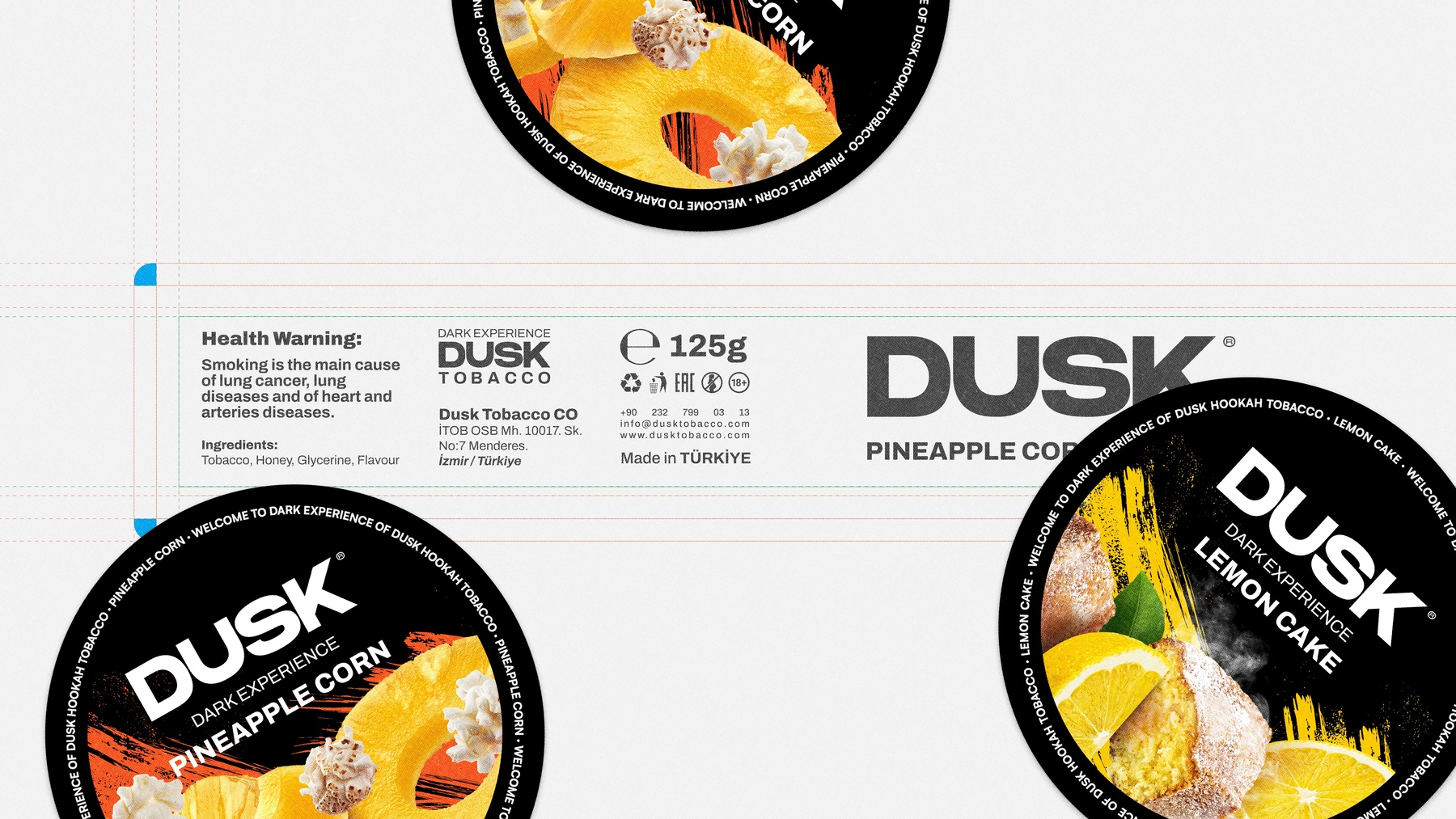
The core challenge was not visibility, but distinction. The category was crowded with competitors relying on loud graphics, predictable flavor coding, and overused “premium” cues that ultimately blurred into one another. DUSK needed to enter with authority, establish immediate recognition, and communicate strength without falling into the trap of visual excess.
Our approach focused on restraint as a differentiator. Instead of competing through noise, we designed clarity. Instead of exaggeration, we built presence.
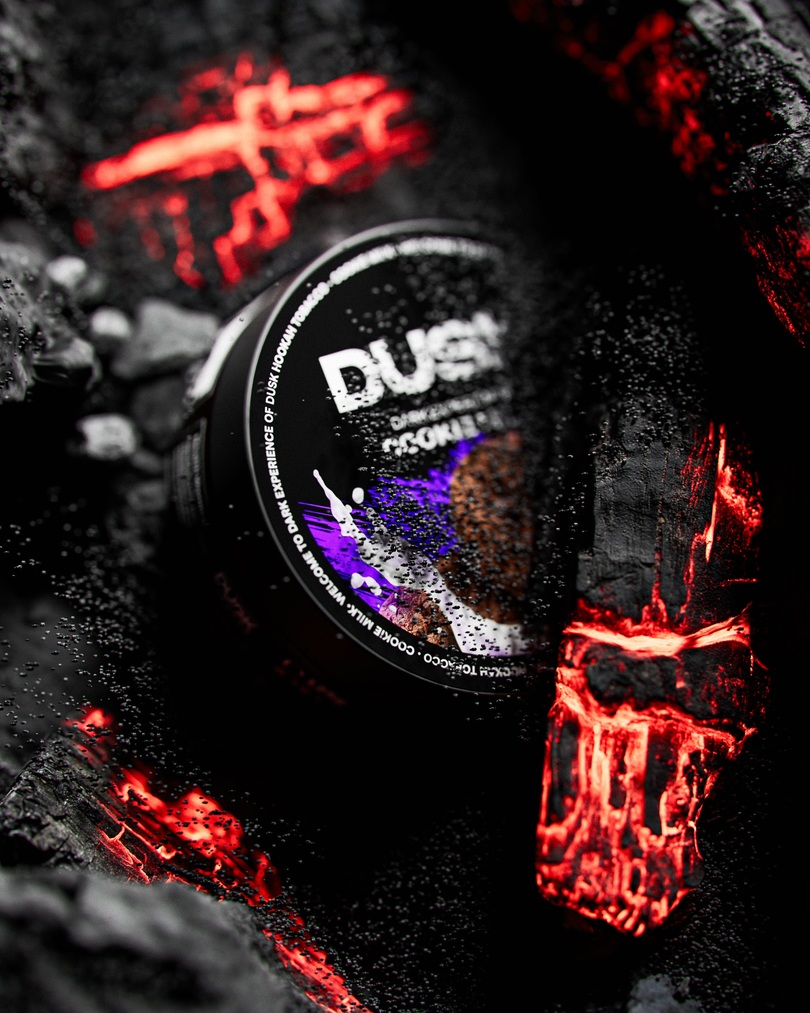
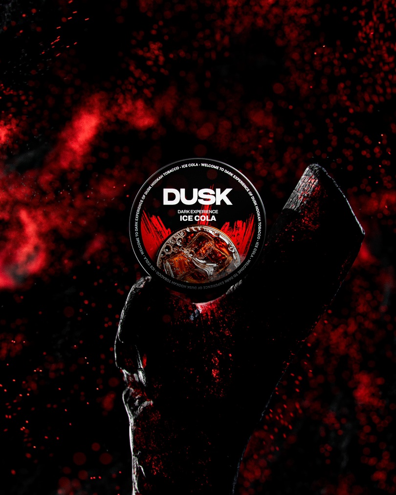
The creative direction was shaped around a central narrative: “Every glow tells a story. And this story begins with rice.” This idea became the backbone of the entire visual language, influencing motion, lighting, pacing, and composition. The product remained at the center — framed intentionally, revealed gradually, and elevated through cinematic storytelling rather than conventional advertising.
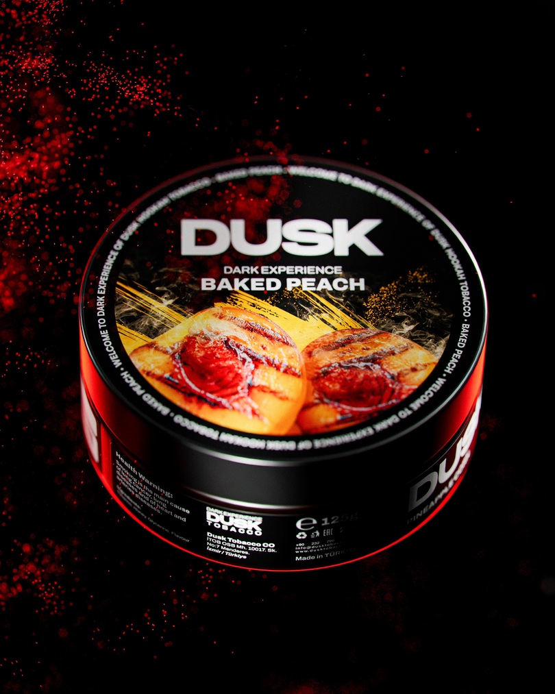
Bright environments, soft light transitions, and controlled color palettes created contrast within the category. Every element served a purpose. Nothing was decorative; everything was directional.
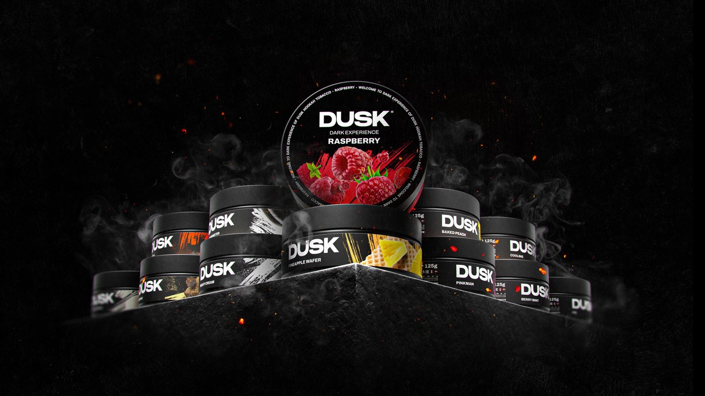
The result was a brand that entered the market with immediate maturity and confidence — a cohesive identity, a premium packaging system, cinematic launch content, and a scalable visual language for long-term growth.
DUSK did not appear as a newcomer trying to compete. It arrived as a brand that already belonged — and more importantly, one that visually dominated its space.
CREDIT
- Agency/Creative: Red Flare DDA
- Article Title: Red Flare DDA Launches DUSK as a New Benchmark in Minimal and Strategic Brand Design
- Organisation/Entity: Agency
- Project Type: Packaging
- Project Status: Published
- Agency/Creative Country: Turkey
- Agency/Creative City: Istanbul
- Market Region: Global
- Project Deliverables: 2D Design, 3D Design, 3D Motion, Advertising Photography, Art Direction, Brand Design, Brand Guidelines, Brand Mark, Identity System, Packaging Design
- Format: Box, Jar
- Industry: Food/Beverage
- Keywords: 2D Design - 3D Design - 3D Motion - Animation - Art Direction - Brand Design - Brand Identity - Brand Mark - Brand Naming - Copywriting - Label Design - Packaging Design - Product Design
-
Credits:
Founder &u2028Creative Director: Arian Tajik
Founder & CEO: Sezai Bilge
Motion Designer and 3D Artist: Erfan Karimi
Motion Designer and 3D Artist: Emad Ameri
Senior Brand & Digital Designer: Reza Abbasi
Senior Brand & Digital Designer: Alireza Bakhshi


