


In recent years, the fastest growing segment of the roasted coffee market has been the specialty segment. The popularity of these products has led to increased complexity in packaging design throughout the industry. Middle-segment brands, like specialty brands, have become more complex and more expensive. Packaging design began to include many profound metaphors that are understandable only to an audience of coffee geeks. These brands are not suitable for commercial products. These industry changes had a negative impact on their perception of ordinary consumers who needed plain coffee. The agency was tasked with developing an understandable brand of roasted coffee in the high and commercial segments.
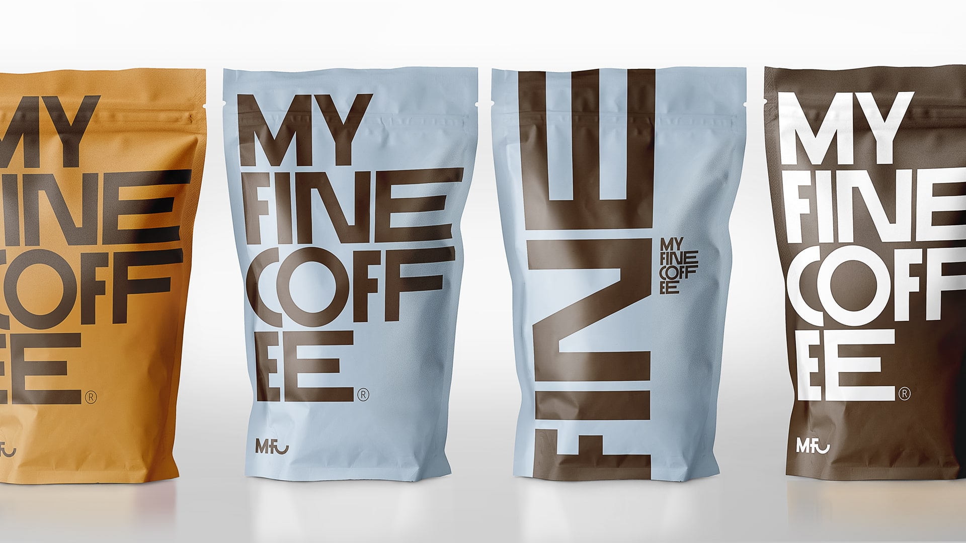
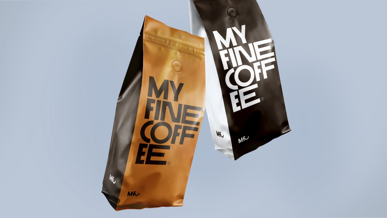
Clean, sweet, simple – three characteristics of taste and constants of the new identity, indicated by the customer. The concept of “simple coffee” begins to unfold in a simple name. The identifier contains categories and refers to a specific type of grinding. The brand name is supported by the double-digit slogan Everyday i’m fine. It enhances verbal communication, makes it more dynamic and interesting for use in advertising. Brandline can develop into a whole system of brandline. Any sentence with the word fine in the context of brand communication will be ambiguous, which will catch the attention of the consumer.
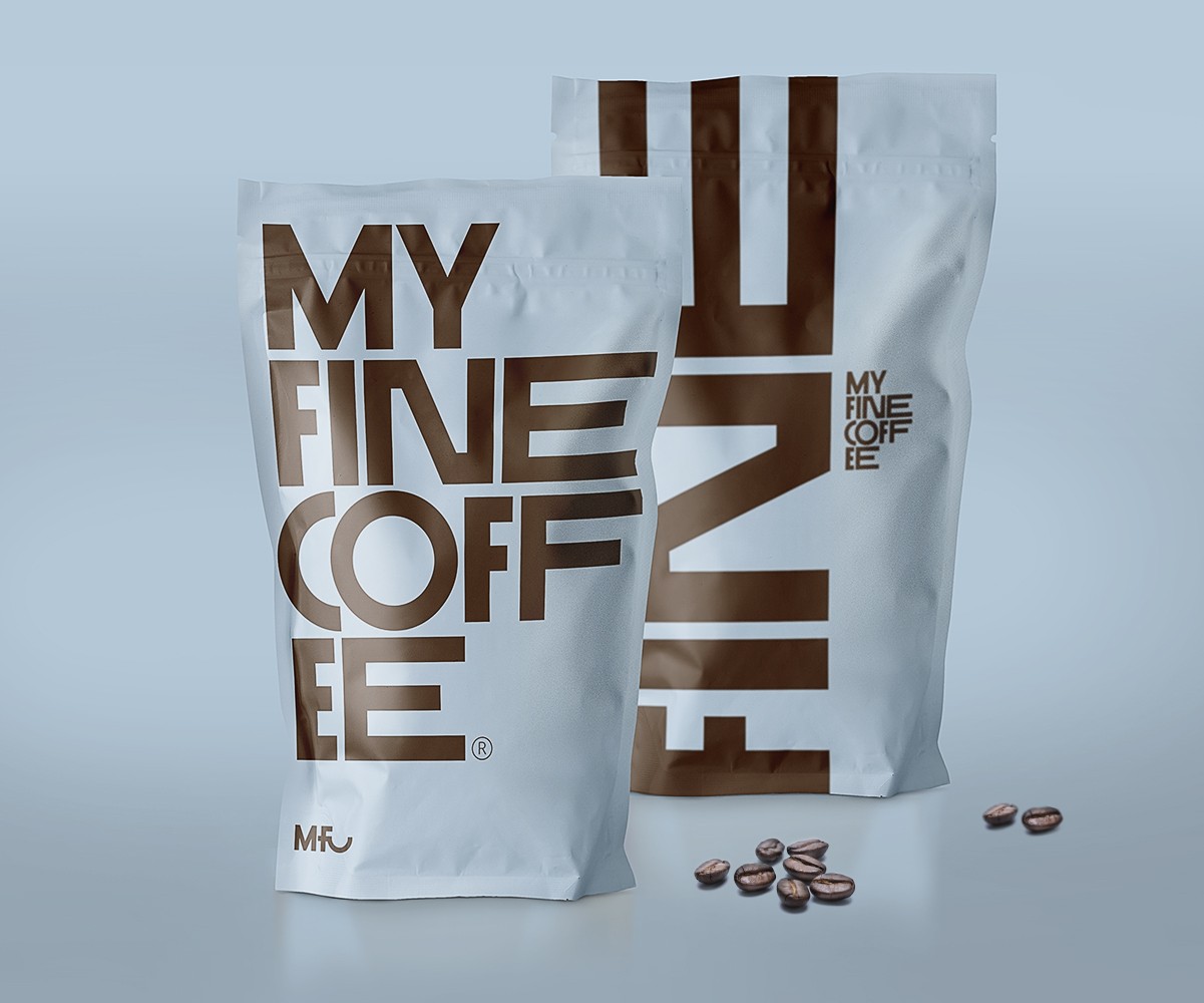
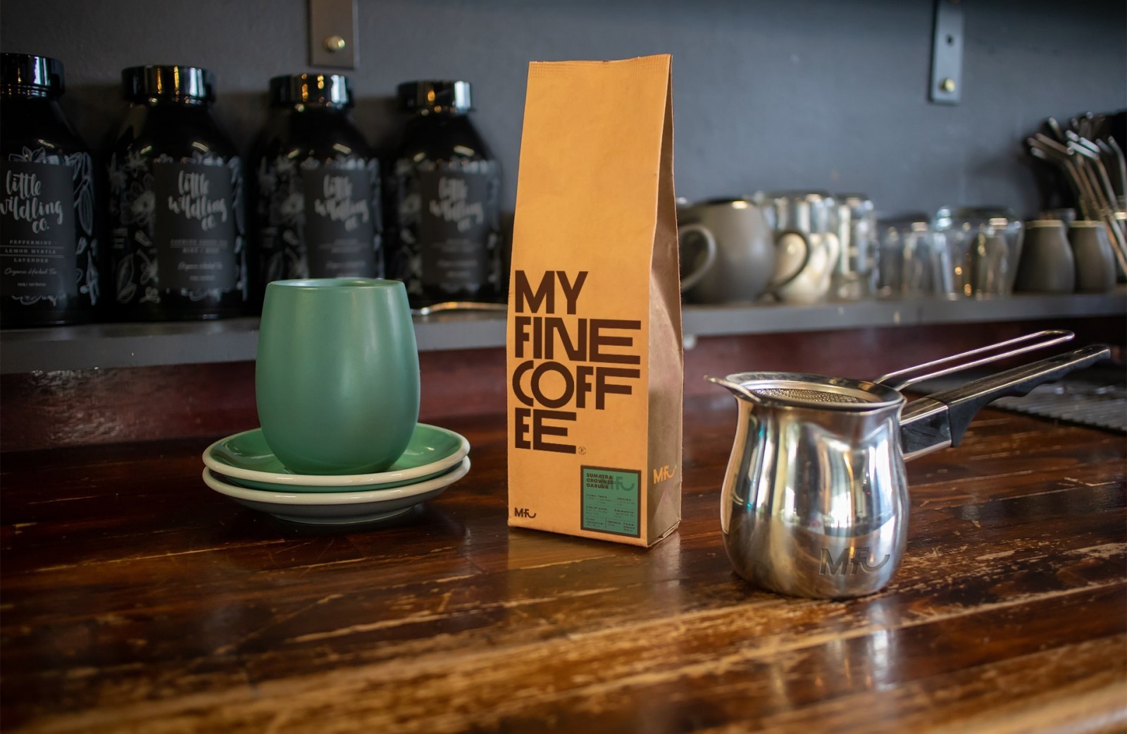
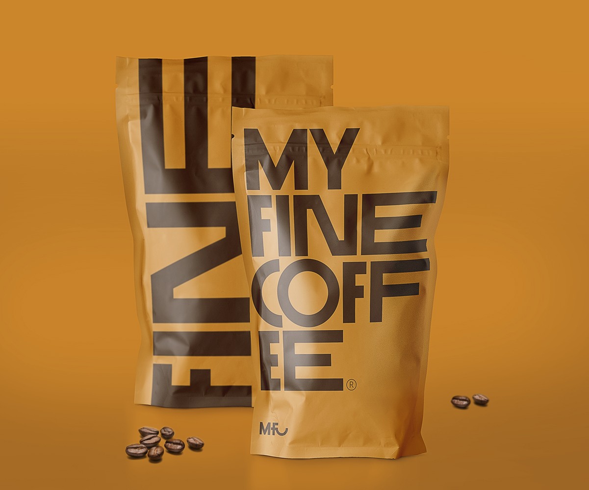
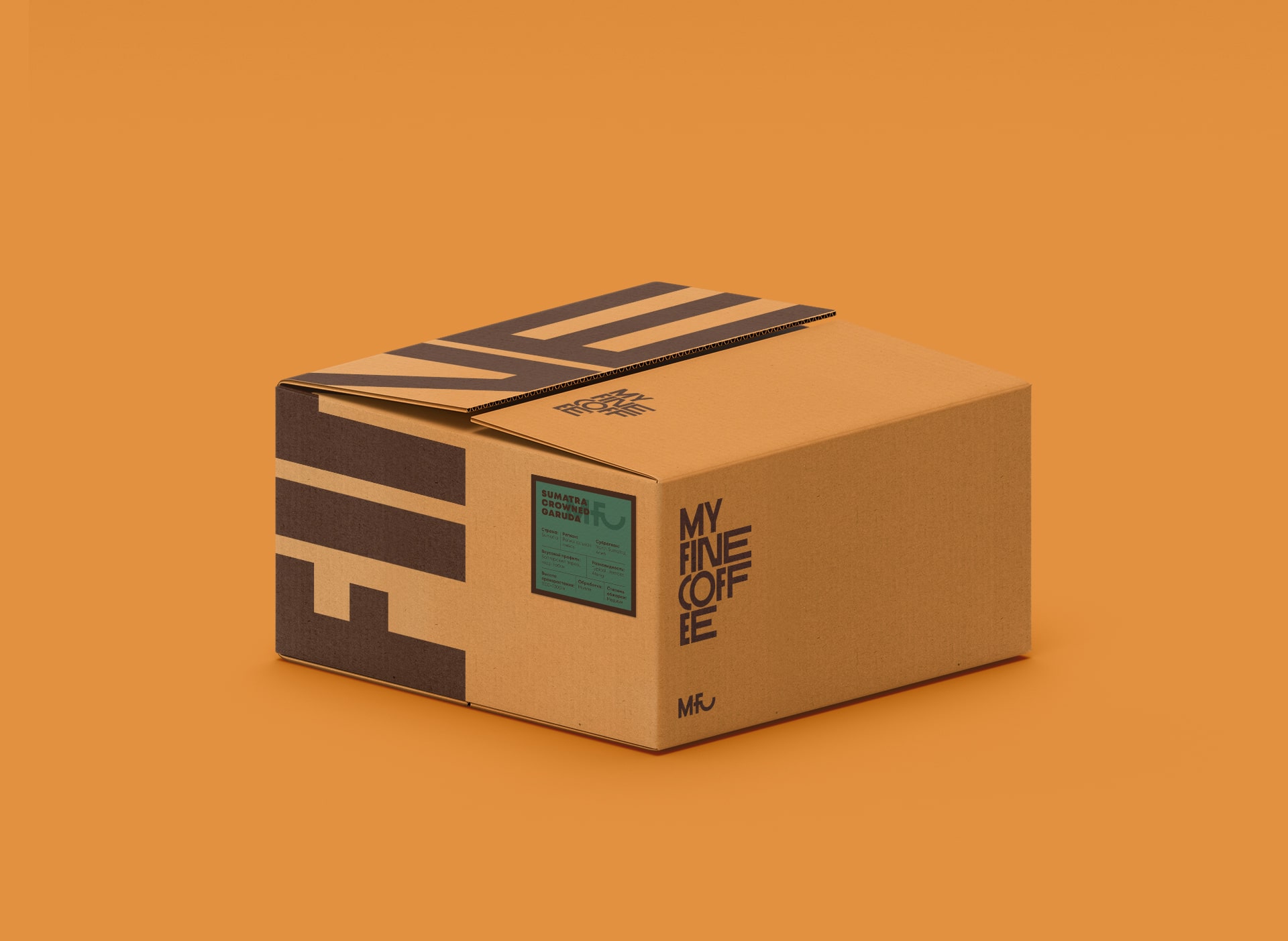
The graphic concept is based on minimalism. The entire area of the front part of the package is occupied by the brand area, which consists of a geometric font logo. The lack of other details makes it easy to understand and easy to remember. The abbreviated version of the logo consists of the abbreviation MFC. In it, the letters form a cup of coffee. The combination of packaging colors depends on the type of product. Only the color of the beans of the New England Roast remains unchanged, chosen as the main one. The absence of a food zone, the use of geometric graphics, minimalism makes the packaging modern. Simple coffee associations make the image easy for a mass audience to perceive.
CREDIT
- Agency/Creative: Red Black Design
- Article Title: Red Black Design Create Packaging for My Fine Coffee Roast
- Organisation/Entity: Agency, Published Commercial Design
- Project Type: Packaging
- Agency/Creative Country: Russia
- Market Region: Europe
- Project Deliverables: Brand Identity, Brand Naming, Branding, Packaging Design, Product Architecture
- Format: Pouch
- Substrate: Pulp Paper


