


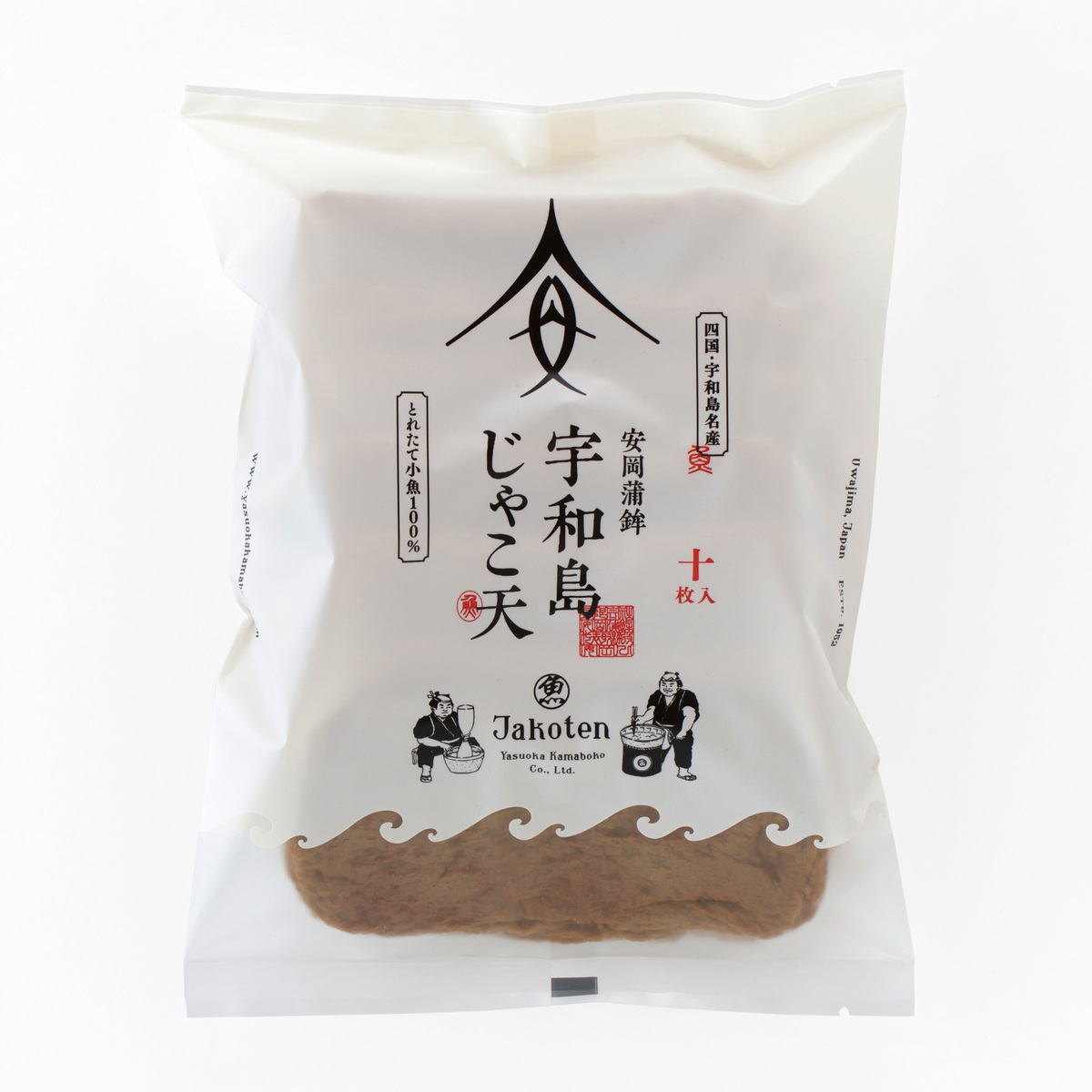
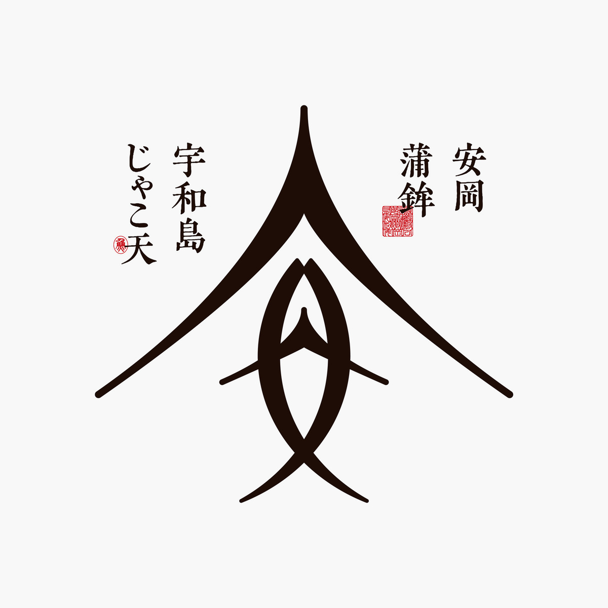
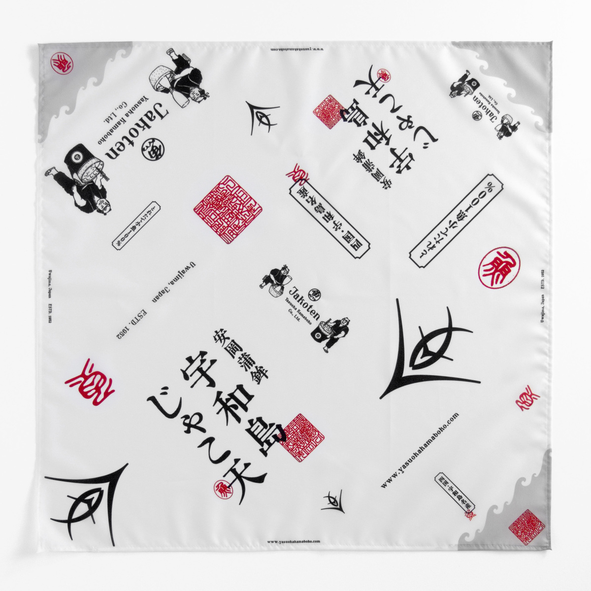
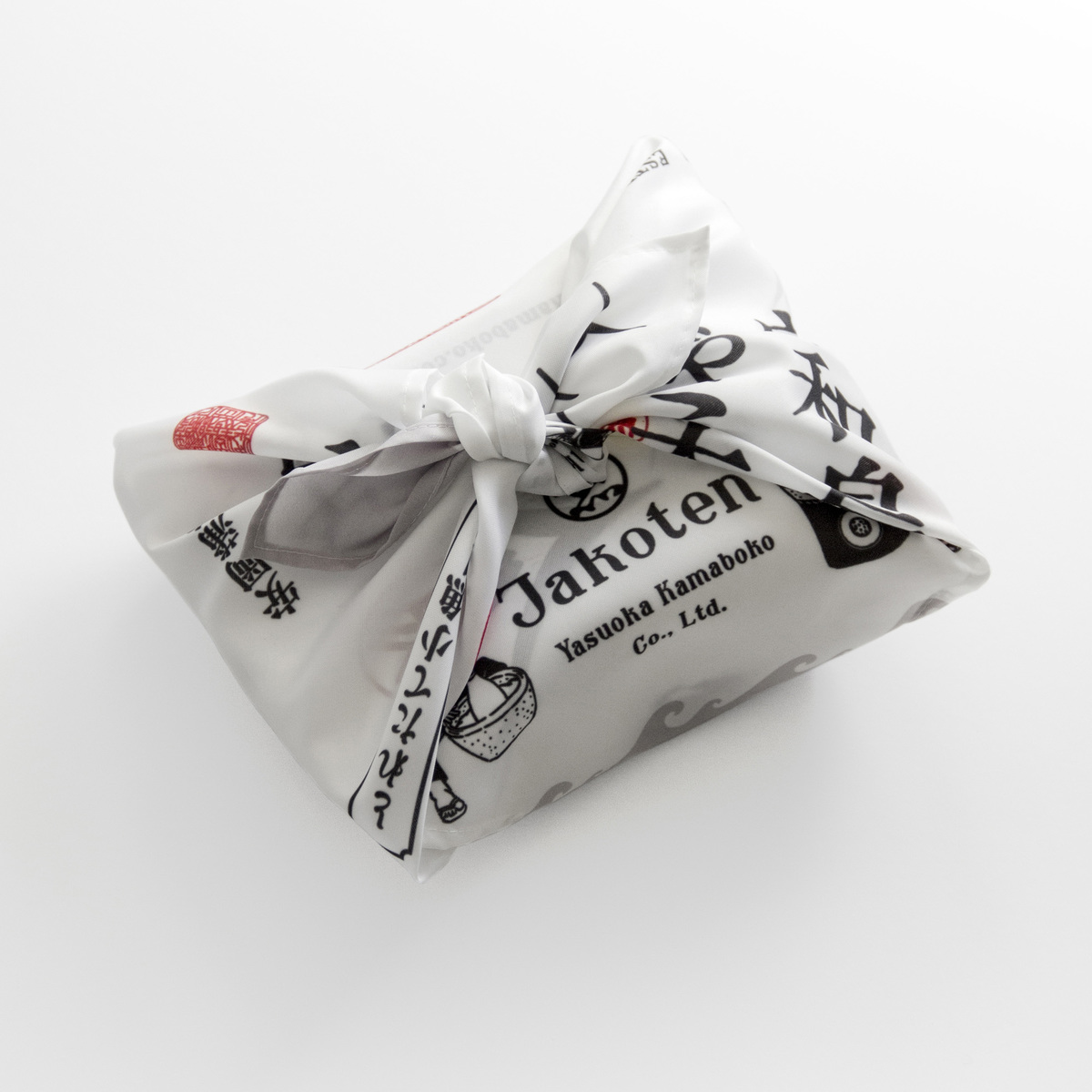
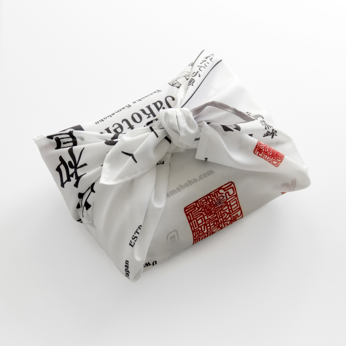
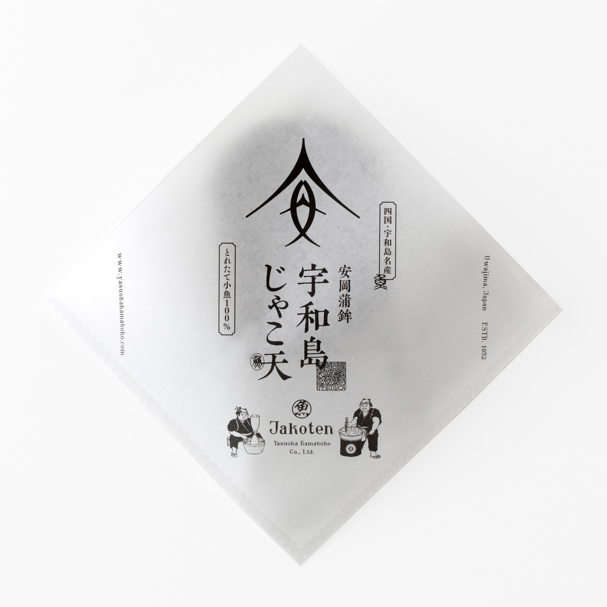
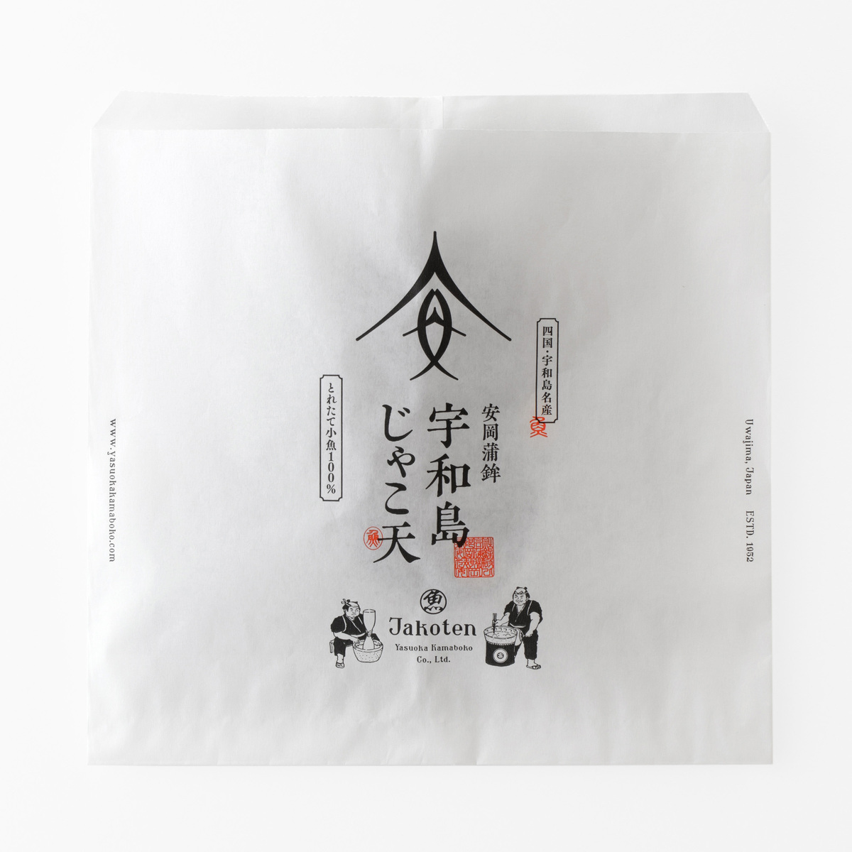
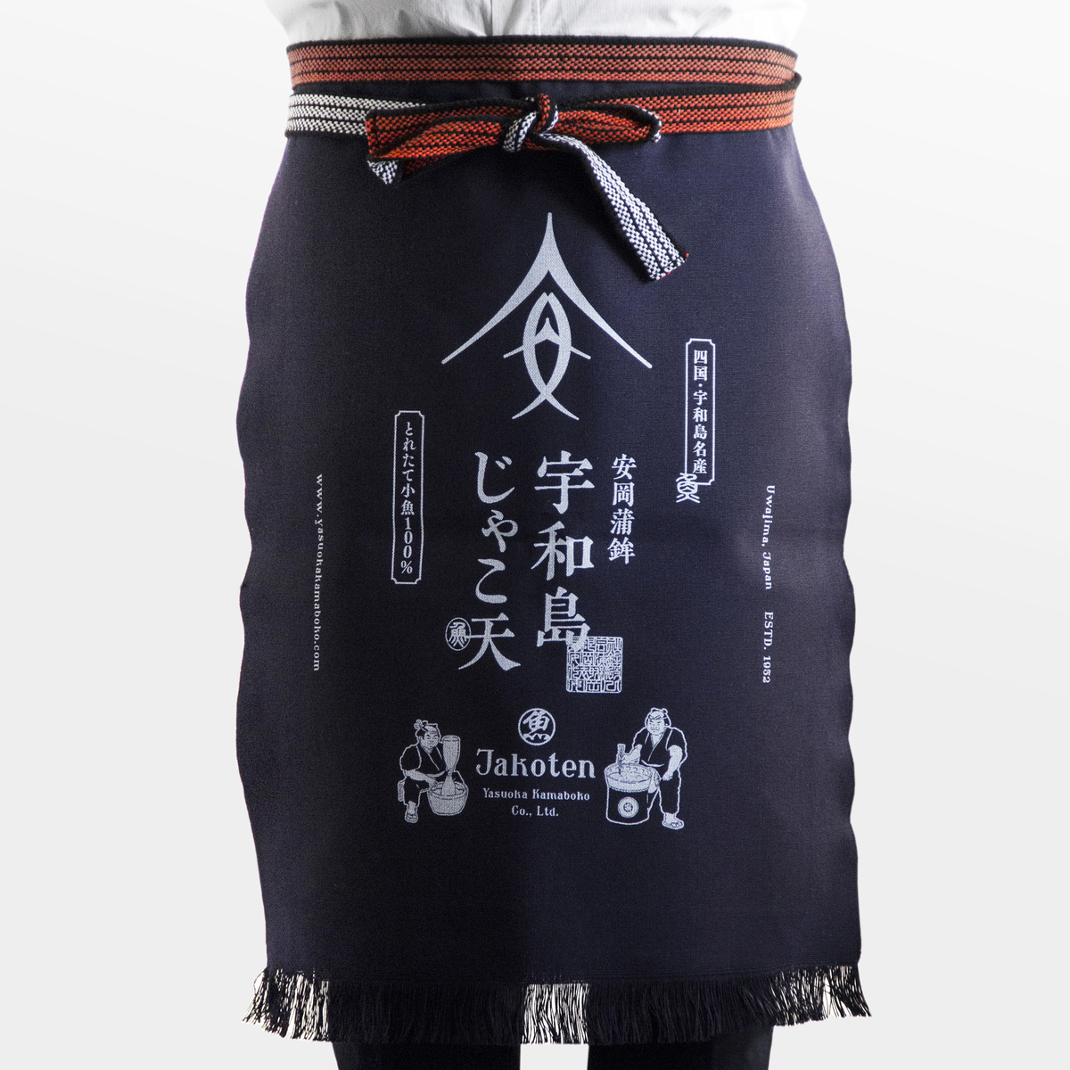
The client, a famous local company, had no established design over its history, and desired rebranding at the time of its 65 years anniversary. The challenges in rebranding were popularization among young people, expansion of overseas business, and demonstration of its long history. Since the first Chinese character of the company name appears to be a fish, the logo was designed to resemble a fish, highlighting the company’s nutritious product using abundant fish. Sharp lines were used for the Japanese family crest-like design. The wave pattern of the lower part of the package represents the fishery product from excellent fishing grounds. Taking into account the company’s long history, rebranding Yasuoka Fishery also included utilization of Japanese traditional culture – wrapping cloths. Rebranding led to bringing in new customers, expanding sales channels, and increasing sales.
CREDIT
- Agency/Creative: Grand Deluxe
- Article Title: Rebranding Yasuoka Fishery with Swordlike Chinese Character
- Organisation/Entity: Agency, Published Commercial Design
- Project Type: Packaging
- Agency/Creative Country: Japan
- Market Region: Asia
- Project Deliverables: Brand Architecture, Brand Creation, Brand Identity, Brand Naming, Brand Redesign, Brand Refinement, Brand Strategy, Brand World, Branding, Graphic Design, Identity System, Packaging Design, Rebranding
- Format: Wrap
- Substrate: Plastic


