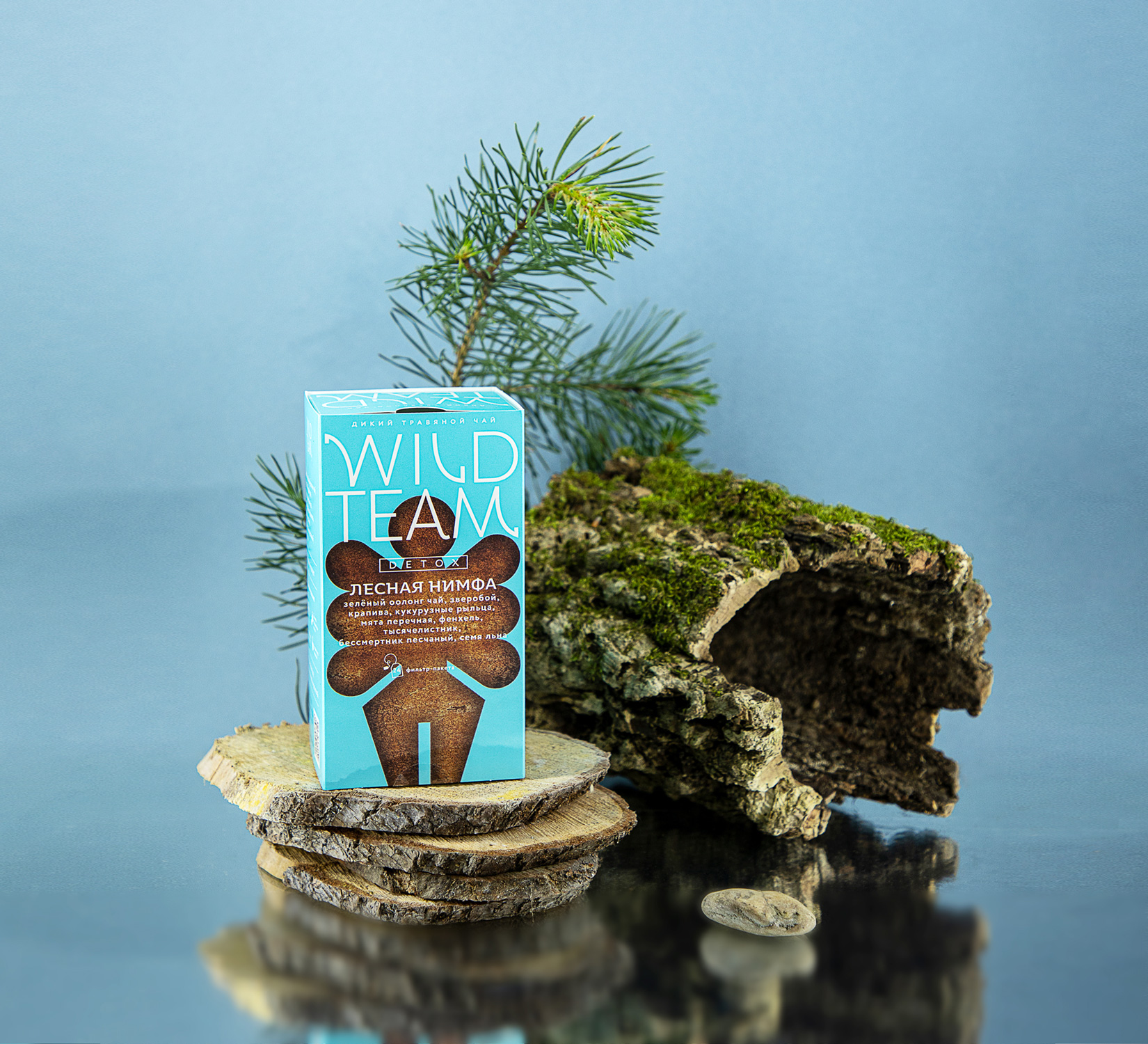
About: The Ohmybrand team has turned an inconspicuous and modest line of herbal teas Fitobar” into a bold and free Wild Team collection — for those who are constantly in search of new discoveries. The idea of making wild plant herbal teas came to the founders of the Fitobar brand not spontaneously. After the successful experience with pharmacy medicinal herbs, the logical decision for a small family company was to go further, into an actively growing retail niche, where more and more local brands are appearing.
However, the tea market turned out to be much more complicated and mostly occupied by Russian and foreign giants. Trying to survive in it, the company faced a number of difficulties, from positioning to communications, and eventually decided on a full restart.
The Ohmybrand team had a complex task — strategy, naming and packaging design. At the same time, it was necessary to propose a concept that would distinguish the brand from competitors and would allow it to produce not only tea under the same brand in the future.
Rethinking the company values and developing the concept of communication, the Ohmybrand team was looking for a new portrait of the ideal customer. Who is this person that chooses natural wild plant tea? What does he miss? How does he spend his free time? So the image of “innovators” was born — bold, curious, brave people who are constantly looking for new experiences and are happy to escape from the stone jungle to the real one, to the forests, fields, mountains or taiga. They like sitting by the fire, drinking tea from a pot and sharing stories.
The founders of the brand are part of this audience themselves. The family often spends time hiking, traveling to unknown places and trying fresh combinations of wild herbs. So, inspired by the new values and image, the client himself proposed the name Wild Team, which eventually united the creators of the brand with their customers.
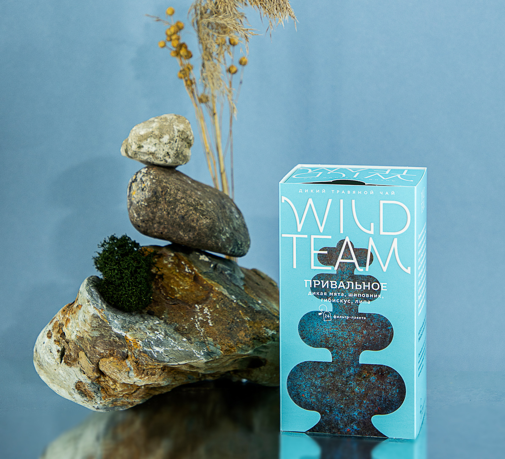
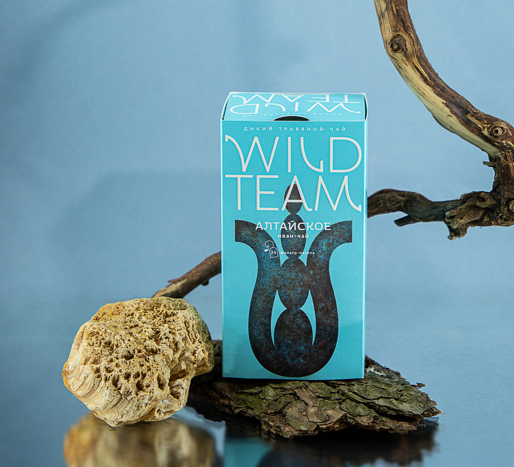
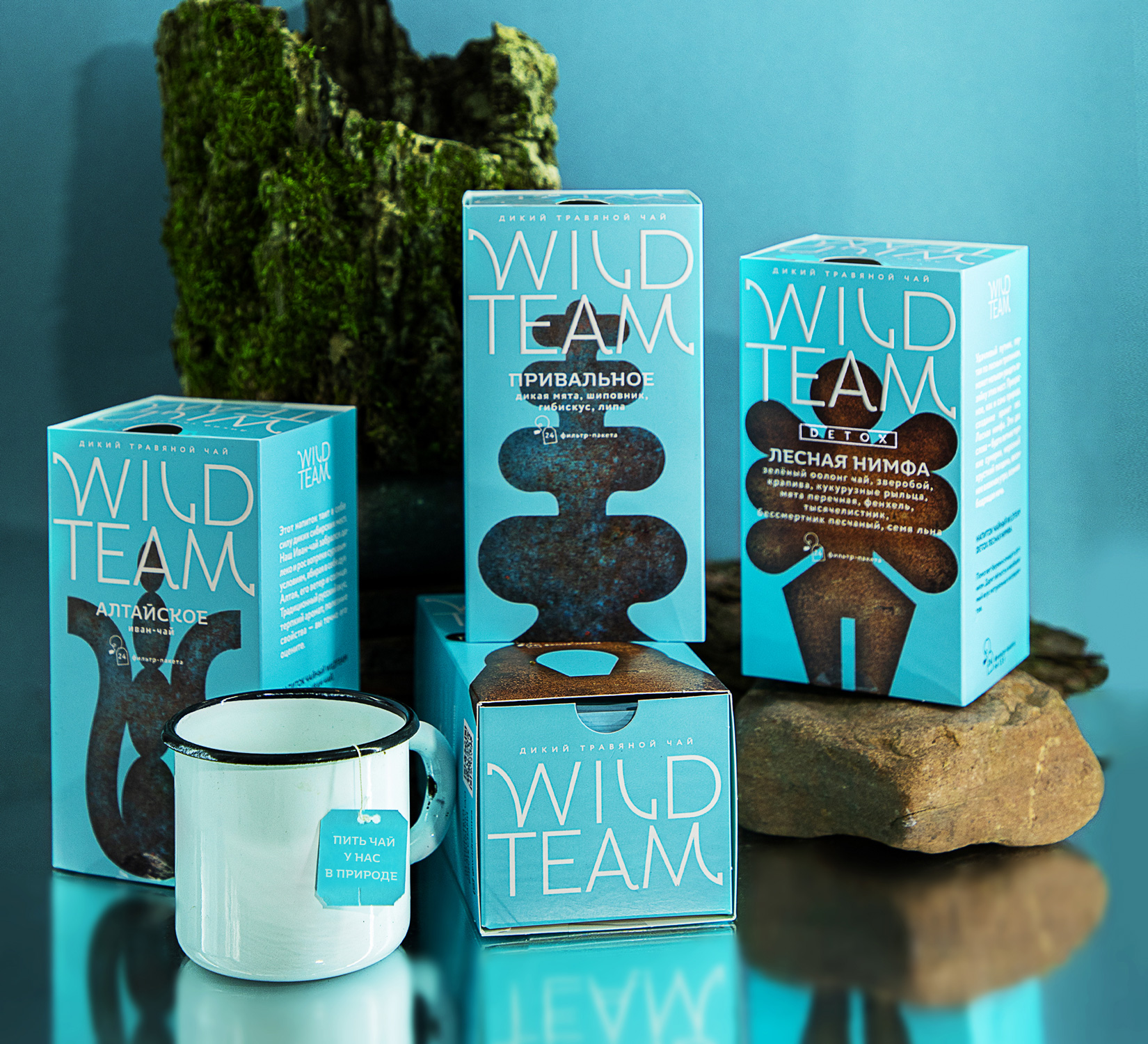
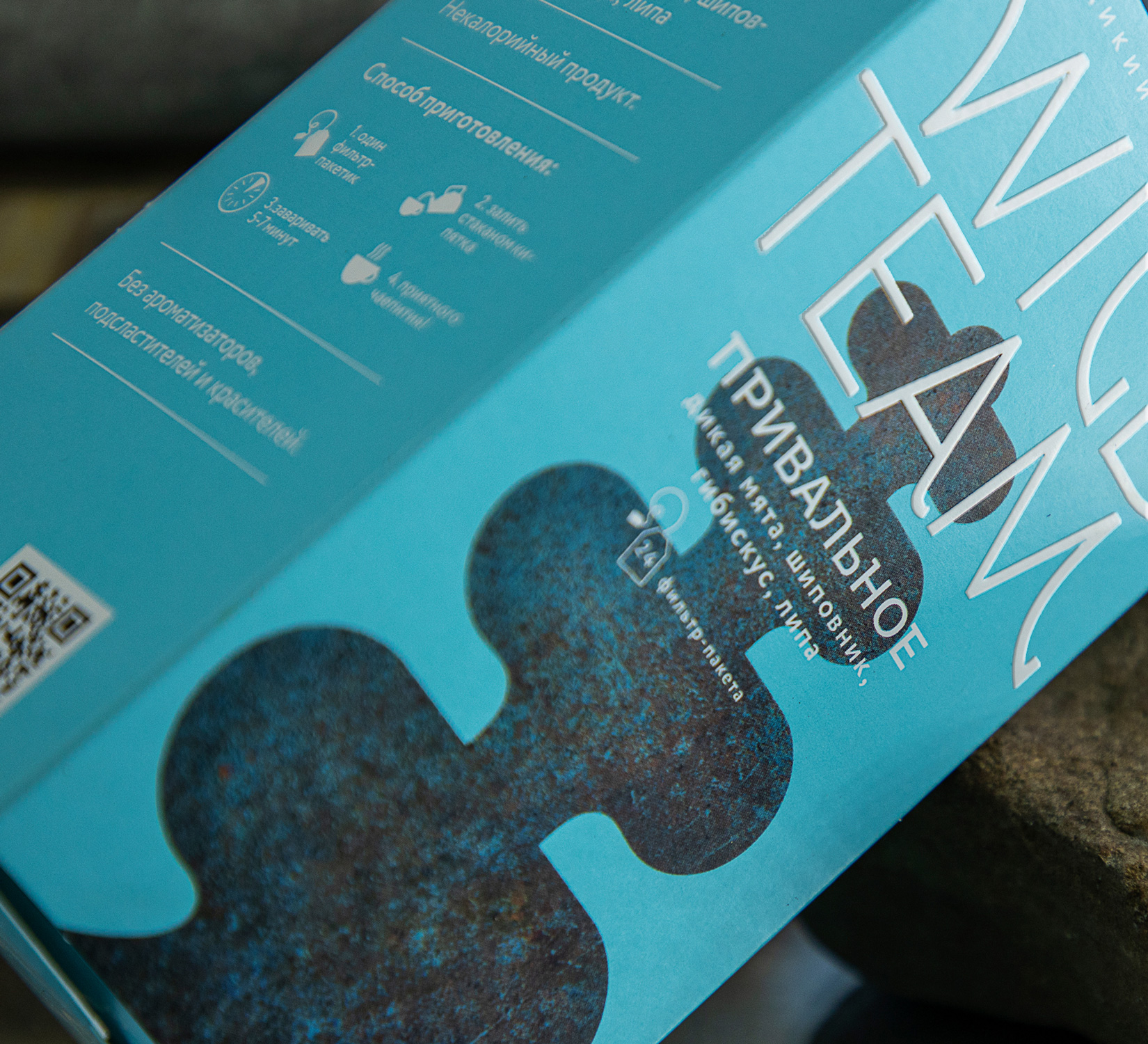
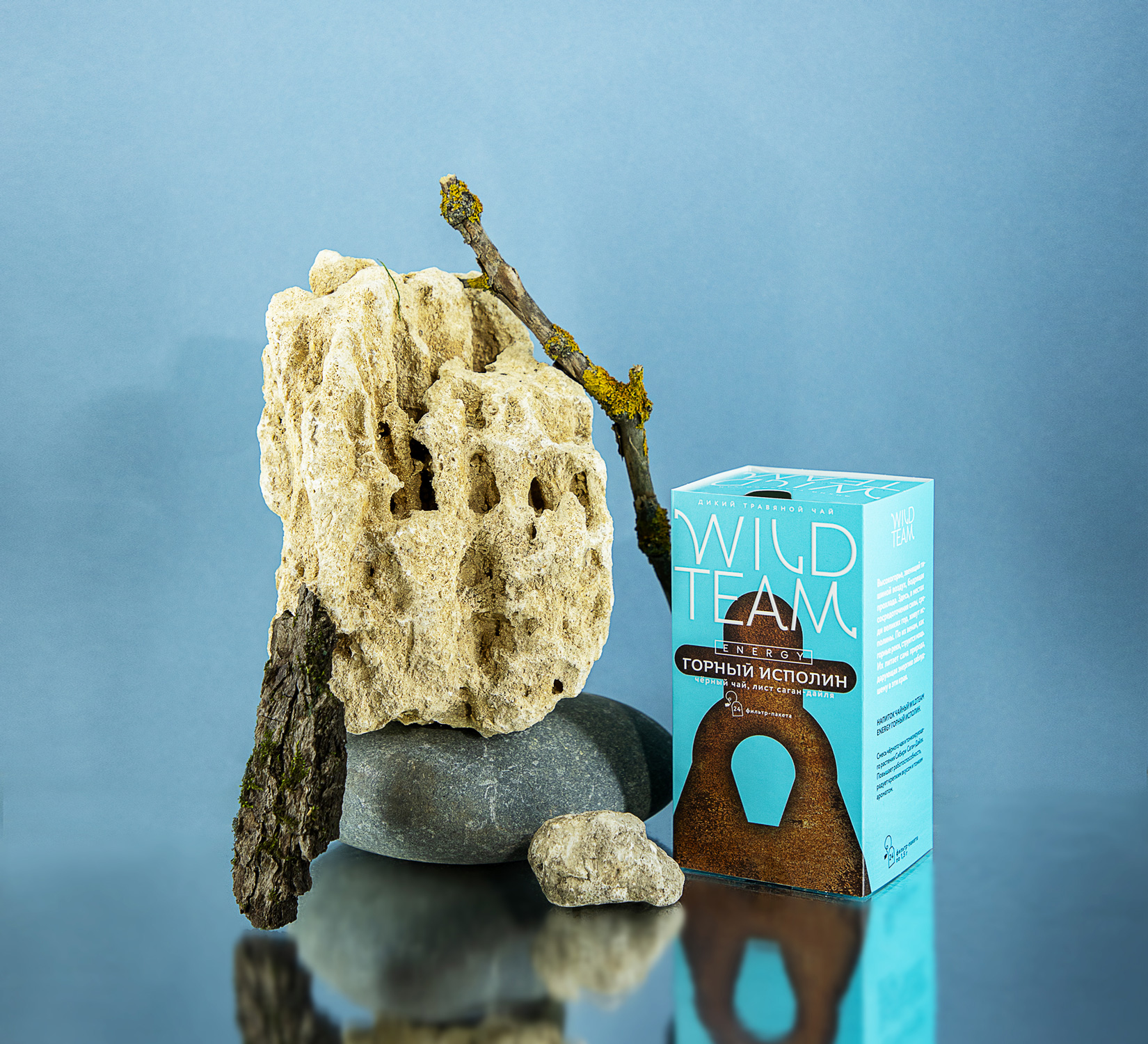
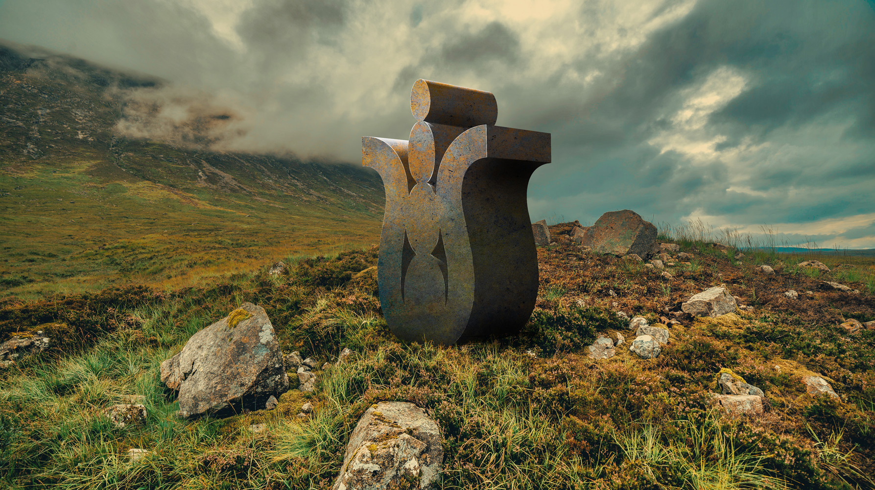
Visual Solution: The stories hidden in each tea mix are an important, even a key part of the brand’s new communication strategy. Places of power, conversations around the campfire and unity with nature refer to ancient legends and symbols that Russia is so rich in. Amulets, dolmens and totems – all this symbolises the desire to go back to the roots that are simple yet powerful and can give you energy and strength. Mysterious and mighty, just like our land, these signs are like wild plants – they keep secrets that can be revealed only to those who know how to read them.
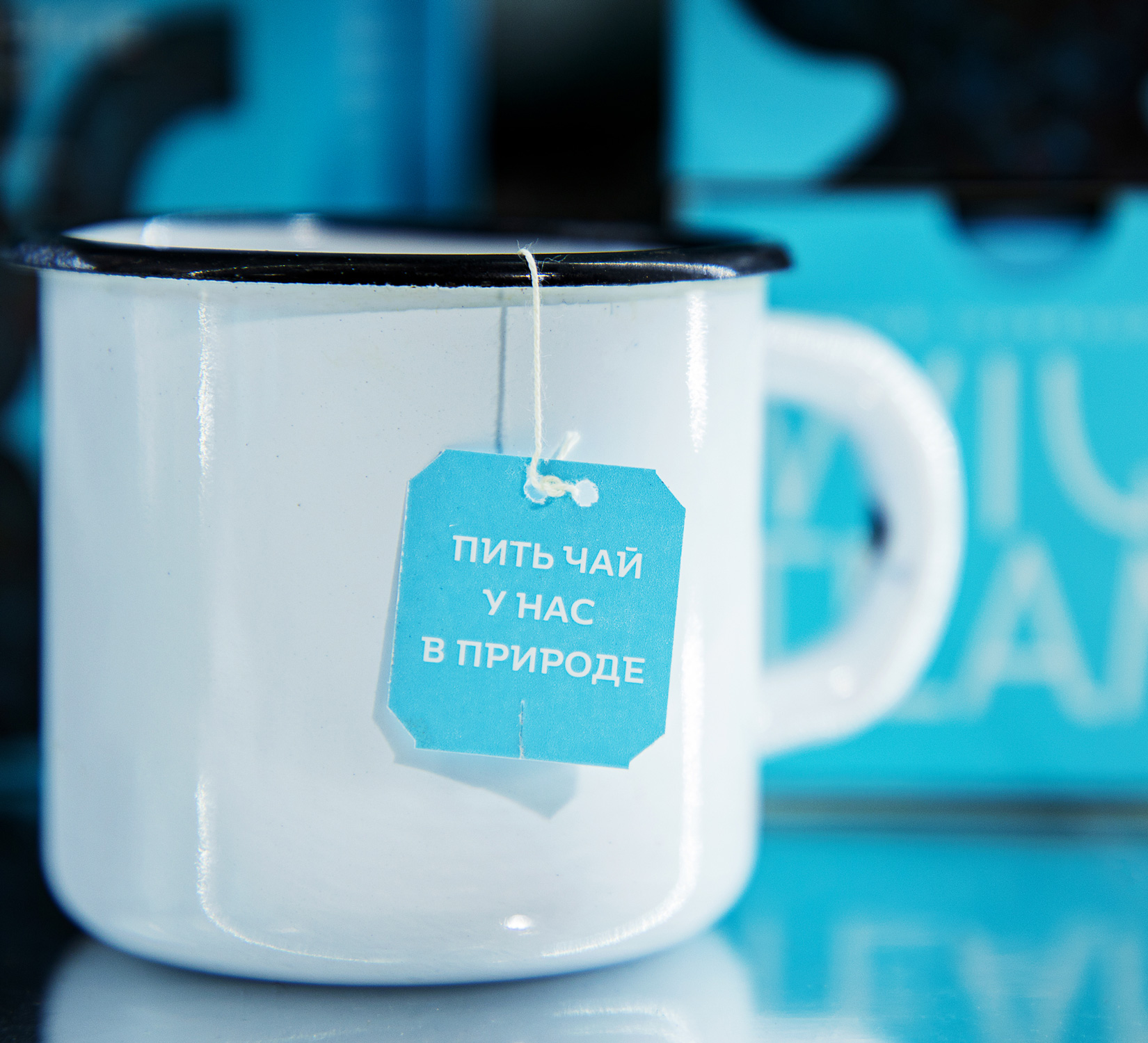
Natural and uncompromising colours of the sky and the soil combined in the design help to preserve associations with nature without exploiting green shades and craft design. At the moment, Wild Team teas are sold through the company’s website, social media and on marketplaces. In addition, negotiations with federal retail chains are underway – with the new positioning the company must be bold in conquering new heights.

CREDIT
- Agency/Creative: Ohmybrand
- Article Title: Rebranding the Wild Team Herbal Teas Designed by Ohmybrand
- Organisation/Entity: Agency
- Project Type: Packaging
- Project Status: Published
- Agency/Creative Country: Russia
- Agency/Creative City: Moscow
- Market Region: Asia, Europe
- Project Deliverables: Packaging Design
- Format: Box
- Substrate: Pulp Paper
- Industry: Food/Beverage
- Keywords: Brands, Health, Strategy, Package
-
Credits:
Creative Director: Nadezhda Parshina
Strategist: Dmitry Komarov
Designer: Valeria Pauli
Project Manager: Anna Tsareva
Wild Team: Ilya Azovtsev


