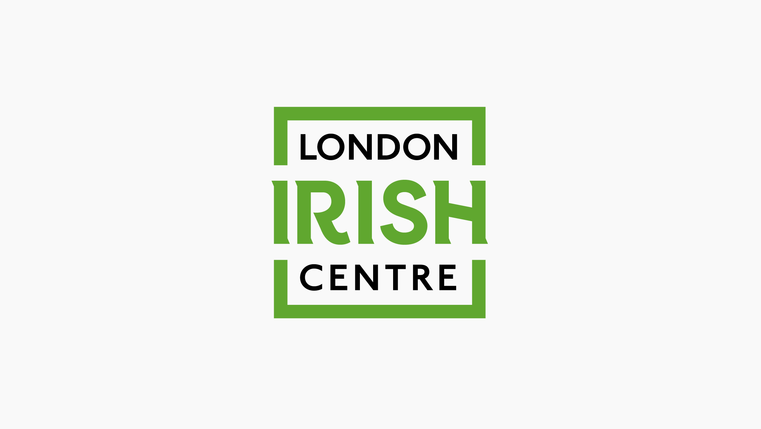
Founded in 1954 the London Irish Centre is the Irish heart of London. Providing care, culture and community to the capital’s Irish population as well as the global Irish diaspora. The centre’s doors have never closed offering the Irish a taste of home, and London’s diverse population a taste of Ireland. Dearness only collaborated with DBLNR, an Irish lifestyle brand to re-strategise and re-brand the centre with a focus on heritage, legacy and meaning.
Brand strategy – ‘Meitheal’‘Meitheal’ an Irish word meaning ‘neighbours helping one another’ became the guiding light of the strategy and resulting design.
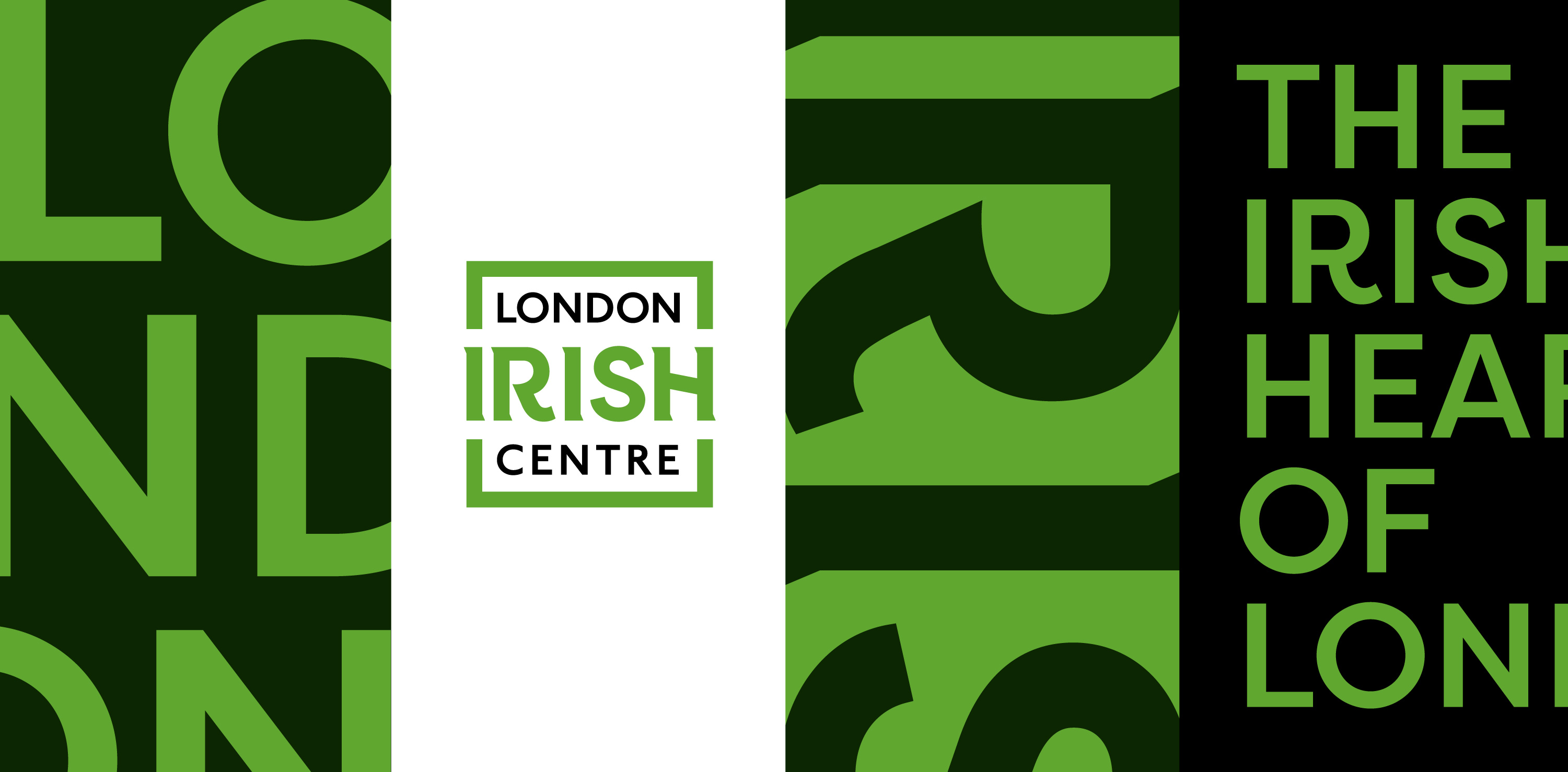
Brand design – An open window: The LIC wanted to retain some elements of the old identity, namely the square shape. The previous logo featured a closed black square which we began working the ideas of ‘Meitheal’ into. Futhermore, the typography lacked any discernible character, it was agreed that we needed to bring some much needed ‘Irish heart’ to it.
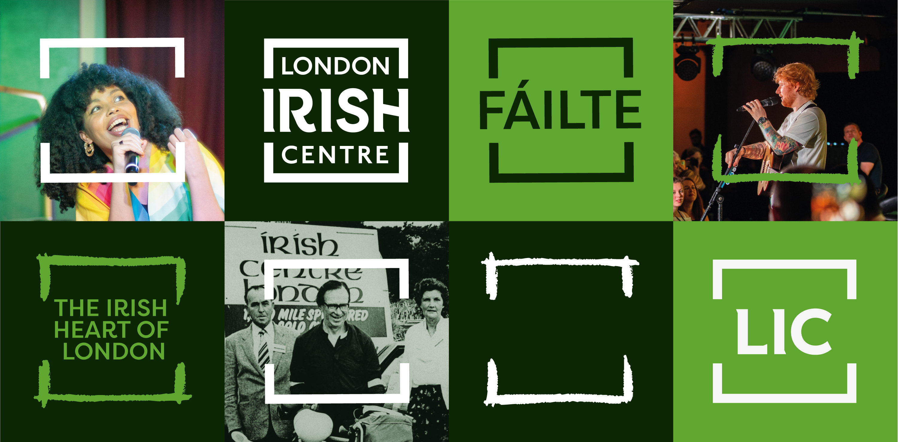
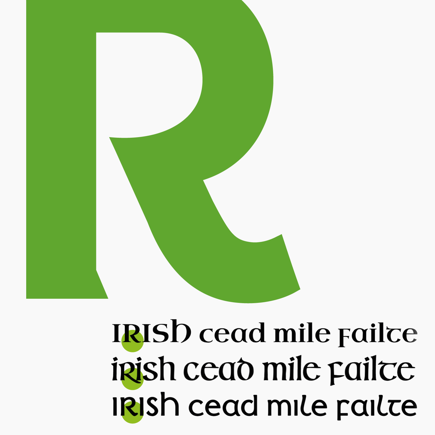
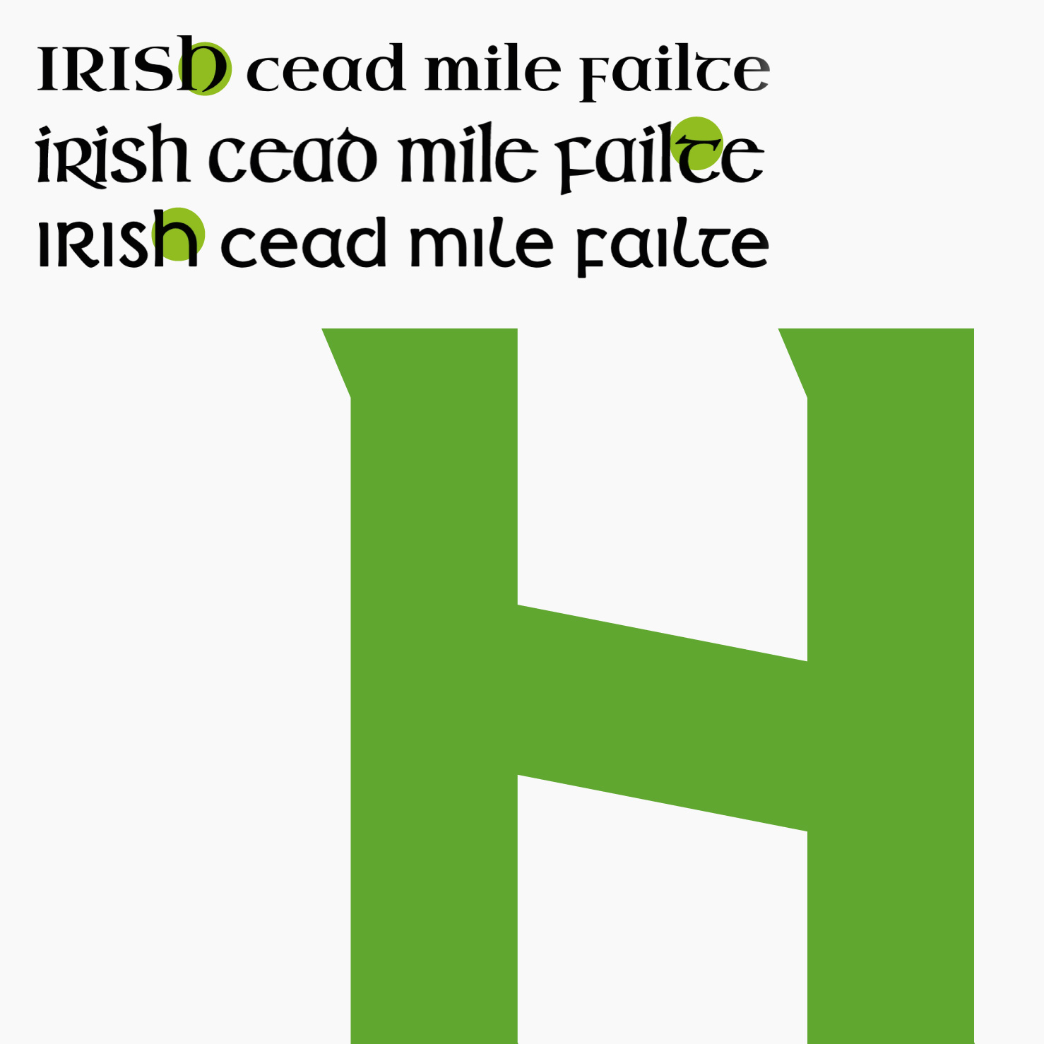
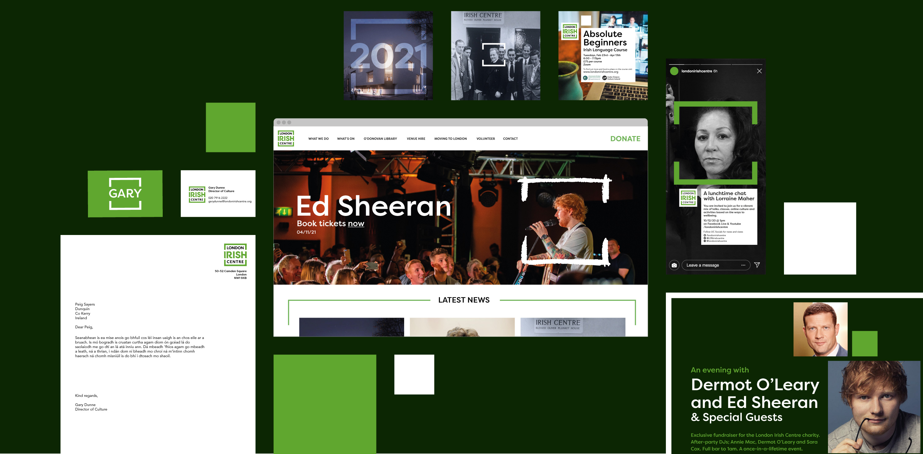
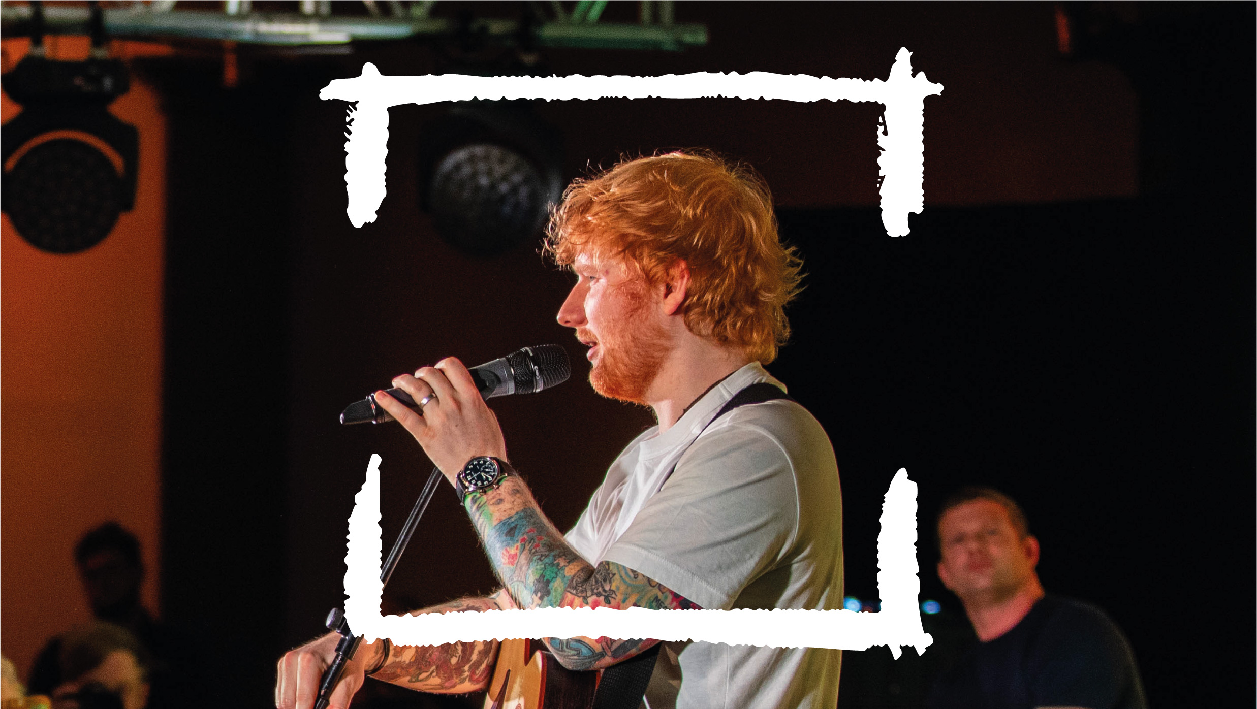
The logo became an always open window, kept open by the Irish at its heart – integral to the mark. Special attention was given to typography within the logo with ancient Irish typography inspiring a bold and modern ‘Irish’ word mark. London is of course represented by the immortal typography seen on the city’s tube network. The new logo has given rise to a brand world of open windows offering glimpses into the care, culture and community on offer at the centre. The branded window asset takes on varying colours and executions allowing it to respond to the content it interacts with. Windows align which each other or stand alone to represent to diversity and unity within the Irish community worldwide.
The London Irish Centre finally has a rich and useful brand that has an idea flowing from the logo all the way through the brand. Launched on St Patrick’s Day 2021 the new branding will hopefully go on to become a highly recognisable entity among the global Irish diaspora and a source of pride.
CREDIT
- Agency/Creative: Dearness only.
- Article Title: Rebranding the Irish Heart of London Created by Dearness Only
- Organisation/Entity: Agency, Published Commercial Design
- Project Type: Identity
- Agency/Creative Country: United Kingdom
- Market Region: Europe
- Project Deliverables: Brand Advertising, Brand Creation, Brand Design, Brand Guidelines, Brand Identity, Brand Redesign, Brand Refinement, Brand Rejuvenation, Brand Strategy, Brand World, Branding, Graphic Design, Identity System, Rebranding, Research, Tone of Voice
- Industry: Non-Profit
- Keywords: Irish, Irish charity, rebranding, typographic design, logo design, brand strategy, brand world, London, bespoke typography


