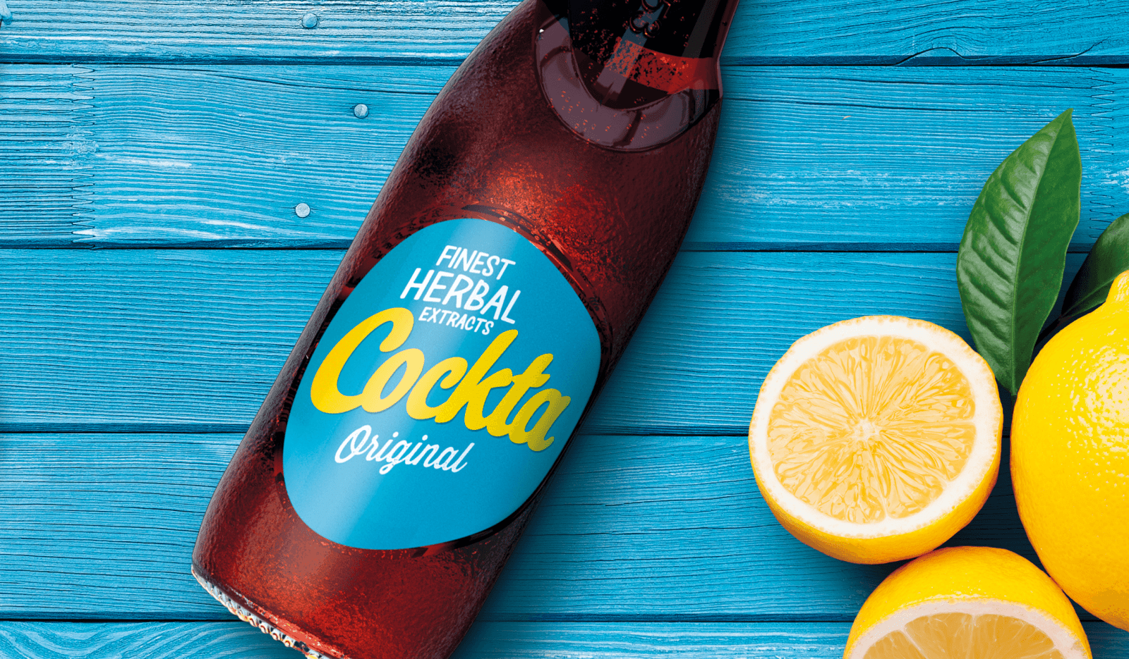
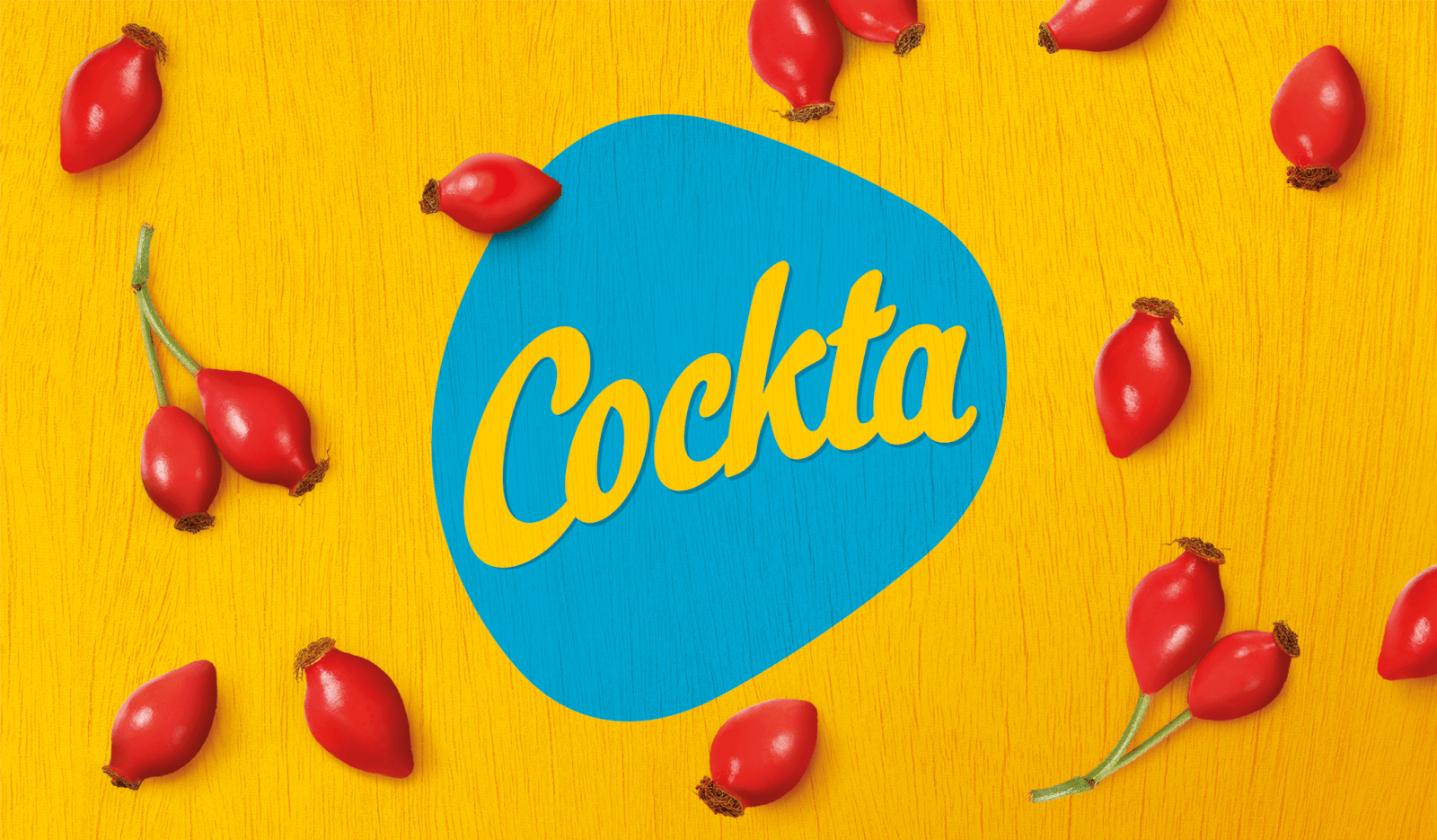
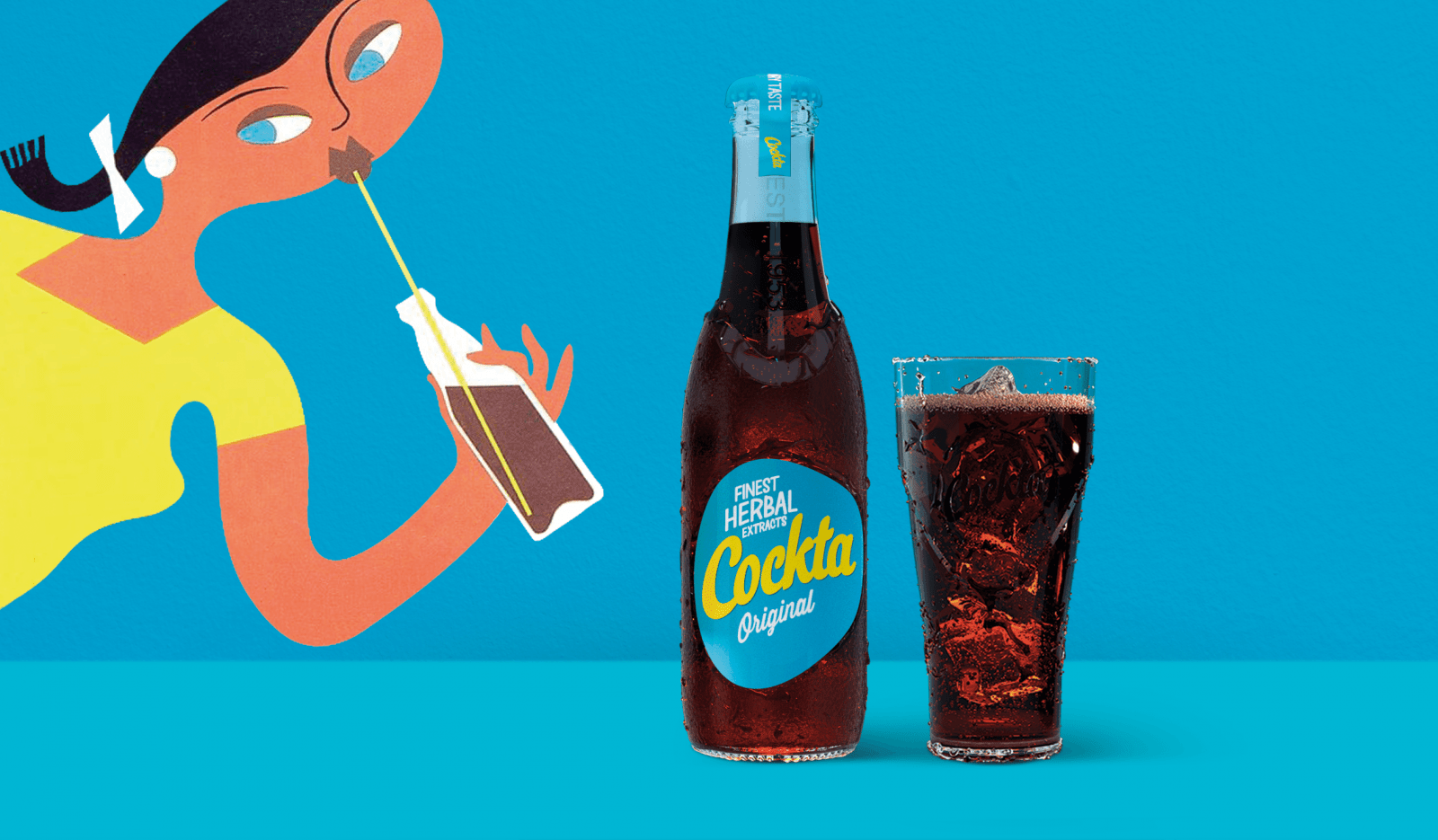
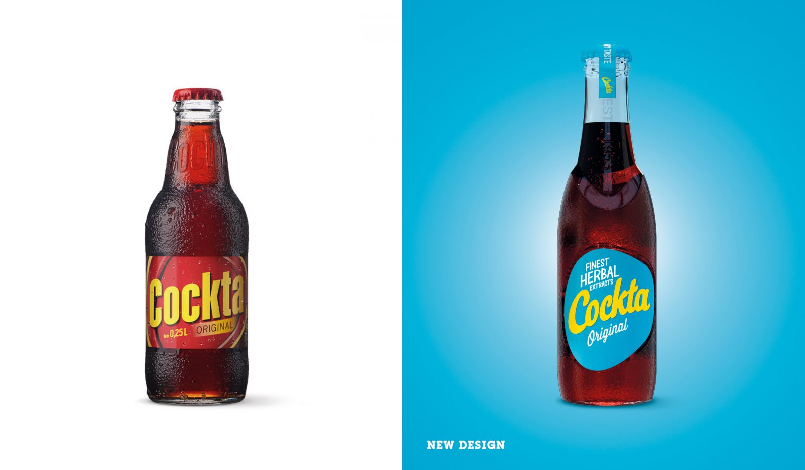
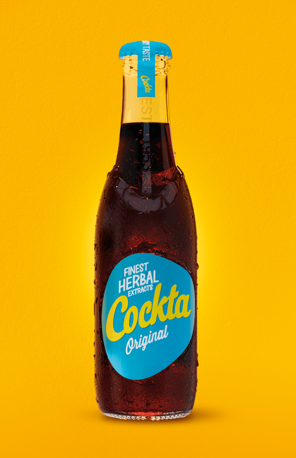
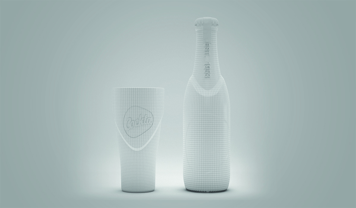
Cockta is an icon beverage of the Balkan’s lifestyle born in the 50s. During the past years, its uniqueness has been diluted with cola’s category cues and our new design aims to be a tribute to the original Cockta. Based on a new brand positioning “Positively different” we capitalise on the recipe and its rose hip taste to create the new bottle and graphic designs. The label and brand block, shaped as a rose hip fruit, give life to our blend, while graphically the combination of the new brand logo and color coding mark the tribute to its original design.
CREDIT
- Agency/Creative: Pointbleu Design
- Article Title: Rebranding Project for “Cockta” One of the Most Famous Drink in the Balkans
- Organisation/Entity: Agency, Published Commercial Design
- Project Type: Packaging
- Agency/Creative Country: Spain
- Market Region: Europe
- Project Deliverables: Brand Identity, Brand Redesign, Brand Rejuvenation, Brand Strategy, Branding, Industrial Design, Packaging Design, Rebranding, Research, Tone of Voice
- Format: Bottle
- Substrate: Glass Bottle
FEEDBACK
Relevance: Solution/idea in relation to brand, product or service
Implementation: Attention, detailing and finishing of final solution
Presentation: Text, visualisation and quality of the presentation


