


BRANDING STUDIO DEZA – VITALAD
Task
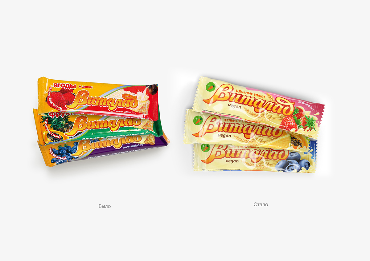
Update a series of packaging bars “Vitalad” company “Linfas” — a product in the low-price segment, which consumers know and love for the taste and quality. The product has existed on the market for a long time and looked on the shelf is not so modern. Therefore, we had a visual upgrade with the retention of recognition for the audience: students, adults, who take care about health, and grandparents buying for grandchildren healthy sweets. Also, the product had to keep its position and price.
Decision
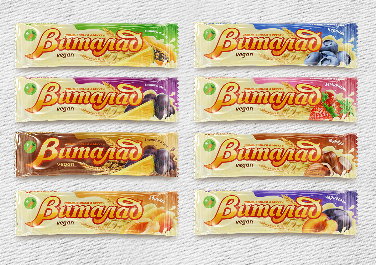
We started from the existing packaging design, but tried to modernize it, make it more clear, concise and at the same time expressive. We paid special attention to the food zone and tried to make it as attractive and natural as possible.
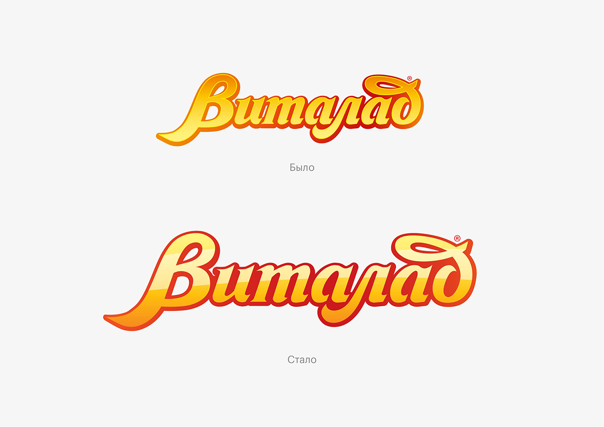
In General, the graphics became more gentle and “fluid”, and the font for writing the designation of taste – soft and restrained. The left part of the packaging area is also responsible for the color of the glaze (white or chocolate), but now the diagonal in the center of the package has become smoother, wavy to emphasize the structure of the glaze. We also updated the logo, making the stroke brighter and putting on the letters layers of shadow, due to which it began to look clear and voluminous.
CREDIT
- Agency/Creative: BRANDING STUDIO DEZA
- Article Title: Rebranding Packaging of Bars “Vitalad”
- Organisation/Entity: Agency, Published Commercial Design
- Project Type: Packaging
- Agency/Creative Country: Russia
- Market Region: Europe
- Format: Sleeve
- Substrate: Plastic


