


The rebranding for the construction company SK-71 began with the fact that we threw out everything related to the previous identity. The logo was so weak that it doesn’t even need to be mentioned. We received a full carte blanche from our client and started looking for a form.
At first it seemed that the name was very complicated. It is completely abstract and consists of different symbols. The name seemed ugly.
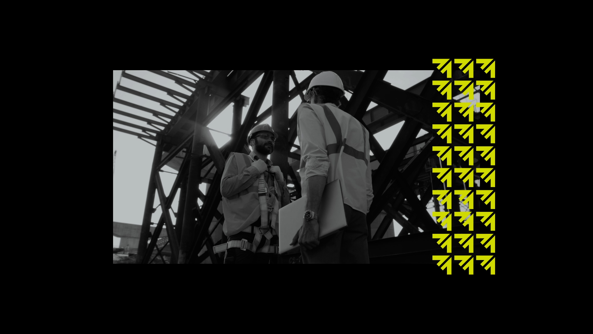
But then, studying construction sites, communicating with builders and photographing their surroundings, we realized that construction is not about traditional beauty.
There is a special aesthetics in construction. It differs from the generally accepted one. This is about large forms. This is about the noble dirt on the hands. It’s about striving for a better world. Builders are alien to decor. These are honest people.
We sat down to research again and decided to abandon all decorative techniques. We have moved away from visual metaphors, from unnecessary decor and completely focused on the typography of the sign. We went through more than a hundred solutions in search of the optimal one. The one that fully corresponded to the mood of the construction site.
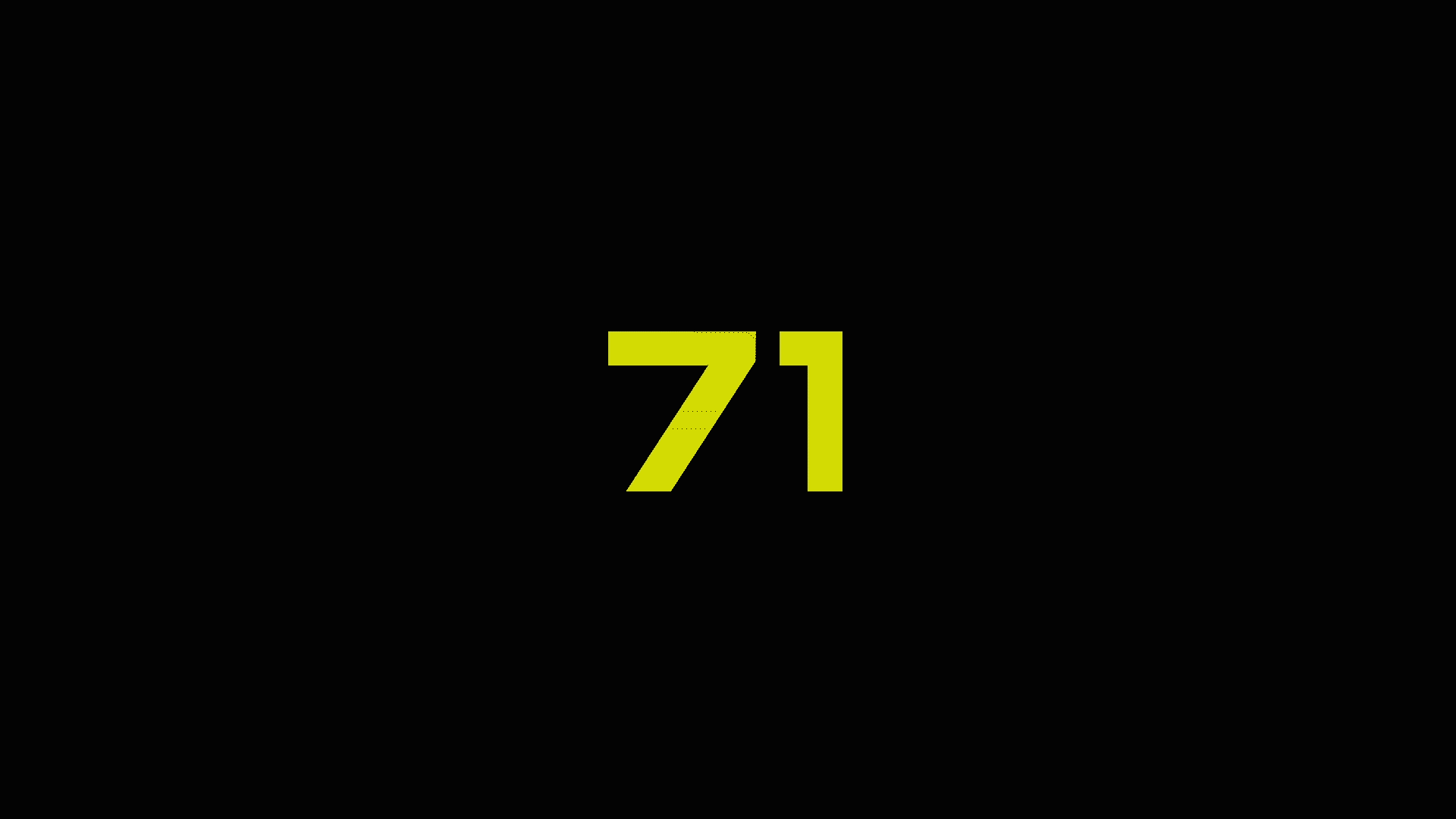
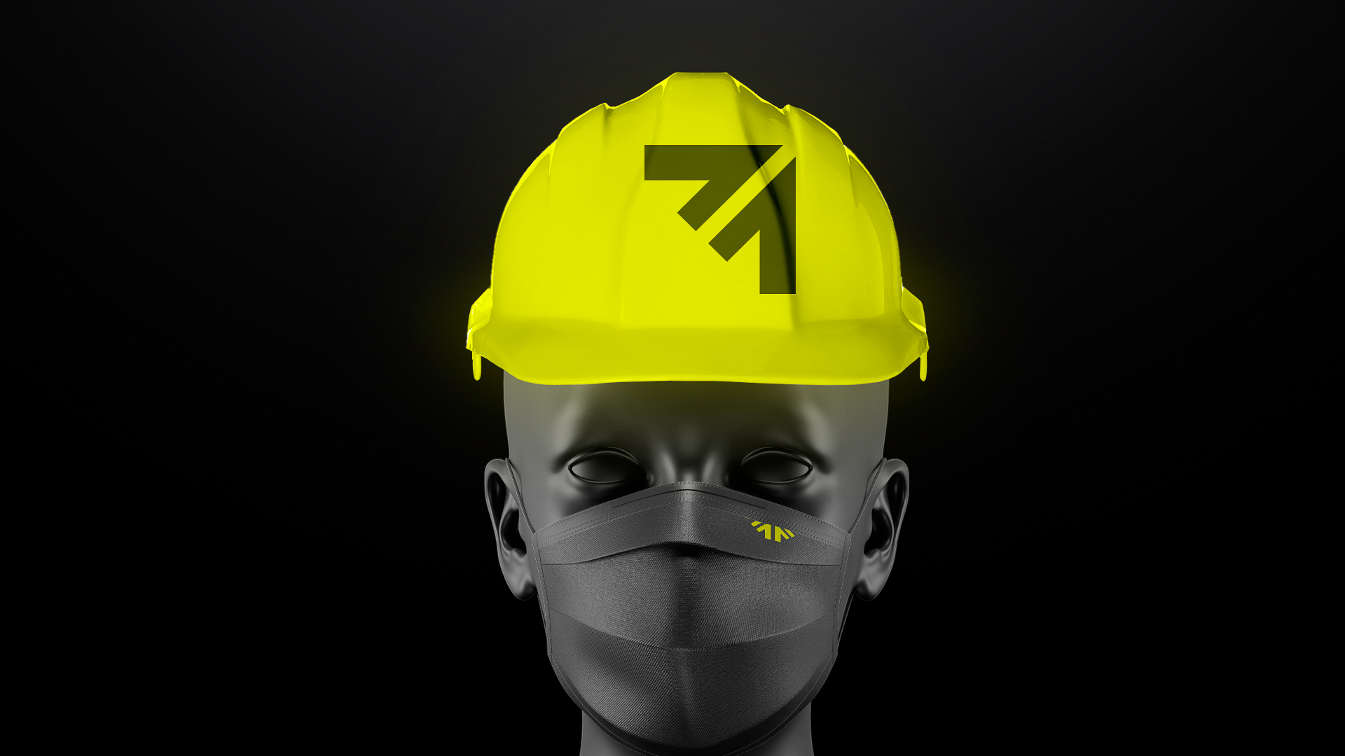
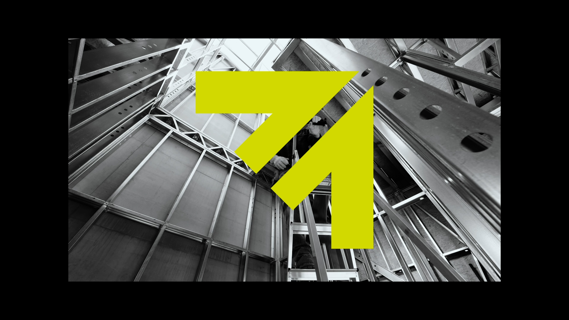
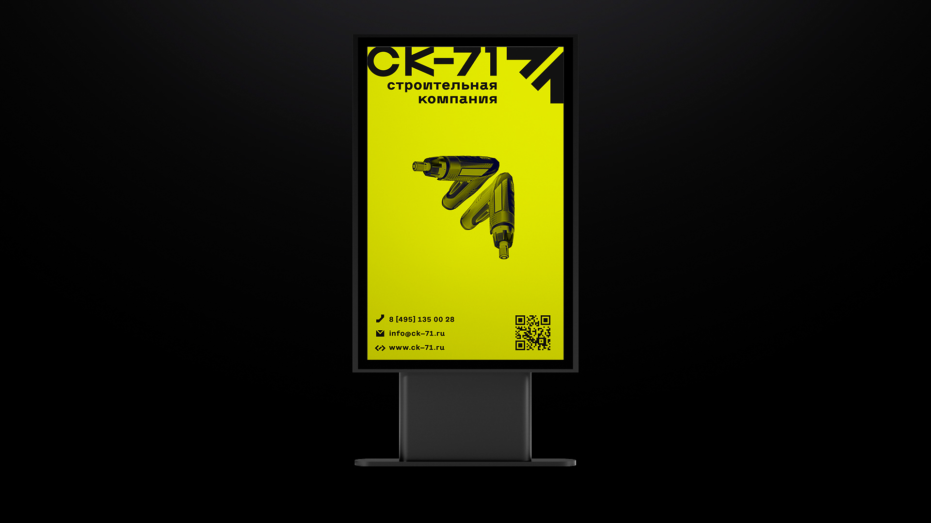
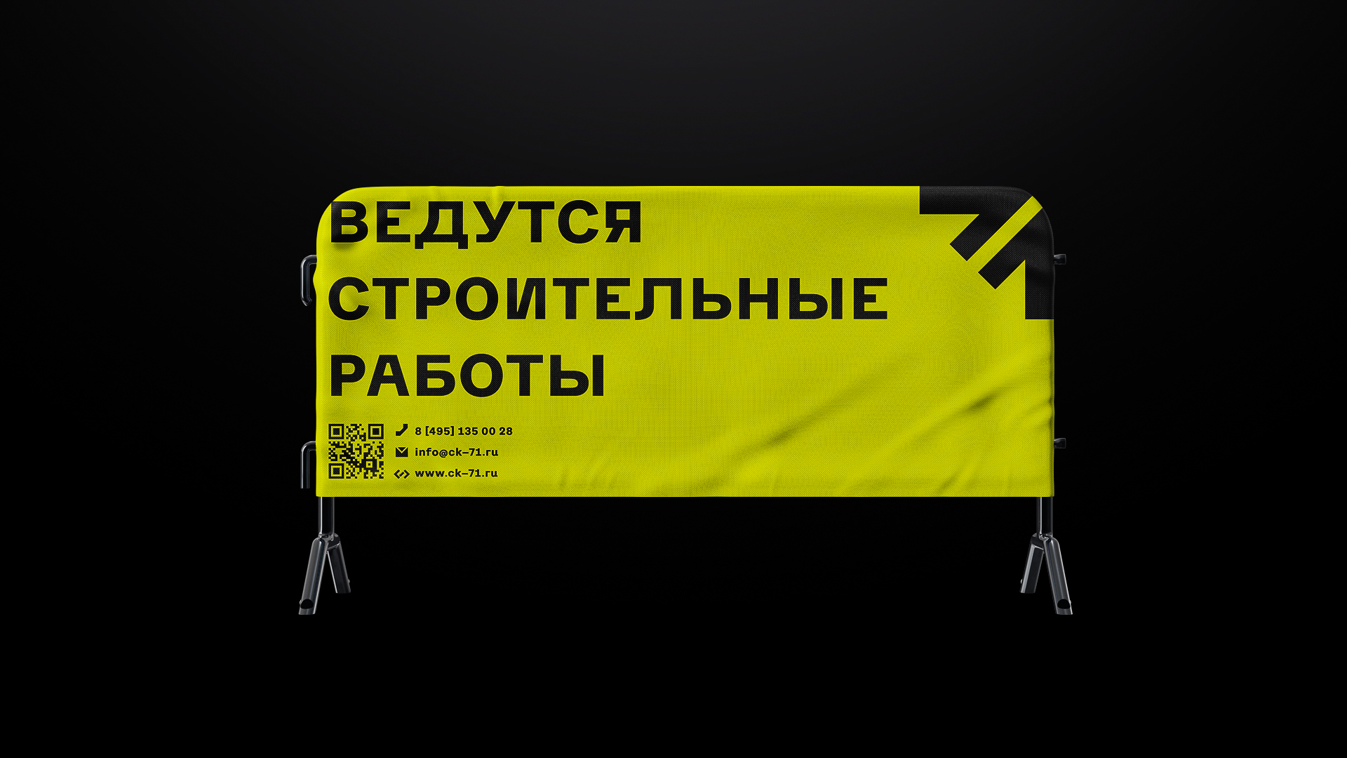
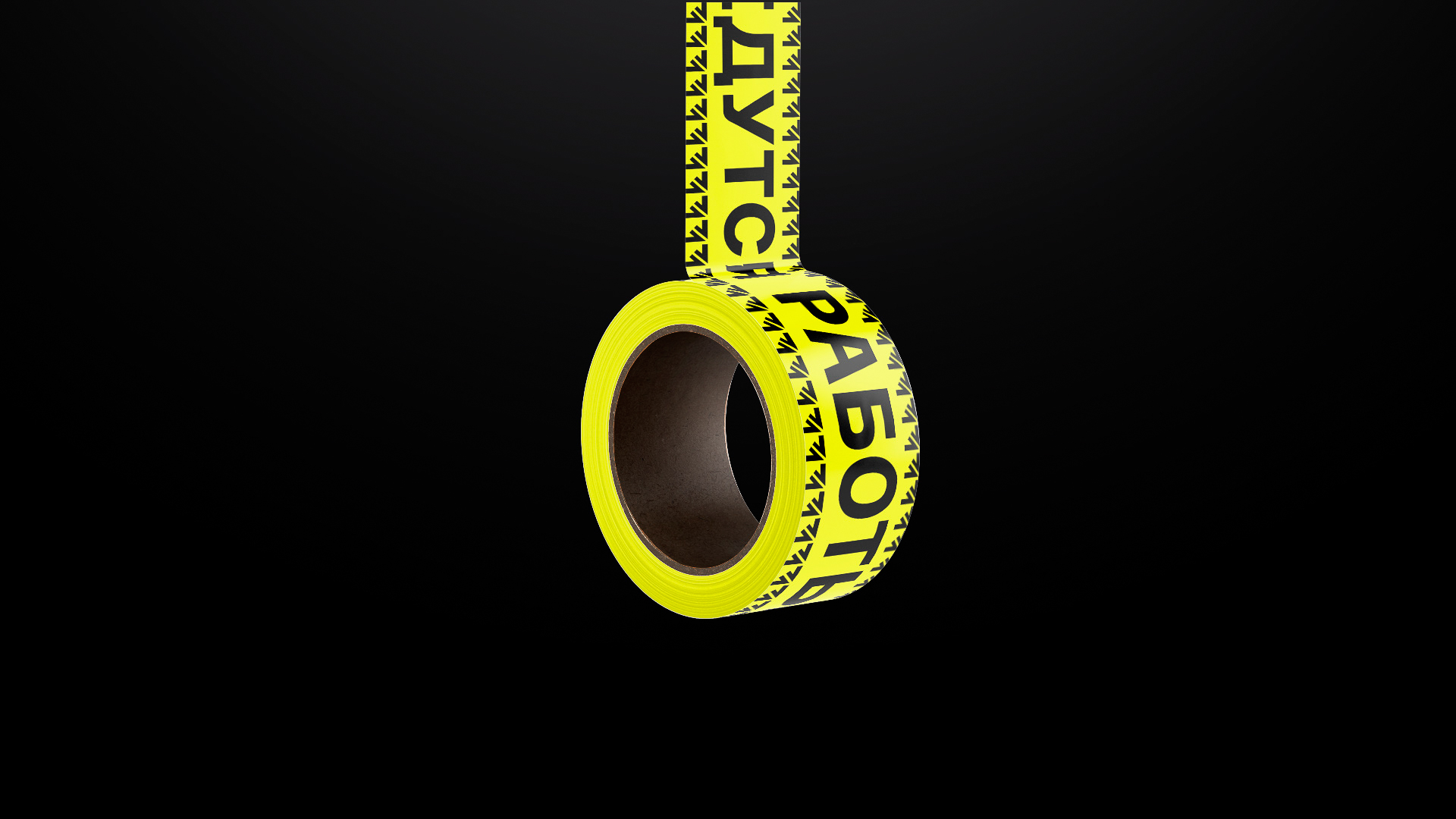
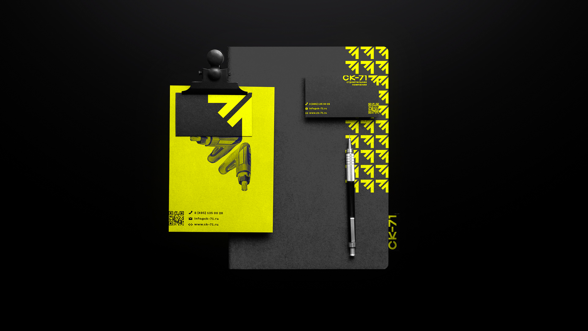
Construction is functional. The corporate identity was supposed to be the same – honest, brutal, clear. We found a very simple but strong form – an arrow pointing upwards to the right. The arrow is a stylized inscription “71”. Its symbolic content is the desire for growth, change, progress.
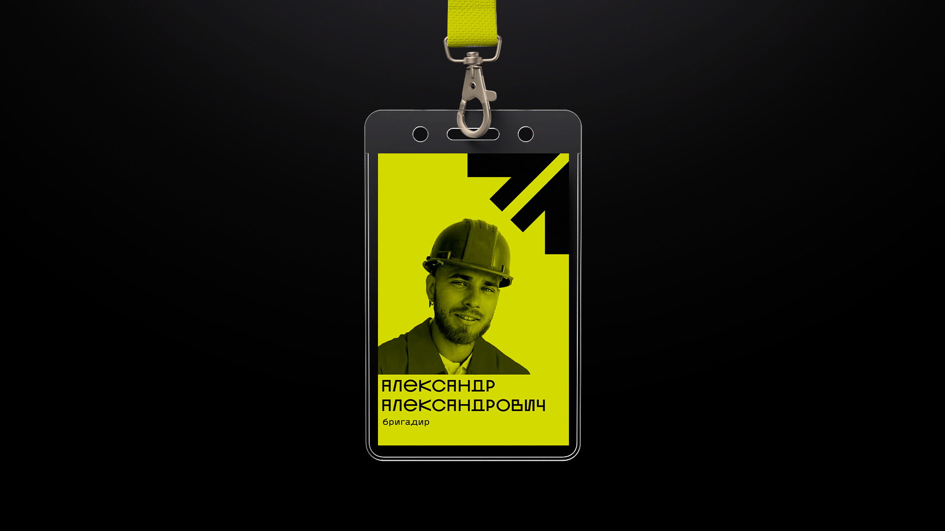
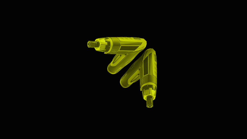
This strong form has gathered all the visual part around it. We added the color of the workers’ vests, diluted with brutal typography and powerful patterns – this is how the SK-71 style was created.
Such a stylistic solution made it possible to make the style universal: application in one paint on any medium is very convenient. We have created a large list of materials that the customer can easily use today: uniforms for employees, company badges, documents, car decor, company posters and souvenirs for partners.
In addition, we understand that a modern company is impossible without a well-thought-out visual strategy on social networks. That is why we have developed a feed design for Instagram and Facebook. Additionally, we have prepared templates, using which our client will be able to continue the ribbon in the corporate style.
Today we continue to accompany the SK-71. We are developing social networks. We develop a website and advise SK-71 on advertising issues.
CREDIT
- Agency/Creative: Pronin Studio
- Article Title: Rebranding of the Construction Company SK-71 by Pronin Studio
- Organisation/Entity: Freelance, Published Commercial Design
- Project Type: Identity
- Project Status: Published
- Agency/Creative Country: Russia
- Market Region: Europe
- Project Deliverables: Brand Design, Brand Identity, Brand Redesign, Brand Strategy, Branding, Graphic Design, Rebranding, Tone of Voice
- Industry: Construction
- Keywords: #logo #logotype #brand #branding #design #moove #animation #construction #building #builder #development #дизайн #бренд #брендинг #лого #логотип #строительство #строитель #rebranding #ребрендинг


