


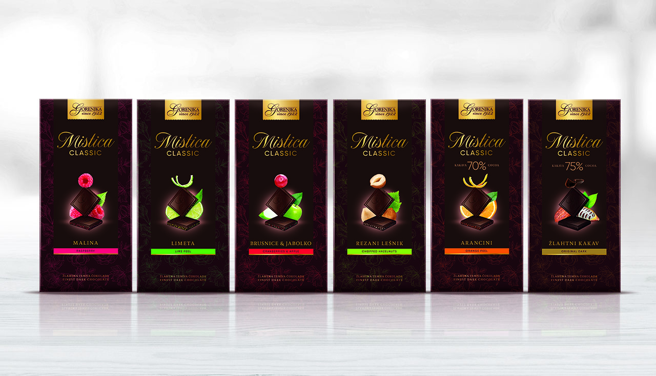
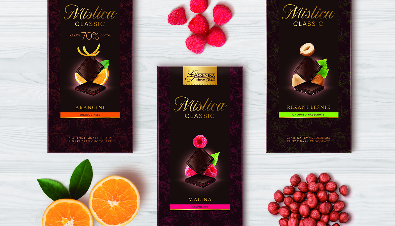
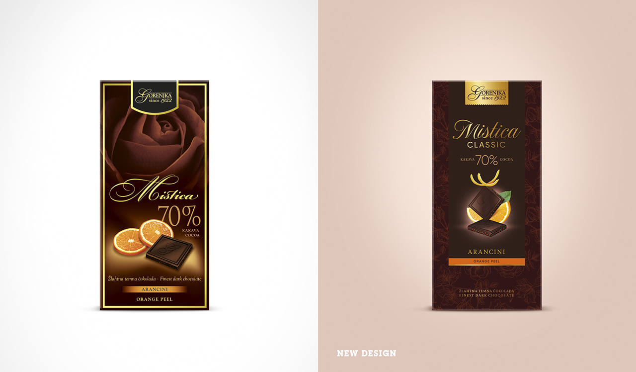
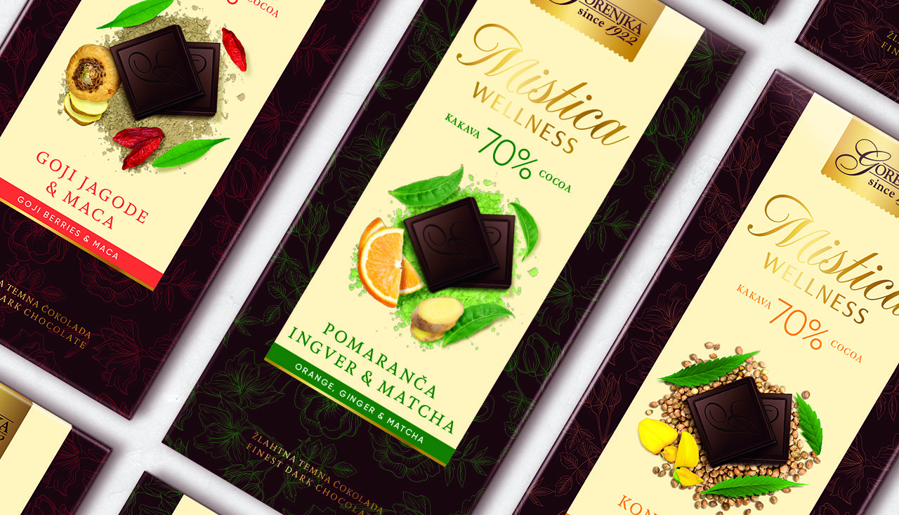
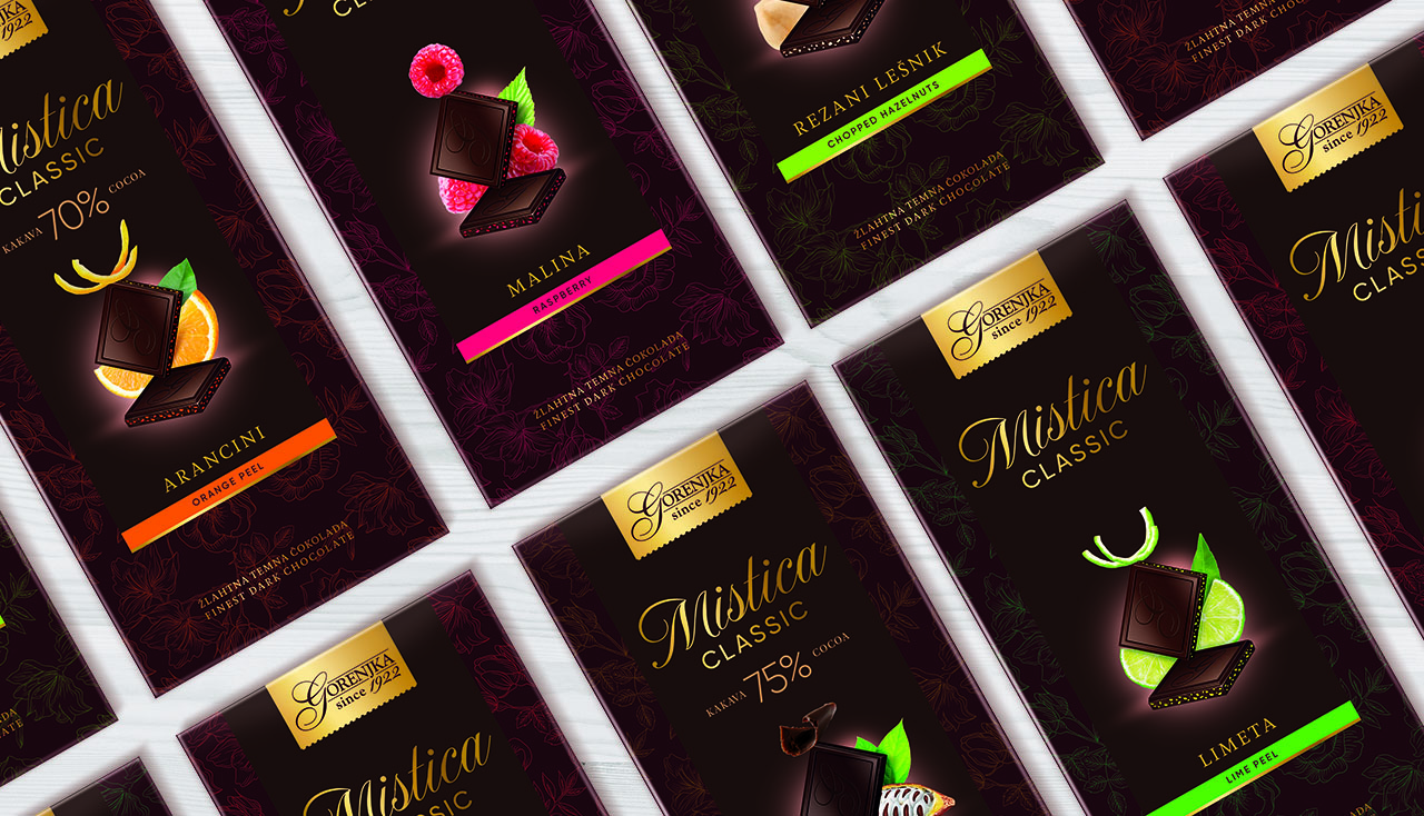
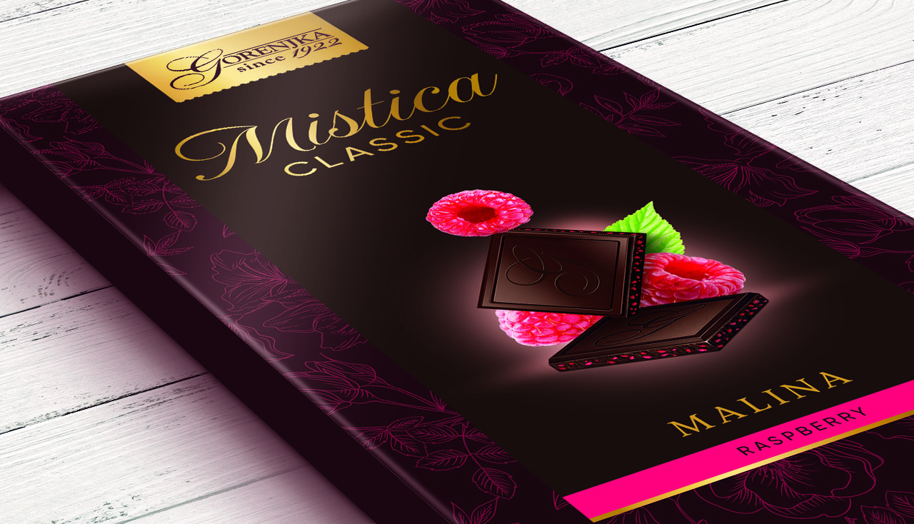
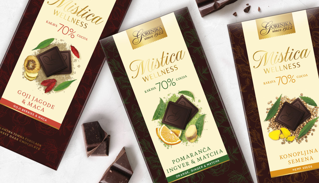
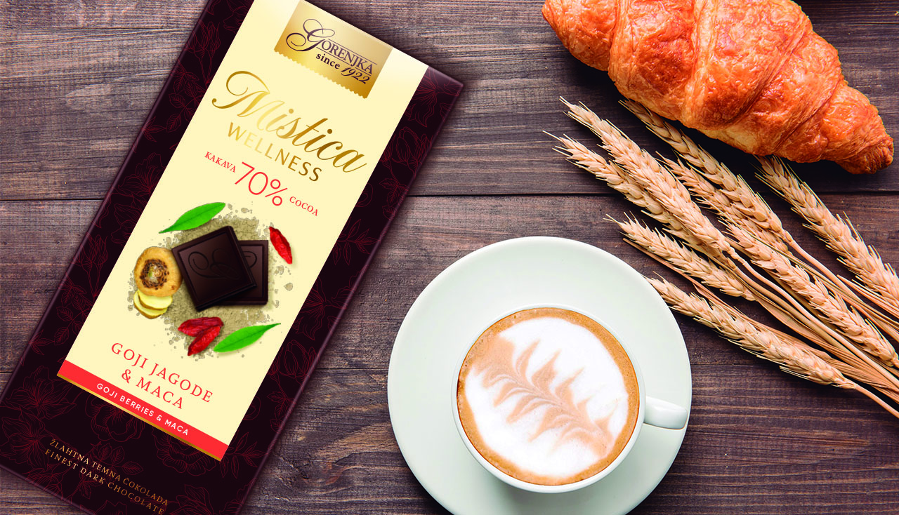
Gorenjka is a famous brand of Slovenia known for its hazelnut chocolate. A few months ago, the brand decided to renew the image of its premium dark chocolate Mistica. Founded in 1922 Mistica has always been recognised for its fine recipes made with the highest quality ingredients. Since its last rebranding in 2007, Mistica centered its image in romanticism, tradition and a passion for things well done. An image which, after 10 years, the brand wanted to evolve in order to offer more healthy recipes. They did do with the same standards through their new products Mistica Classic and a new brand called Mistica Wellness. For Mistica Classic uplight, we pushed the tradition into a more modern, attractive and up-to-date design. Elements that enhanced the importance of the ingredients were given more significance, it became the most important part of the packaging.
CREDIT
- Agency/Creative: Pointbleu Design
- Article Title: Rebranding of Mistica Chocolate
- Organisation/Entity: Agency, Published Commercial Design
- Project Type: Packaging
- Agency/Creative Country: Spain
- Market Region: Europe
- Project Deliverables: Brand World, Graphic Design, Packaging Design, Product Architecture, Rebranding
- Format: Box
- Substrate: Pulp Carton


