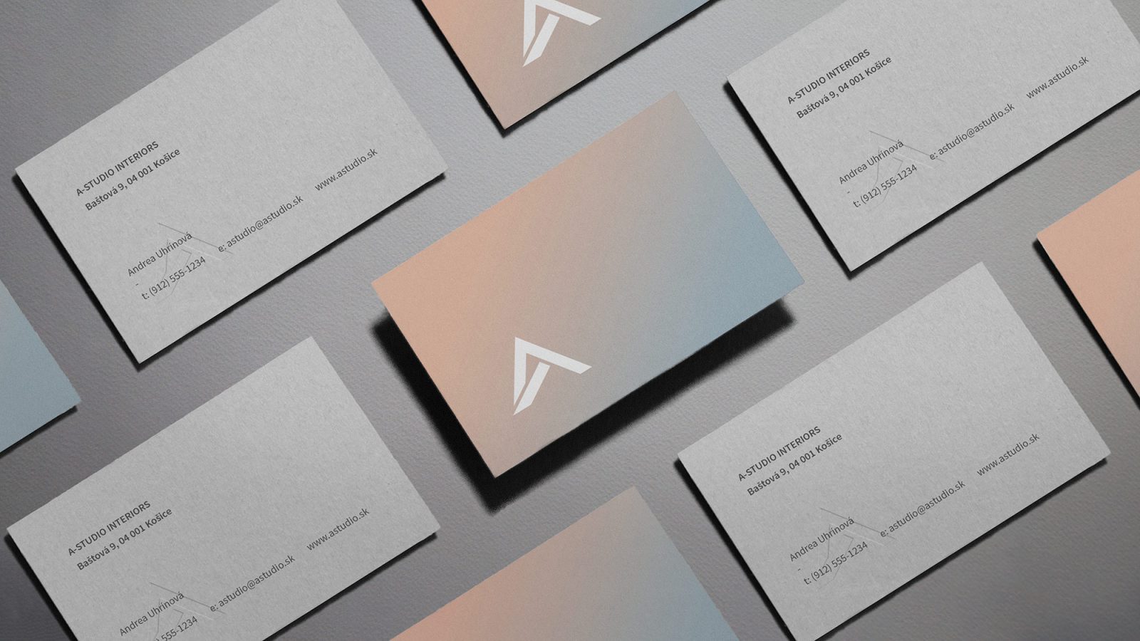
Kaschau – A-studio Interiors
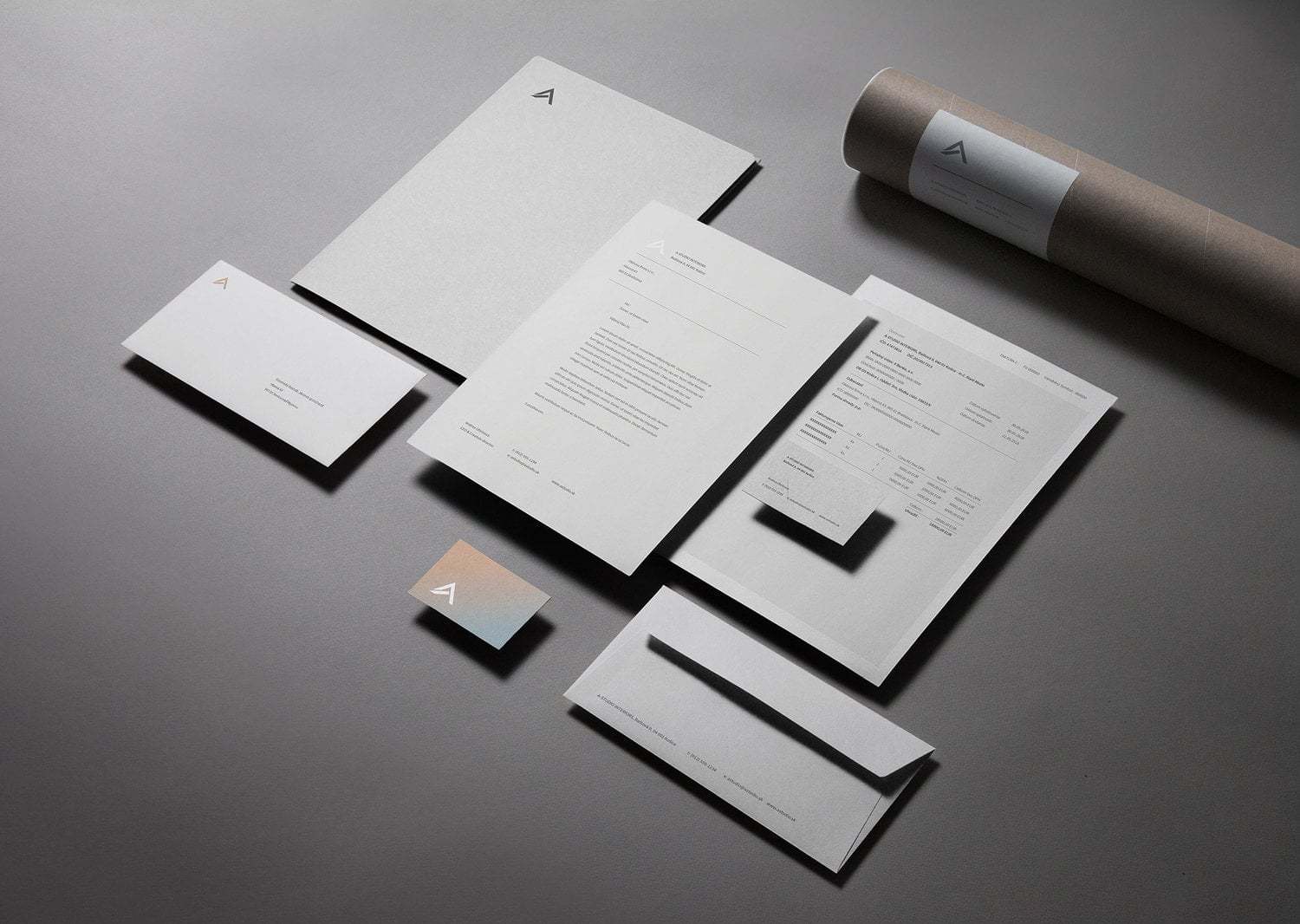
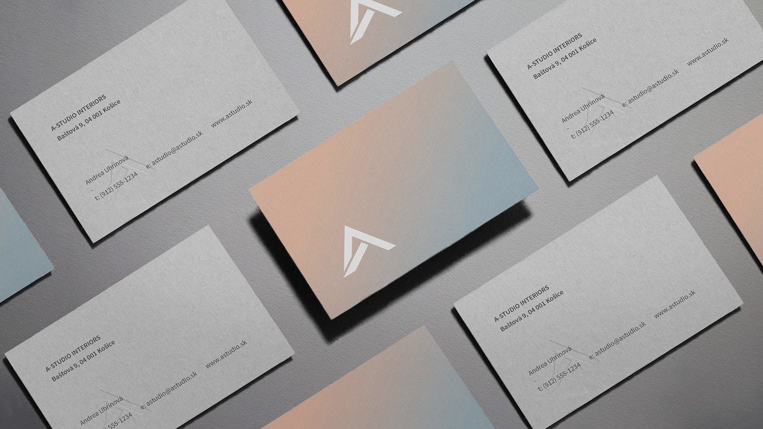
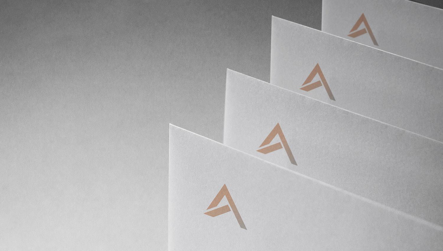
Based in Kosice, Slovakia, the studio is mainly focusing on interior design for both commerical and non-commercial sectors. After 30 years of history the studio decided to transform its visual identity to a more solid appearence. Our outcome was a new logo with a symbol resembling the letter “A”. The nature of this symbol with its unusual cuts is rooted in sharp folds that are recognizable from collisions of architectural elements in interiors. Also the color palette consisting of warm and cooler color is based on the base elements of architecture – brick and concrete.
CREDIT
- Agency/Creative: Kaschau
- Article Title: Rebranding of A-studio Interiors
- Organisation/Entity: Agency Commercial, Published
- Project Type: Packaging
- Agency/Creative Country: Slovakia
- Market Region: Europe
- Industry: Construction
FEEDBACK
Relevance: Solution/idea in relation to brand, product or service
Implementation: Attention, detailing and finishing of final solution
Presentation: Text, visualisation and quality of the presentation


