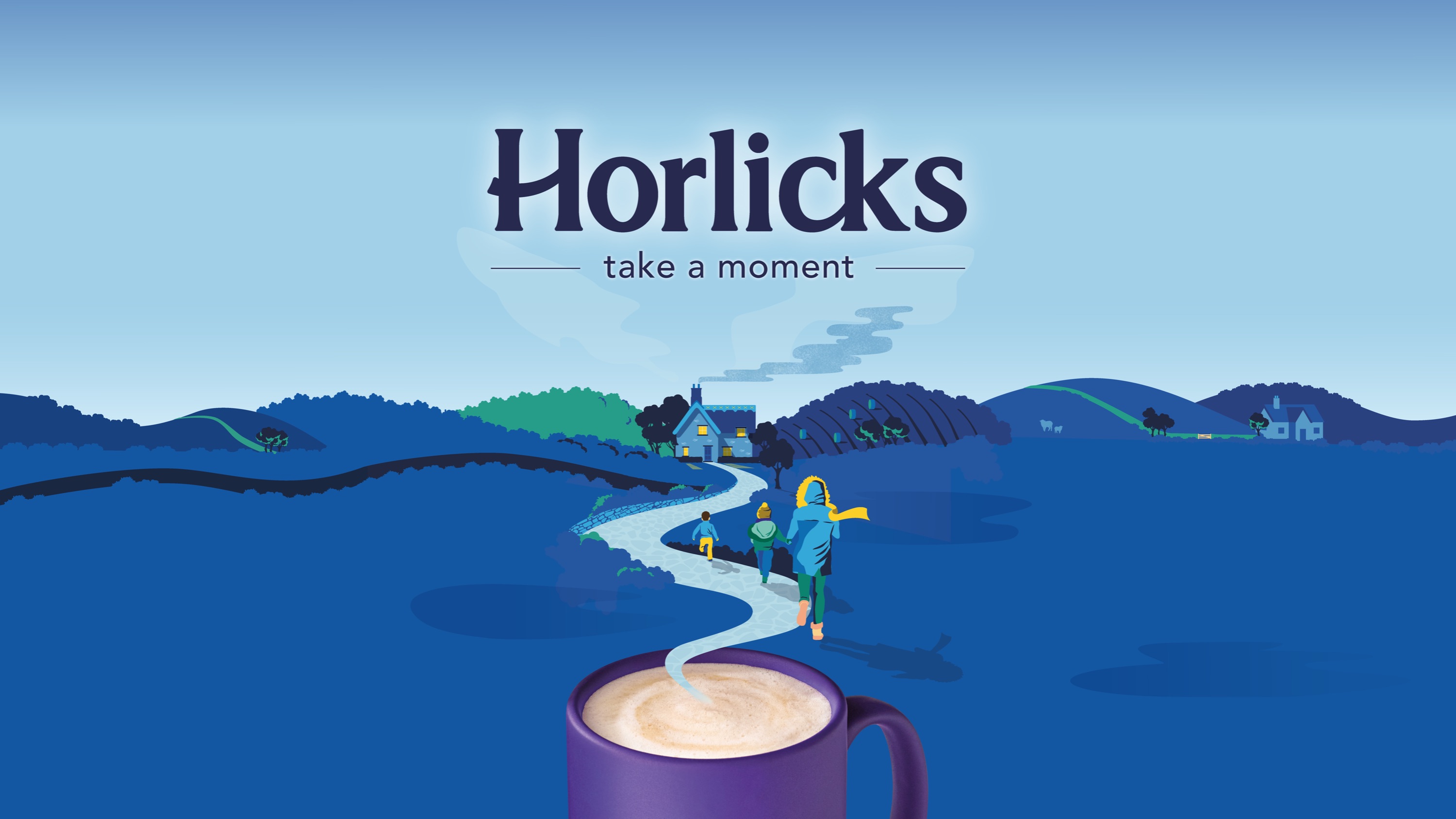
Our rebrand got “millennials hooked on Horlicks” and value sales increased by +16.7% YOY.
Challenge
The UK Malted Drinks category had been in decline for several years, with some retailers reducing fixture space for products in favour of more innovative offers mimicking those provided by coffee shops. Horlicks, once one of Britain’s most-loved brands, had also seen volume and value sales decline over the years due to a decline in buyers. Two consumer perceptions (or misconceptions) of the brand had kept its consumer base firmly in the aged 65+ bracket – firstly that it’s a bedtime drink, and secondly that it’s a drink for your grandparents.
Horlicks asked us to reposition the brand to attract a broader audience, to halt the decline in sales and cement its position as brand leader in the malted drinks category.
Insight
Nowadays, we’re all very hectic with busy work and home life schedules – in fact, a study in 2018 by the Mental Health Foundation uncovered that 74% of people felt so stressed that they have been overwhelmed or unable to cope. Modern life can be chaotic meaning that it can be hard to switch off and find ‘me time’. Indeed, our research showed that as many as 44% of Horlicks’ current consumers were already turning to the brand for general relaxation purposes (rather than sleep), highlighting an opportunity for the brand – sometimes, we just need to know it’s okay to press pause.
Idea
‘Take a moment’ not only encourages people to slow down regardless of the time of day or time of life, but also addresses the brand’s key issues. It speaks to lapsed, existing and new consumers in a way that’s relevant to the brand and provides the escapism and comfort that people crave.
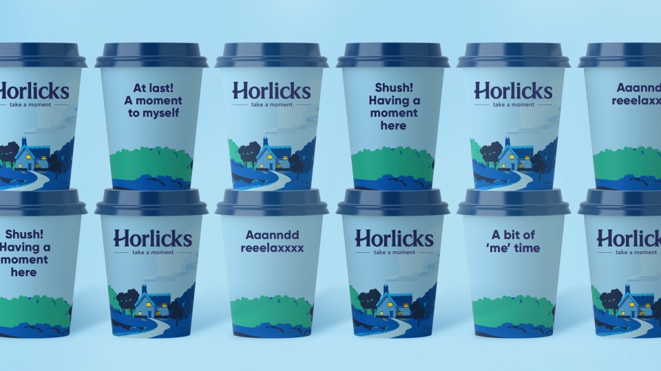
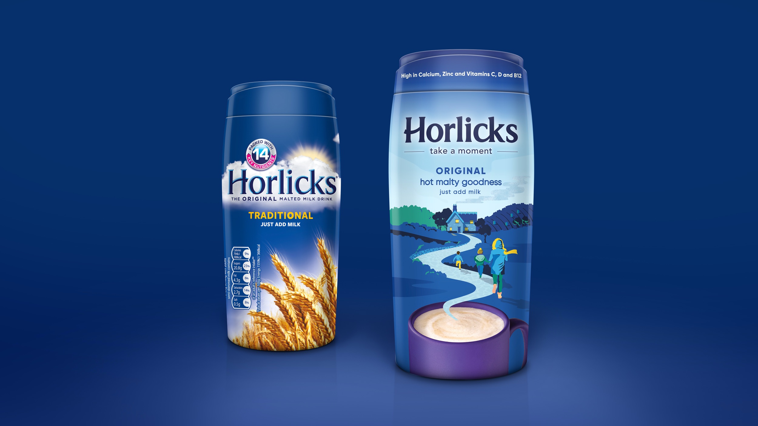
Born from nostalgia, but with a contemporary twist, our new brand identity reflects a daydream like moment in a mug. We contemporised the brand mark; adding a reassuring smile in the ‘H’, removing the bevelling and softening the type to add warmth and iconicity.
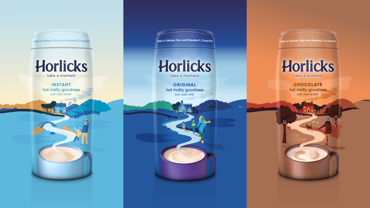
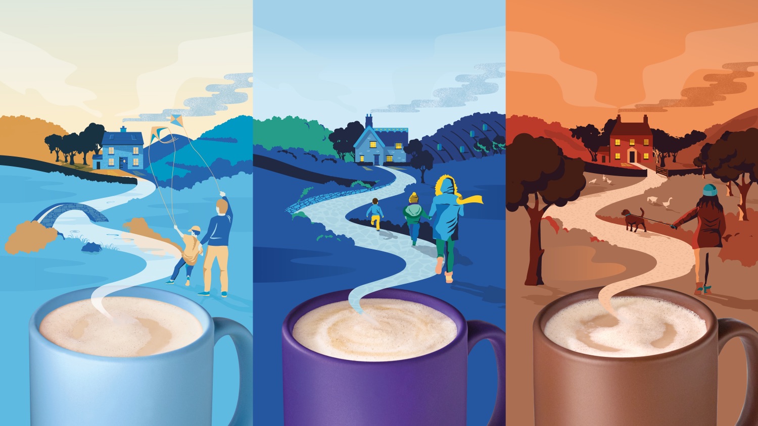
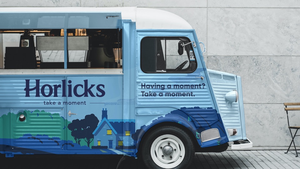
Going against category norms, we moved away from how the product’s made to how it makes you feel. Gone are the clouds and barley that did nothing to create desire from a younger audience, replaced instead with a warming mug of Horlicks. Across all variants, a meandering, steamy vapour road slowly leads its characters to an inviting home, which encourages consumers to ‘take a moment’ and also gives each pack a warm, human element.
Finally, our unique, consistent and seamless illustration architecture creates a suite of distinctive assets to bring strong product blocking and shelf-standout.
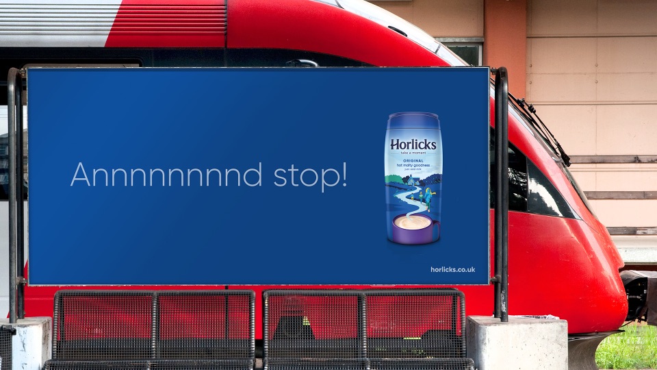
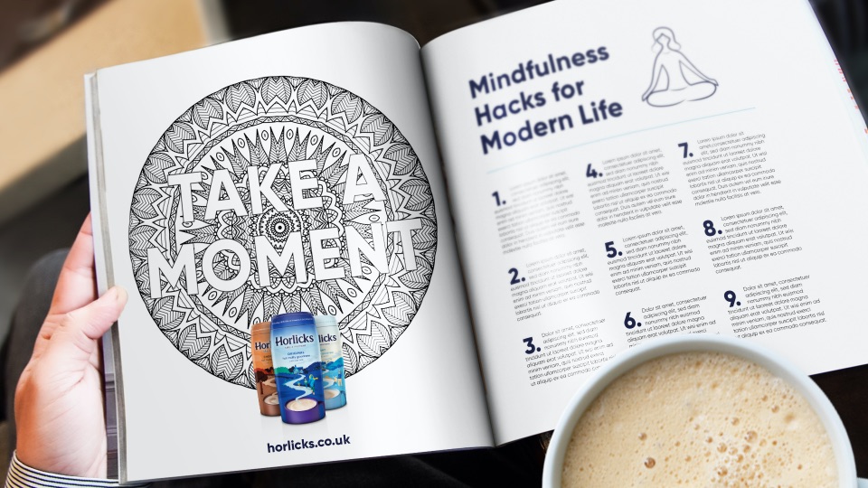
‘Take a moment’ has also provided the brand with endless campaign ideas and social media engagement.
Impact
By creating a daydream like moment in a mug, we have created a look of positive nostalgia that moves the brand from functional to emotional escapism. Horlicks’ revitalised look brings it to the forefront of people’s minds and sets it up as an anytime drink for both existing and new consumers. And its increased shelf standout encourages desire at the point of purchase.
But the last word goes to The Mirror, which in January 2020 ran the following article: ‘Stressed-out millennials hooked on Horlicks as antidote to busy lives; Young people have helped boost sales of the traditional bedtime drink, which first hit shelves almost 150 years ago’.
We couldn’t have written the headline better ourselves!
• +22ppts increase in perception that it’s not just for bedtime amongst users, +11ppts for non-users
• +146k new buyers in the under 65 age group – surpassing target by 46%.
• +16.7% value growth in the year following the rebrand, followed by +8.9% the following year outperforming that of the total Hot Milky Drinks market.
• 47% market share, cemented Horlicks’ position as #1 in Malted Drinks
CREDIT
- Agency/Creative: Brandon
- Article Title: Rebranding Horlicks Malted Drinks by Brandon
- Organisation/Entity: Agency
- Project Type: Packaging
- Project Status: Published
- Agency/Creative Country: United Kingdom
- Agency/Creative City: Manchester
- Market Region: Global
- Project Deliverables: Packaging Design
- Format: Bottle
- Substrate: Plastic
- Industry: Food/Beverage
- Keywords: WBDS Agency Design Awards 2021/22
-
Credits:
Design Agency: Brandon


