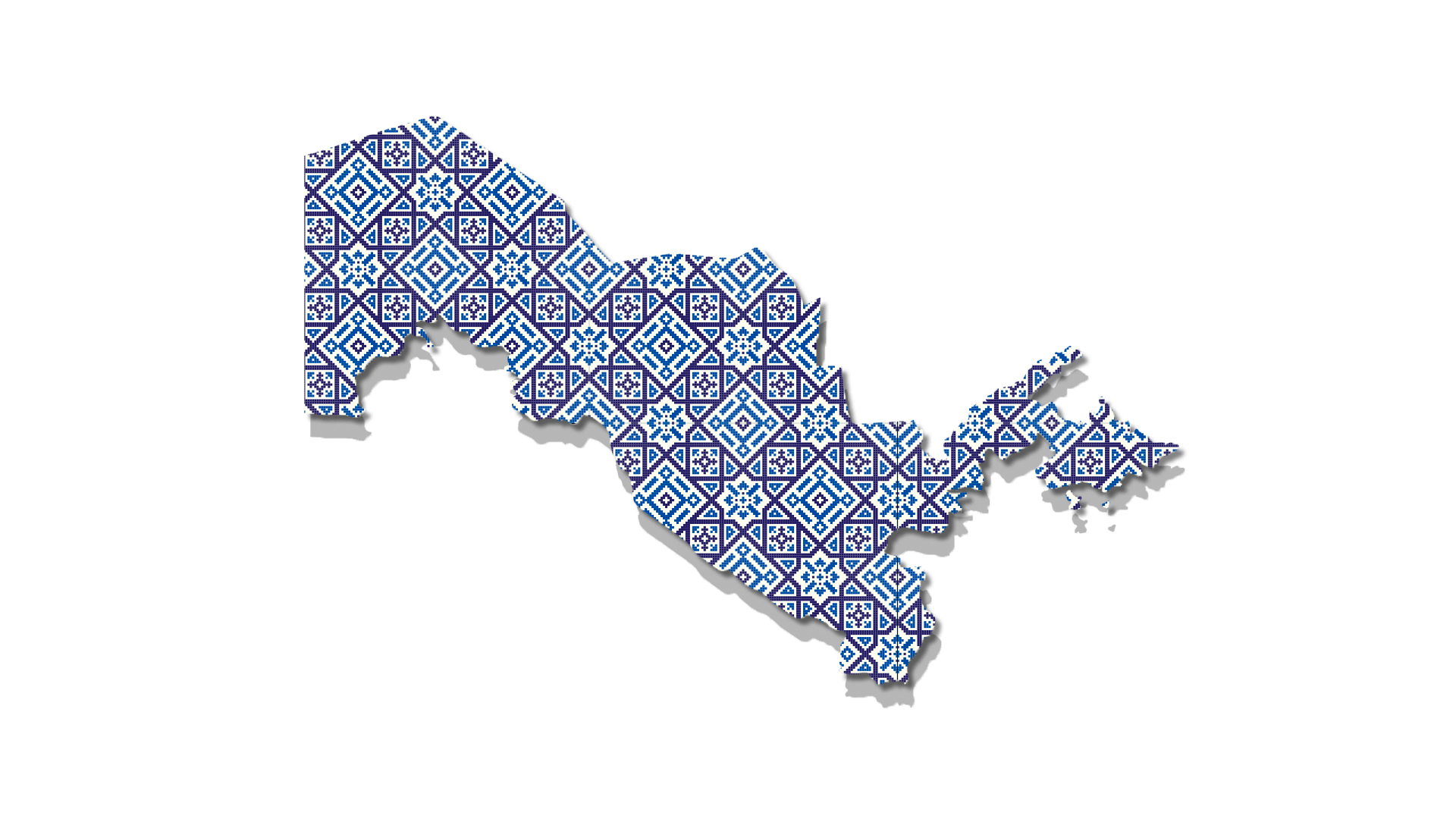
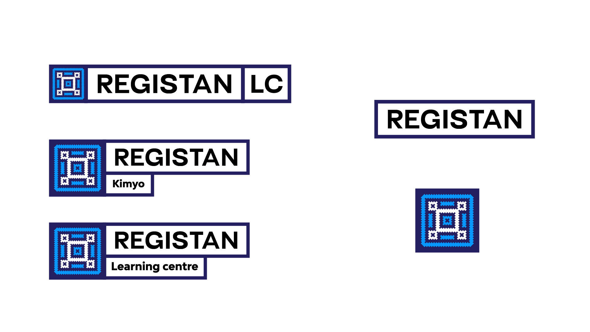
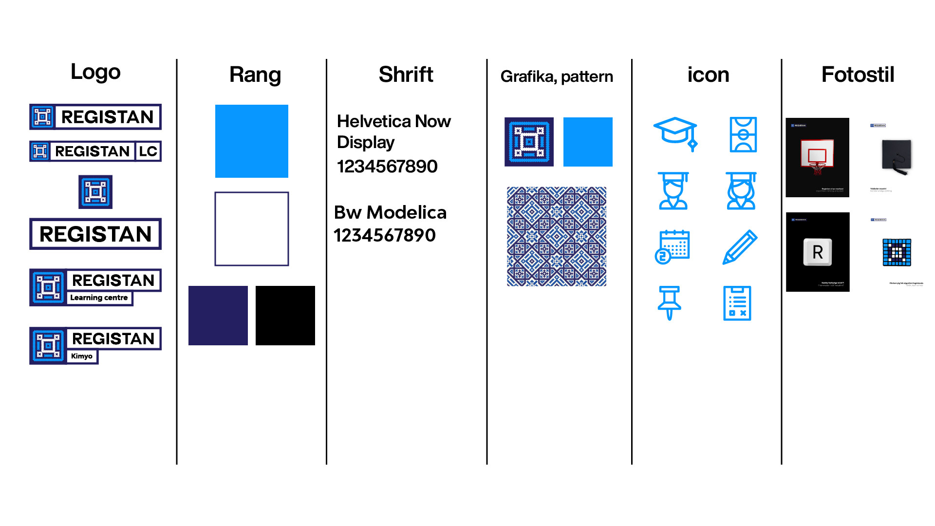
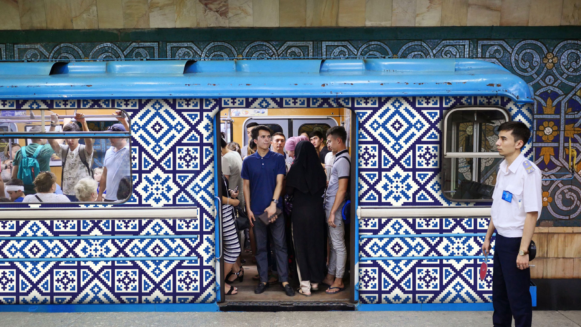
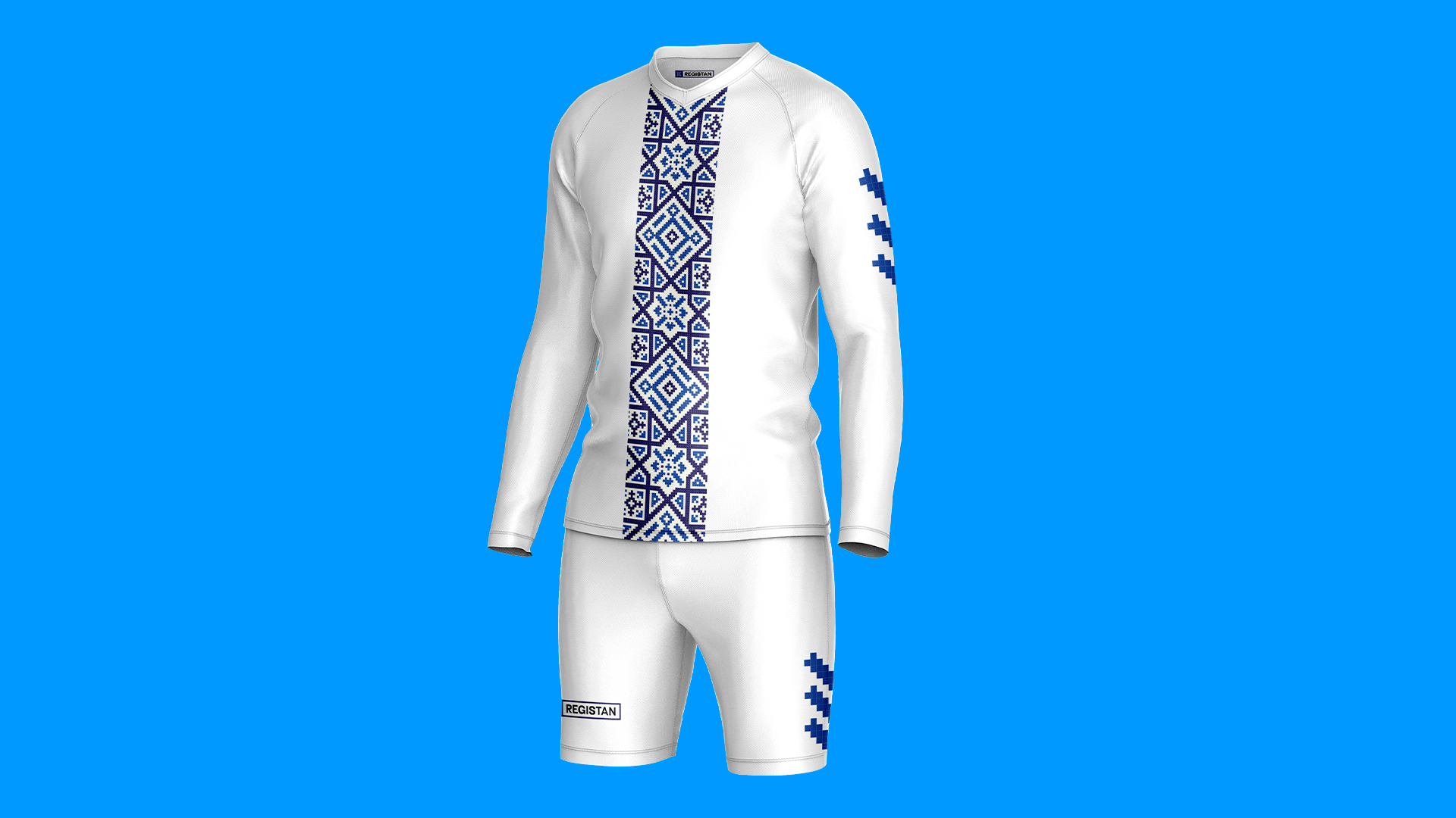
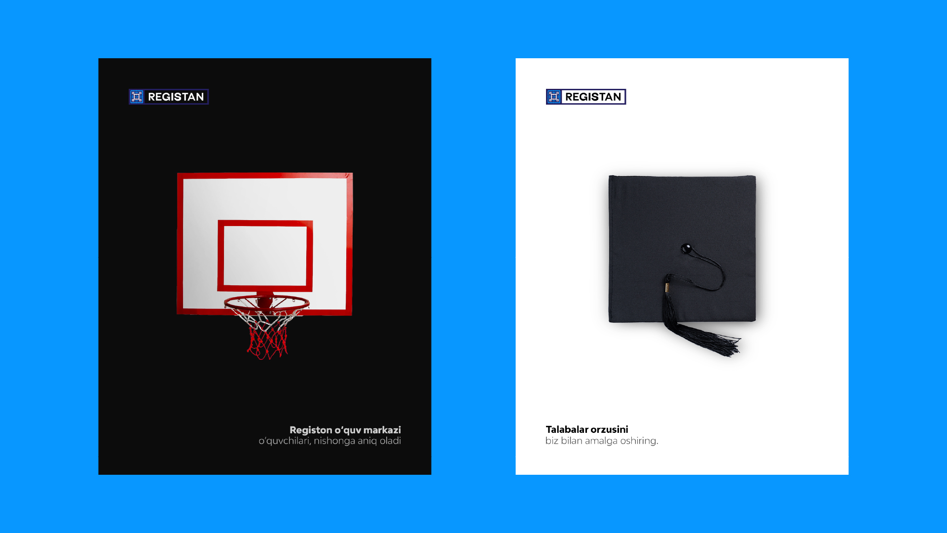
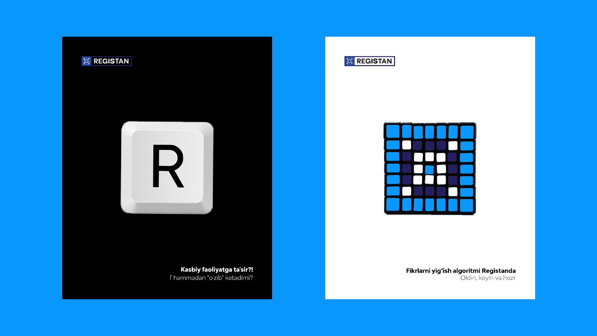
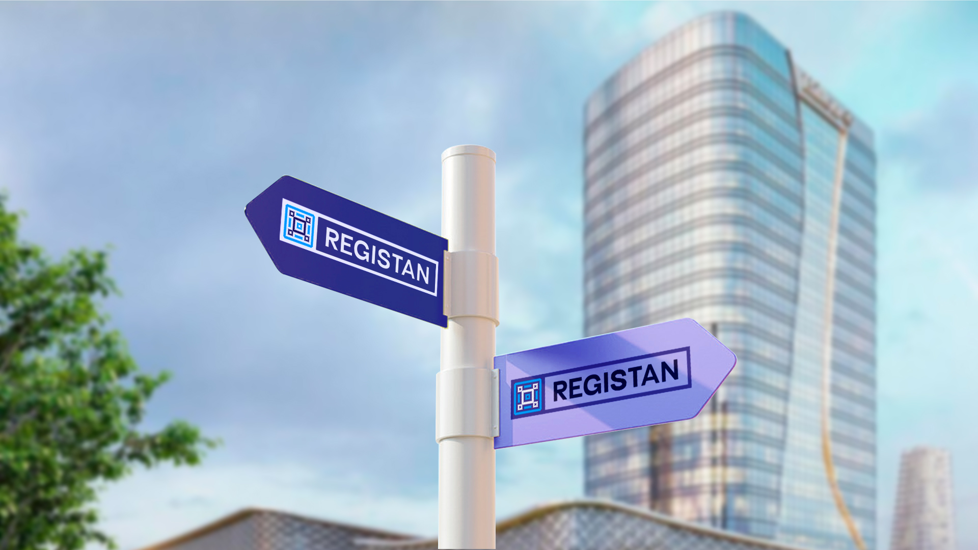
Rebranding provided for Registan Training Center. In this identification, we used the patterns found in the Registan Square in the national Samarkand. We hope that this brand will achieve great things with this visual look. It can be well known in the world market by the nationality used in aydetics. When we analyzed the brand, we found that this center had a lot of advantages, and a lot of unique values. But they could not prove it. We have allowed all the possibilities to open up with this identity. If this pattern is drawn on a center, uniform, car, or dormitory, they know that it belongs to the Registan Learning Center. Today we see that nationalism and various illustrations are on trend. We also suggested using this identification without deviating from this trend. The character of the square represented in the logo section corresponds to the character of the brand. In the marketing section, we found the brand to be a constant coach and honest. Therefore, we found it appropriate to use these colors. In addition, the nature of these colors was found to be in line with the brand. The font section shows the REGISTAN script we tried to create. To get a better view of this identity, we made a small video. You can see it on Instagram or on the Behance platform under the name Ulugbek_Hasan. The main shape the brand uses will be square. We offered a very minimal smm style. This style is very rare but at the same time a very unique method. I am very pleased to present this rebranding.

CREDIT
- Agency/Creative: Ulugbek Hasan
- Article Title: Rebranding for Registan Training Center by Ulugbek Hasan
- Organisation/Entity: Freelance
- Project Type: Campaign
- Project Status: Published
- Agency/Creative Country: Uzbekistan
- Agency/Creative City: Tashkent
- Market Region: Asia
- Project Deliverables: Brand Design, Rebranding
- Industry: Human Resources
- Keywords: Rebranding, Registan, Samarkand, Identity, learning center
-
Credits:
Director: Ulugbek Hasan


