


Kingdom & Sparrow – Popti Cornish Bakehouse Rebrand
“Popti is a delicious baked biscuit brand, handmaking an array of crunchy crackers and thins. Growing from their home kitchen to the Popti kitchen, they needed a brand that really let their personality shine.
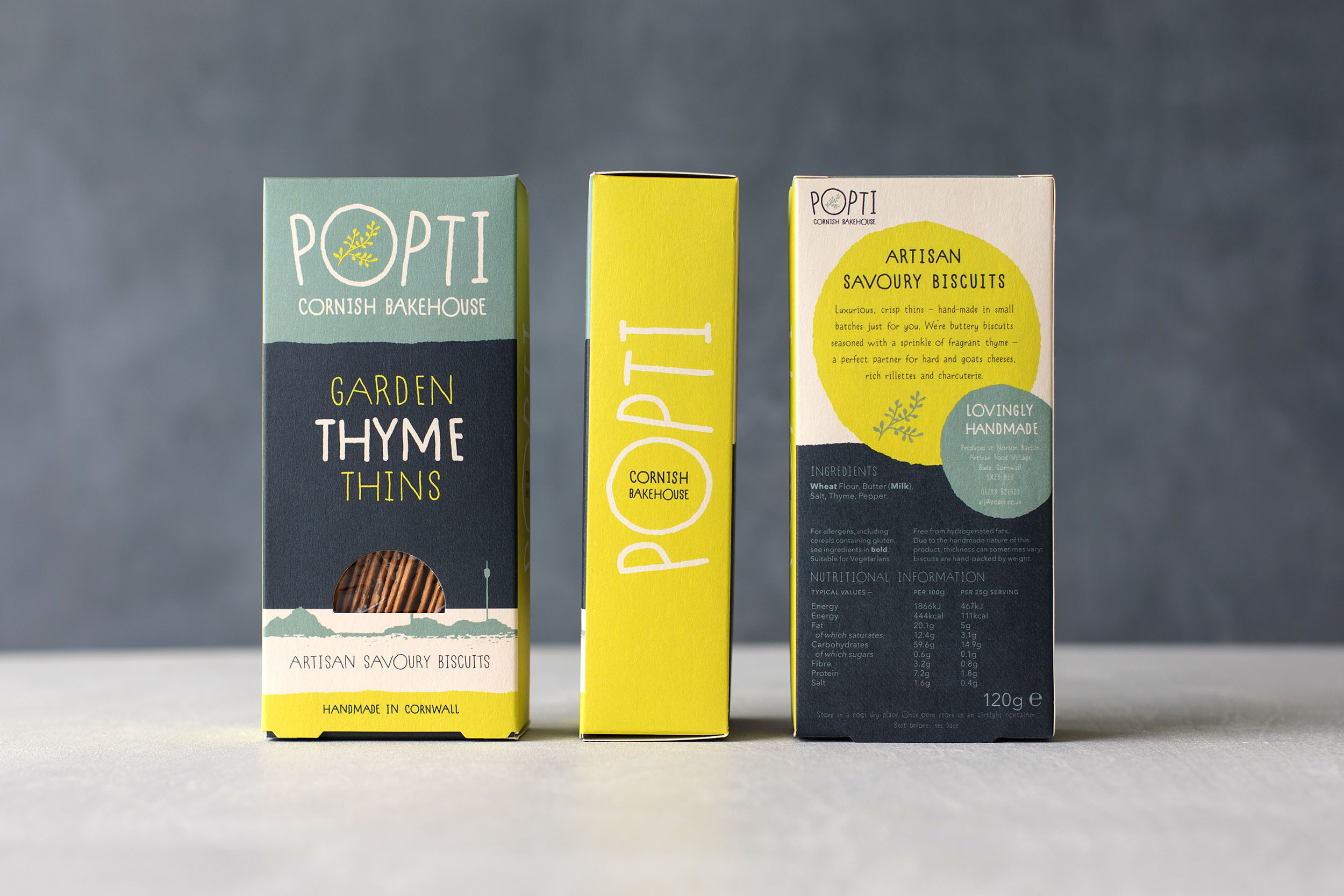
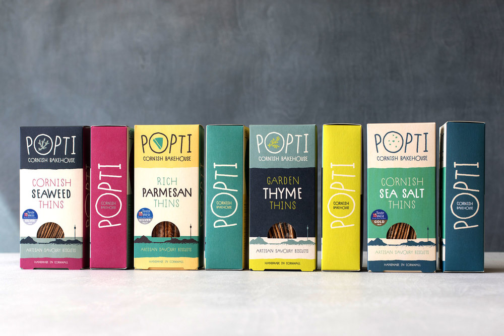
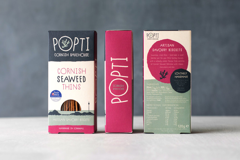
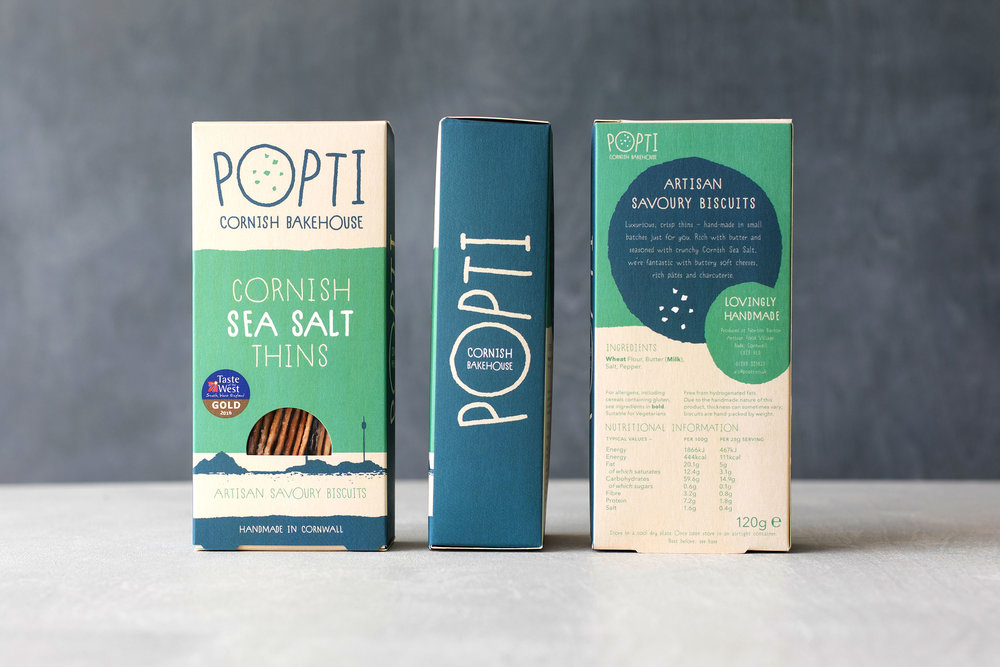
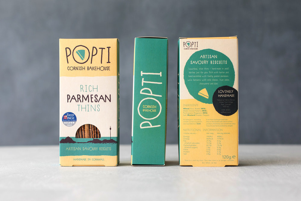
Popti means ‘Cornish Bakehouse’ and this really sums up what they’re about. We wanted to get across the real Cornish, artisan nature of the product.
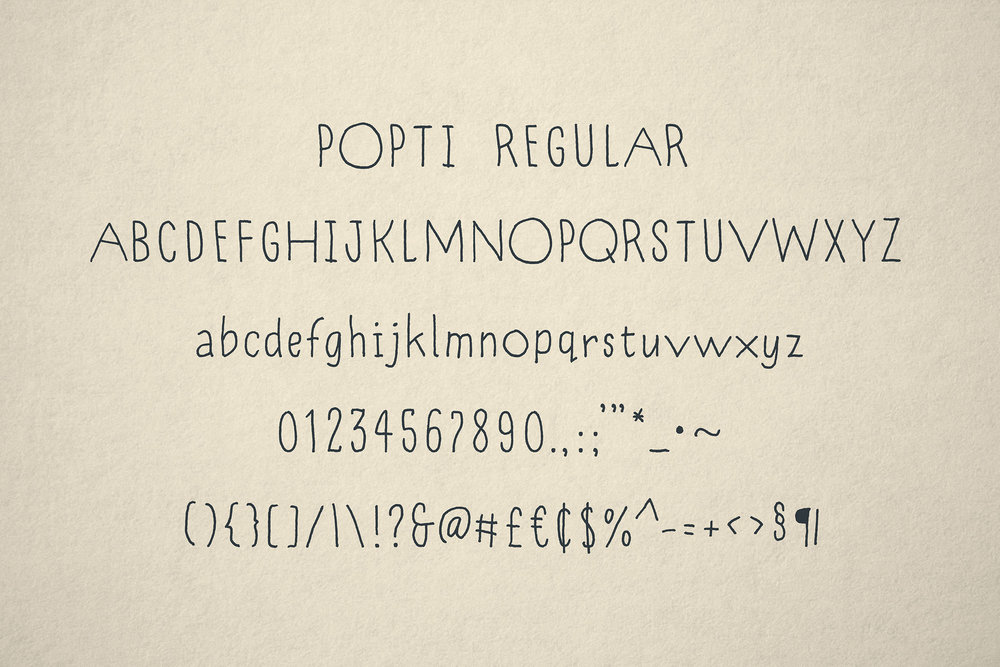
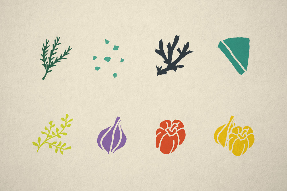
For the logo and main typeface we designed a playful custom, workable font. The logo is flexible, with a little hand drawn ingredient asset sitting within the O, allowing personalised variations from product to product.
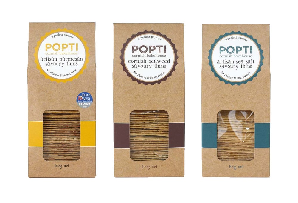
The packaging has a custom window that shows the sun setting over their local landmark, Barrel Rock in Bude. We also used vibrant and earthy colours to reflect the natural but fragrant taste each product flavour has.”

CREDIT
- Agency/Creative: Kingdom & Sparrow
- Article Title: Rebranding for Cornish Bakehouse and Artisan Products
- Organisation/Entity: Popti Cornish Bakehouse
- Project Type: Packaging
- Agency/Creative Country: United Kingdom
- Format: Box
- Substrate: Pulp Carton


