Foskar is a Polish technical chemical brand of created for professionals working in various industries.
Foskar’s products are used in industrial, automotive, construction and electronics brands. The aerosol lubricants are destined for machine maintenance and the repair, the concentrates are for machine and manual washing, and anaerobic and cyanoacrylate adhesives, corrosion neutralizers, are just a part of foskar’s wide range of professional technical chemicals.
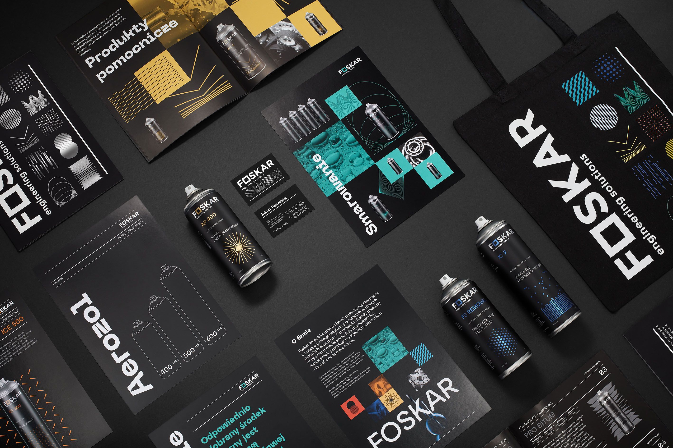
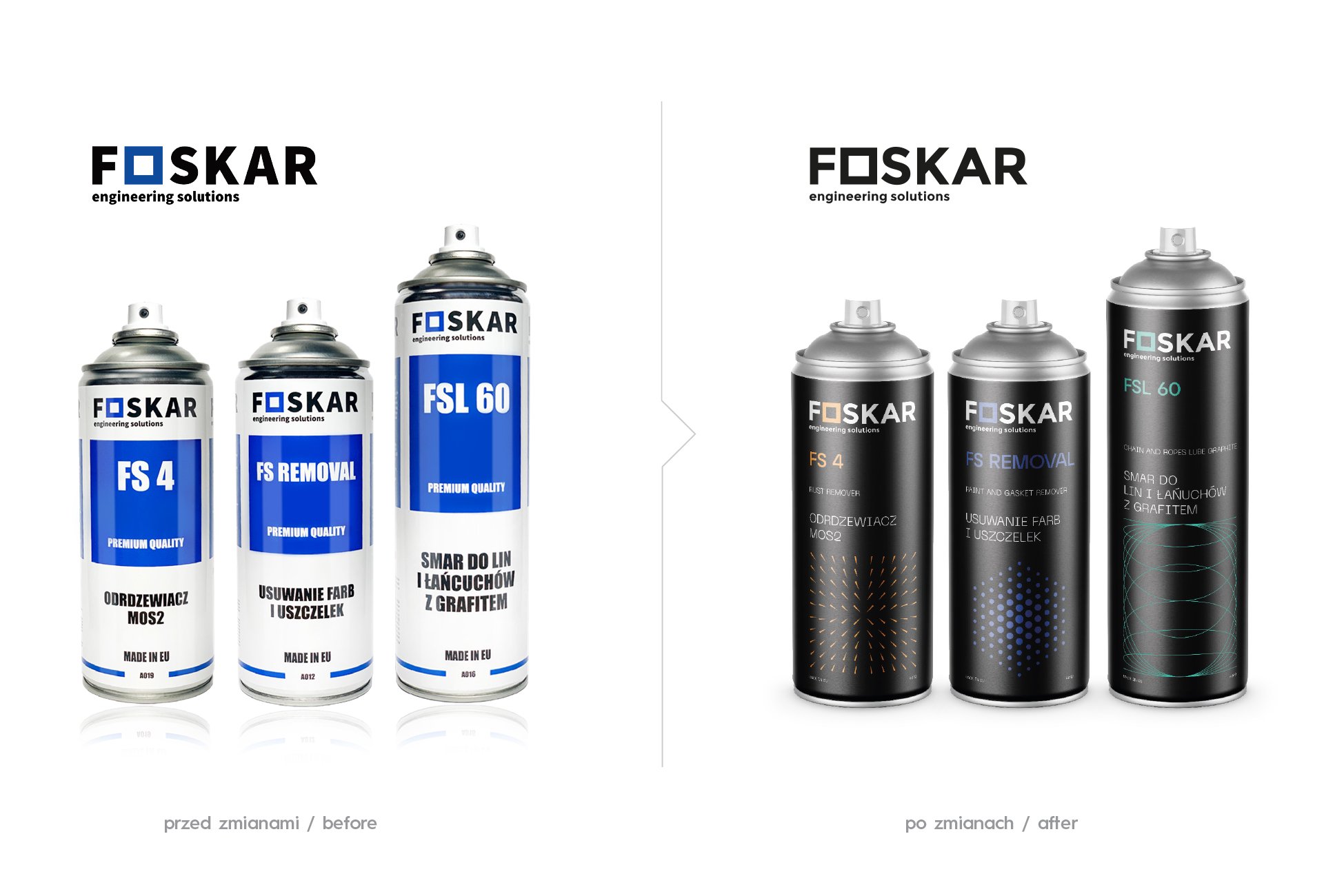
Our Studio was responsible for the rebranding and new visual identity of the brand. Our goal was to present the company as innovative, more modern and based on knowledge and technology. We focused on the brand’s strength and on the recognition of the offer addressed to consumers and experts.
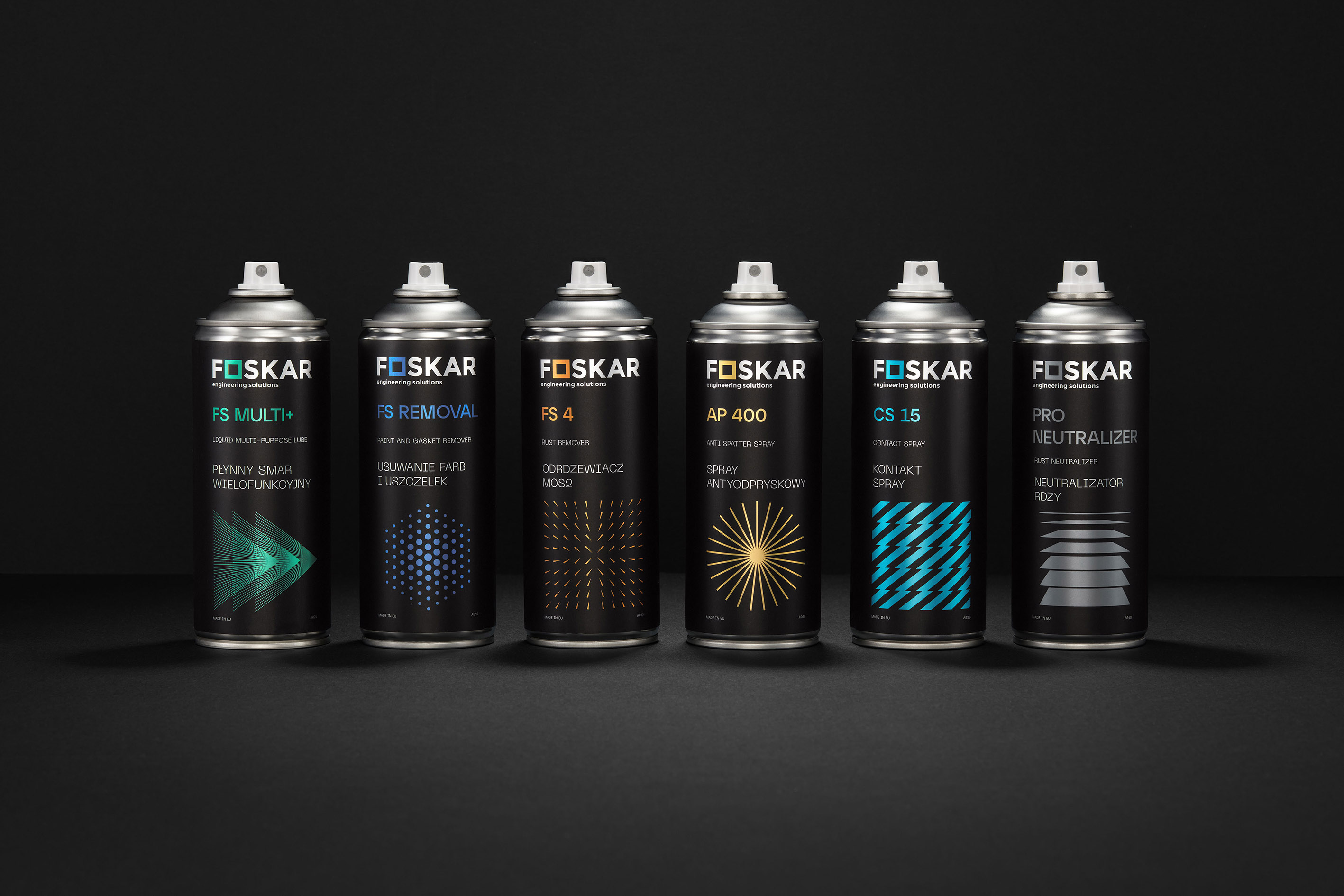
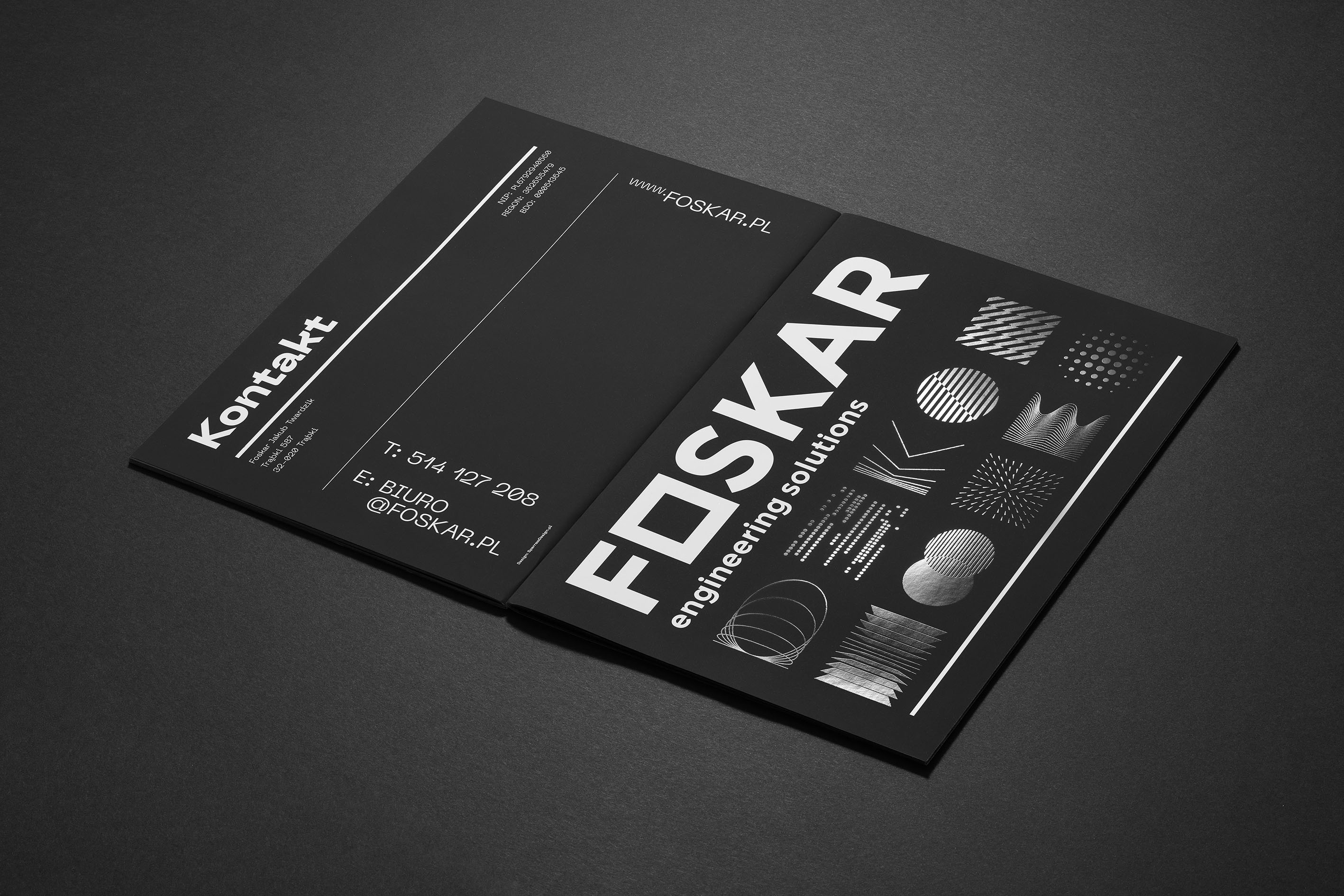
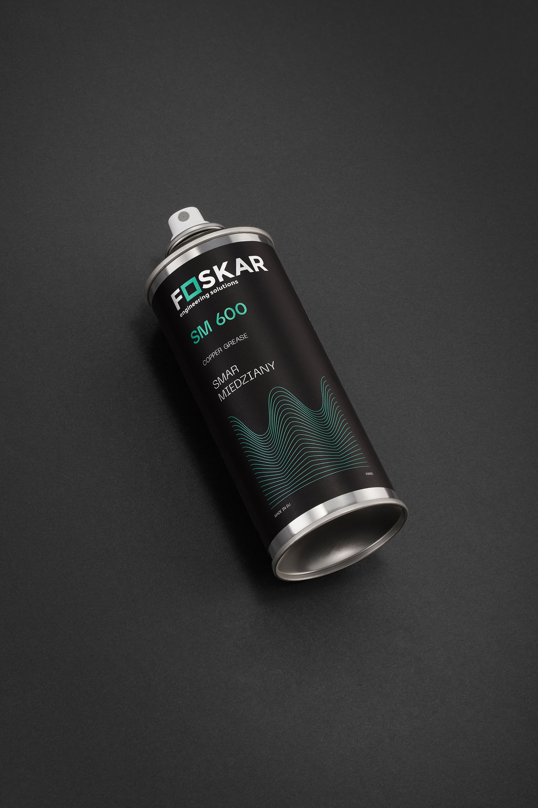
In visual identification, we used symbols of geometric figures and shapes that create associations in a given product group of the Foskar brand. The composition of the figures is beautiful and mesmerizing in an aesthetic sense, it defines the way in which subsequent elements of the visual identity’s composition are built.
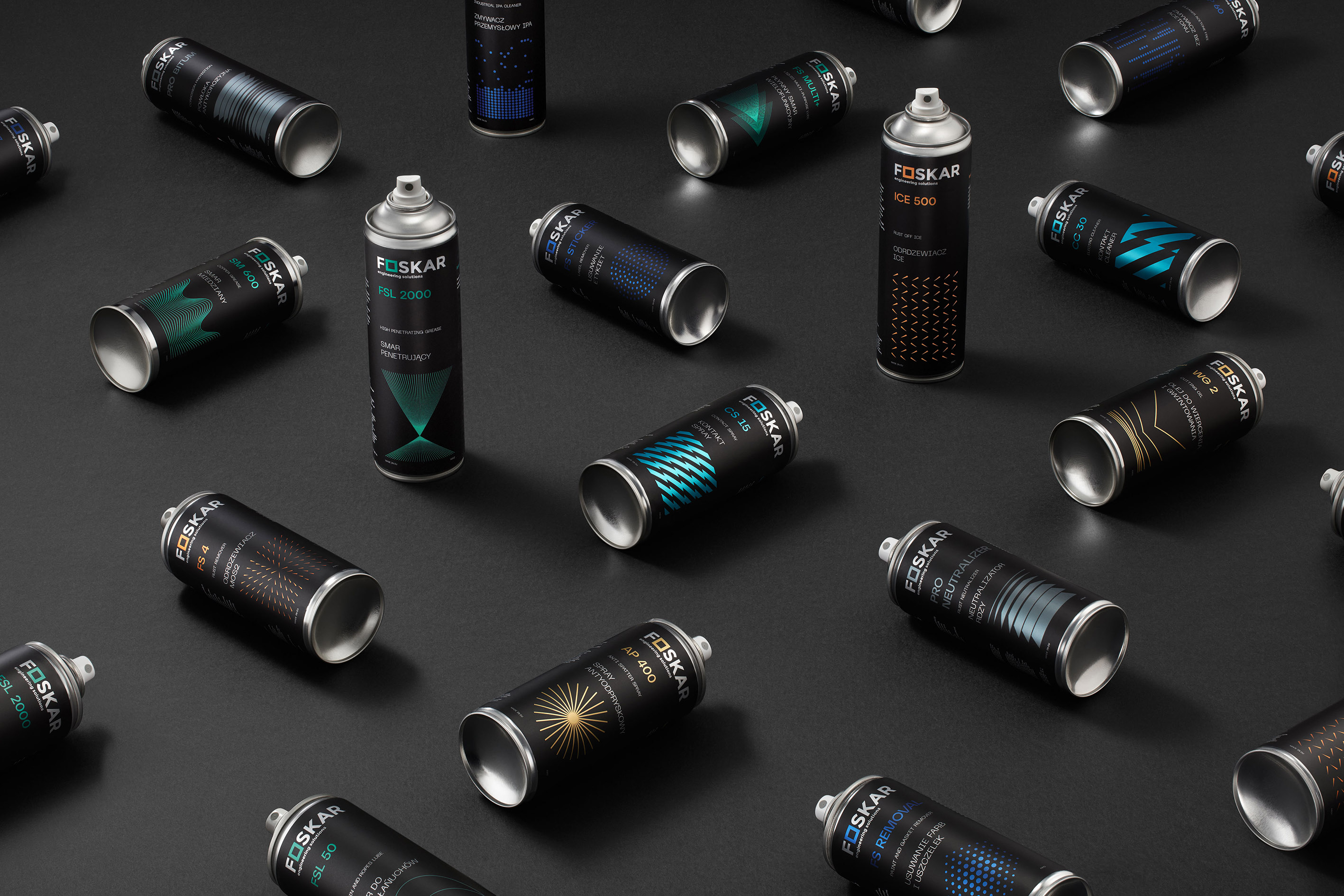
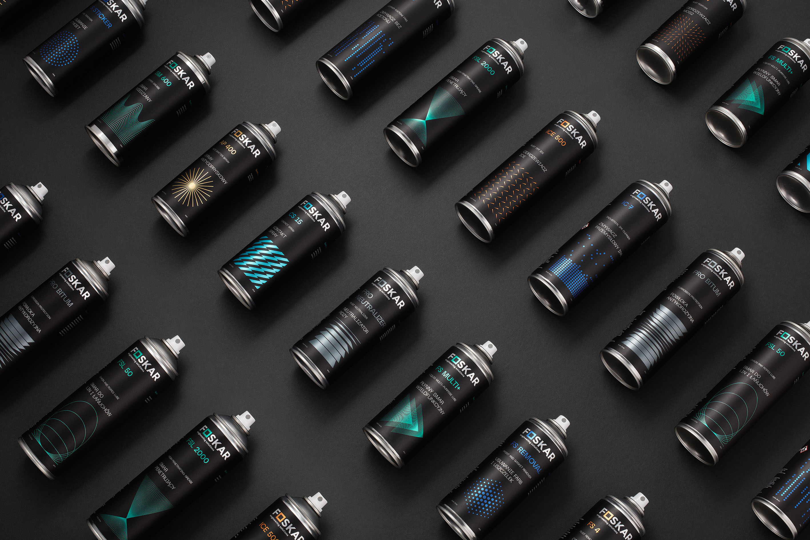
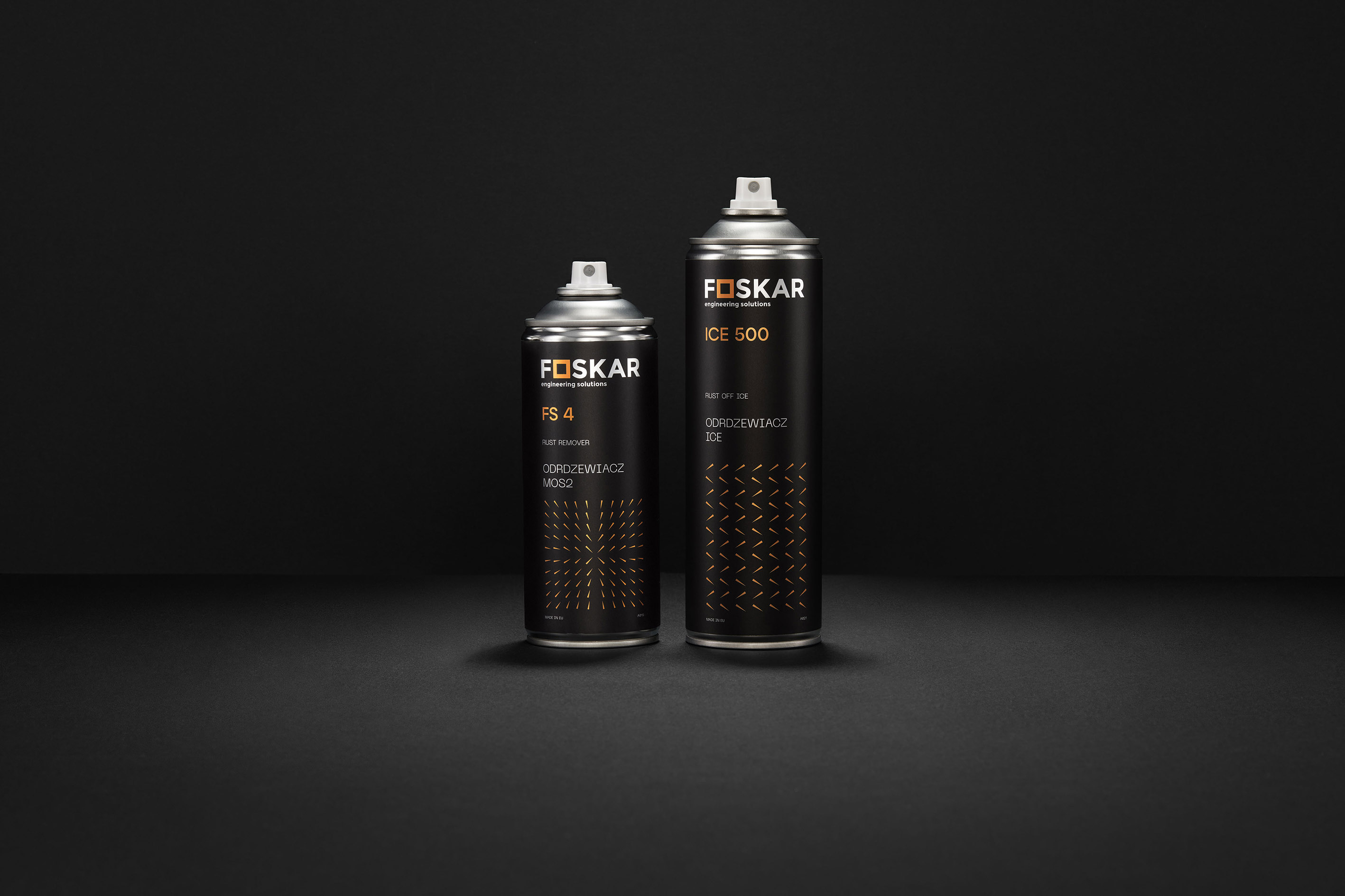
The products have been divided into 7 categories such as: lubrication, cleaning, rust removal, auxiliary products, electrics, adhesives and surface protection. The entire brand portfolio consists of about 50 products.
The choice of colors and graphic details give the brand an extremely dynamic, modern character. We have achieved this through, among others, black colours, enriched with the colours of the given category. Due to the non-standard design and colours, the packaging has gained unique visibility on the shelf and makes a very good impression on customers. The labels have a metallised base.
Typography is a meticulously crafted typeface that boasts geometric features and is also inspired by the aesthetics ofthe future of technology and machinery.
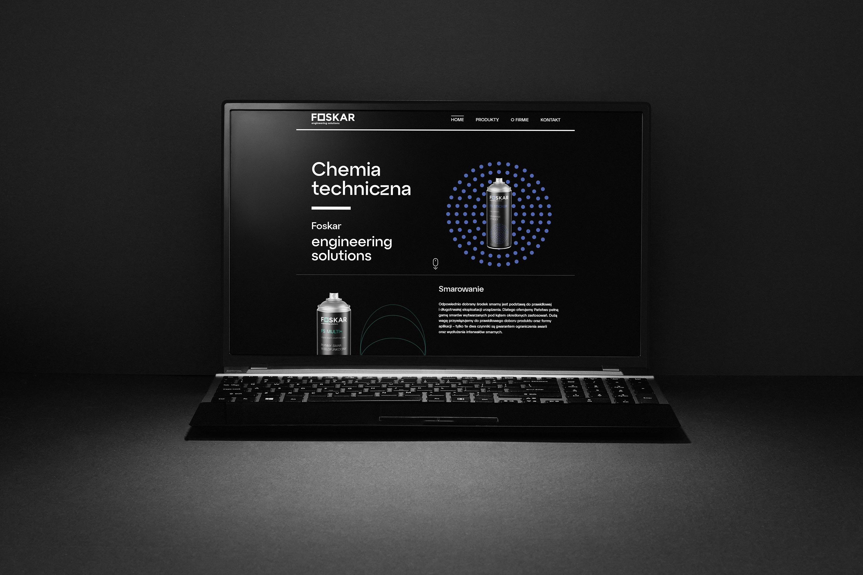
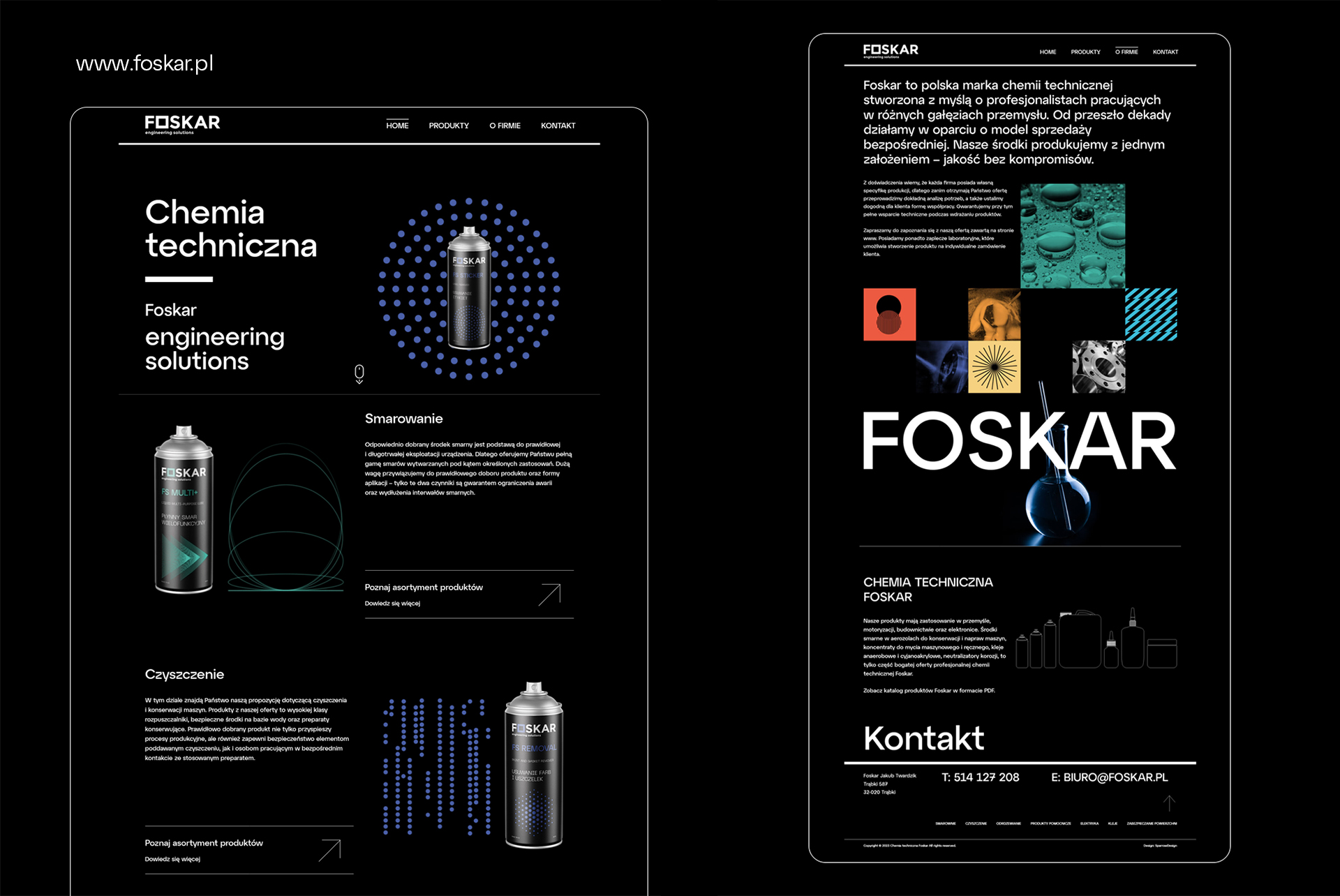
The new website and a series of marketing materials have been embedded in the visual identity’s main motif. The new website and product catalogue primarily involve a clearer product structure and this is better for customers and business partners. It provides key information in an intuitive way. We have also created animations for each of the groups. The company’s website has been developed considering the best UI / UX and SEO practices.
The well-thought-out information architecture distinguishes Foskar with its simplicity and professionalism, giving it a dynamic, modern character.
CREDIT
- Agency/Creative: Sparrow Design
- Article Title: Rebranding Chemical Brand Foskar
- Organisation/Entity: Agency
- Project Type: Packaging
- Project Status: Published
- Agency/Creative Country: Poland
- Agency/Creative City: Grodzisk Mazowiecki
- Market Region: Europe
- Project Deliverables: Animation, Brand Architecture, Packaging Design, Photography, Rebranding, Web Design
- Format: Bottle
- Substrate: Metal
- Industry: Chemical
- Keywords: Packaging, Design, Chemical, Logo, Branding, Web, Animation, Foskar, SparrowDesign
-
Credits:
Art Direction: Marek Kowalczyk
Photography: Łukasz Mazurkiewicz


