Studio DEZA – Dairy Culture. Truth And Impression
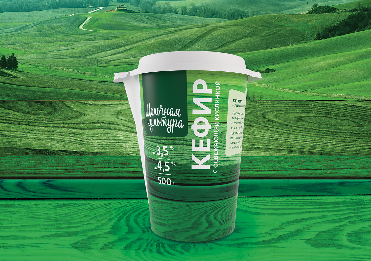
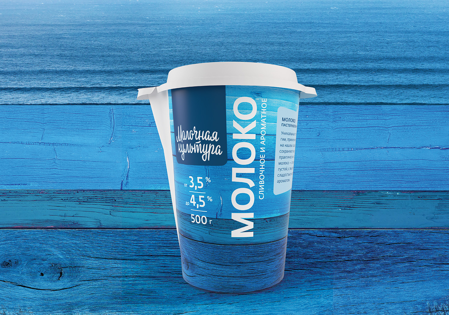
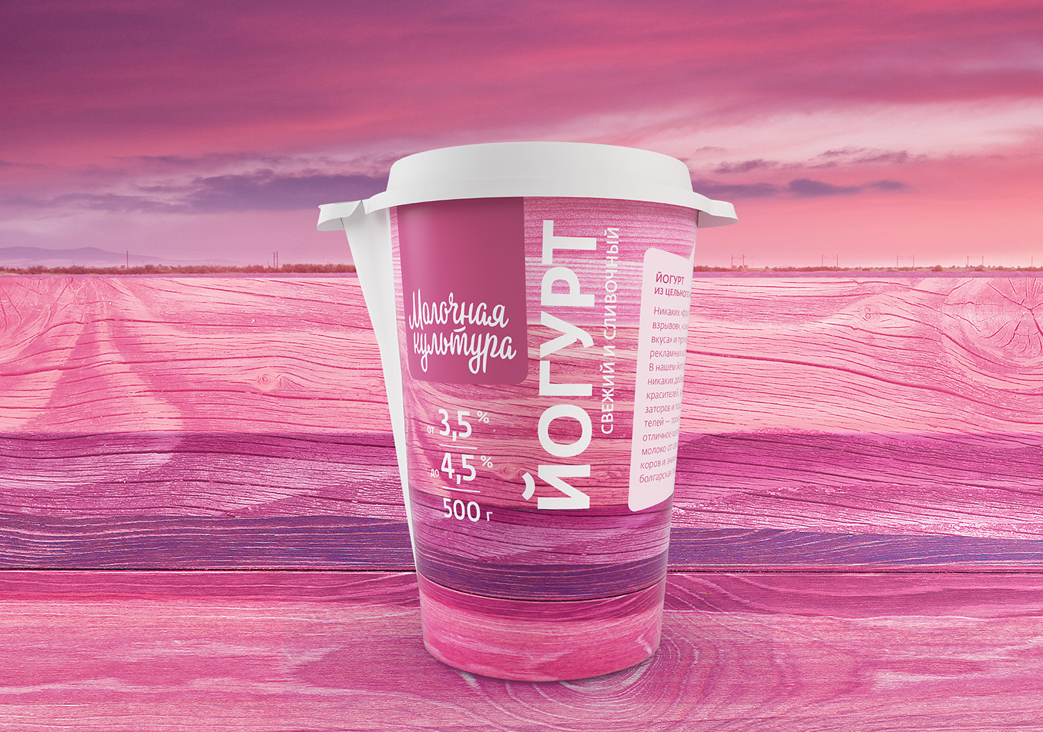
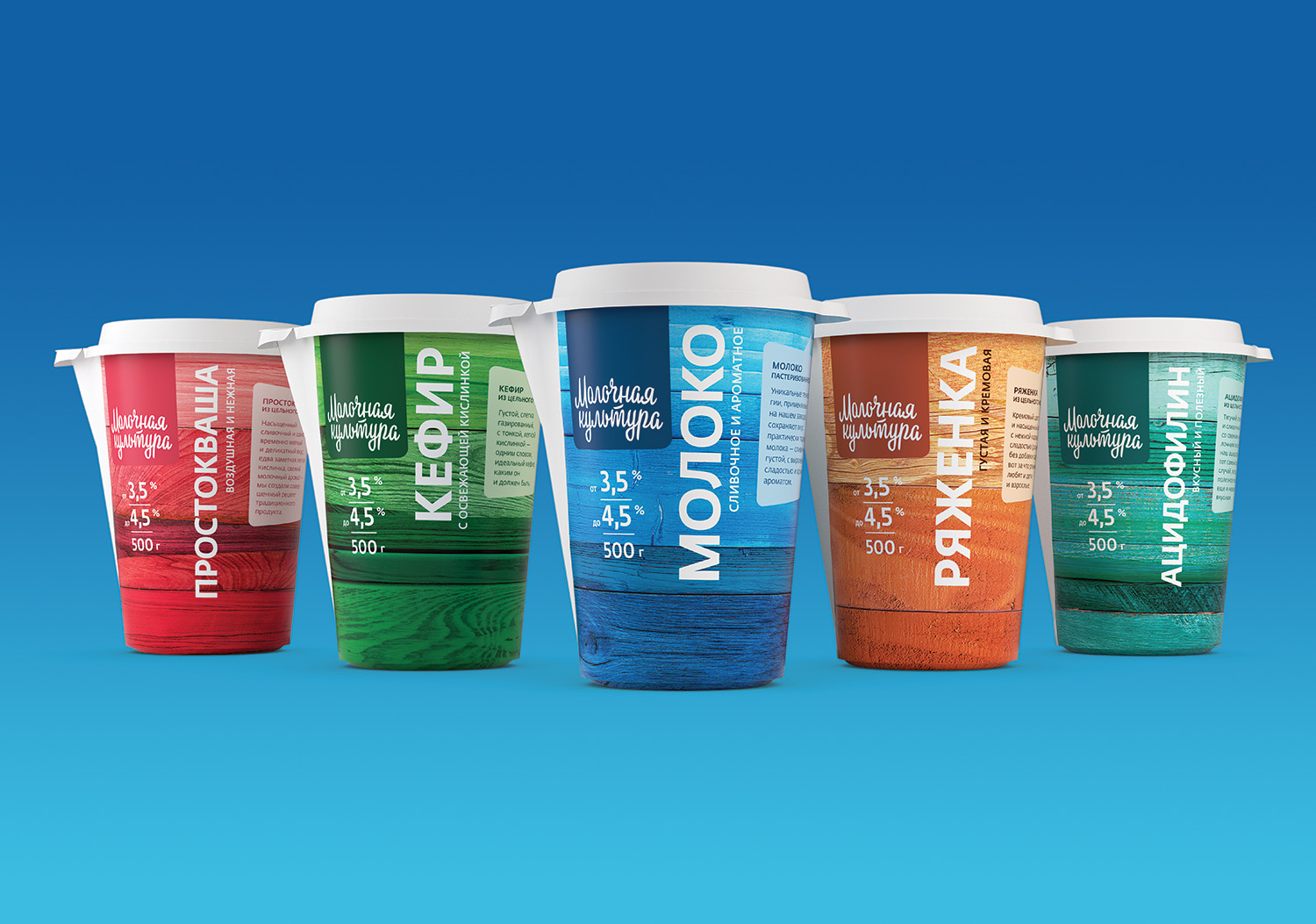
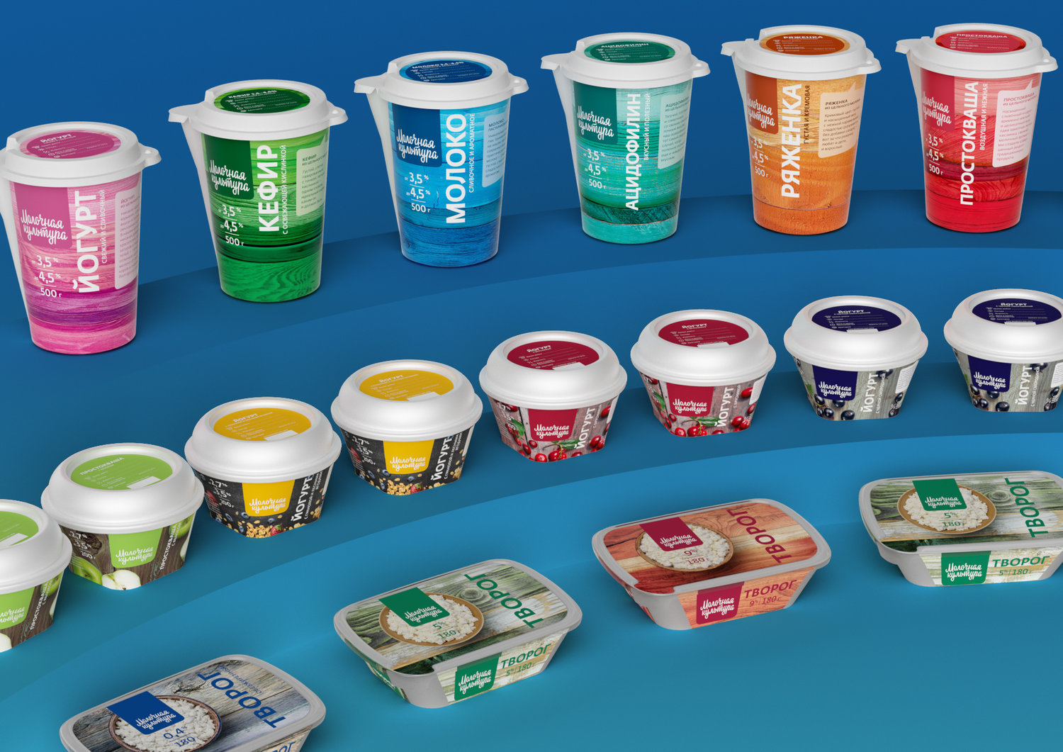
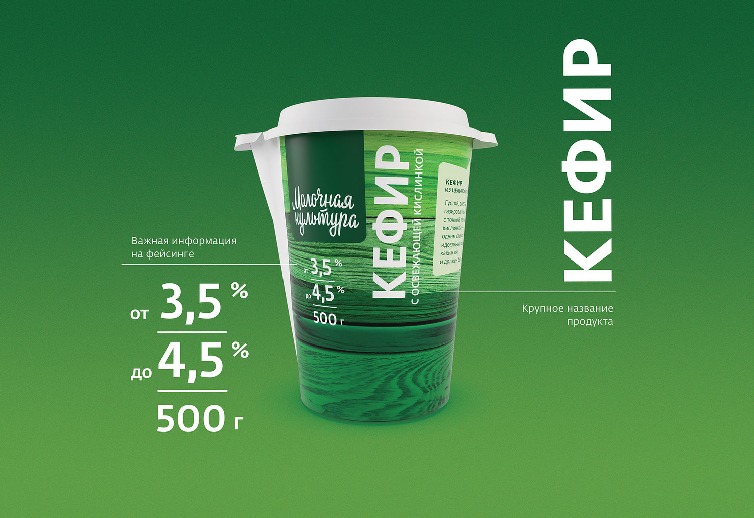
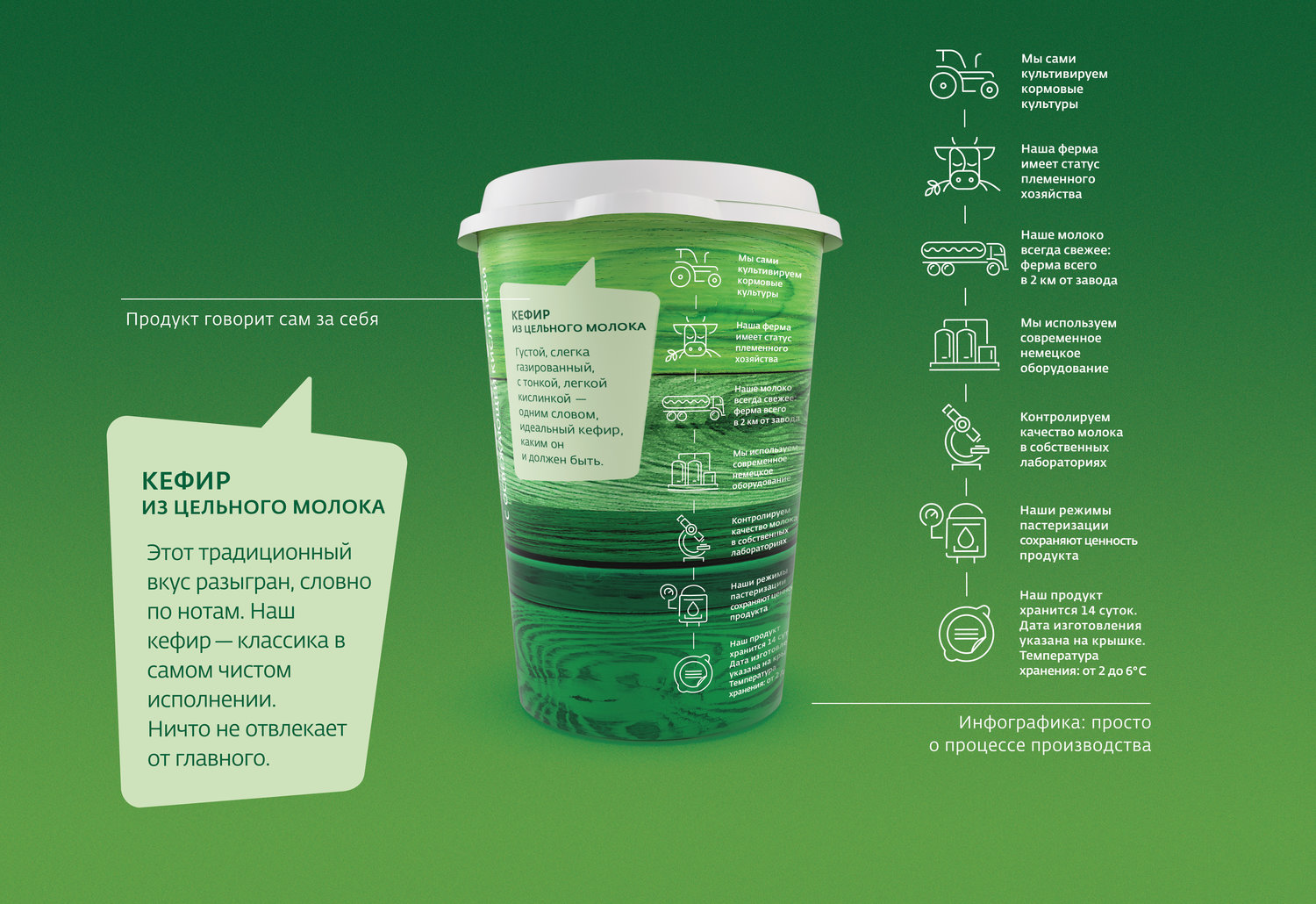
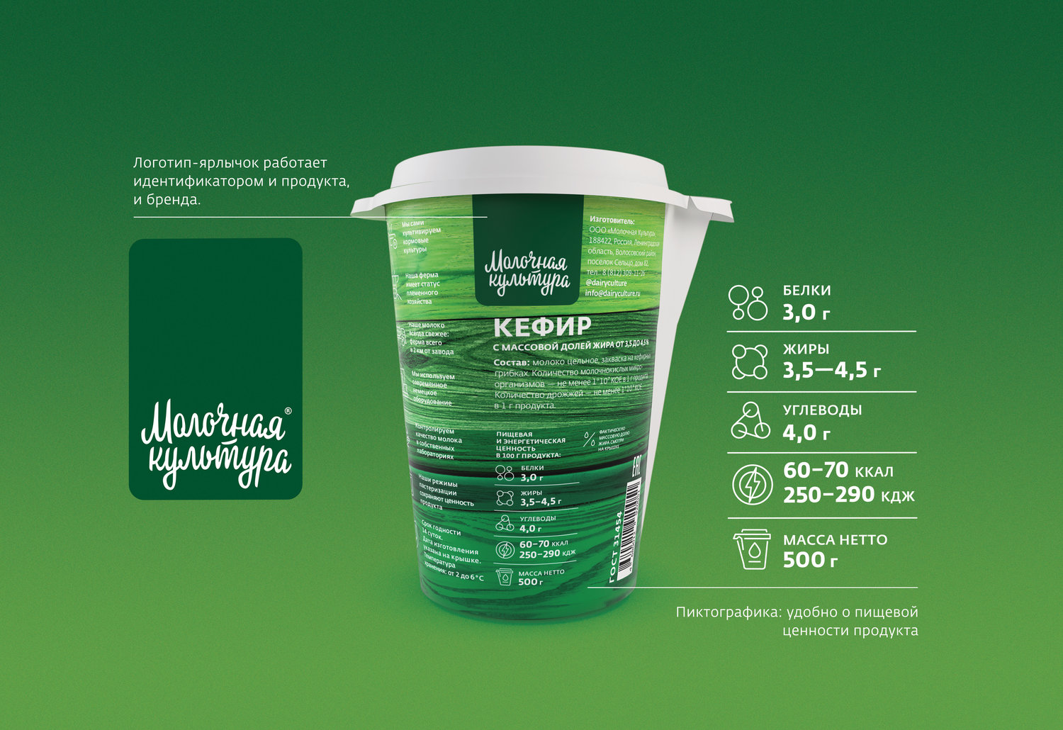
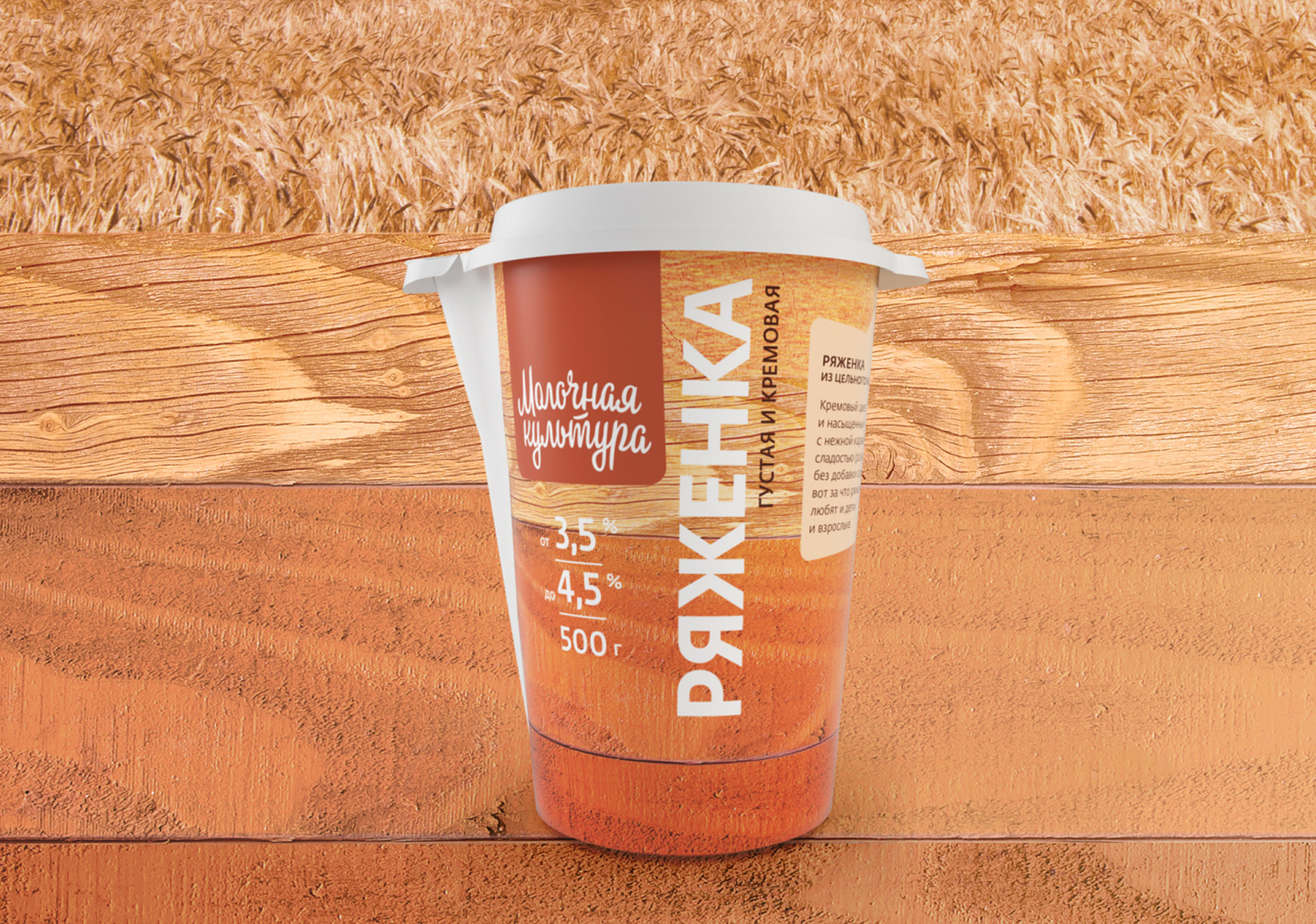
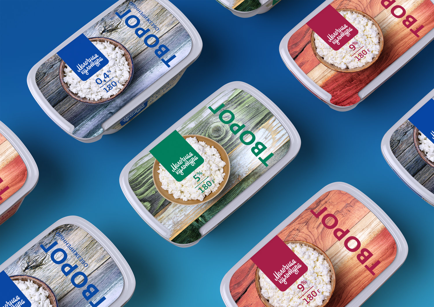
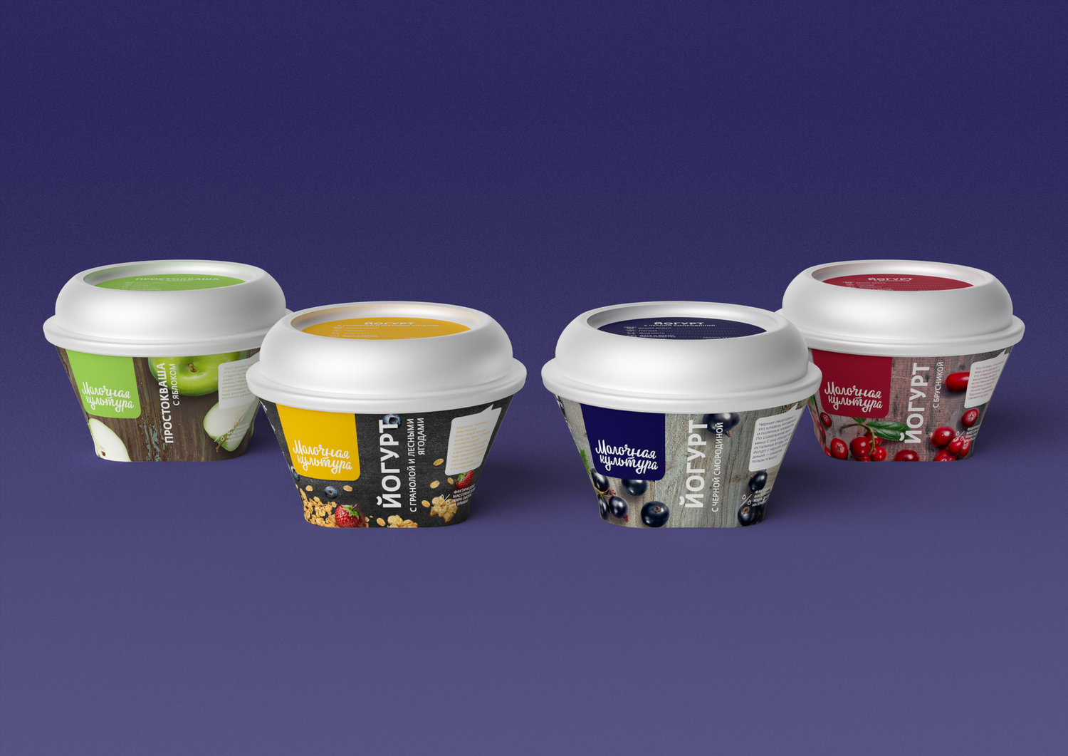
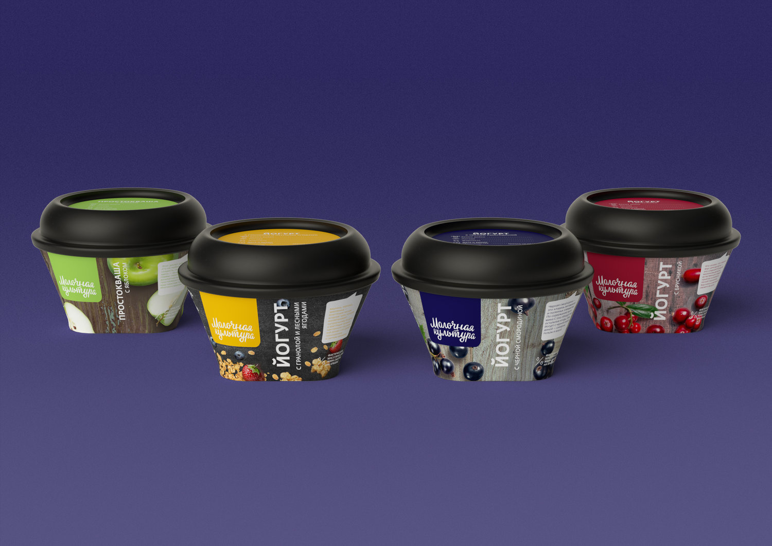
Task.”Dairy Culture” is positioned as a brand of modern high-quality dairy products to improve the quality of life. Related aspects of the brand’s culture are high technological solutions and present-day and advanced approach to dairy products, constant improvement of its consumer characteristics. The main tasks of the rebranding are to harmonize the visual attributes of the brand and its positioning by keeping the symbolism of the natural origin of products and a certain handmade look-and-feel. At the same time the goal was to bring actual, up-to-date and trendy features to the design, as well as to make the packaging bright, eye-catching in order to be more recognizable on the shelf.The audience of the brand consists of modern urban women of big cities who care of their nutrition, responsibly take the choice of products and at the same time appreciate not only the pure contents, but also value a rich natural taste that make the products of “Dairy Culture” stand out from the competitors. The glass of “Dairy culture”, the one with a spout, should become an essential part of the culture, image and environment of the consumer, an element of her everyday healthy lifestyle.The purpose of the rebranding of “Dairy Culture” is to expand the audience of the brand by visual update: to strengthen the loyalty of the existing target audience and attract a new one.Solution.1. The bright identity on the shelfWe decided to emphasize the logotype of “Dairy Culture” by placing it on a colored plate that became the guard field of the logo. That way we solved the problem of the readability of the brand name on the packaging for all types of products. Previously, the logo was lost on an illustrative informational background, which did not have a common design line for different products. As a result, there was no clear brand identifier. Now the consumer can read the brand name on any package immediately and recognize the “Dairy culture” product.There was a problem indicated by the client – the absence of an expressive “Milk Culture” color spot on the shelf of dairy products. Solving the problem, we analyzed the color spots of other brands and decided to think out of the box.Instead of a traditional approach such as fixing a single specific color behind the brand we gave “Dairy Culture” a bright positive multicolor that is a feature of the nature itself. It allows to present and highlight the brand on the shelf. At the same time, due to the contrasting color differentiation of the product line, it is much easier for the consumer to distinguish products from each other. Everything is simple and clear.2. Thinking about consumer.Not only we wanted the consumer to find the “Dairy Culture” brand on the shelf in just three or four seconds, but we also wanted him to choose correctly the desired product at the same time. Therefore, along with the bright and clear color differentiation of the brand and its products, we paid great attention to the readability of product names by showing them as large and catchy as possible on the packaging.Our certain achievement was the forethought of so-called “little” things, such as placing production date next to the time of use. The consumer will quickly and effortlessly get confirmation of the freshness of the “Dairy Culture” products.3. The convincing truth.The woman of “Dairy Culture” appreciates the quality of life. She is demanding, and we are very grateful to her. We believe that the best way to show the respect would be not just to assure her of the quality of the brand’s products, but to bring detailed evidence of its quality – rational and emotional arguments.Therefore, clear and reliable infographics on the package show the stages of quality assurance and quality control starting with natural fodder, that is grown directly by the manufacturer, and ending up with the laboratory where the products are tested.We know that our woman perceives a tasty product as a small reward for herself, for example, during an active and busy day. To enhance this perception, we added rather emotional descriptions of product recipes with special attention to the taste and products characters.4. From the shelf to the lifestyle.Finally, this is what could be the most important. Thinking over the new concept and design of “Dairy Culture”, we thought about its place – not only on the shelf, but also in the life of our customer. How to make her want to take this glass of milk to her world – bright, fashionable, tasty and active one.We were wondering how she dresses up to look not fancy, but stylish and unique; how she serves her table; what she takes to out-of-town weekend; what she wants to post to “Instagram” and how she would decorate her house if she wants to bring the nature atmosphere into it.By getting possible answers, we came up with the concept of “impression of nature”. In the design of “Dairy Culture” we used only two tools: the texture of wood and intense colors. The imagination of the audience itself will tell what to see on this vivid package. The main thing is the impression. And she would want to come back to it repeatedly.
CREDIT
- Agency/Creative: Studio DEZA
- Article Title: Rebranding and Packaging Desing for Dairy Culture from Russia
- Organisation/Entity: Agency, Published Commercial Design
- Project Type: Packaging
- Agency/Creative Country: Russia
- Market Region: Europe
- Format: Pot
- Substrate: Plastic


