


About UR Bakery
UR Bakery started with a simple passion for baking and a love of bringing people together to eat sweets. Founded in 2021, it started as a home kitchen experiment and then evolved into a business dedicated to making high quality and delicious biscuits for everyone to enjoy. Since the beginning, our focus has been on using the best ingredients, which is the philosophy of the brand’s “the best ingredients”, experimenting with new flavors and perfecting traditional recipes.
We have expanded from selling on campus in the state of Virginia, USA, to providing our biscuits in the Kuwait market, with multiple stores.
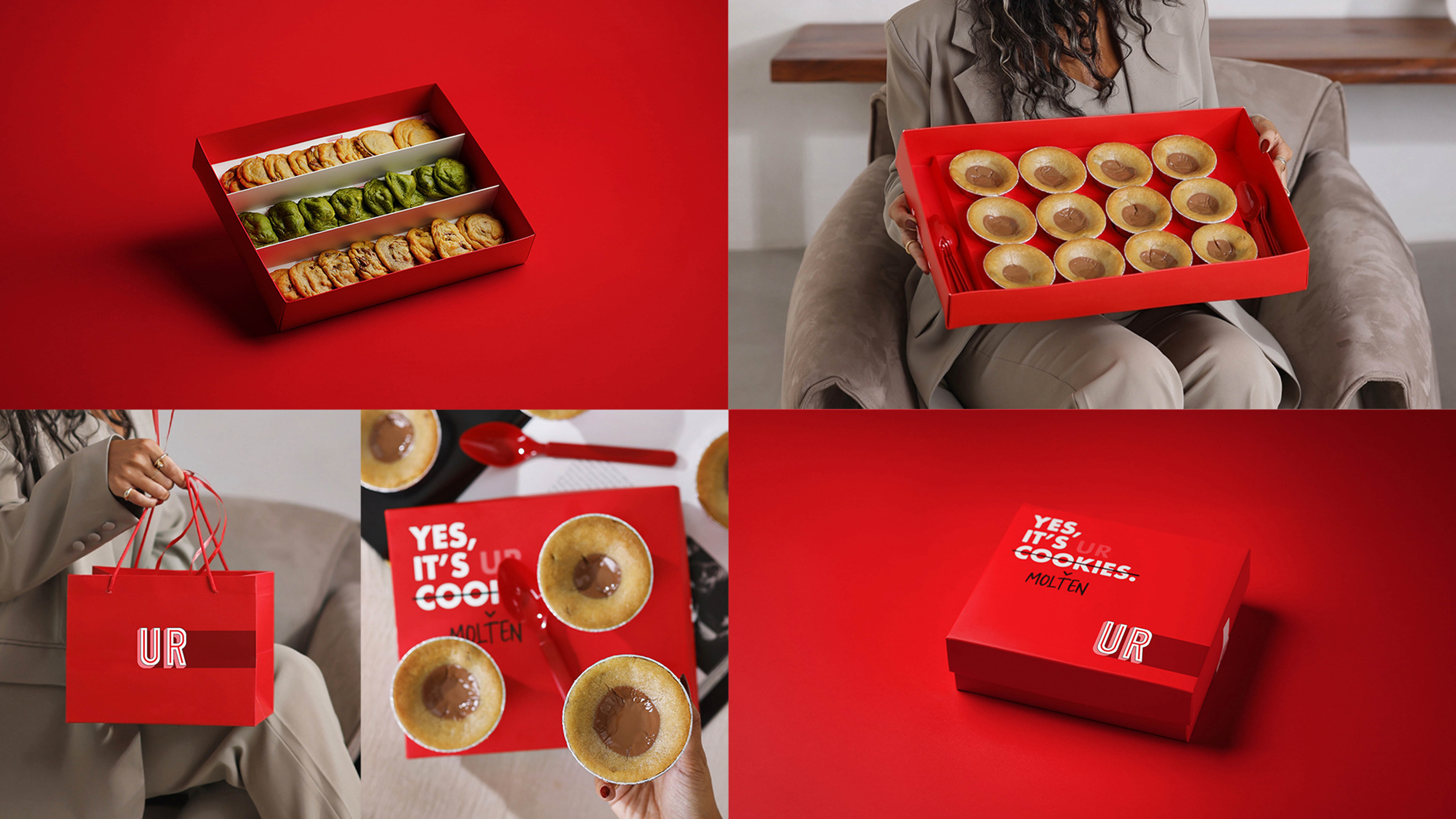
While maintaining our commitment to handmade excellence. Each batch of UR Cookies is made with care and love, ensuring that each bite delivers warmth and delicious taste.
Project details
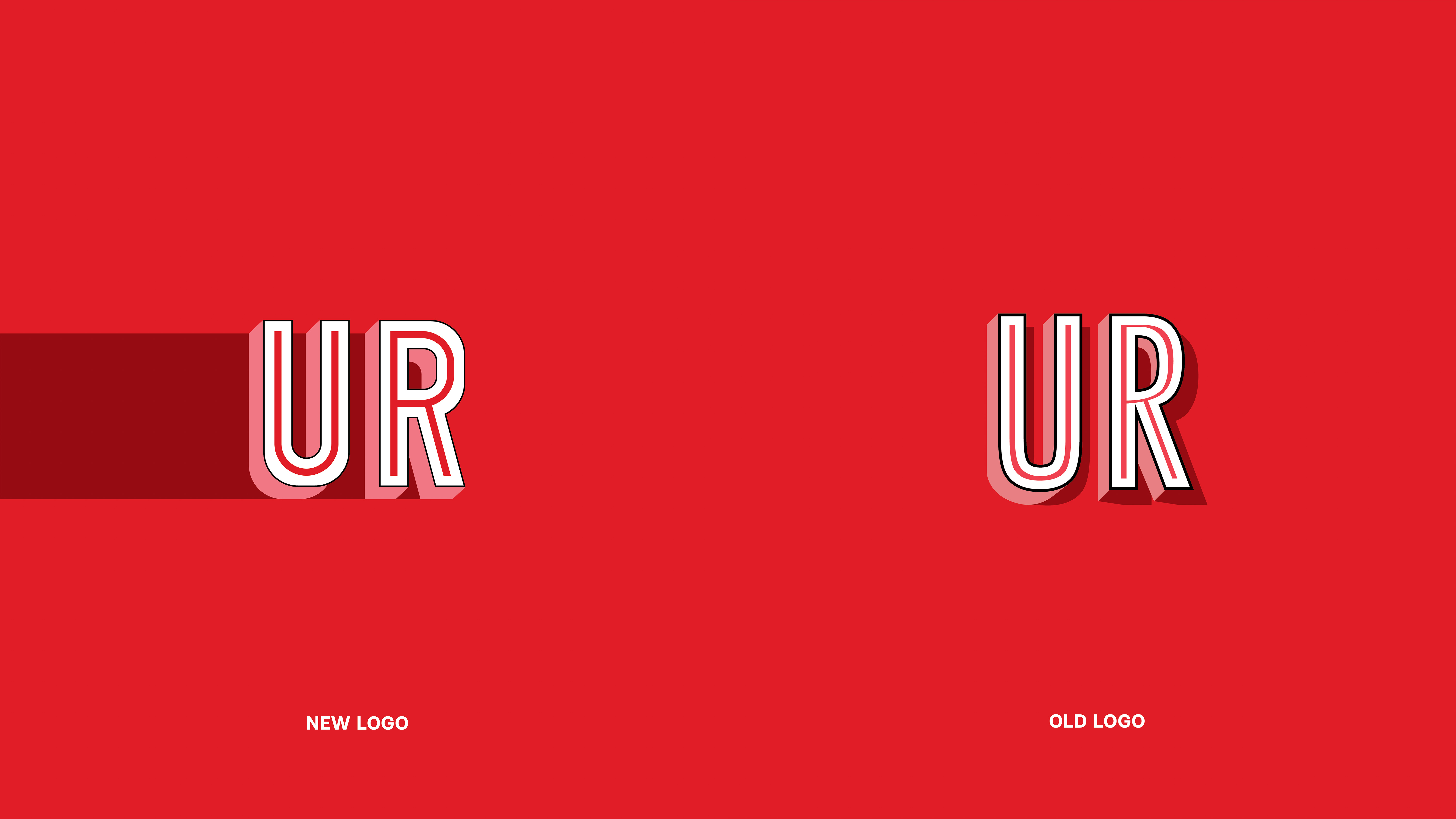
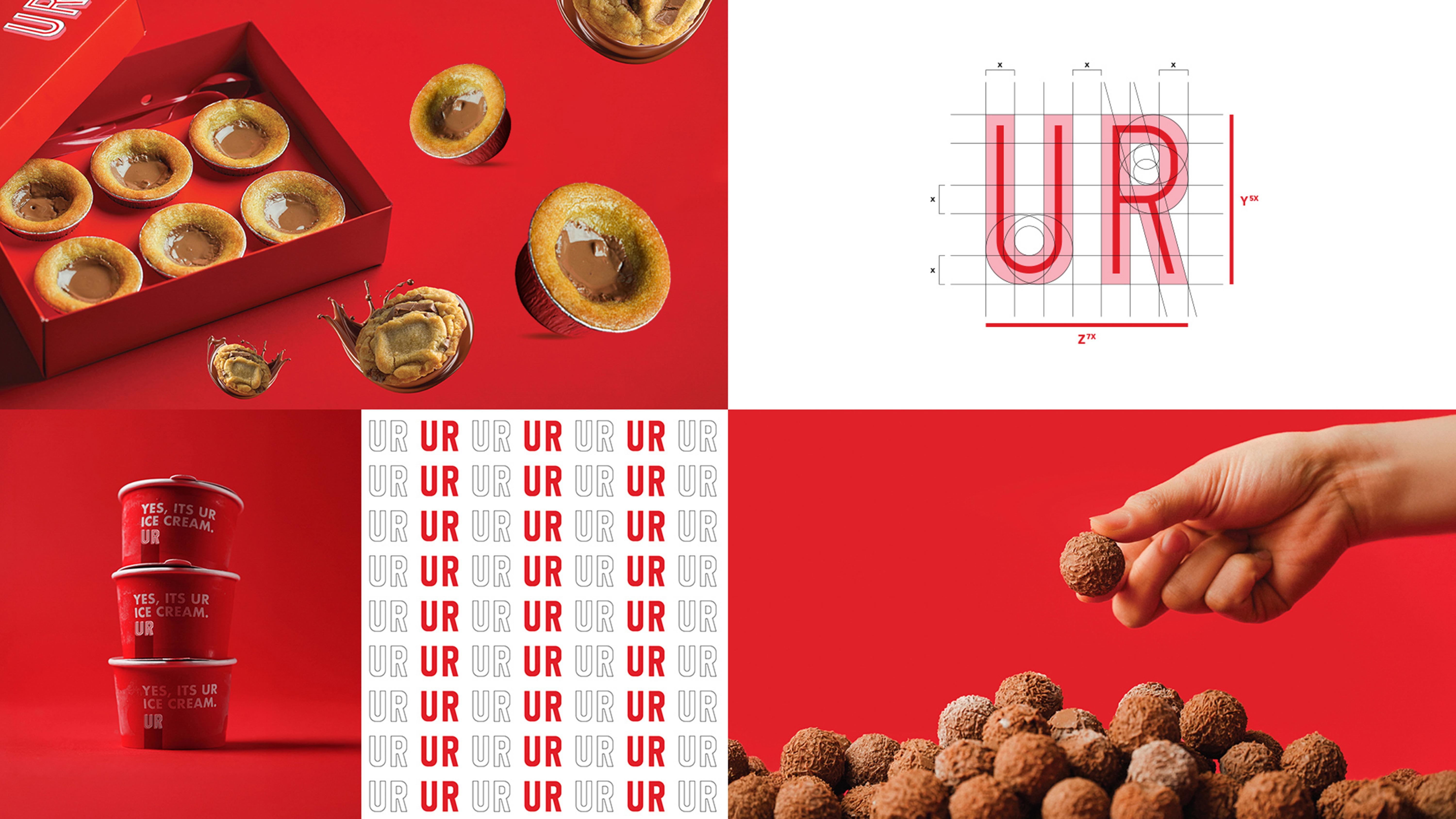
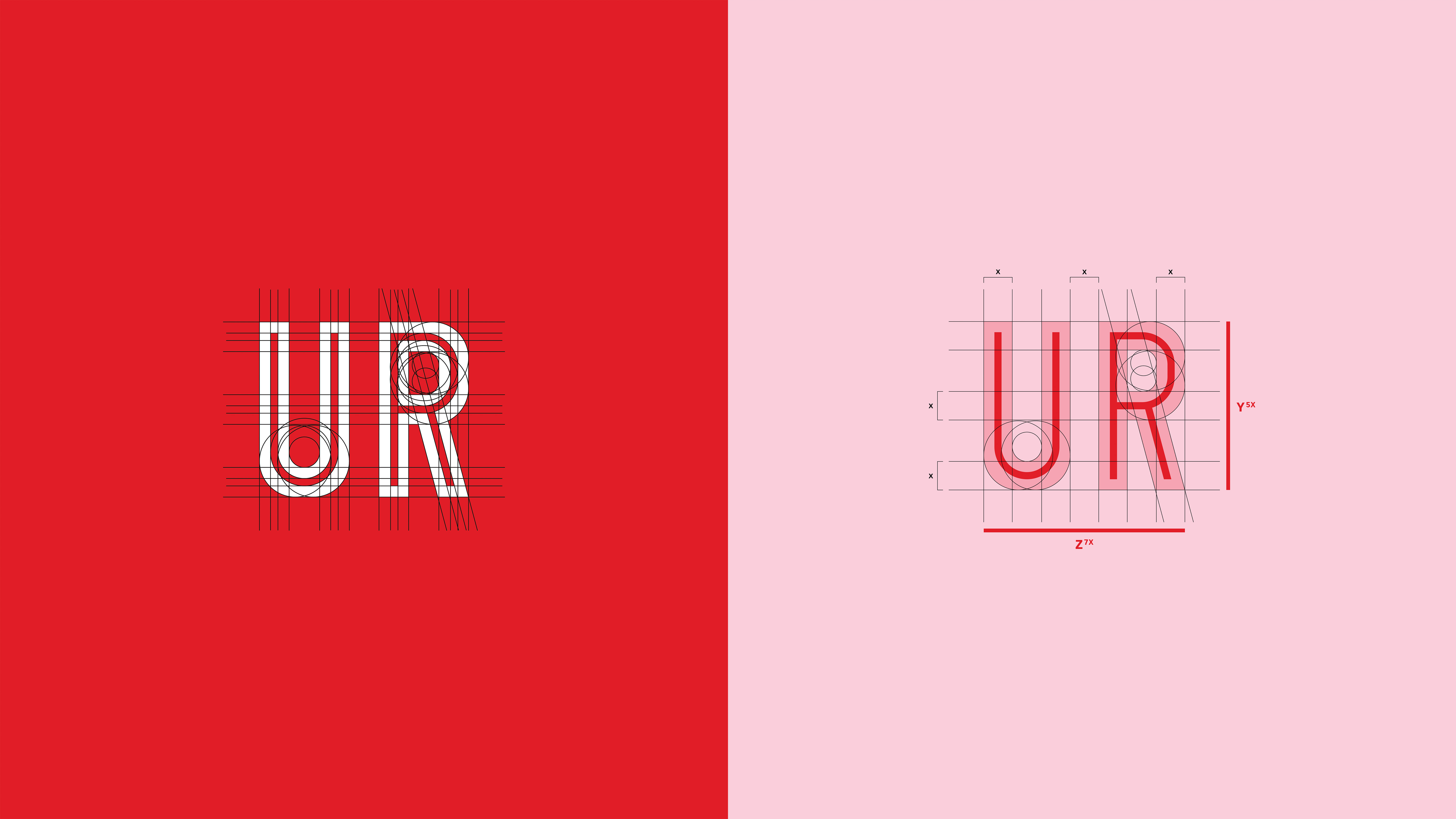
It is a redesign of the brand, starting from the logo to the packaging, the main goal of the redesign was to find solutions to several problems, including the shadow of the old logo, the incorrect drawing of the letters of the logo ” U+R “, the incompatibility of the letter “R”, as well as the printing problem, where the shadow appears on social media designs in one color and in print a completely different color when printing the logo individually (shadow have belending mode layer not solid color)
Why the logo has not been completely changed
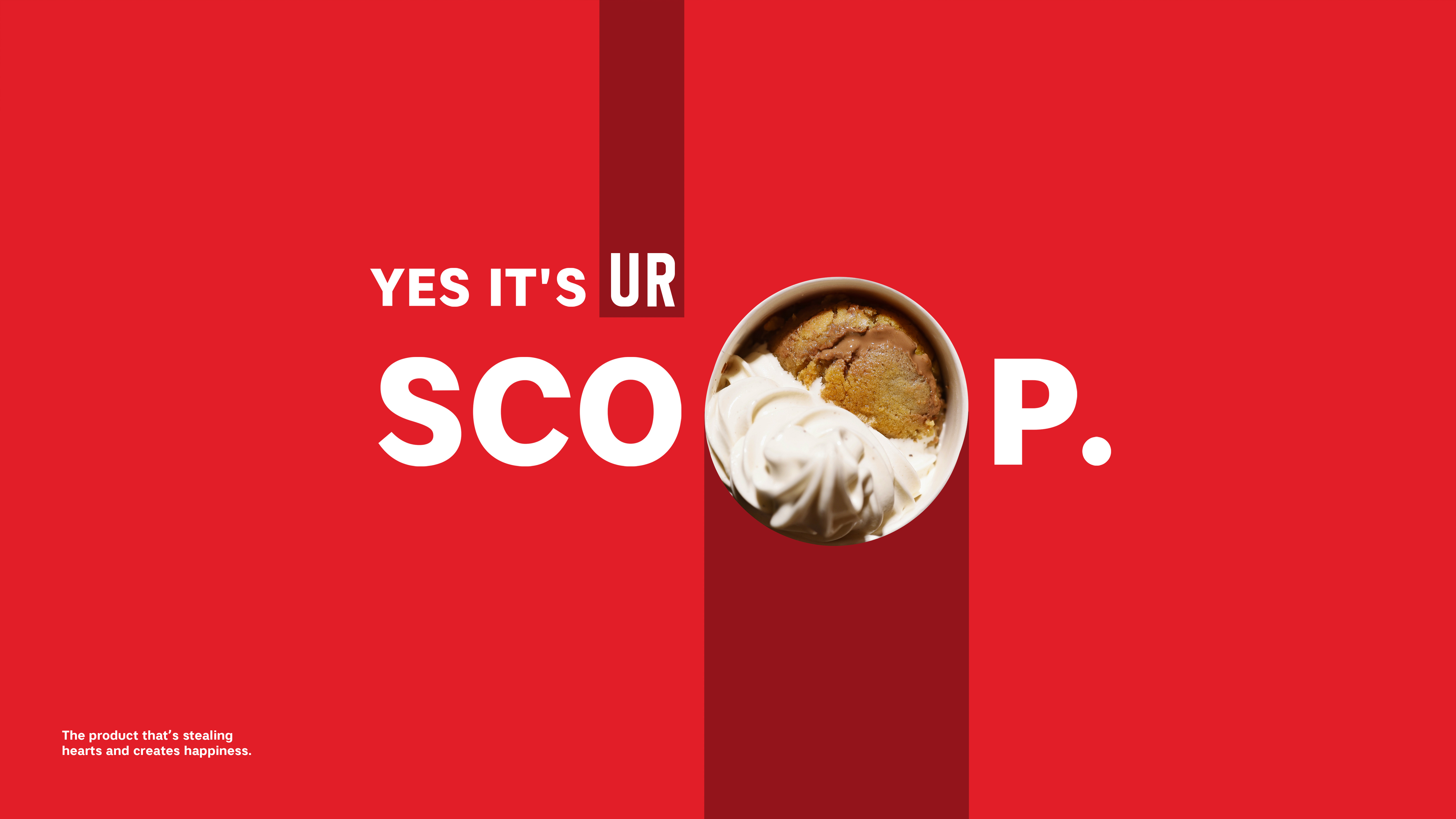
This was the most important question before the redesign, and the answer to the question is that the brand’s marketing strategy is based on (yes, it’s UR + product name), so here it was necessary to keep the word YOU ARE = UR , since the name was shortened to letters ” UR ”
Marketing strategy
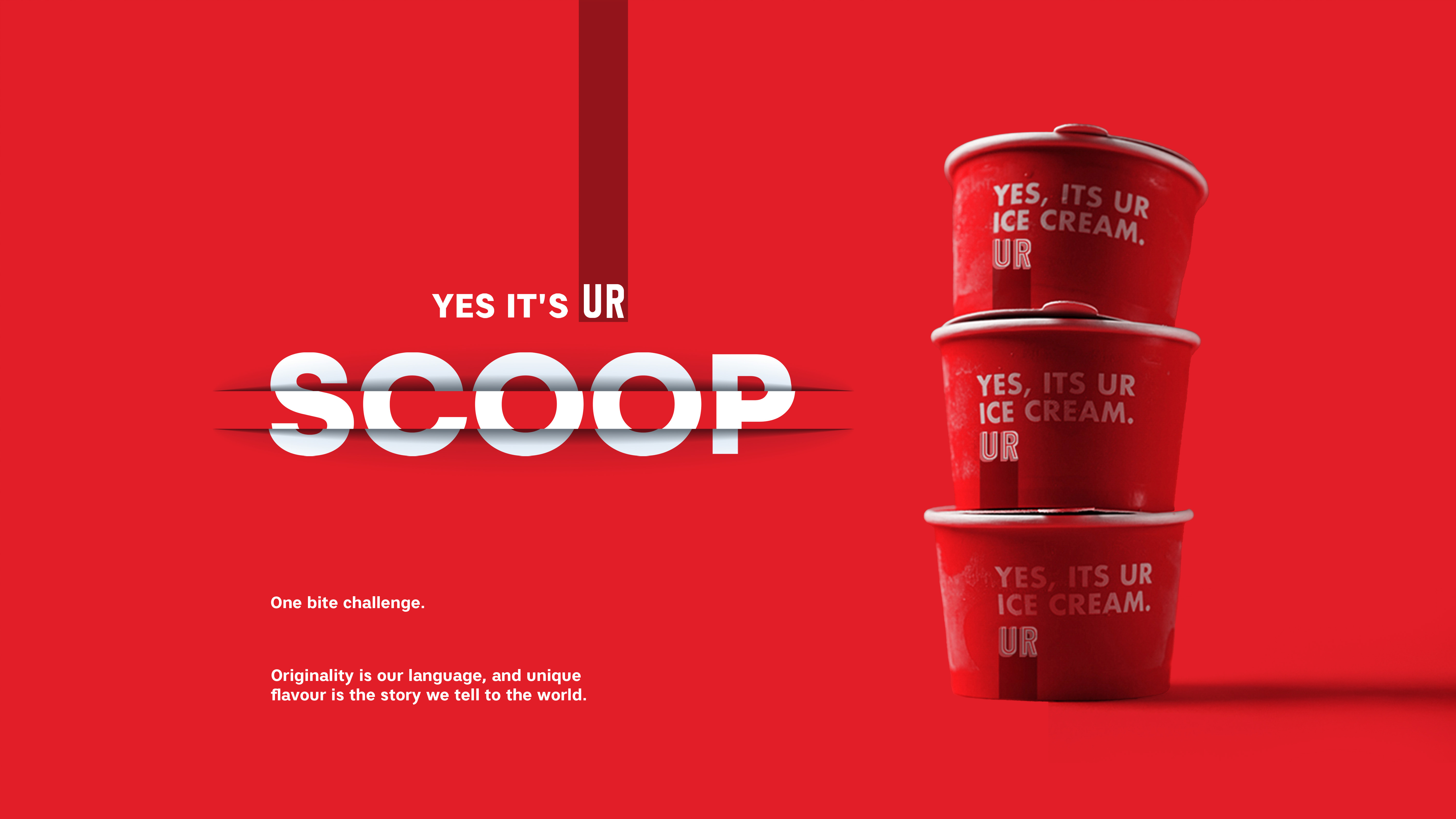
The two letters “UR”is an abbreviation for “YOU ARE” and the verbal logo of the brand is “YES IT`S UR COOKIES” so the logo has not been completely changed because the strategy requires it , and it is a strategy based on the public’s love for the brand, which is a real thing indeed, all Gulf countries adore this brand When conducting design research before the design process, it was found that almost all the items “slod out” and the best-selling product was “UR scoop ” + ” UR Molten ”
Swiss style
Red was chosen as the main color because it is the color of delicious food, love, delicious chocolate and fun The packaging was redesigned and the emphasis was placed on the Swiss style “”Swiss school “” with texts and this style was mainly adopted with print designs as well as packaging and social media designs
Logo
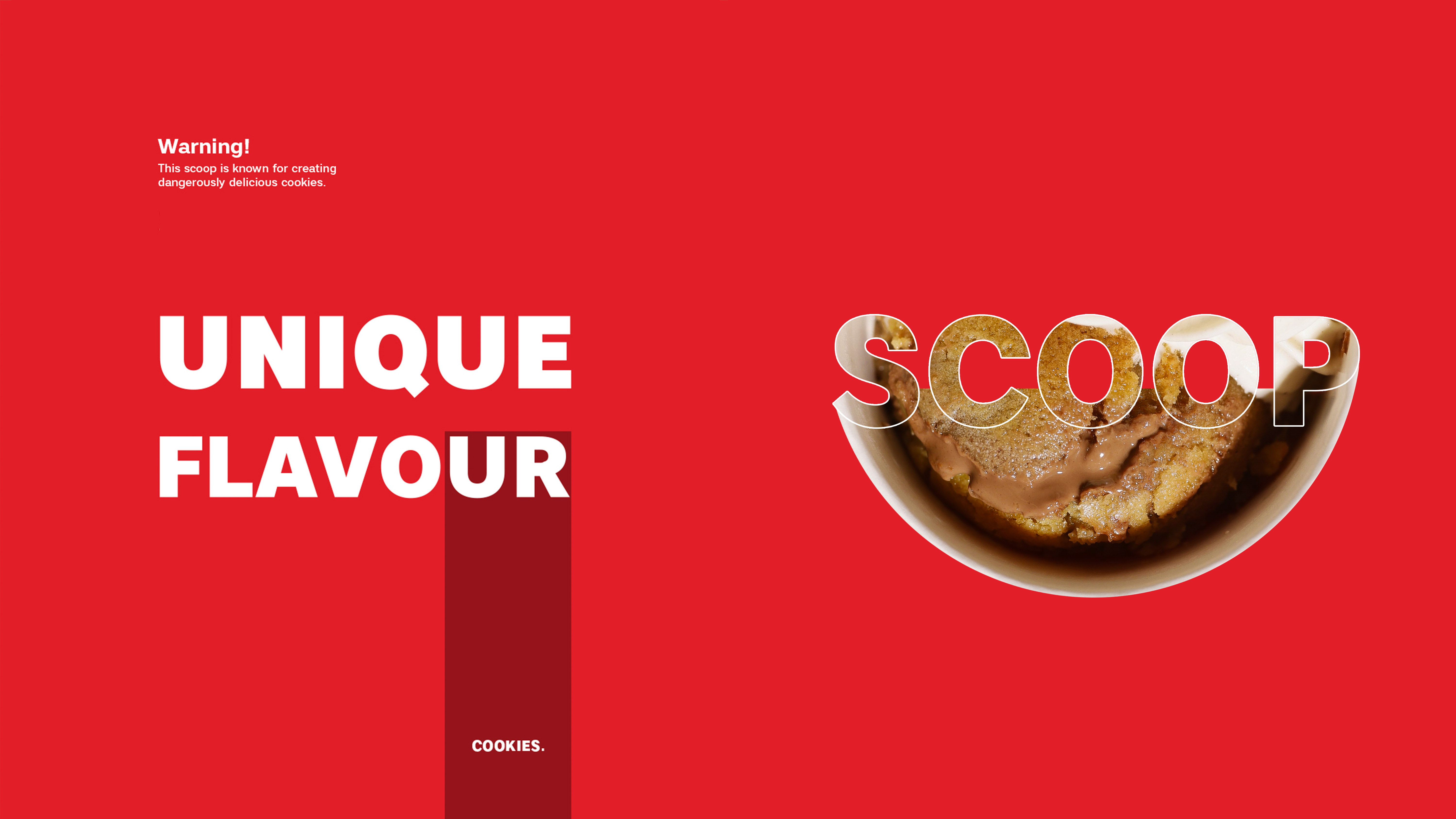
The logo is divided into 4 colors in addition to internal and external lines, in order to indicate the overlap of the ingredients with each other, which was done with a balloon and layers of the logo color overlapping with each other and overlapping layers to give the best taste at all, “overlap is for ingredients that mix with other ingredients to give a delicious and wonderful taste, and this is the most important feature of this brand (very tasty and new taste).”
There was a very deep question here (where does this brand come from with such a delicious taste)
The answer to this question was the presence of a lot of experiments with exotic and new ingredients to give the best taste ever
Here I will mention a question when taking brand data before official work, which is ” how many times has the scoop Product been tested to show to the world?””
The answer was 27 times a test so that the product reaches the delicious and original taste of the brand, and here the brand team confirmed that the secret is in the ingredients and details.
Simplicity
The style of the Swiss school was relied upon in re-designing the packaging and the brand as a whole, and this also appears in some posters on the items or even the designs of social media also brand presentation. It is a delicious, fun and cheerful brand, chocolate and happiness that we made easy, abstaining, beautiful and brief, red chocolate or red velvet or red UR.
CREDIT
- Agency/Creative: Ahmed Ghazi
- Article Title: Rebranding and Packaging Design for UR Bakery by Ahmed Ghazi
- Organisation/Entity: Freelance
- Project Type: Identity
- Project Status: Non Published
- Agency/Creative Country: Kuwait
- Agency/Creative City: Salmiya - Kuwait
- Market Region: Asia
- Project Deliverables: Brand Creation, Brand Guidelines, Brand Identity, Brand Redesign, Branding, Graphic Design, Identity System, Packaging Design, Rebranding
- Industry: Food/Beverage
- Keywords: WBDS Creative Design Awards 2025/26 , Bakery & Scoop & Cookies & Red & Molten & Cakes & ice cream & Kuwait
-
Credits:
Creative Art Director, Brand Designer: Ahmed Ghazi


