
Kisho – Sho Chiku Bai
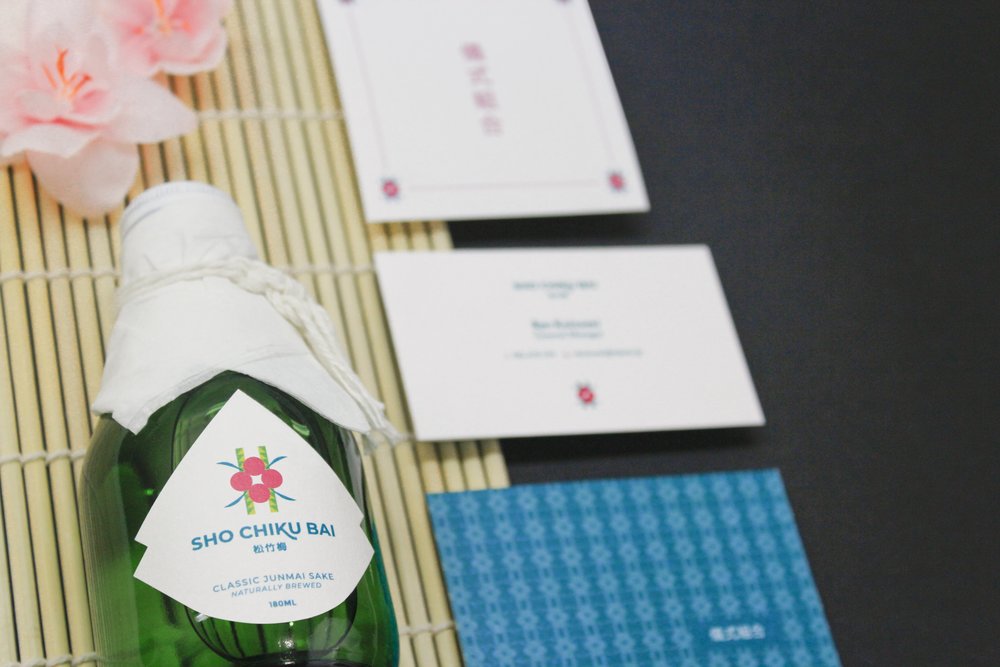
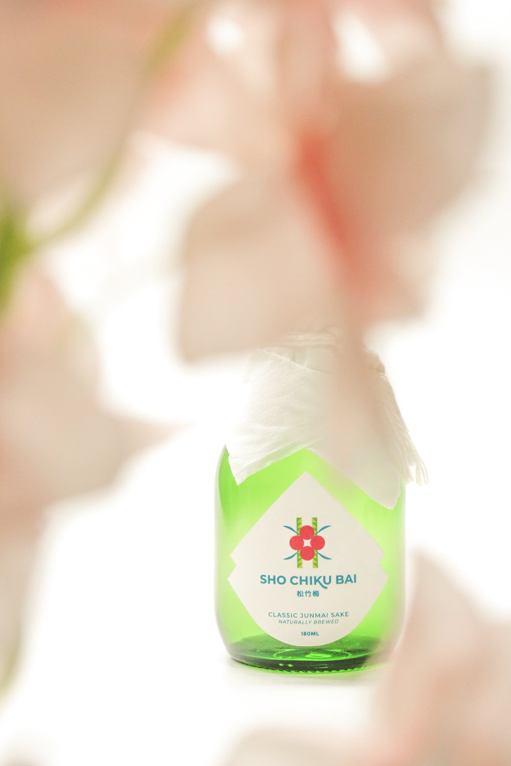
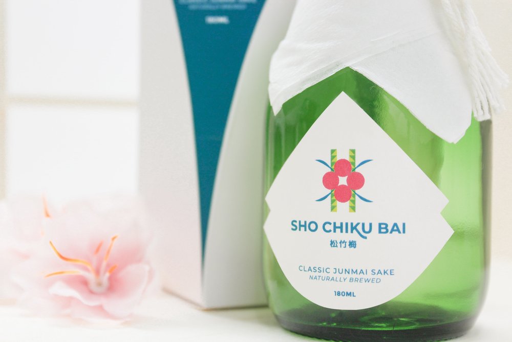
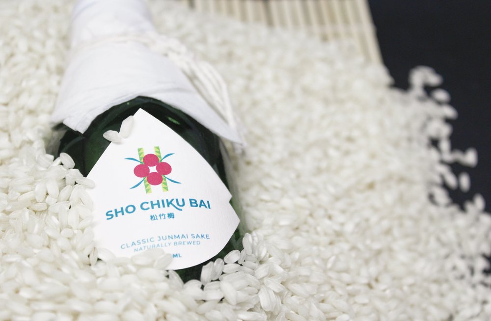
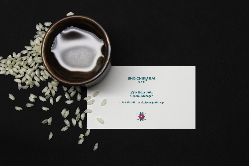
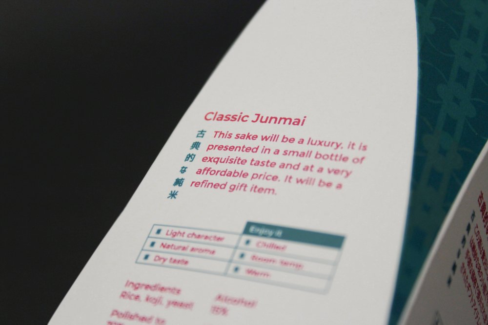
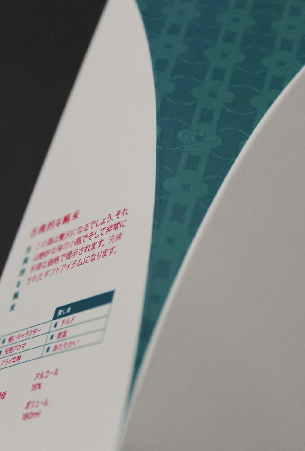
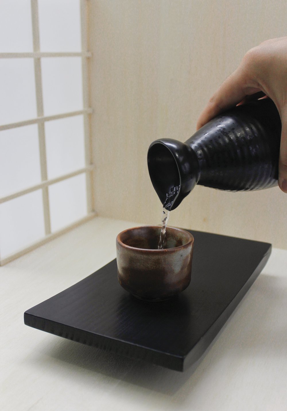
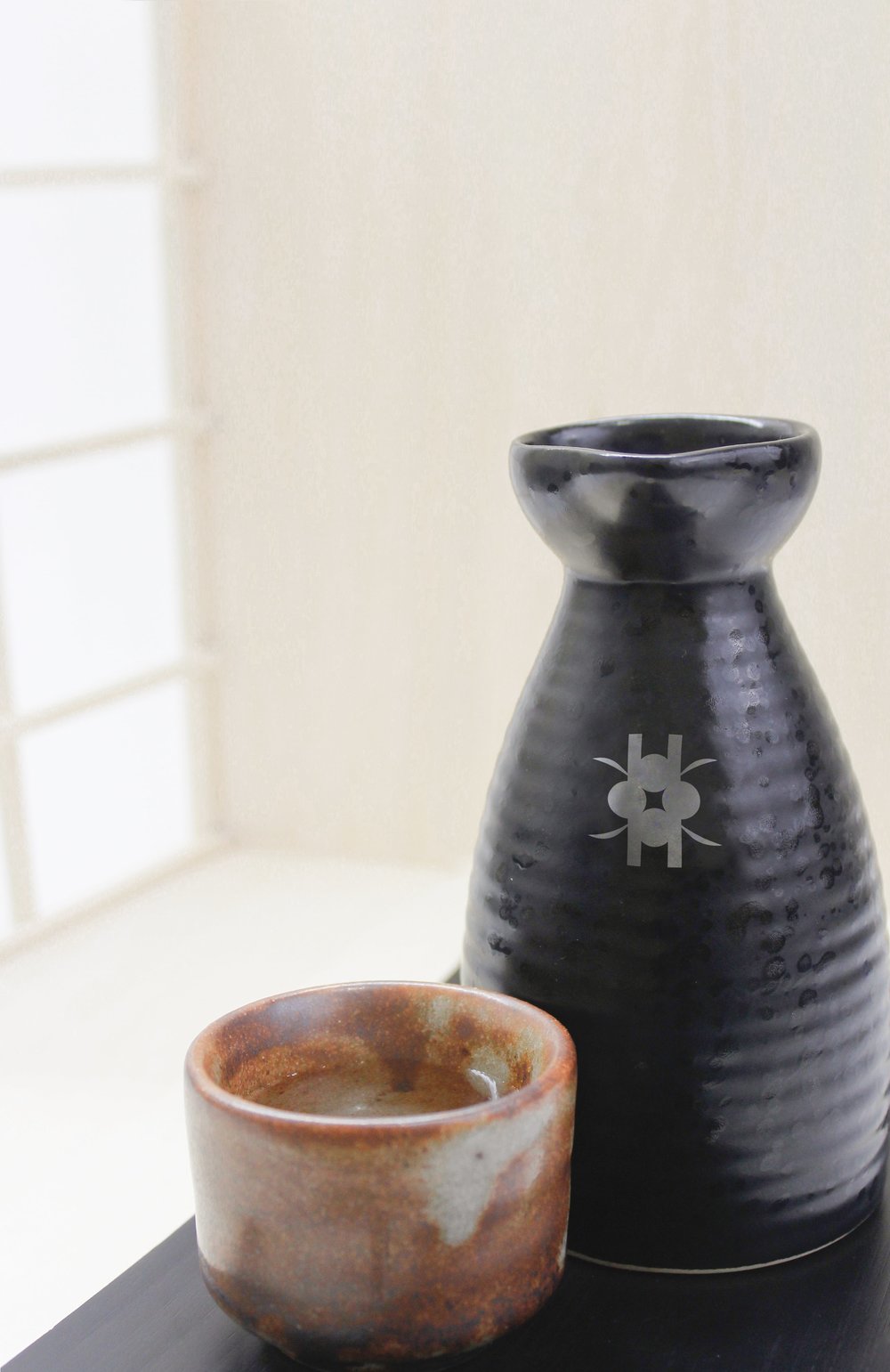
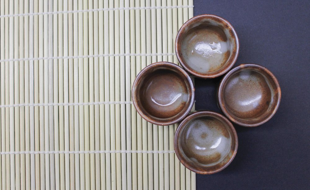
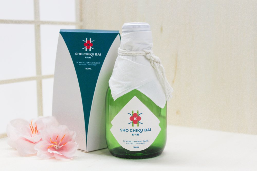
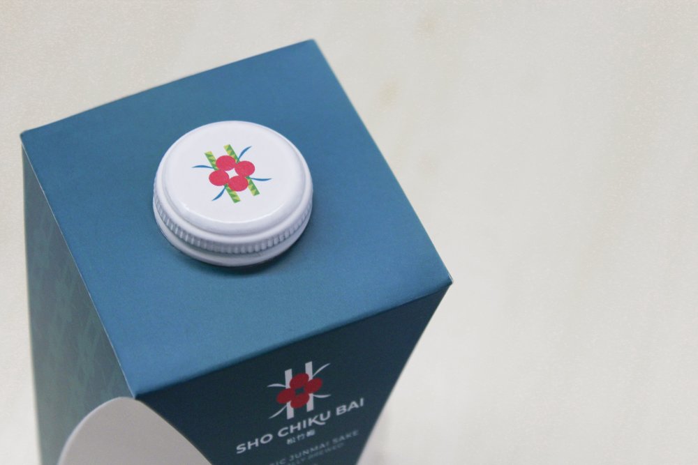
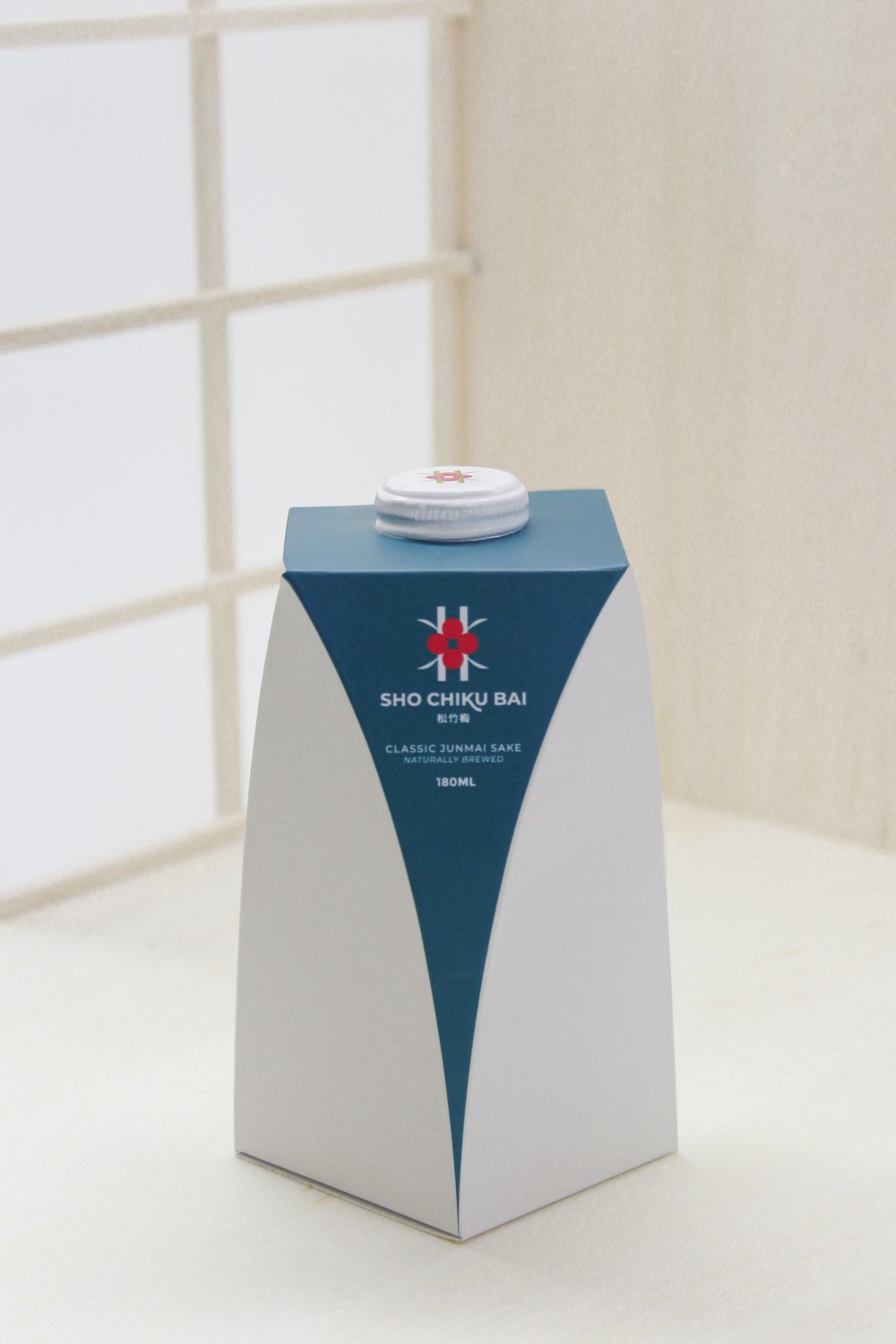
Takara Sake USA Inc®. Is one of the members of the Takara group, one of the most popular producers and distributors of alcoholic beverages based in the japanese culture.Among its emblematic products, they have Sho Chiku Bai ™, the high quality junmai sake, to which no alcohol is added in its preparation. The drink represents the luxury, exquisiteness and tradition that has accompanied its reputation in the market.Responding to the modernity that surrounds us, faster and faster, the rebranding project was developed, with the premise of renewing its appearance, to a more modern and minimalist one, without losing its oriental identity. Thus, under the concepts of union and ceremony, it was possible to give it a new visual breath, where we unify its existing symbols, in the midst of what represents the luxury of being a ceremonial product.Finally, it was bet on a package that synthesizes the shape of the grain of rice and that also departs from the conventional and squared. Throughout this process, we were able to learn more about what Japan means to share, unite and celebrate.
CREDIT
- Agency/Creative: Kisho
- Article Title: Rebranding and Packaging Design for Sho Chiku Bai Sake From Takara Sake Usa Inc.
- Organisation/Entity: Student, Published Commercial Design
- Project Type: Packaging
- Agency/Creative Country: Peru
- Market Region: South America
- Format: Bottle, Box
- Substrate: Glass, Pulp Carton, Pulp Paper


