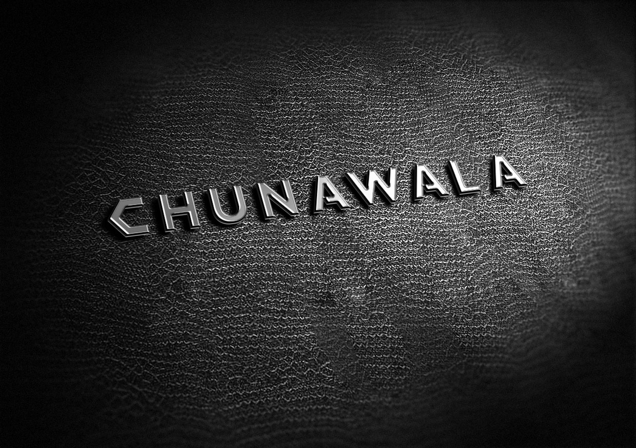
We were approached to do branding for Chunawala- A real estate firm in Mumbai. Reliability, strength and stability were the key takeaways we got from our research. Being in a real estate business you are required to be real strong and reliable as you are providing a commodity that your customers will be using for generations to come. We worked around those words and created a simple yet remarkable type based logo that beams strength and stability. We also added a brandmark using the brand initial to be used secondarily in the branding.


CREDIT
- Agency/Creative: Identity Brandcom
- Article Title: Rebranding a Real Estate Firm Based in Mumbai
- Organisation/Entity: Agency, Published Commercial Design
- Project Type: Identity
- Agency/Creative Country: India
- Market Region: Asia
- Project Deliverables: Brand Creation, Brand Guidelines, Brand Identity, Brand Redesign, Brand Strategy, Branding, Graphic Design, Identity System, Rebranding, Research, Tone of Voice
- Industry: Real Estate
- Keywords: real estate, housing, homes, rooms, architecture, art, creative identity, logo design, typography, type logo, logotype, branding, identity, strong, stability, construction, black, classy
FEEDBACK
Relevance: Solution/idea in relation to brand, product or service
Implementation: Attention, detailing and finishing of final solution
Presentation: Text, visualisation and quality of the presentation


