We’re super excited to officially reveal our new brand identity and website to the world today! Over the last 18 months, ORCA has been undergoing a huge repositioning and restructuring exercise. We are no longer the same agency we were 18 months ago. So much has changed and we feel more confident in our vision, mission and values as a result.
So, what’s changed? We’ve welcomed a few new team members who themselves have very strong opinions for how we should be perceived as an agency. Our team may be small but our vision is big and we feel confident with our collective skill set. Secondly, our focus is now creating experiences for challenger brands and ethical and sustainable businesses. As a challenger ourself, we’ve always felt comfortable and at home in this space, and over the years we’ve honed our skillsets and knowledge to become a challenger brand expert. While design will always be at the heart of what we do, we’ve expanded and strengthened our repertoire to include multiple strategic services, allowing our clients to get the full experience with us.
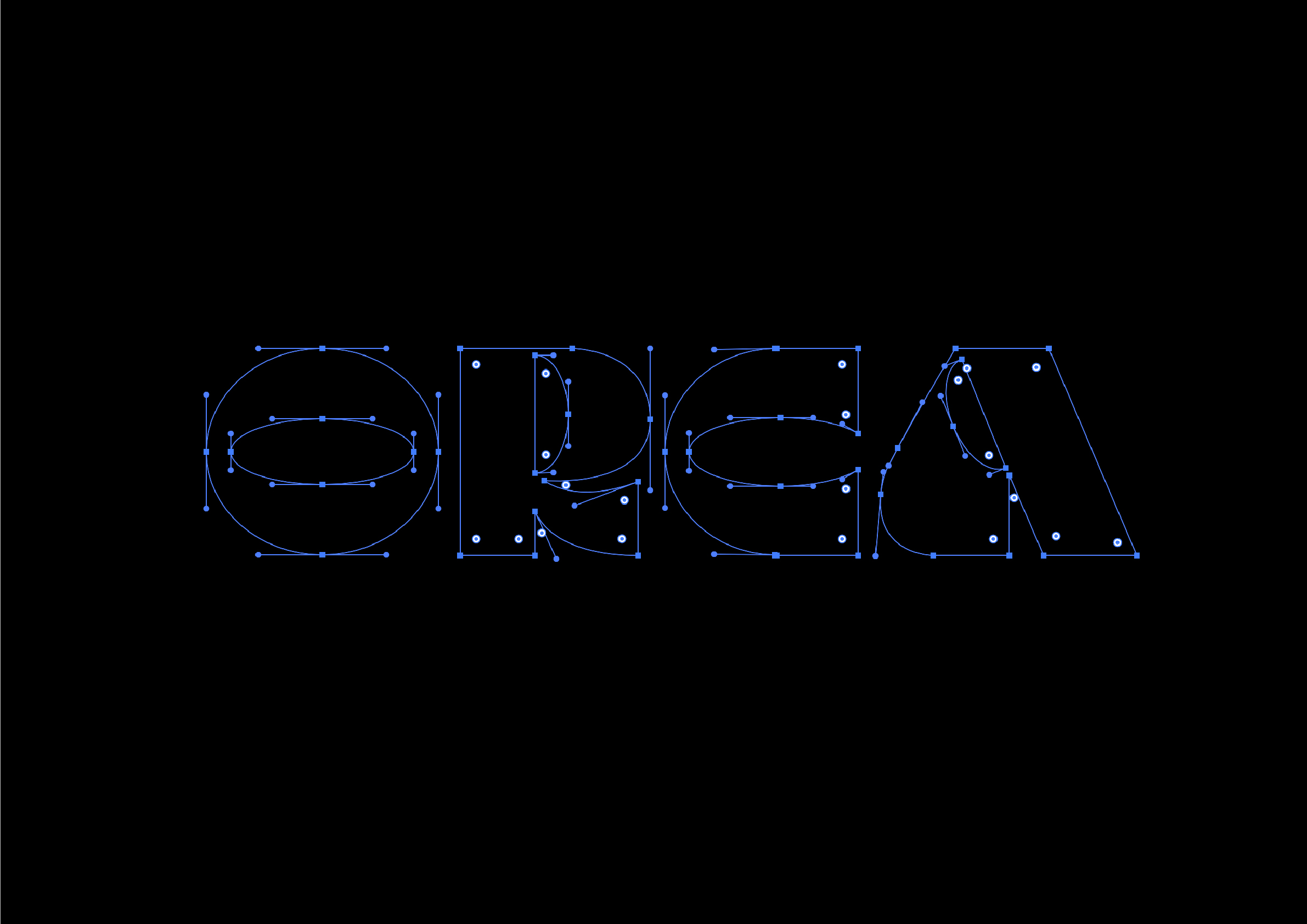
ORCA was built on a foundation of craft. We’ve always been passionate about design in all it’s forms, but particularly about custom typography. Every brand identity we’ve had over the years has started with this, and so we followed the same process this time.
After a lot of debates, disagreements and moments of hysteria- we eventually landed on a wordmark that felt right. It’s unique and bold, loud and progressive- suiting our new direction down to a T. We then built the rest of our identity from here and we feel like it’s the strongest we’ve ever had.
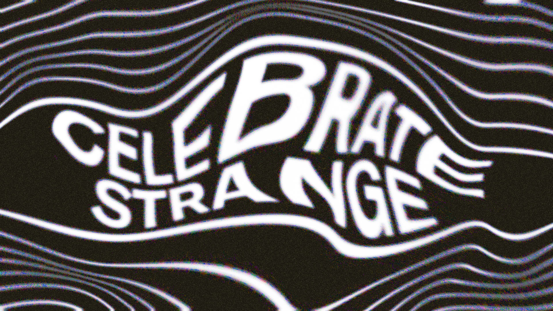
Leading with bold oranges and blues, and championing texture in all its forms through the use of expressive, abstract imagery, we now own a visual identity which we can own for many years to come. When it came to our website, we wanted a digital presence that felt as bold and confident as our brand values, and that allowed each project to shine. Working with a JAMstack headless CMS solution, we were able to create a super lightweight, fast and environmentally friendly website.


CREDIT
- Agency/Creative: ORCA
- Article Title: Rebranding a Brand Agency – The Trials and Tribulations
- Organisation/Entity: Agency, Published Self Promotional Design
- Project Type: Identity
- Agency/Creative Country: United Kingdom
- Market Region: Global
- Project Deliverables: Brand Design, Brand Guidelines, Brand Identity, Brand Redesign, Brand Rejuvenation, Brand Strategy, Branding, Rebranding, Research, Tone of Voice
- Industry: Information
- Keywords: Rebrand, Agency, Design Studio, Reposition, Challenger


