


Coffignon is a spectacles brand founded in Paris almost 100 years ago. They offer high-quality glasses. Their experts offer you excellent visual solutions, which combine the best glass technologies with in-house creations or exclusive collections by artisans and designers. The shop is located in the 8th district of Paris, an area well known for its high-end shops. Coffignon’s motto ‘To see and to be seen’ refers to how every single detail of the spectacles is carefully made. Each glass is a piece of art. Their target are people aged between 40 and 60 years old, people with interest in culture, such as design, cinema, music… People who are interested in fashion and well dressing.
We were commissioned to redesign a brand with almost 100 years of history. The initial brief was to reshape their ‘C’ monogram to make it look more contemporary. However we saw a good opportunity to create a unique brand’s visual language that could speak consistently throughout all the different channels.
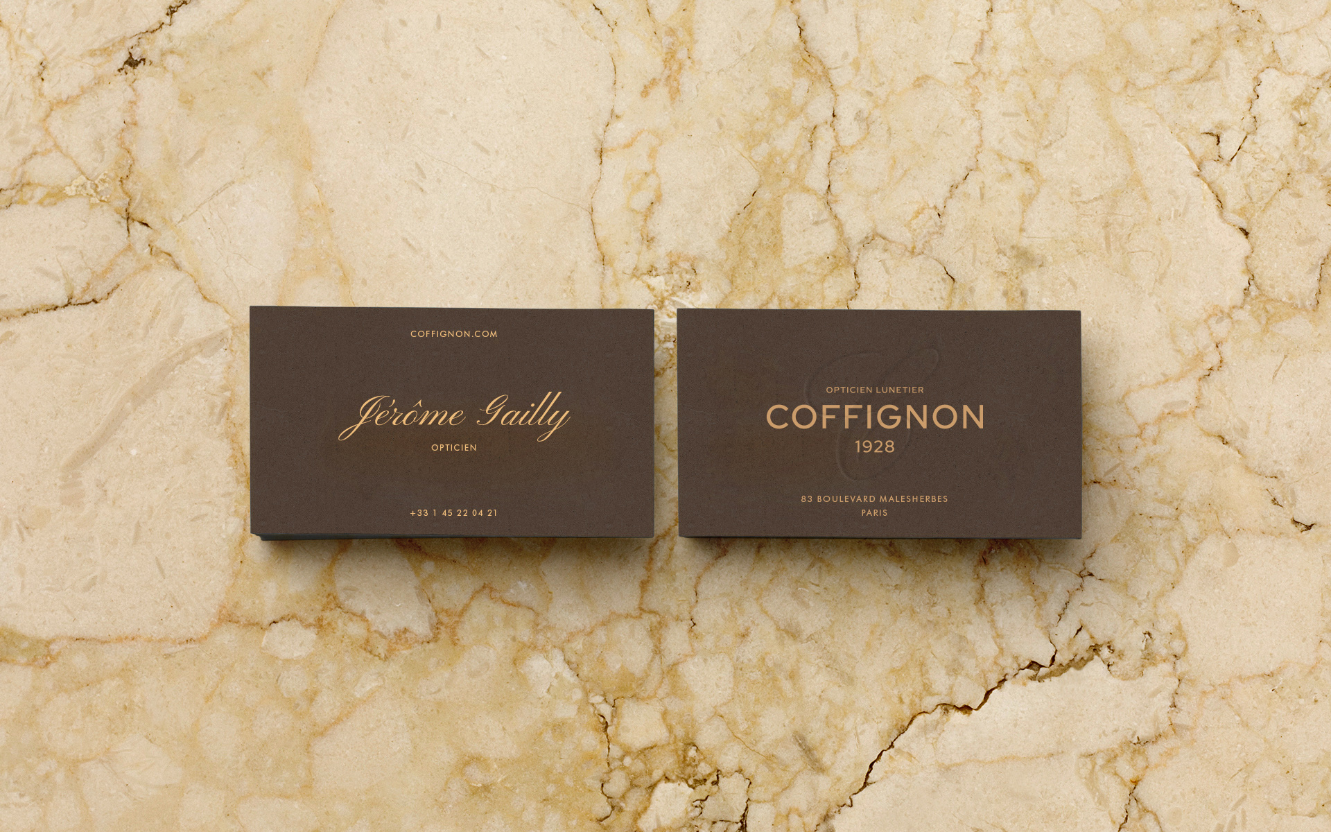
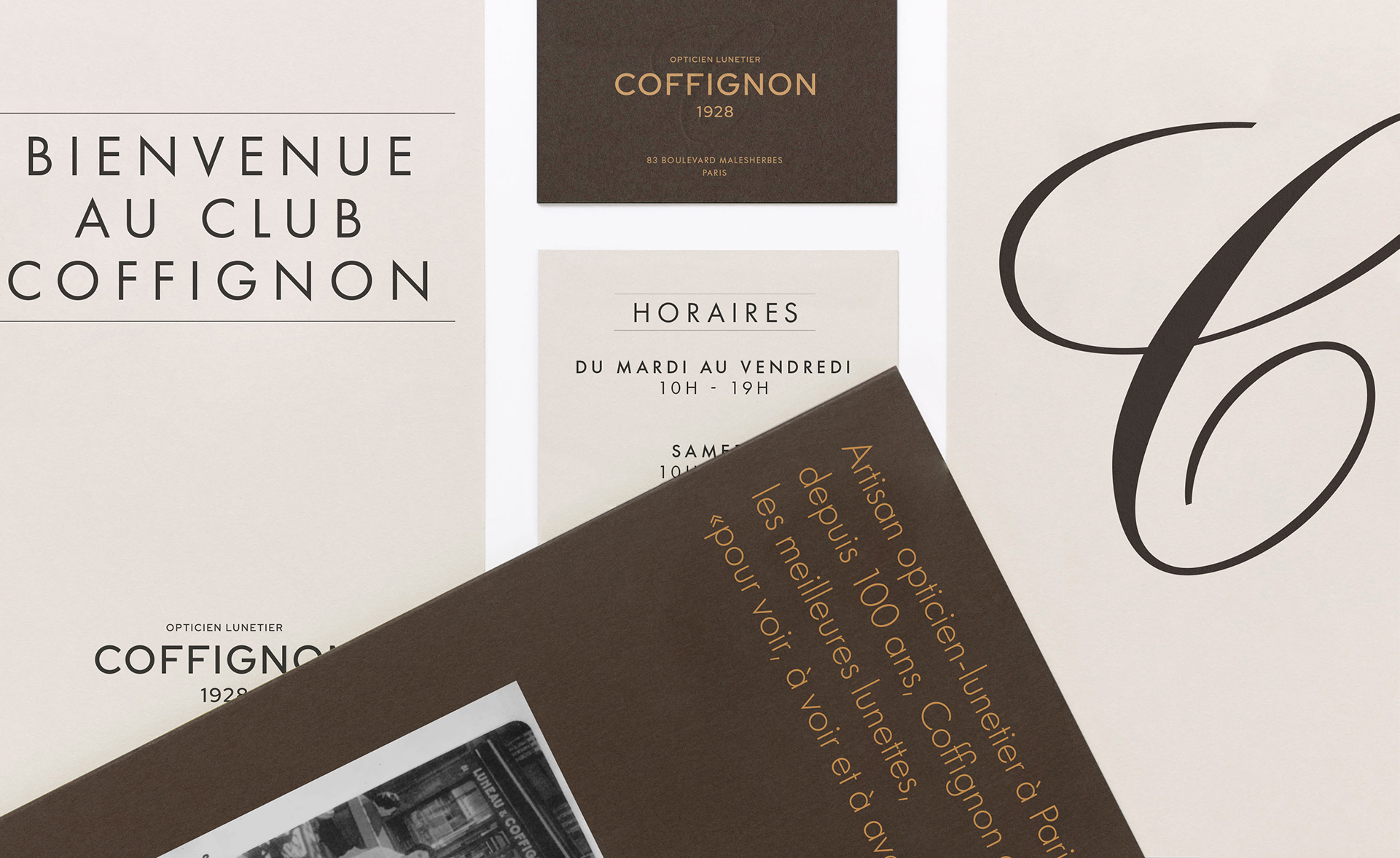
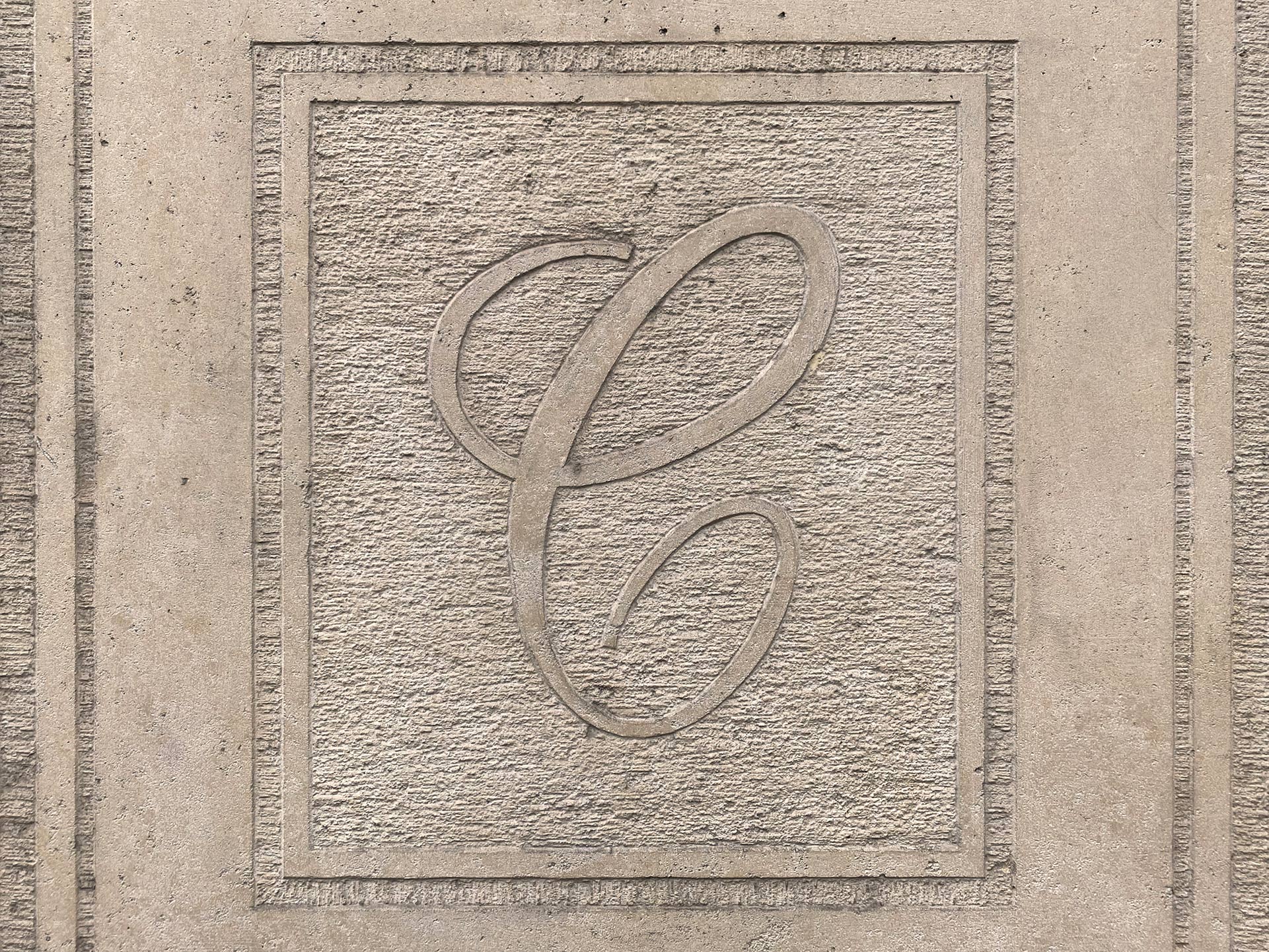
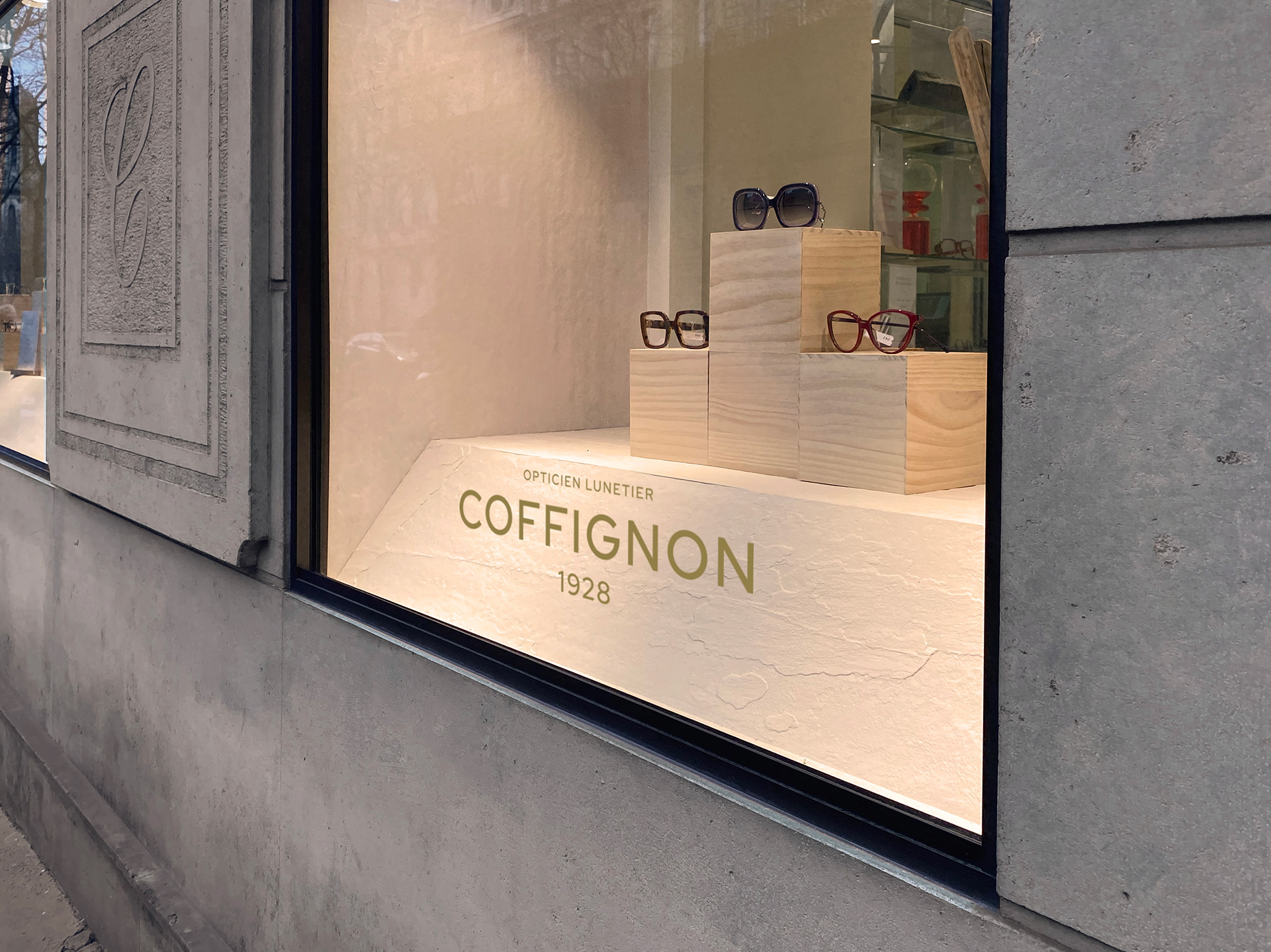
Colour and Typography were key elements to play with this balance of keeping the heritage of the brand and contemporariness. We created a new wordmark, to give more visibility to the brand and to make the ‘Coffignon’ word, the main character of the show. As a secondary element, the brand would use the ‘C’ as a monogram. We reshaped the ‘C’. We presented the logo proposals with the ‘C’ to the client. The client was happy with one of them. However, after a few meetings, we understood more about the needs of the client and we thought it would be more clever to have 2 points of attention: logo and monogram. The client accepted and we developed the different brand applications and signage for the shop.
The deliveries were the Logo and Monogram, Brand guidelines (Colour palette, Typography, Logo Usage) Business cards and Letterhead, and Signage. The result is a simple identity. It’s timeless, it has character but it let the spectacles stand out. It attempts to be almost transparent, it doesn’t shout. It’s there and it speaks for the brand.
CREDIT
- Agency/Creative: Jose Maria Gonzalez
- Article Title: Rebrand of Coffignon, a Tailored Spectacles Brand Based in Paris
- Organisation/Entity: Freelance, Published Commercial Design
- Project Type: Identity
- Agency/Creative Country: Spain
- Market Region: Europe
- Project Deliverables: Brand Architecture, Brand Guidelines, Brand Identity, Brand Redesign, Brand Refinement, Brand Strategy, Branding, Graphic Design, Identity System, Rebranding, Research, Structural Design
- Industry: Retail
- Keywords: Optician's, Spectacles, Brand Strategy, Brand guidelines, Logo


