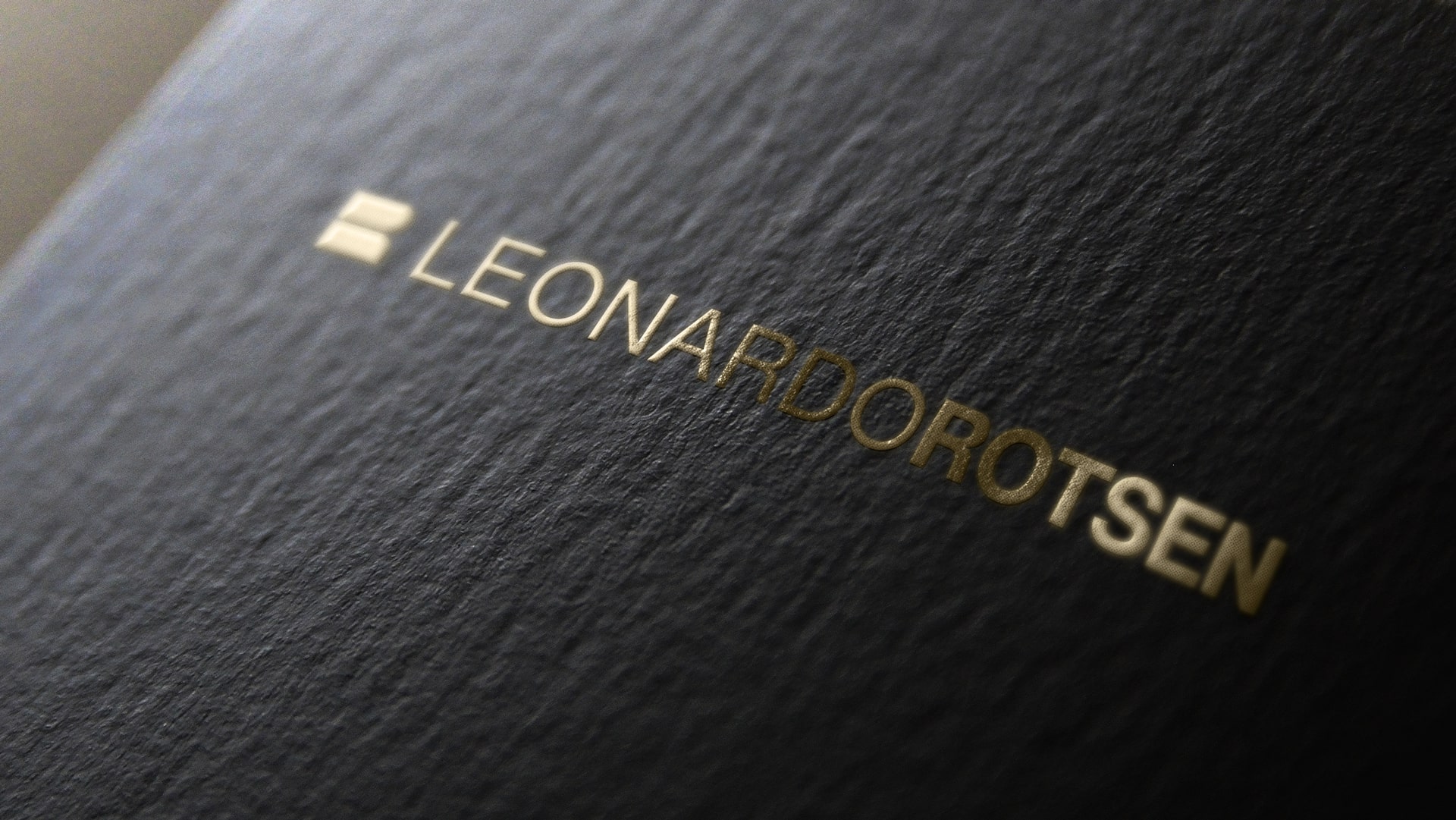
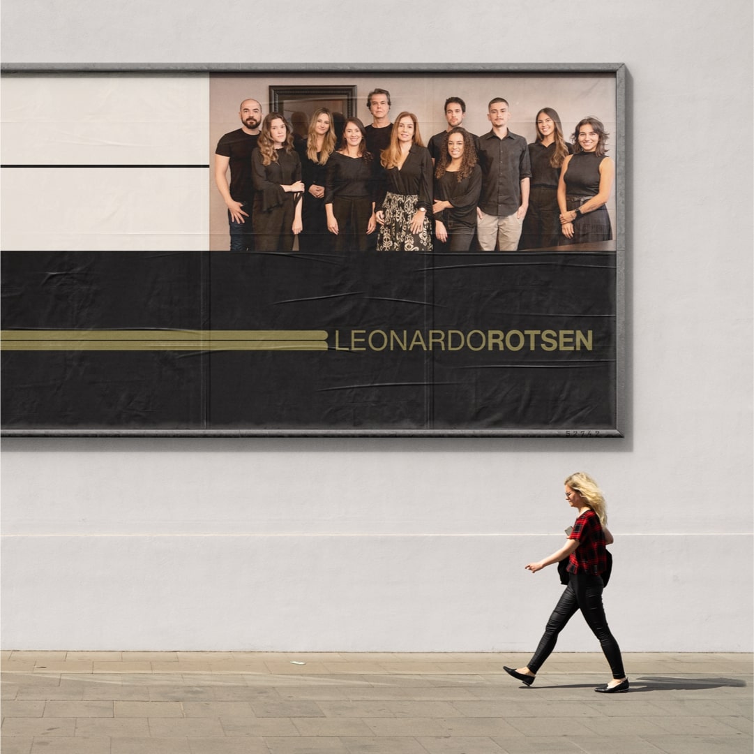
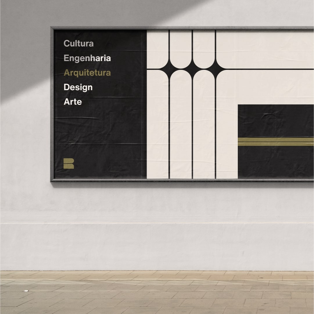
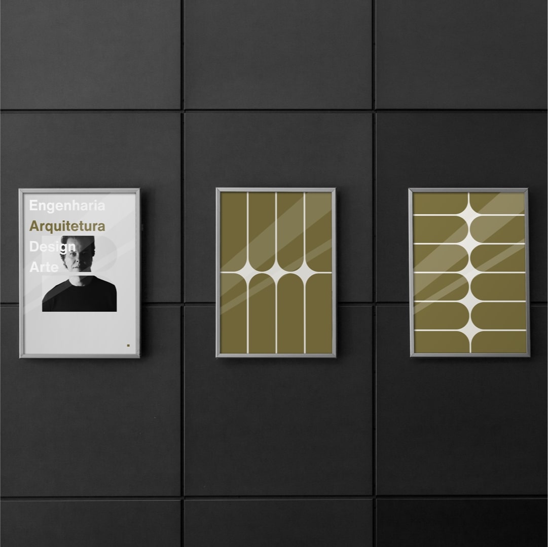
Visual weight, contrast, gestalt and the clear use of basic shapes in the graphic composition of the symbol and pattern, are the ingredients of the new brand by the architectural firm Leonardo Rotsen.
In the market since 2004, the architectural firm Leonardo Rotsen is recognized for the development of high standard projects. In addition to serving clients in Brazil and abroad, the firm also participates in events such as Casa Cor and Modernos e Eternos and works together with large construction companies throughout Brazil.
The creation of the corporate visual identity of the office brought as a central challenge the creation of a symbol that represented the office with the modern style of the architect. It is noteworthy that the “modern” here refers to both contemporaneity and the modernist movement, both present in the language of the professional.
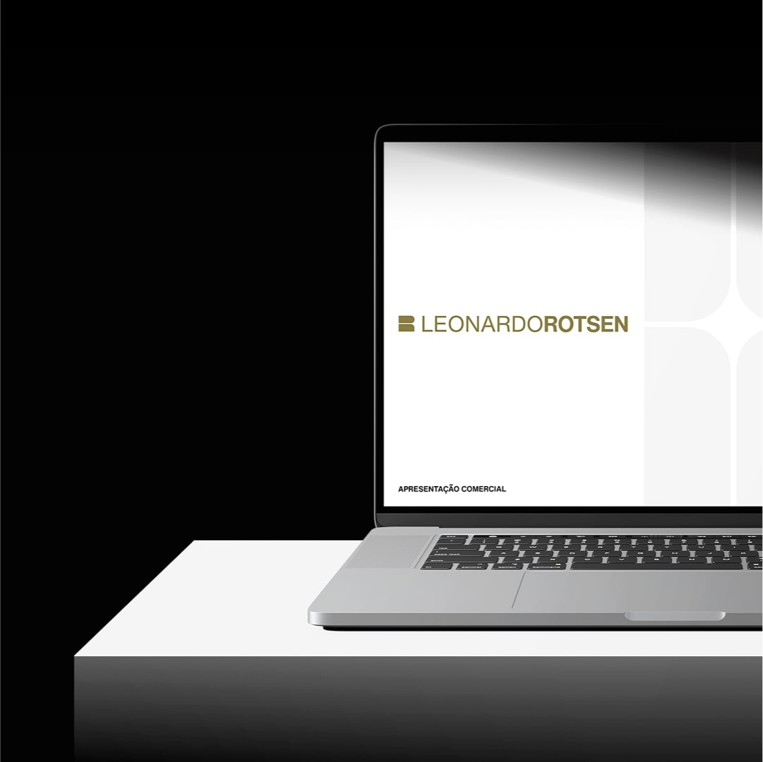
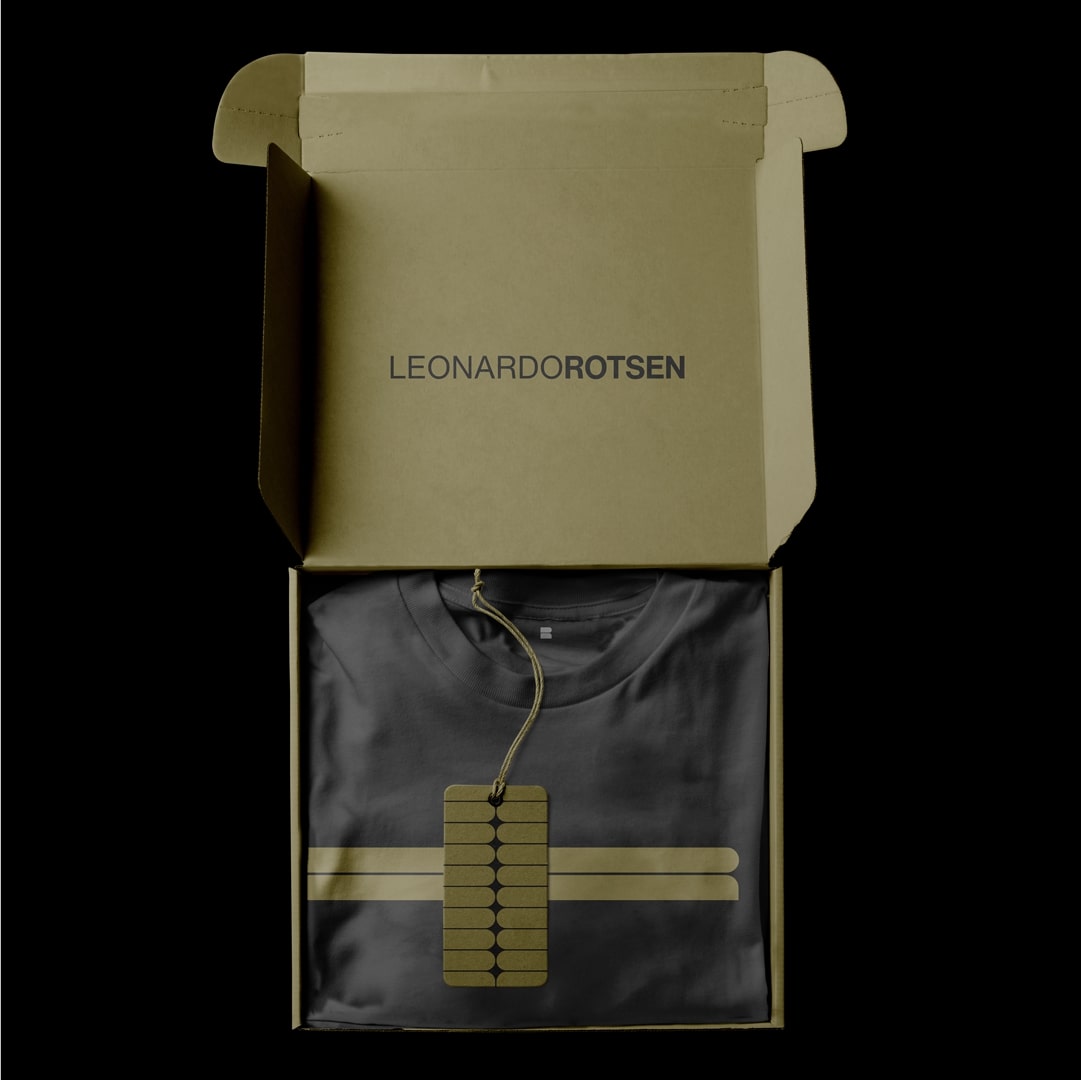
Among the design guidelines, it should have good applicability in the traditional materials of an architectural firm and be flexible enough for special applications, gifts, gifts and other important points of contact in the business.
The problem was the translation. The creation of a symbol that, in addition to conveying the essence along with the logo, was capable of representing them alone.
In the research phase, Estúdio Construto was lucky. As he is a professional with hundreds of projects, it was possible to observe the essence of the architect’s trait. Thus, the inspiration for the project did not come only from the great names of architecture. The architect’s contemporary reading of the word modern was decisive.
In the architect’s portfolio, contrast and focal point are elegantly worked out and the delicate manifestations of modernism give personality to the work. So the creative process was directed to a more authentic proposal.
A decisive phase for the evolution of the project was the observation of the Cibele Andrade jewelry project, which highlighted the intersection of graphic design and architecture, showing the equal importance of positive and negative fields for the understanding of the whole, bringing to light the concept of closure. of Gestalt.
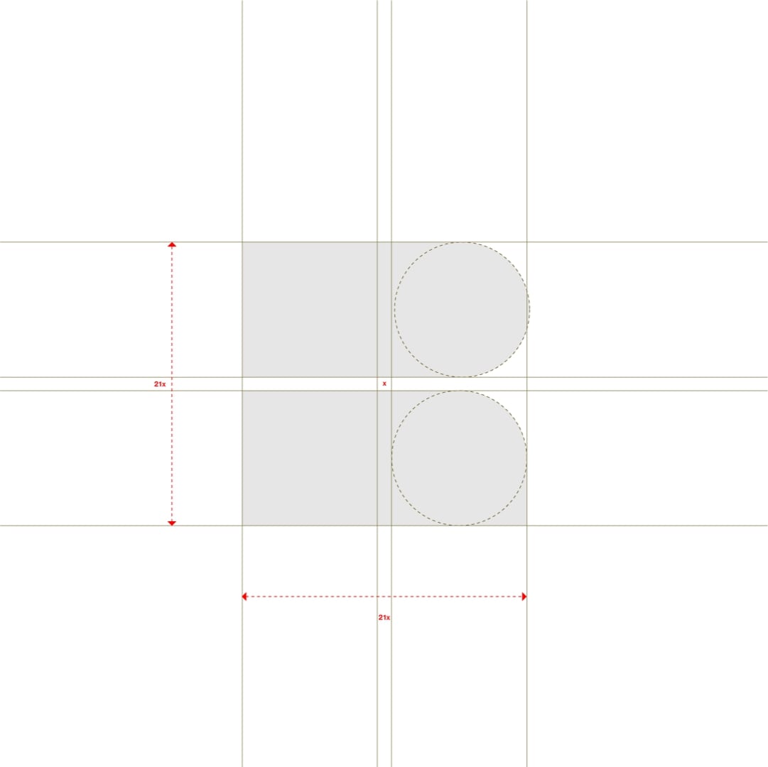
A symbol with basic geometric shapes is a challenge to ownership, originality and visual differentiation. Pursuing these ideals and conveying the expression of the office’s language, a pattern was developed capable of creating rhythm, transmitting solidity and exuding modernism.
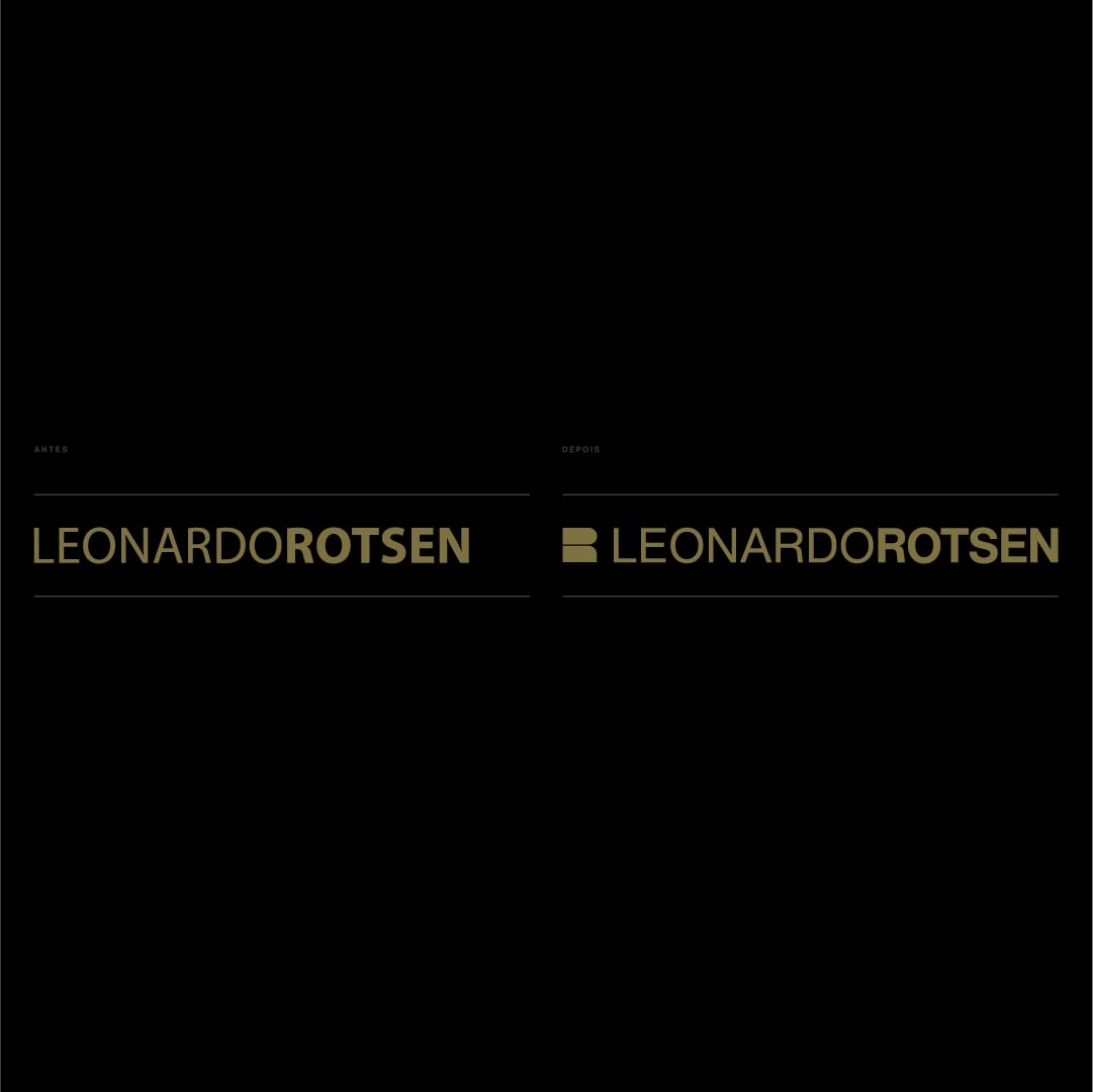
The office already had a logo with no spacing between words. The weight difference between name and surname was what distinguished the logo. But small sizes did not work well.
As a color, they used yellow gold, and because it did not have a color code, there was no consistency in the materials.
Following the evolution of the brand, characteristics of the logo (in use since 2004) were preserved, typography and color palette were updated, finishings were defined, correct use and artistic applications.
The project was well accepted by customers and partners and is already implemented and evolving along with the business.

CREDIT
- Agency/Creative: Estúdio Construto
- Article Title: Rebrand for Leonardo Rotsen Architecture
- Organisation/Entity: Freelance
- Project Type: Graphic
- Project Status: Published
- Agency/Creative Country: Brazil
- Agency/Creative City: Teófilo Otoni
- Market Region: South America
- Project Deliverables: Rebranding
- Industry: Construction
- Keywords: Architecture, Rebrand, Rebranding, Redesign, Monogram, Visual Identity, Graphic Design, Symbol
-
Credits:
Designer: Igor Horta
Motion: Marcos Hernandez


