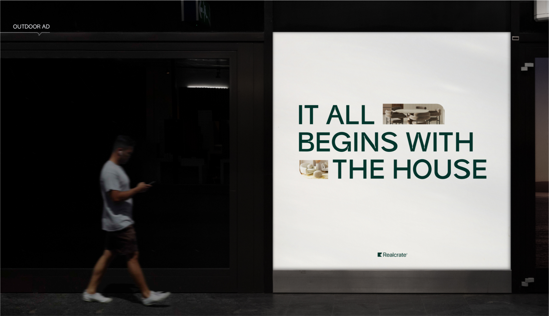
After our first meeting with this ambitious company and its project, we realized that it promises to be large-scale and exciting.The customer’s request was to create the face of their brand from scratch. The key messages the company wanted to convey to its audience were help, reliability, accuracy, expertise, and elitism. The customer wanted to make an impression of a serious and (more than that) modern company. After a deep analysis of competitors and an understanding of main goals and corporate policy, we came to the conclusion that brand identity should be clean and minimalistic, as well as variable for adaptation to various media.
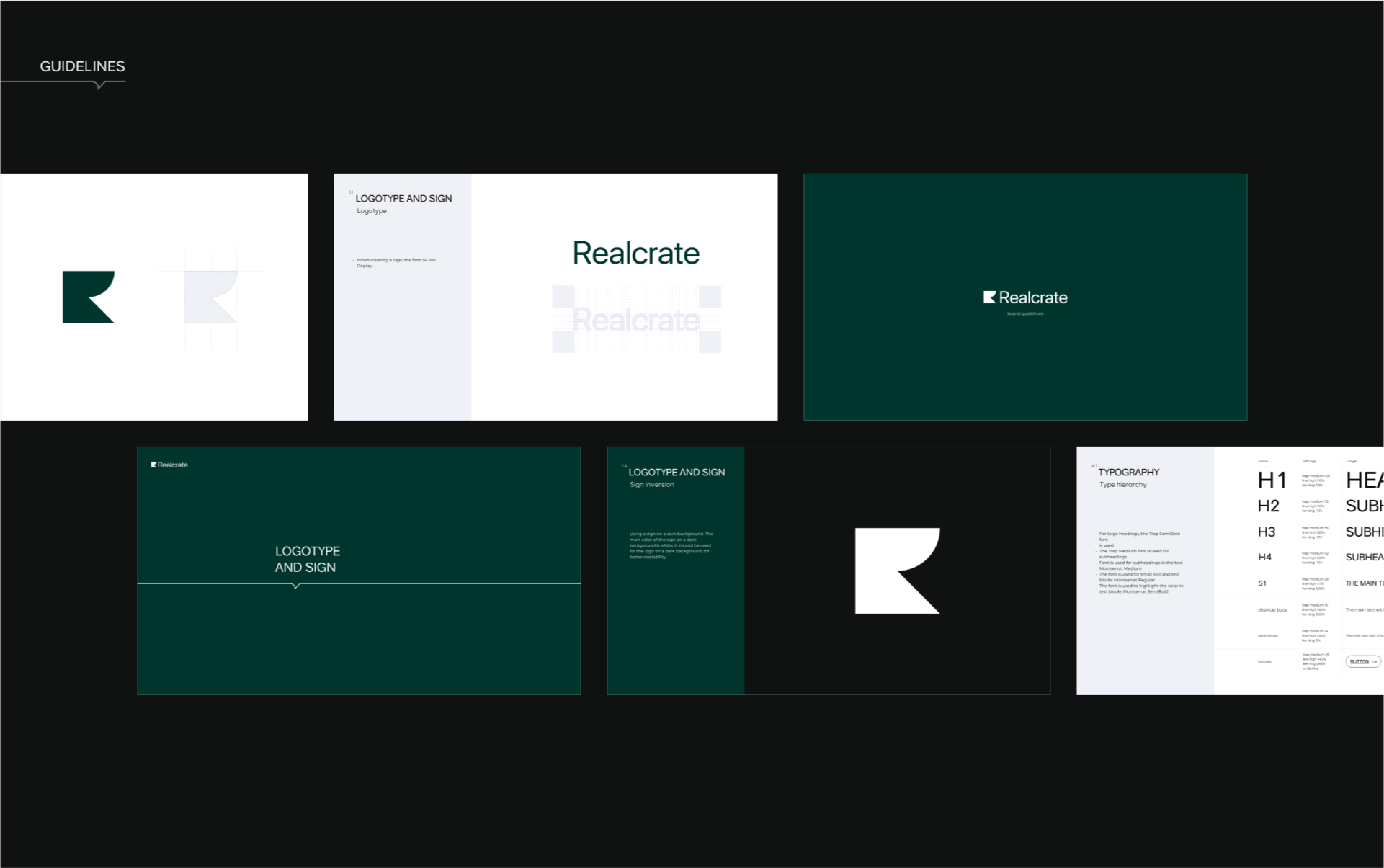
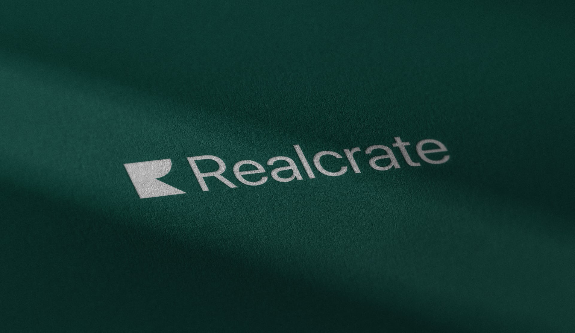
There were many attempts to create something unique while developing the identity. The task was to underline the company’s activities subtly and not directly. We used words like «help» and «accuracy» when creating a sign and as main messages. Then we used the social similarity of the shapes: round — help, sharp — precision.
We also used images of two lines in the sign — a square and a protractor, with which sketches of apartments and houses are usually created. So we found a duplicate reference to the company’s activities. All other brand elements were based on the same principles as the sign. All graphic elements are variably scaled, and that gives identity mobility.
CREDIT
- Agency/Creative: Spacemotion Pictures Ltd.
- Article Title: Realcrate Brand Design
- Organisation/Entity: Agency
- Project Type: Identity
- Project Status: Published
- Agency/Creative Country: Singapore
- Agency/Creative City: Eilat
- Market Region: Asia
- Project Deliverables: Animation, Brand Design, Brand Experience, Brand Guidelines, Brand Identity, Brand Strategy, Brand Tone of Voice, Design, Graphic Design, Logo Design, Web Design
- Industry: Real Estate
- Keywords: real estate, brand identity, web design, logotype, logo, brand guidelines, graphic design, design
-
Credits:
Ceo: Matthew Grouss


