A Real Rebel With a Real Cause…
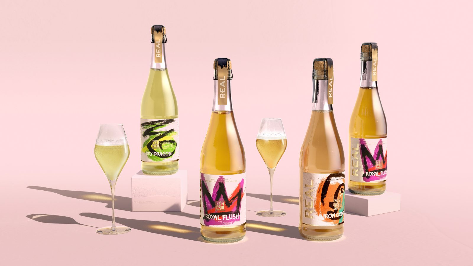
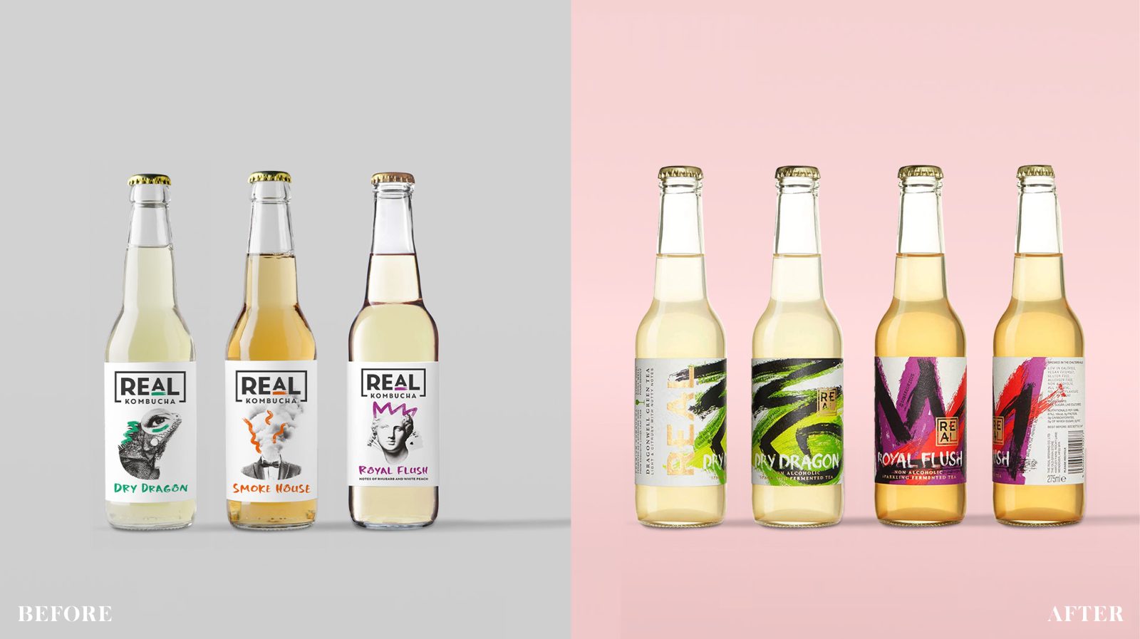
With alcohol-free rapidly becoming the ‘real’ new normal, our rebrand for this high-quality Sparkling Fermented Tea (aka Kombucha) had to balance the brand’s disruptive, primal character with the refinement of its luxurious high-end offer.
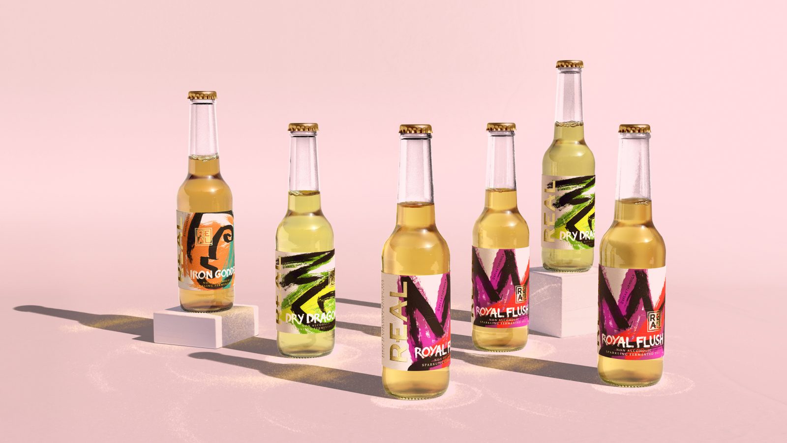
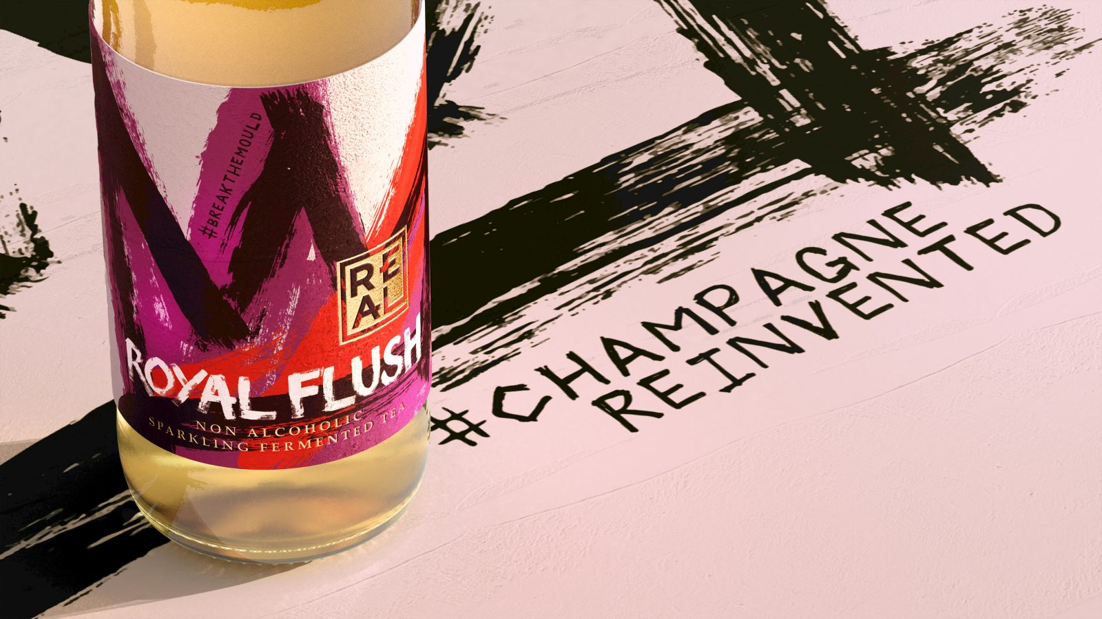
Visceral and valuable, contemporary street art was our hook. Bold brushwork captured the product’s beauty. The logo nodded to its Asian provenance. Foil and embossed texture gave inherent value. REAL had something to say; updateable, digitally printed, hand-scratched messaging promotes positive change; #sobercurious #champagnereinvented
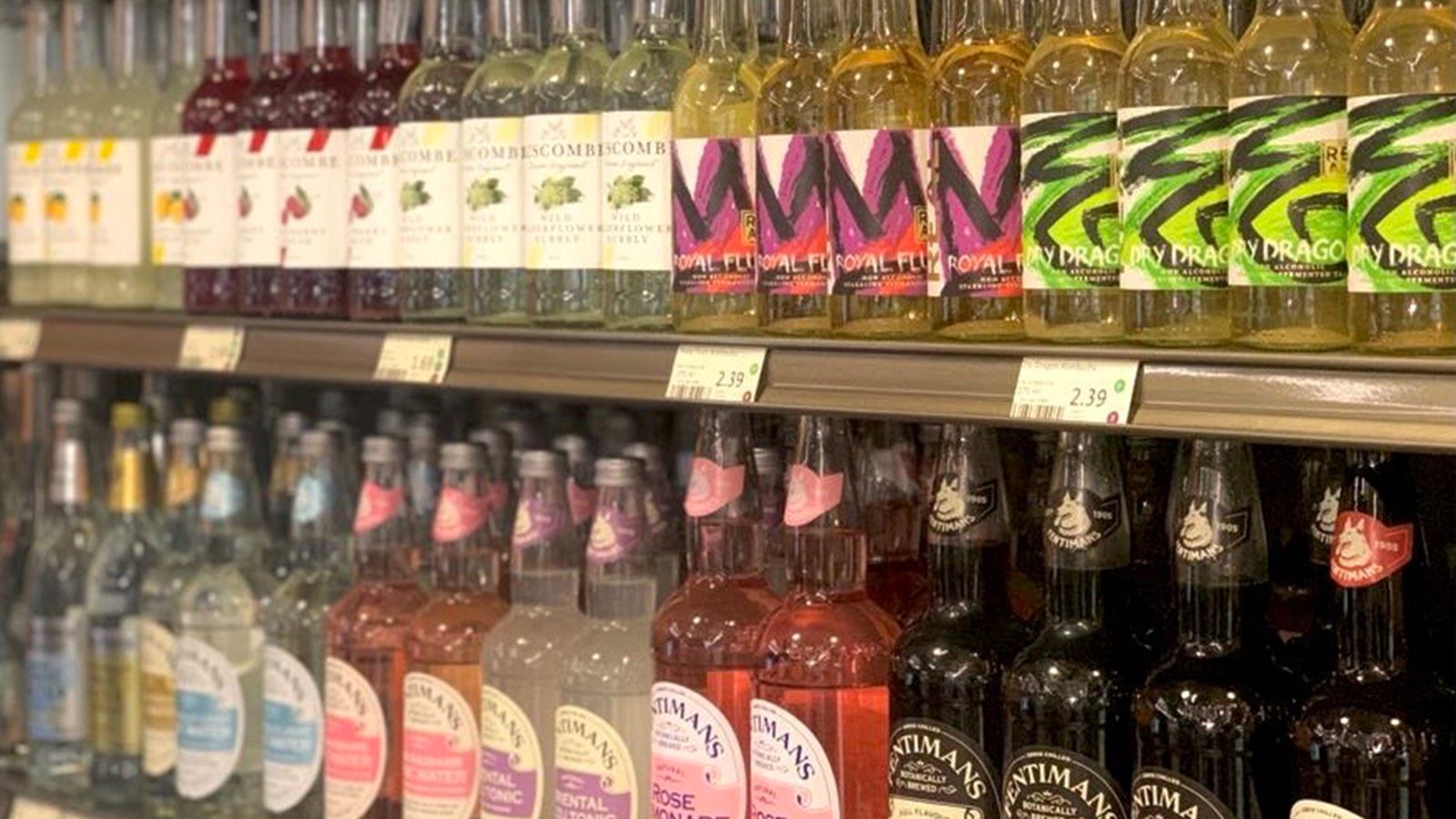
Real results since the rebrand went live at the height of lockdown; 170% vol. increase, 700% online sales uplift in 3 months. The rebrand is now at home in 50+ Michelin star venues and is listed in Whole Foods, Sainsbury’s & Waitrose; the buyer commenting on the redesign’s great standout. Sales outperform the no/low alc. category.
Norway, Belgium & Holland are now also ‘keeping it Real.’
A Little more details…
Real Sparkling Fermented Tea was launched in 2017 to cater to foodies who were increasingly choosing an alcohol-free lifestyle. Until then the only choices had been sugary soft drinks, water or alcohol-free alcohols(!) – which neither satisfied their palette or complemented their food. Much more than the ‘home-brew’ Kombucha you buy down at the local farmers market, Real is made from only the finest loose-leaf teas, naturally fermented with no added flavourings. This gives it a sophisticated nose and mouthfeel that is on par with premium sparkling wines and Champagnes.
With an alcohol-free lifestyle rapidly becoming the ‘real’ new normal and 40% of consumers cutting back on alcohol consumption and one in four 18-24-year-olds going completely alcohol-free, Real had aggressive growth plans to become The alcohol-free champagne alternative. Whilst the design to date had worked well for the start-up phase of the brand, our redesign needed to better balance the brand’s disruptive, primal character with the refinement of its luxurious high-end offer, cementing its Michelin star on-trade reputation. Opening the door for new growth opportunities in the off-trade.
How to be visceral and valuable? Contemporary street art was our solution. The bottle labels became our canvas, with each variant’s name and character articulated by a single brush stroke icon; such as the crown for Royal Flush – made from first flush Darjeeling tea, often referred to as the ‘Champagne of Teas’ and the lizard eye for Dry Dragon – produced using an exquisite pan-roasted Dragonwell green tea from China. These were emblazoned over clashing textural colours inspired by the flavour profile of the liquids, representing the bold, expressive artistry that goes into making the sparkling fermented teas themselves.
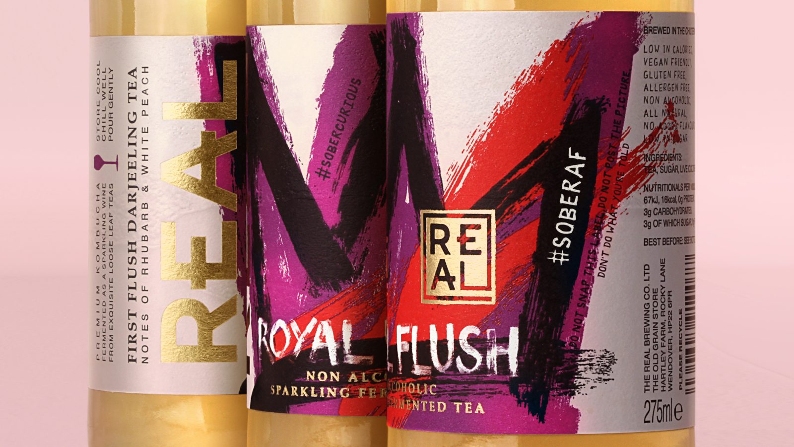
The redesigned Real logo is inspired by Far-Eastern artist signature seals – nodding to the Asian provenance of the fine teas it is made from. As a finishing touch, foil and embossed finishing convey inherent value in the hand.
REAL is a brand with something to say. So intertwined into each design we incorporated topical messages in a bespoke hand-scratched typeface. Digitally printed, so they are easily updateable, they reflect the brand’s activist mentality and promote positive change. For example…
“#ChampagneReinvented” & “#SoberCurious…what alcohol promises sobriety delivers”.
Going live at probably the most challenging time possible – the start of the COVID lockdown, the very Real results speak for themselves: 170% vol. increase, 700% online sales uplift in 3 months. The award-winning rebrand is now at home in 50+ Michelin Star venues and is listed in Selfridges, Sainsbury’s, Whole Foods & Waitrose; the buyer commenting on the redesign’s great standout. The REAL brand continues to go from strength to strength – opening the first dedicated ‘Fermentery’ for non-alcoholic drinks in the UK, to keep up with demand and releasing new canned formats.
Norway, Belgium & Holland are now also ‘keeping it Real.’
“Not interested in imitating our traditional alcoholic cousins, we are as good as, if not better than, most sparkling wines, and we wanted to reflect that. The exceptional redesign has given us a new brand identity and packaging that reflects our own unique personality, speaks to our origins and approach to life and stands us in good stead for our future innovations.”
David Begg, Founder of Real
CREDIT
- Agency/Creative: Butterfly Cannon
- Article Title: Real Sparkling Fermented Teas Packaging Redesign – A Real Rebel With a Real Cause
- Organisation/Entity: Agency
- Project Type: Packaging
- Project Status: Published
- Agency/Creative Country: United Kingdom
- Agency/Creative City: London
- Industry: Food/Beverage
- Keywords: WBDS Agency Design Awards 2022/23


