Brief:
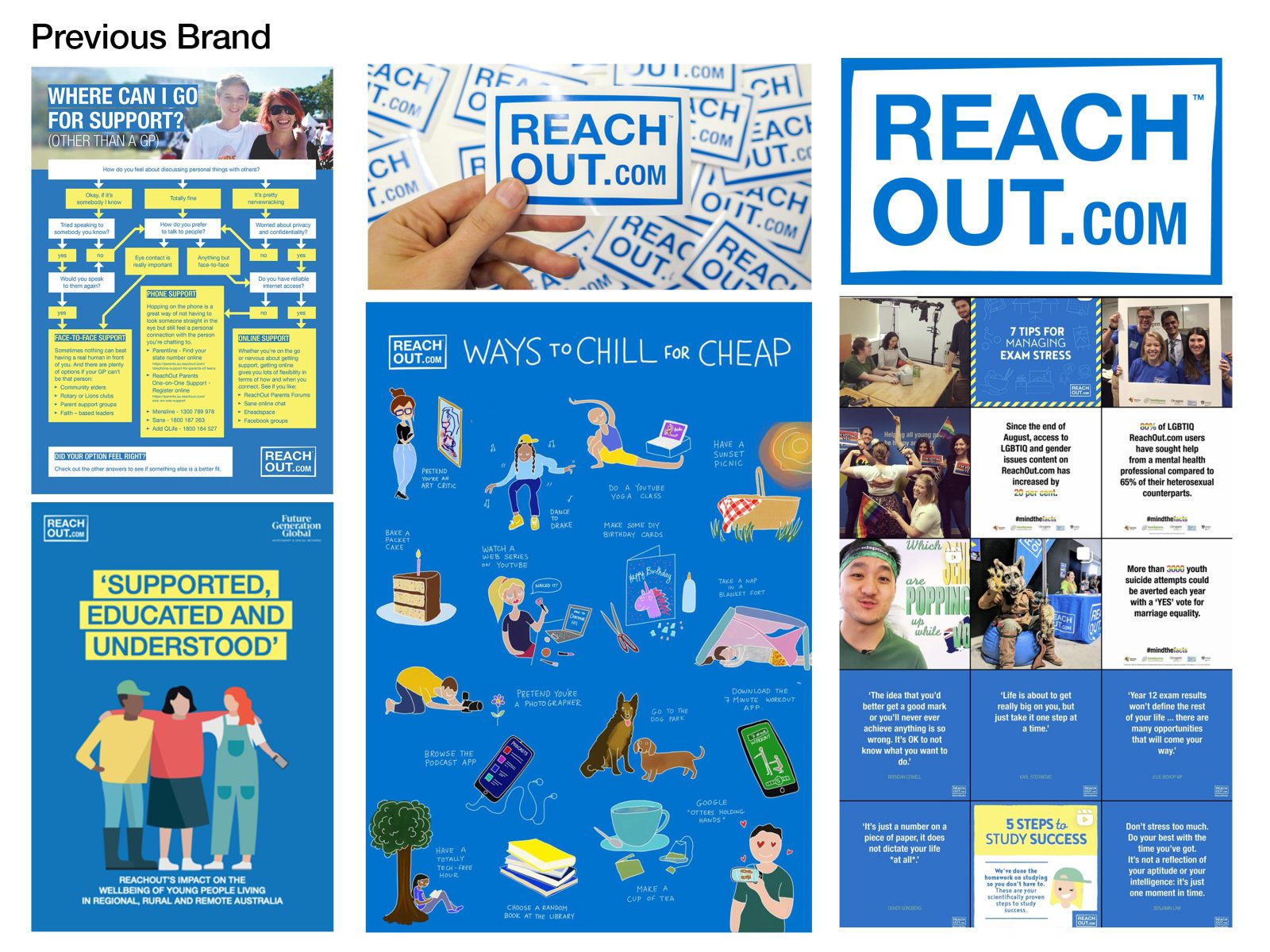
ReachOut Australia is an online-only youth mental health organisation. They help young people feel better, no matter what challenge they’re facing – big or small. But the young people ReachOut were helping when their brand was first developed are now in their 40s. Since then smart phones have been invented, and social media has proliferated. ReachOut’s strategy to engage with new generations of young people through new products and services was rapidly evolving but their visual brand was being left behind.
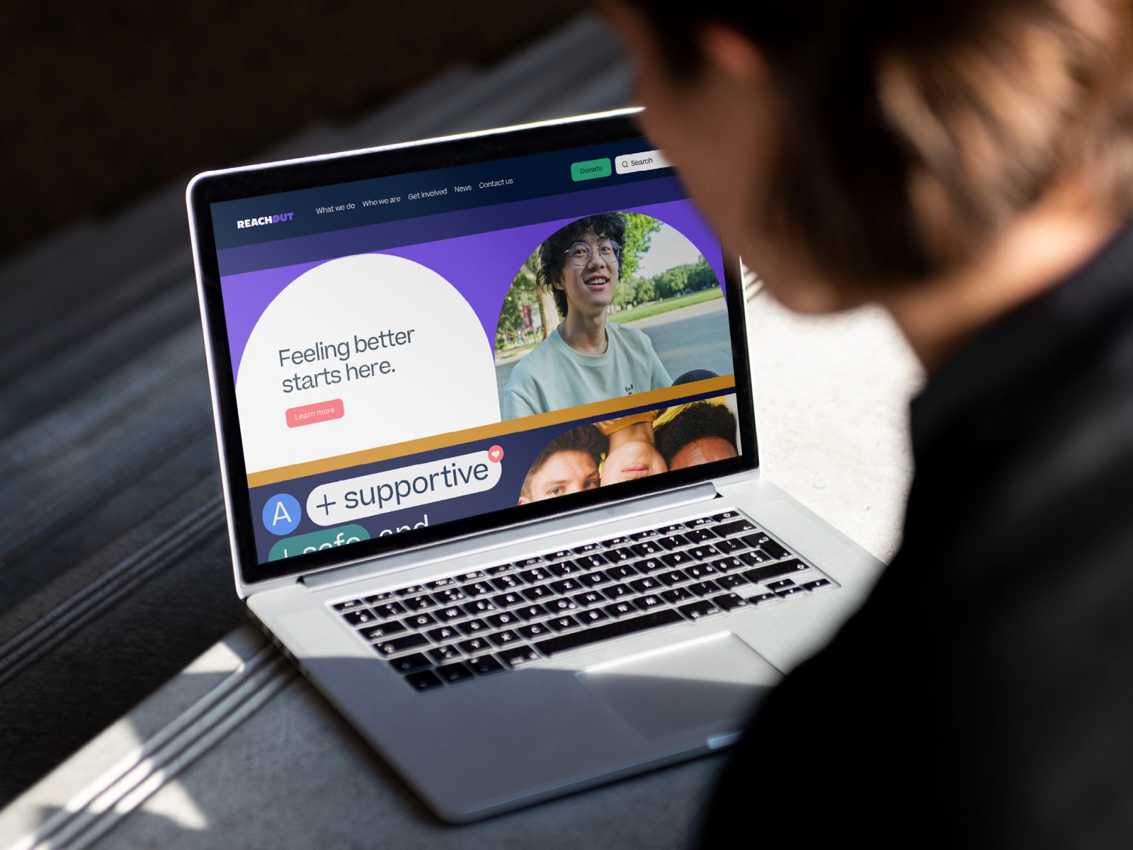
Our task was to create a new identity that is contemporary and optimistic. It needed to reflect the digital nature of ReachOut’s service, which now focuses on peer-to-peer support, conversations and community and other non-traditional approaches to youth mental health.
Solution:
As ReachOut is an online service, our new brand system needed a digital-first approach. We needed to differentiate ReachOut in a cluttered mental health category, raise their profile in a competitive not-for-profit sector and explain their offering in a way that resonated with young people.
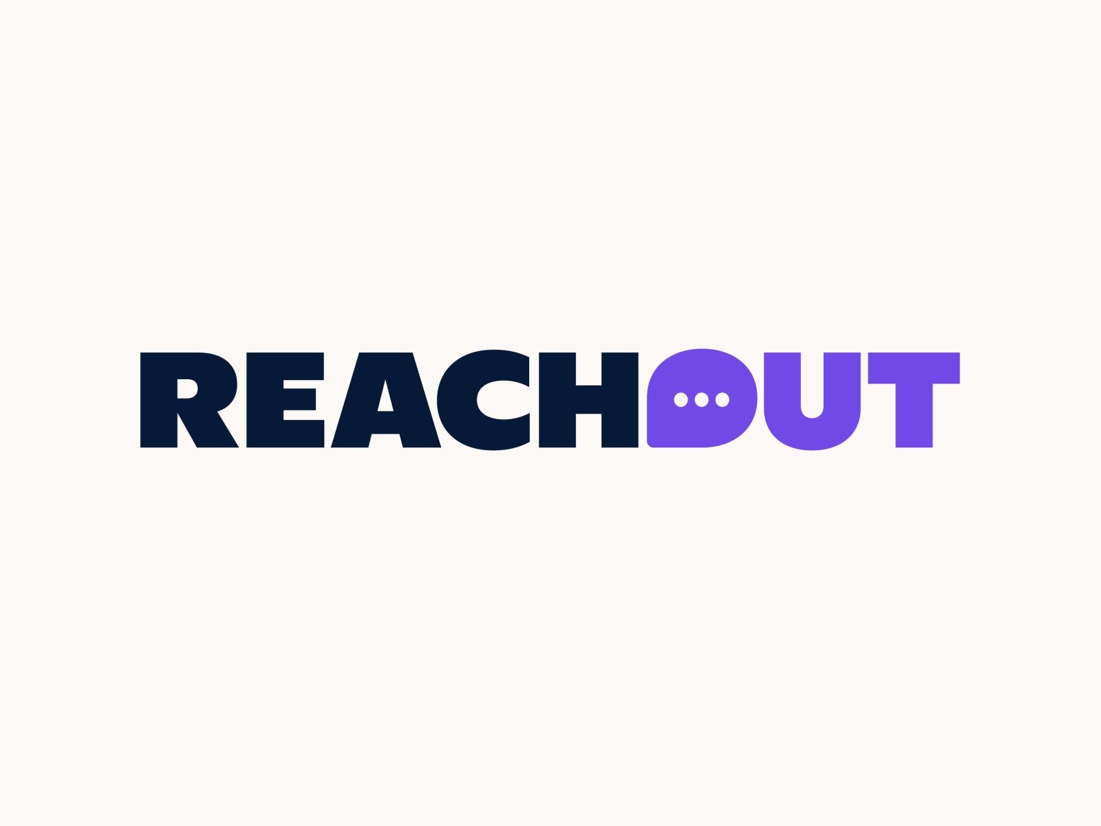
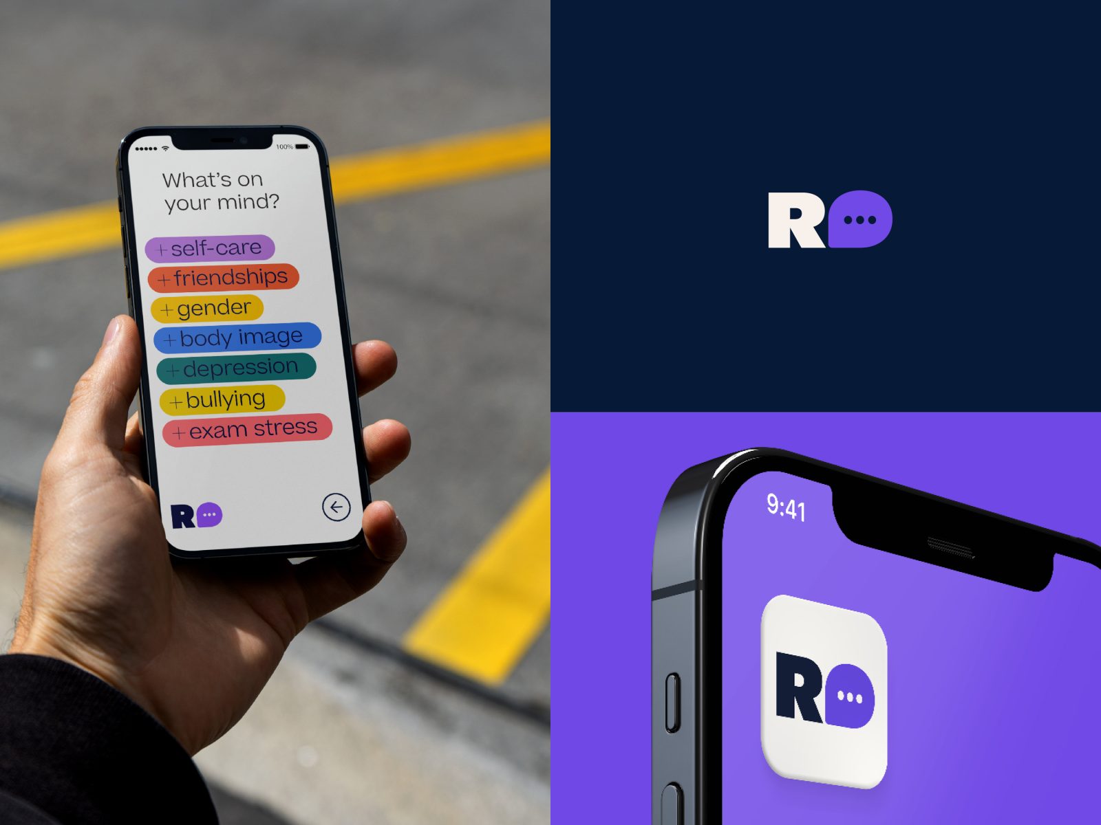
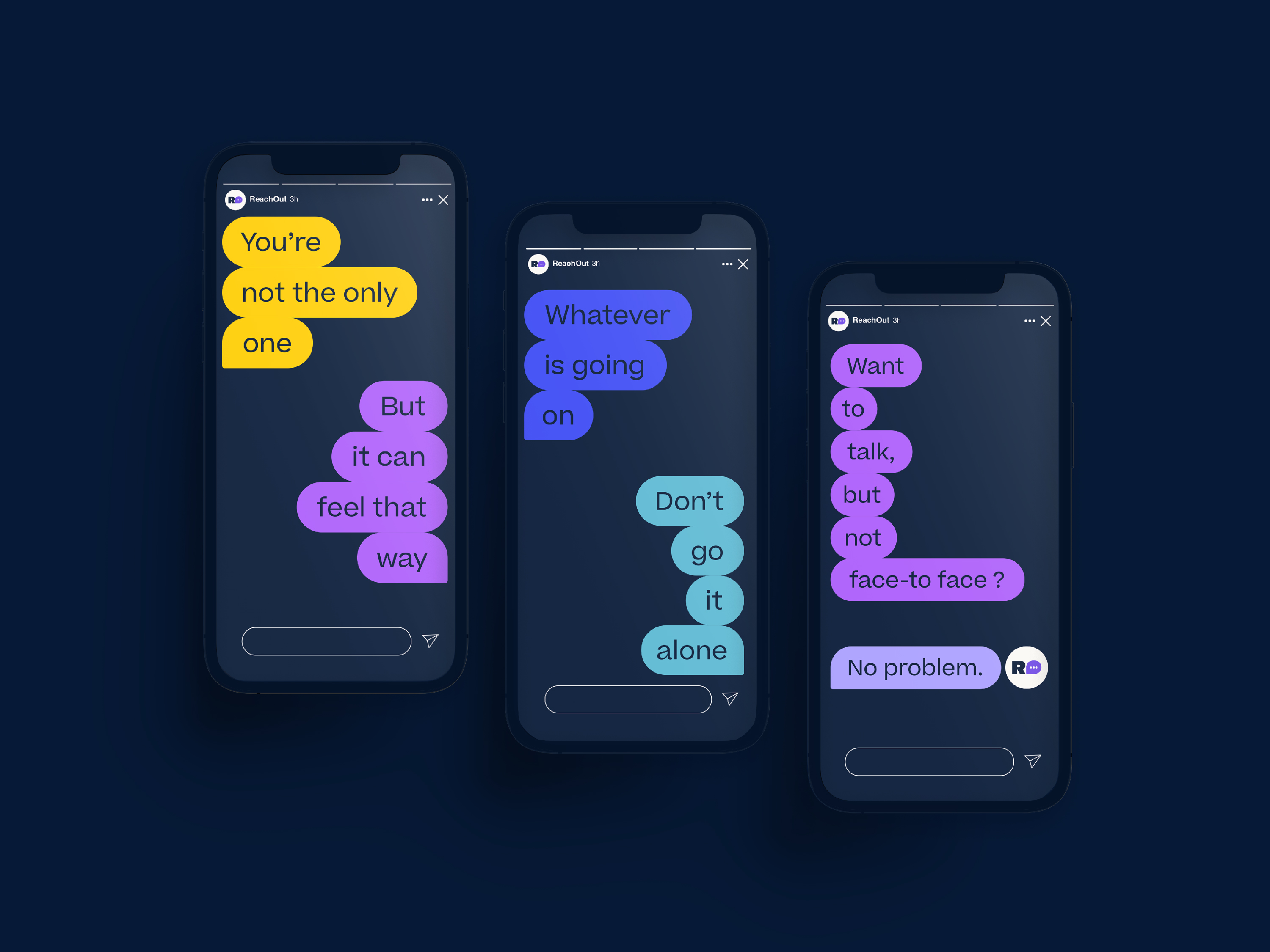
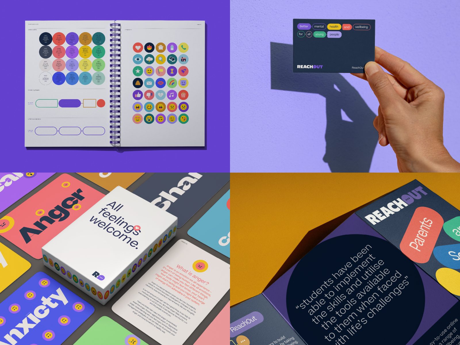
Our solution was to develop a brand system that references and magnifies the visual language of online chat and messaging. At the centre of the system is a new logotype with a chat bubble modification to the letter “O”. We removed “.com” from the logo to open up the possibility for the brand to offer services in a range of digital channels extending beyond the website, such as apps, podcasts or even metaverse activations.
As blue is the dominant colour in the mental health category, we shifted to a palette of brights that helps them stand out in the market and set a positive tone for ReachOut’s new positioning of helping young people feel better.
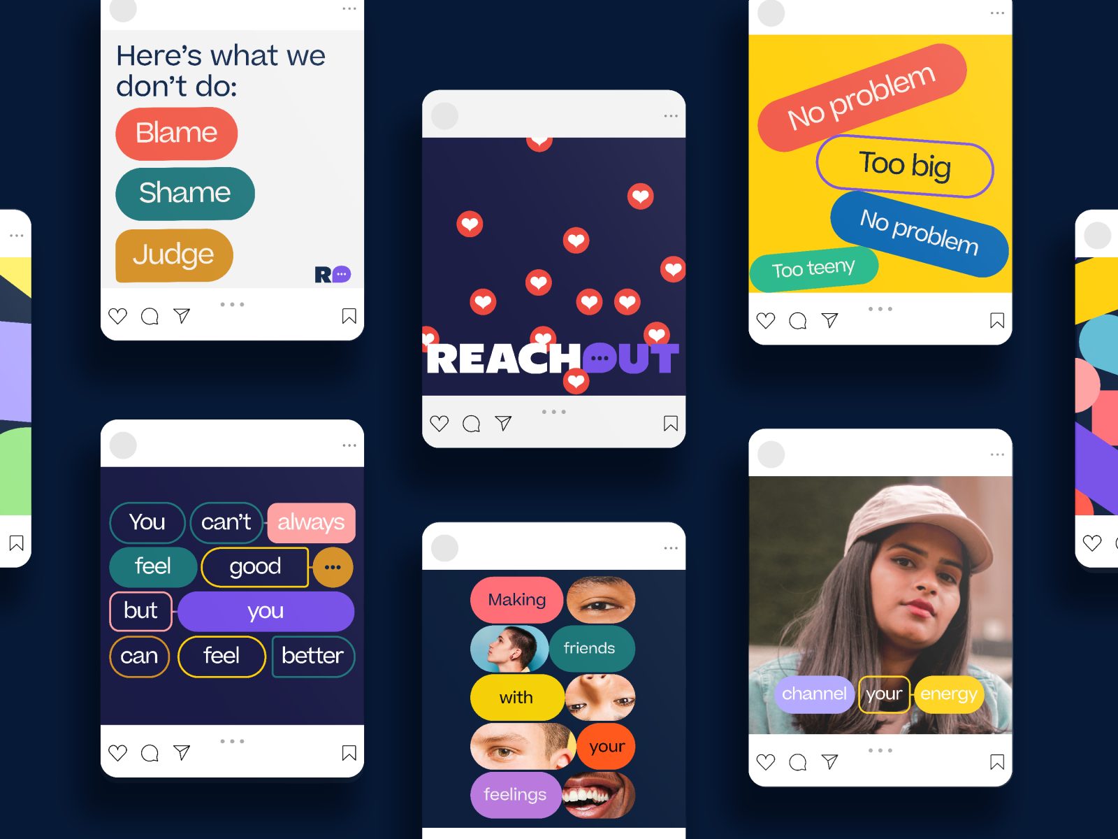
We removed the generic illustration seen consistently throughout the category too, and replaced it with a candid and authentic photography style.
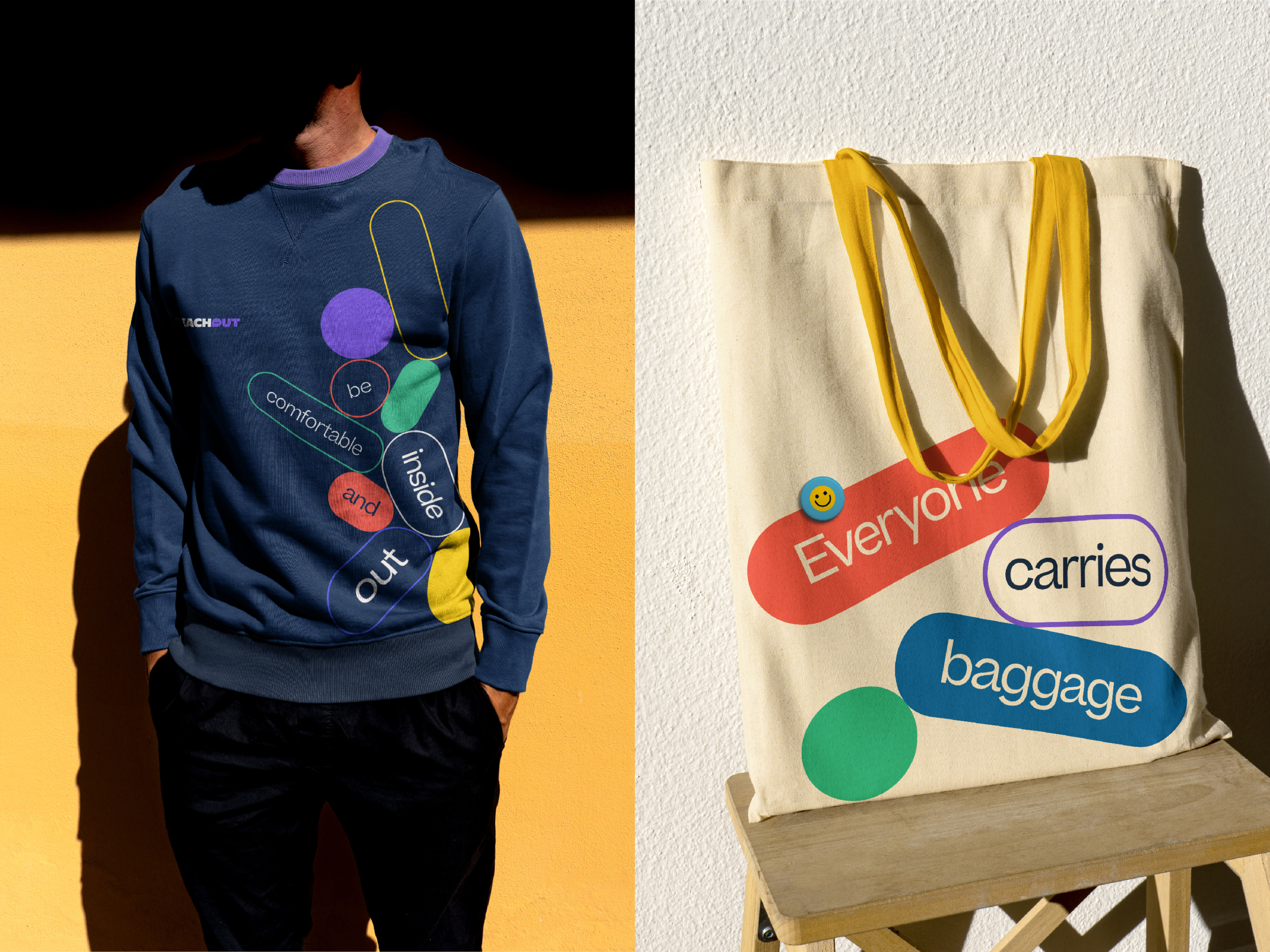
We created a simple set of graphic assets that can be remixed and applied in an infinite number of ways, and developed a new tone of voice that was both activating and non-judgemental, and could stretch to speak to a variety of audiences from young people and their parents to governments and corporate bodies.
CREDIT
- Agency/Creative: Yonder Creative
- Article Title: ReachOut Brand Redesign
- Organisation/Entity: Agency
- Project Type: Identity
- Project Status: Published
- Agency/Creative Country: Australia
- Agency/Creative City: Surry Hills
- Project Deliverables: Brand Redesign
- Industry: Health Care
- Keywords: WBDS Agency Design Awards 2022/23
-
Credits:
Creative Director: Benjamin Gay
Creative Director: Julie Faktor
Designer: Benjamin Gay
Designer: Judit Arroyo
Designer: Matt Morgan
Art director: Benjamin Gay
Writer: Julie Faktor
Strategy Director: Brad Doble
Account Manager: Stacey Paton
Motion Design: MelloMotion


