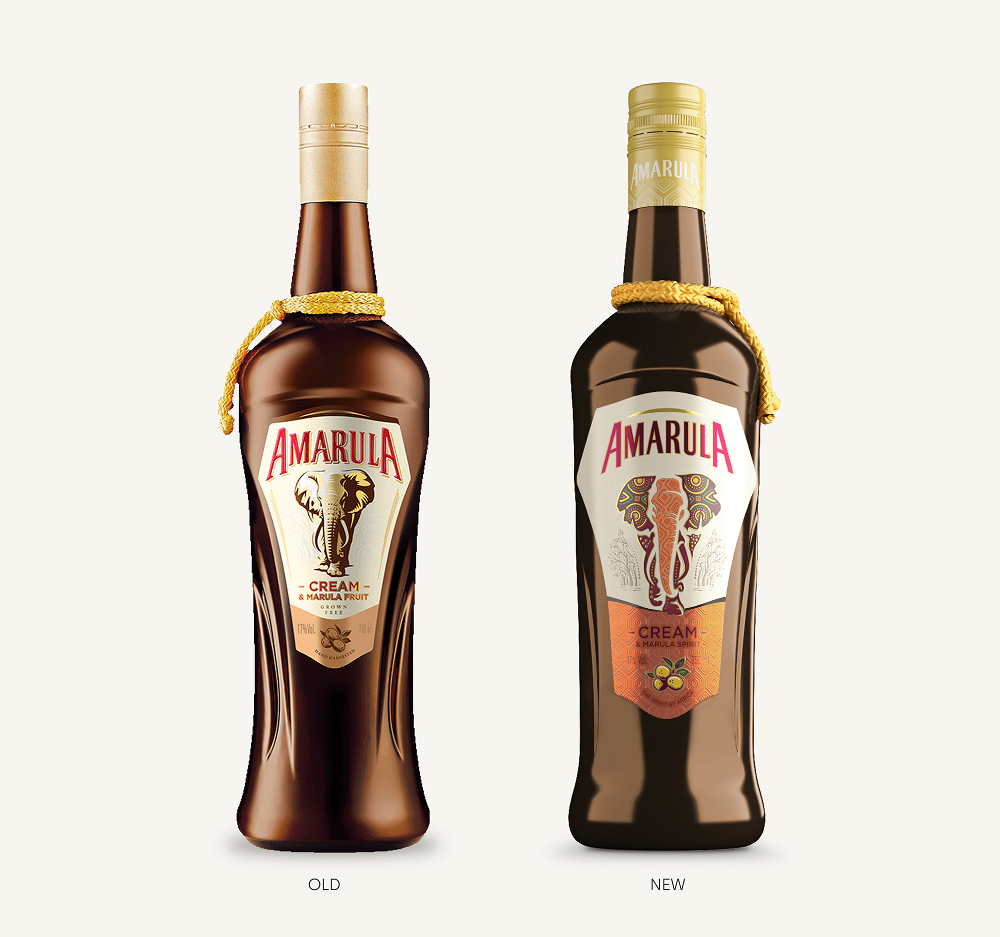
As appetites and attitudes continuously change, so popular brands need to constantly reinvent themselves to stay relevant. Amarula, as world leader in premium cream liqueurs and one of SA’s best known export brands, maintains its position through continually adapting to meet the times. The latest identity upgrade remains true to the brand origins whilst evolving to appeal to modern audiences in over 100 countries around the globe.
Distilled from the ethically-sourced, organically-grown, sun-ripened and hand-harvested fruit of the sacred marula tree, Amarula is the only cream liqueur of its kind. The compelling marula fruit story has more prominence in the latest iteration of the brand and the brand team turned to long-time packaging partners, Just Design, to bring the new positioning to life. The updated visual identity and packaging extends to a new bottle, larger label and ultimately into new flavour variants.
“We tell our story not only in the uniqueness and quality of our product, but also through the care we take in making it and its distinctive packaging.”
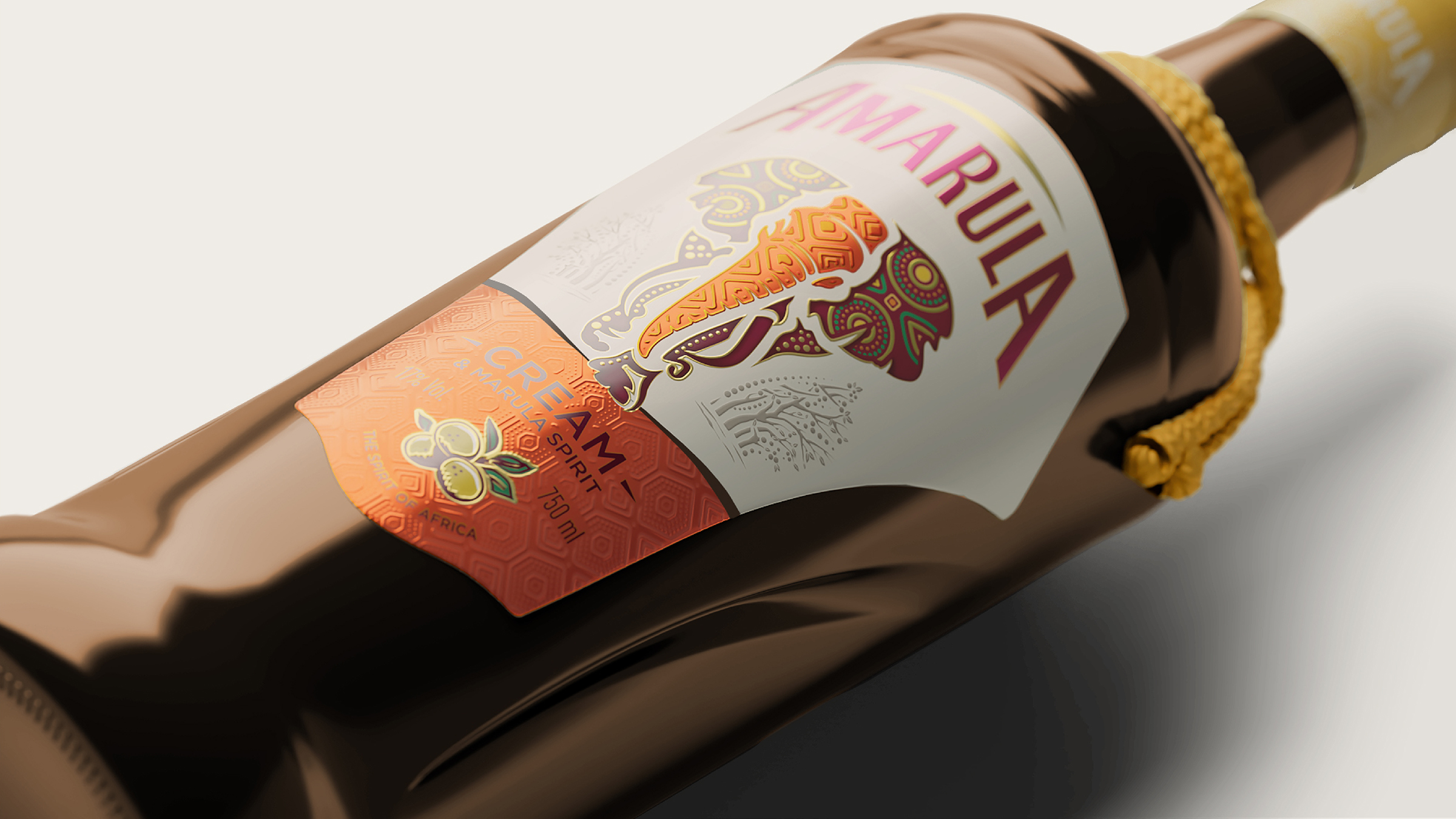
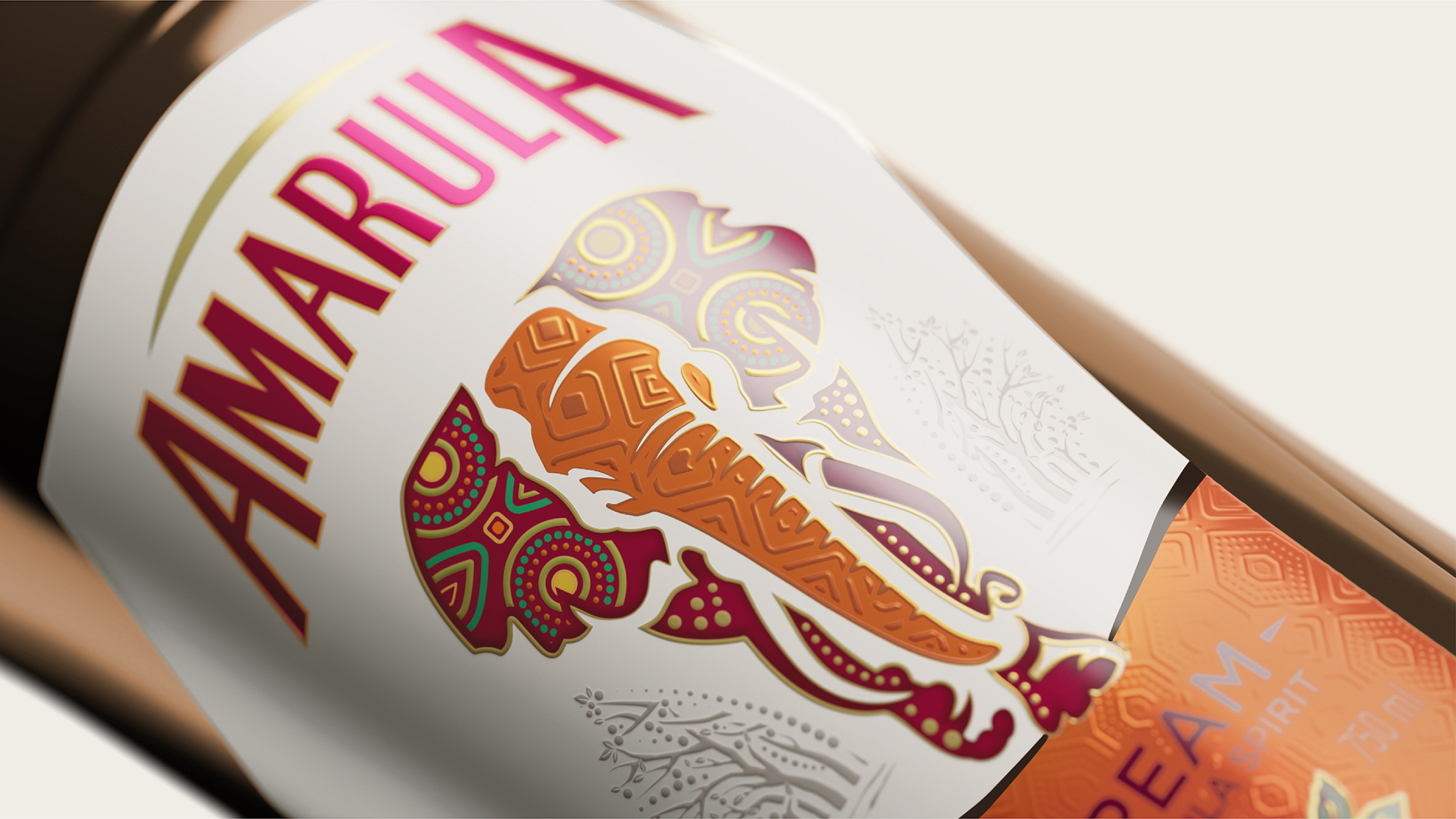
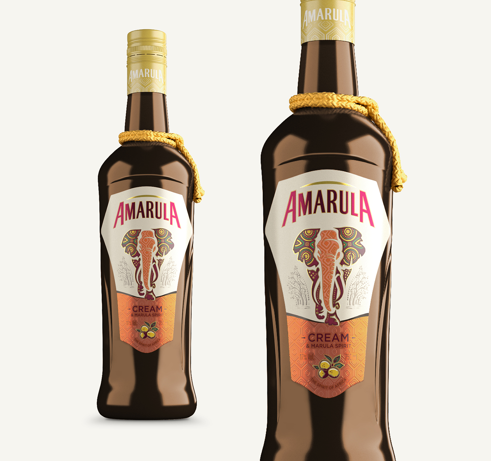
“We set out to create a fresh visual language for Amarula without losing any of its heritage,” says Charmelle Conning, Amarula’s global brand leader. “The shape of the bottle and the design of the label have evolved to keep pace with changing trends, but three key visual elements are still front and centre: the elephant, the marula fruit and the distinctive tassel around the neck of the bottle.”
Just Design took a collaborative approach, working closely with the Amarula brand team, contributing strategy, concept development, design and roll out to create a new pack that builds on the brand’s distinctive assets. The bottle is subtly sculpted to reflect the shape of the elephant’s head. The label is crowned with the modernised Amarula logo, featuring the brand name beneath a stylised curve representing the African sun. The elephant retains a confident stance, with a subtle forward moving motion crossing over the horizon line towards the fruit. Embellished with patterning and colours inspired by the local landscape and communities. Confidently and proudly South African.
The new packaging released in November 2021. Each bottle is a piece of our natural heritage, made to be savoured and playing on a world stage.


CREDIT
- Agency/Creative: Just Design
- Article Title: Re-design for Sa Icon Brand, Amarula
- Organisation/Entity: Agency
- Project Type: Packaging
- Project Status: Published
- Agency/Creative Country: South Africa
- Agency/Creative City: Just Design
- Market Region: Global
- Project Deliverables: Brand Redesign, Brand Refinement, Design, Label Design, Packaging Design, Pattern Design, Product Design
- Format: Bottle
- Substrate: Glass
- Industry: Food/Beverage
- Keywords: WBDS Agency Design Awards 2022/23
- Keywords: Just Design Agency, Amarula, Packaging Redesign, Packaging
-
Credits:
Creative Director:: Thelmarie Toerien
Senior Designer: Jolize Jacobs
Global Brand Leader:: Charmelle Conning
Agency:: Just Design
Client:: Distell International


