


Design Stack – SoulTree
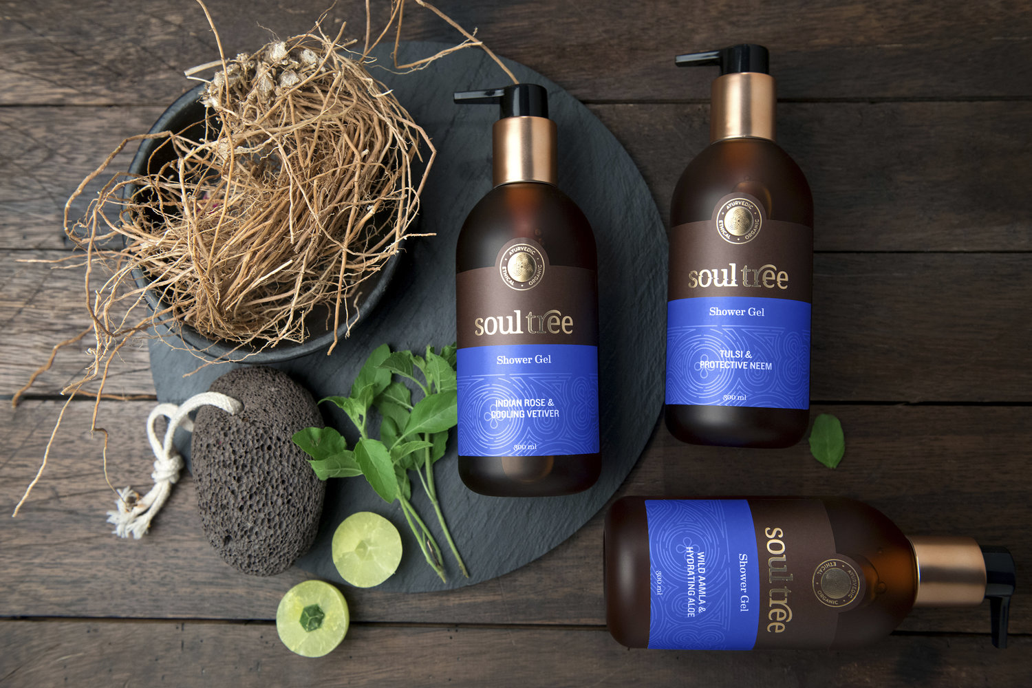
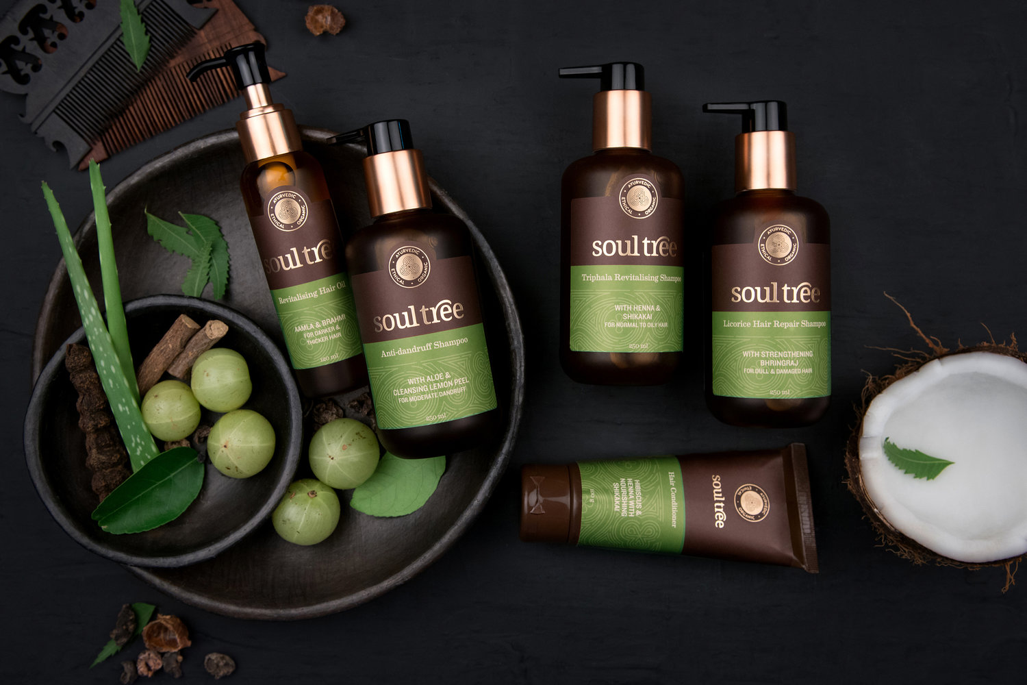
Design Stack rebrands SoulTree, an ayurvedic range of beauty and wellness products. Inspired and rooted in nature, the proposition of Truth is central to the brand: from its organic and ethically sourced ingredients, to its eco-friendly and in-house manufacturing processes.Nurture is the focus of the SoulTree word mark, where the arm of the ‘r’ extends protectively to create a canopy of shade akin to a tree. The Serif typeface lends a softness to the logo and reiterates the nurturing aspect of the brand. We also created the SoulTree seal, a three-leaved herb.Rendered in a finger-print style, it represents the 3 SoulTree truths – Ayurvedic, Organic and Ethical. The brand colours of Turmeric, Mehendi, Indigo and Vermillion point to Indian roots, while creating a clear brand architecture. The copper adds an authentic Ayurvedic touch and makes the product more premium.Our brand identity refresh of SoulTree highlighted Truth and Nurture, while the overall look and feel took the brand into a more premium category of Ayurvedic wellness products.
CREDIT
- Agency/Creative: Design Stack
- Article Title: Re-Branding True Ayurveda SoulTree
- Organisation/Entity: Agency, Published Commercial Design
- Project Type: Packaging
- Agency/Creative Country: India
- Market Region: Global
- Format: Bottle


