As one of the leading charities in the UK, the Health Foundation are committed to bringing about better health and reducing health inequality for everybody. Yet, the gap in life expectancy between people living in the most deprived areas of the UK and those living in the more affluent areas has grown over the last decade.
Health campaigns attempting to address this have traditionally fallen into two camps: either encouraging individuals to make healthy choices; or calling for health services to be improved. But the factors that influence our health are complex. The world around us – where we live and work – plays a huge role too. But traditionally this hasn’t been focused on.
Alongside a coalition of 29 national organisations representing areas like housing, employment, business and education, the Health Foundation appointed RBL to create a new brand strategy, name, visual and verbal identity for the UK’s first ever campaigning initiative uniquely focused on the wider building blocks of health, to inspire a cross sector movement that galvanises public action and drives policy change.
Our research showed that there was little understanding of how our health is shaped, beyond our genes and individual lifestyle choices. What information existed on how our surroundings, place of work and living conditions effect our health was technical, factual and evidence based. Accessible for health experts but not for wider audiences.
With the building blocks of good health largely outside of an individual’s control and not available to everyone – quality homes, stable jobs with fair pay, good neighbourhoods and communities and a decent education – it soon became clear that to change the nation’s health for the better, we would need to change the conversation around how our health is shaped too.
Asking people to look at health differently and stand up for change, would require a bold, transformative and disruptive approach. Our language and storytelling would need to be much more relatable, personal, and tangible to compel attention and build engagement; with a focus on real people, real lives and real voices.
To offer something beyond noise, something strident but not scary we would need to walk the walk and provide a way forward with approaches, solutions and actions. We’d also need to inspire collaboration, uniting 29 organisations into one shared voice, making partnership and cooperation around such a potent issue desirable and easy.
If the air that you breathe is dirty; your home is cold and full of mould; your mental wellbeing is not supported at school; or you’re not earning decent income then your health is impacted. And if you’re facing many of these challenges then your life might be cut short. In real and simple terms, your health can impact on your opportunities in life, and your chance to live a happy life. Our health is valuable. So why isn’t everyone’s health valued the same?
Stripping the issue back to these simplest, most emotive elements was the key to unlocking a compelling way forward.
When we explored the idea of what good health really means, the recurring themes were all innately positive ‘value’, ‘opportunity’, ‘chance’, ‘benefits’. We knew from that point on we needed to build our strategy around these ideas, and convey a sense of positive action, optimism and energy to move things on.
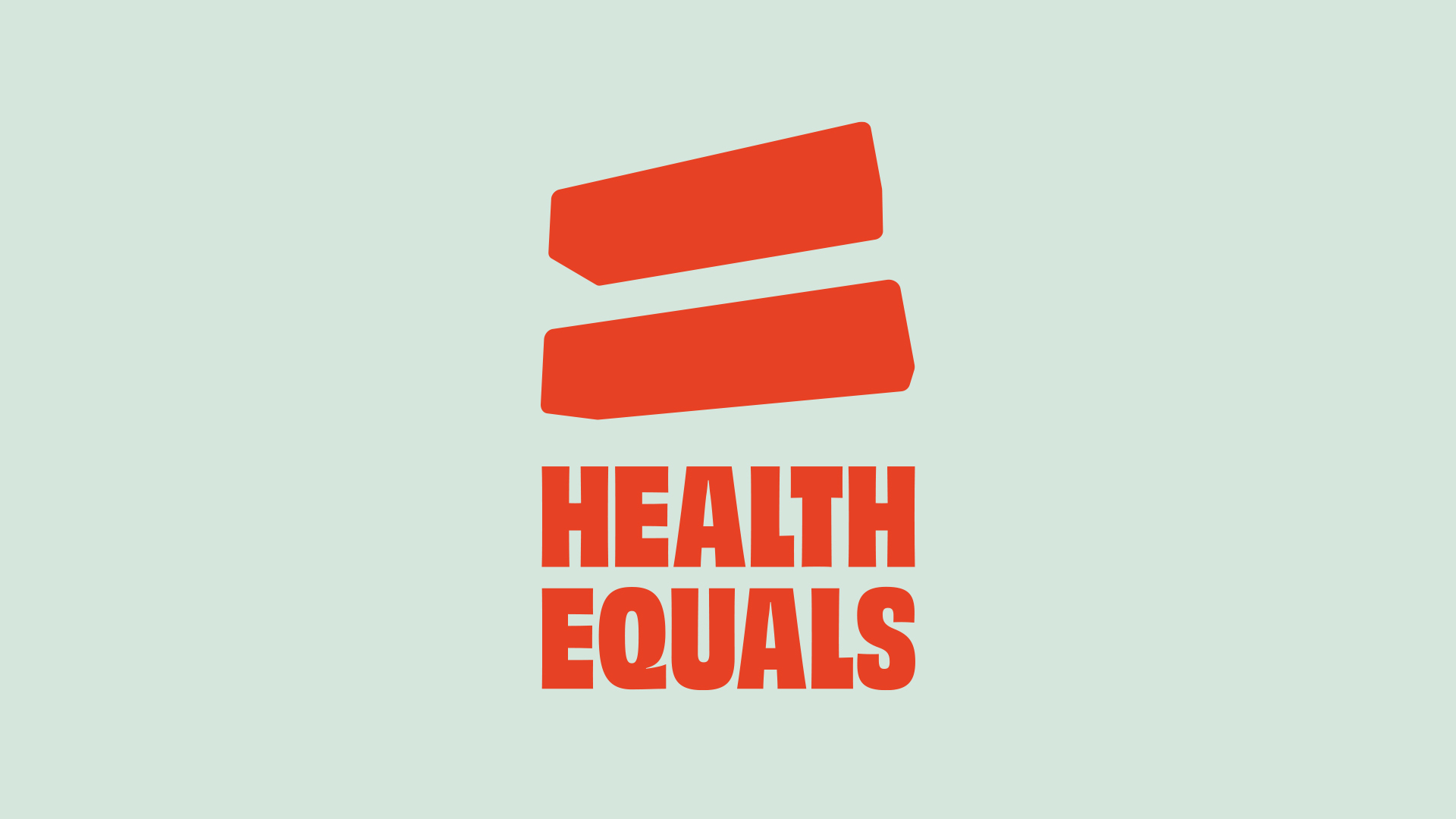
Keeping things simple, emotive and positive also informed our work around the name. The Collaboration for Wellbeing & Health was seen as vague, long and not very inspiring, so we cut to the heart of the issue with a new name – Health Equals. Short, punchy and easy to say, it links to positive effect health has on people’s lives and it naturally lends itself well to campaigning around inequalities. And opened up a whole new world of creative possibilities.
With such a bold purpose – driving forward the insight, ideas and action to positively change the way the UK looks at health – we needed an equally bold and disruptive identity.
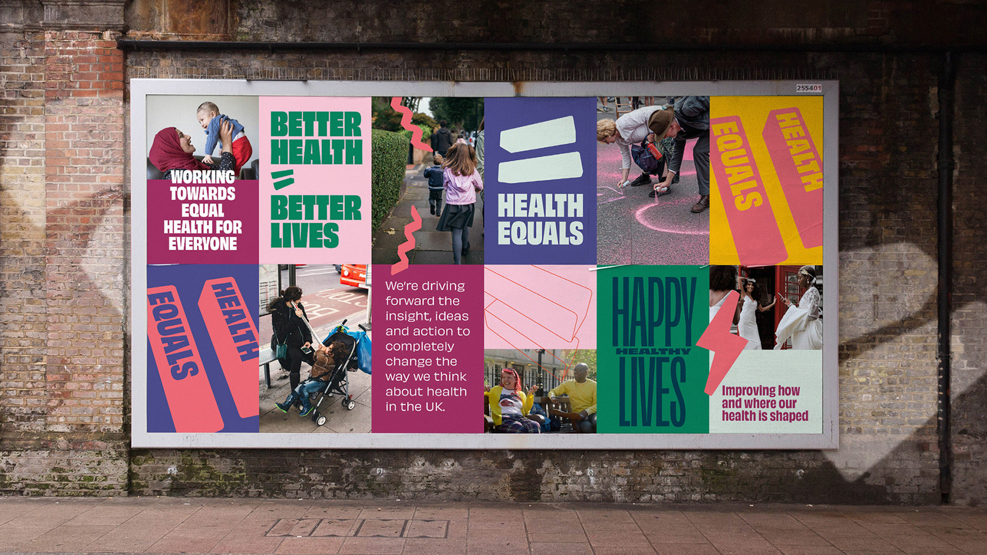
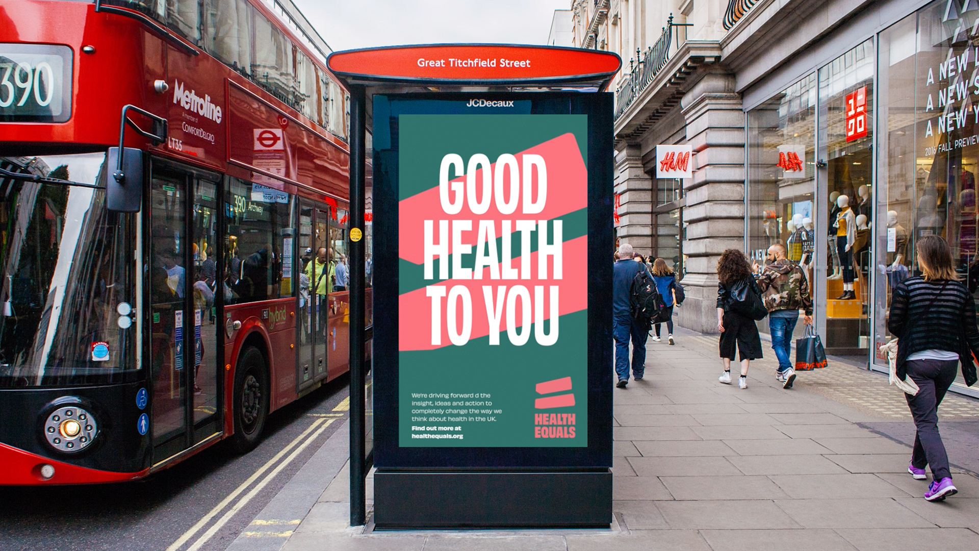
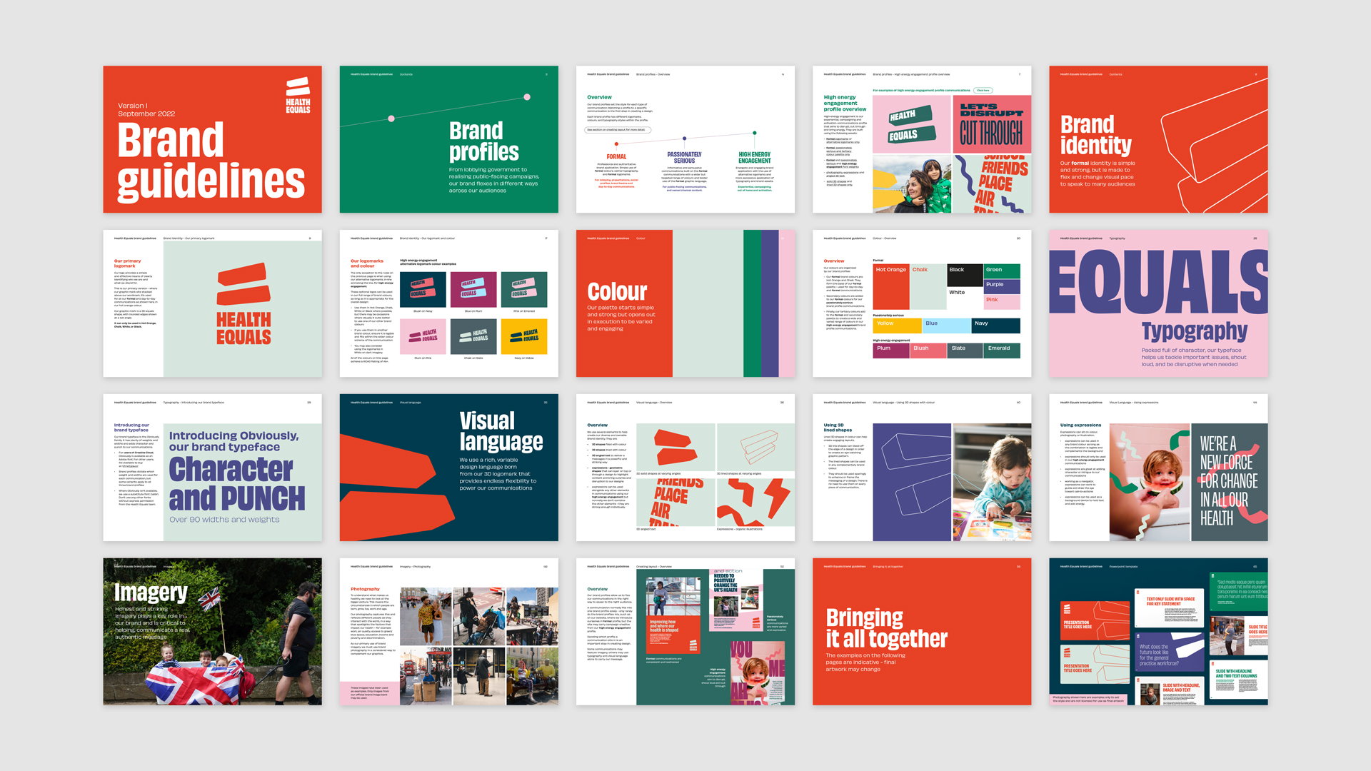
One that was fresh, unexpected, and different to your typical health brands and think tanks; that would not just make you turn your head once but keep you looking. As well as inspire people and organisations to get involved. Here are some of the elements we created:
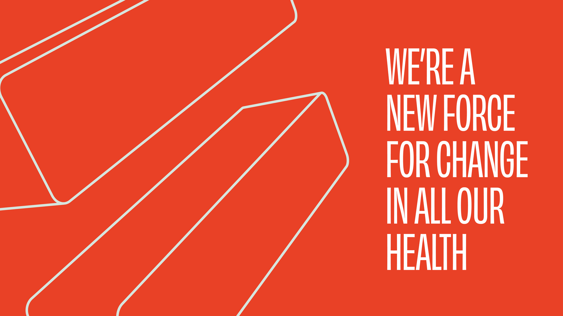
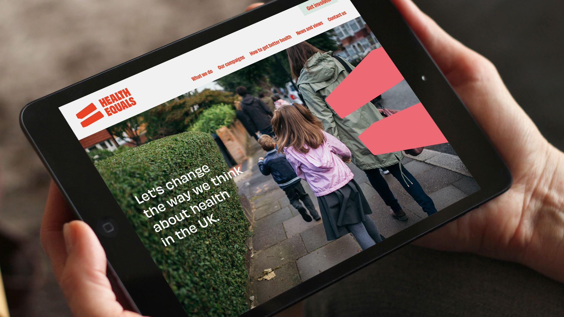
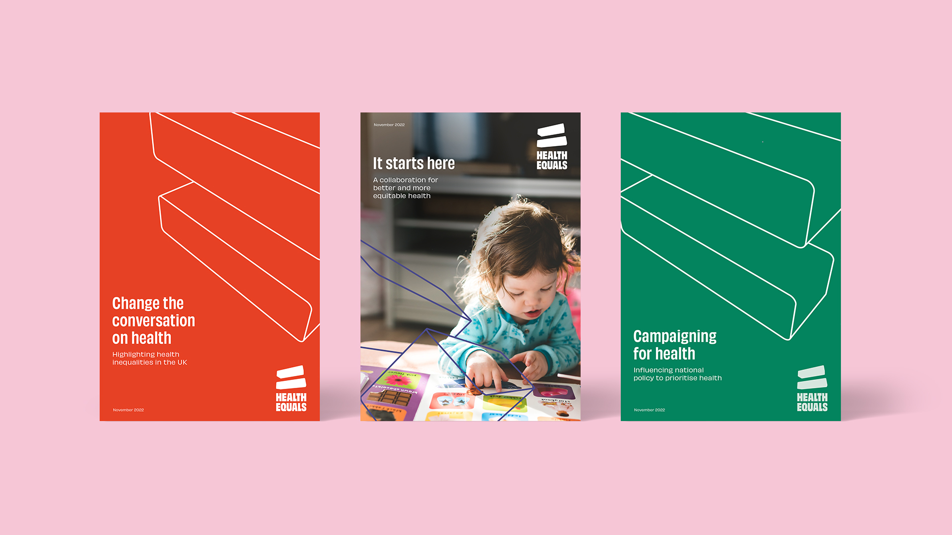
• 3D equals logomark as a strong, dynamic and striking symbol that provides endless flexibility to power communications
• Flexible, contrasting typography that’s packed full of character and personality
• Bright, vibrant palette with unusual colour pairings
• A human, authentic photography style that shows the bigger picture, connecting surroundings to people’s lives, representing the diversity of people and communities across the UK.
Because of the diversity of communications and campaigns our design system also needed to be highly versatile, providing a platform that would enable the brand to talk with gravitas, simplicity and focus for more formal communications like policy asks, or increase the energy for high impact public engagement and activation.
From the heart of policy making to the school playground, these tools – name, messaging and visual identity – provide the platform for an original, ambitious, purposeful campaign focused on shaping a society that values everyone’s health, where each of us has our best chance of a healthy life, no matter where we’re born, work or live.
CREDIT
- Agency/Creative: RBL Brand Agency
- Article Title: RBL Creates Disruptive Brand for Health Equals
- Organisation/Entity: Agency
- Project Type: Identity
- Project Status: Published
- Agency/Creative Country: United Kingdom
- Agency/Creative City: Leamington Spa
- Market Region: Europe
- Project Deliverables: Brand Creation, Brand Design, Brand Identity, Brand Naming, Brand Strategy, Brand Tone of Voice, Brand World, Identity System
- Industry: Non-Profit
- Keywords: Brand strategy, brand identity, naming, visual identity system
-
Credits:
Creative Director: Adam Concar
Strategy Lead: Rhiannon Lowe
Creative Lead: Andy Mathias


