


Brewfist is a second generation craft brewery in northern Italy now among the top ten independent producers in the country. Since the beginning, they committed to bold flavours and a no-compromise approach to do things, which reflects in their brand identity and extensive portfolio. 2020 marked the brewery’s 10th anniversary and, in typical Brewfist fashion, they wanted to celebrate big! So they decided to embrace cans and asked ByVolume, who worked on their rebranding in 2016, to create a bold design system for their one-off beers.
The ”one-off” product range was initially designed as a container for all the many special, collaboration and never-to-be-seen-again beers made by Brewfist. ByVolume saw this new canned range as the perfect vehicle for an entirely new visual system, one that had to be different and impactful in an already crowded market but also flexible, economical and easy to update.
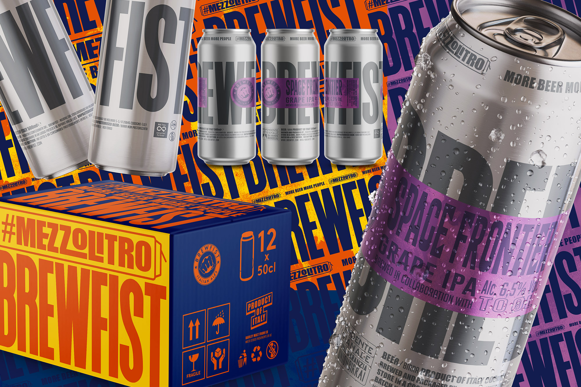
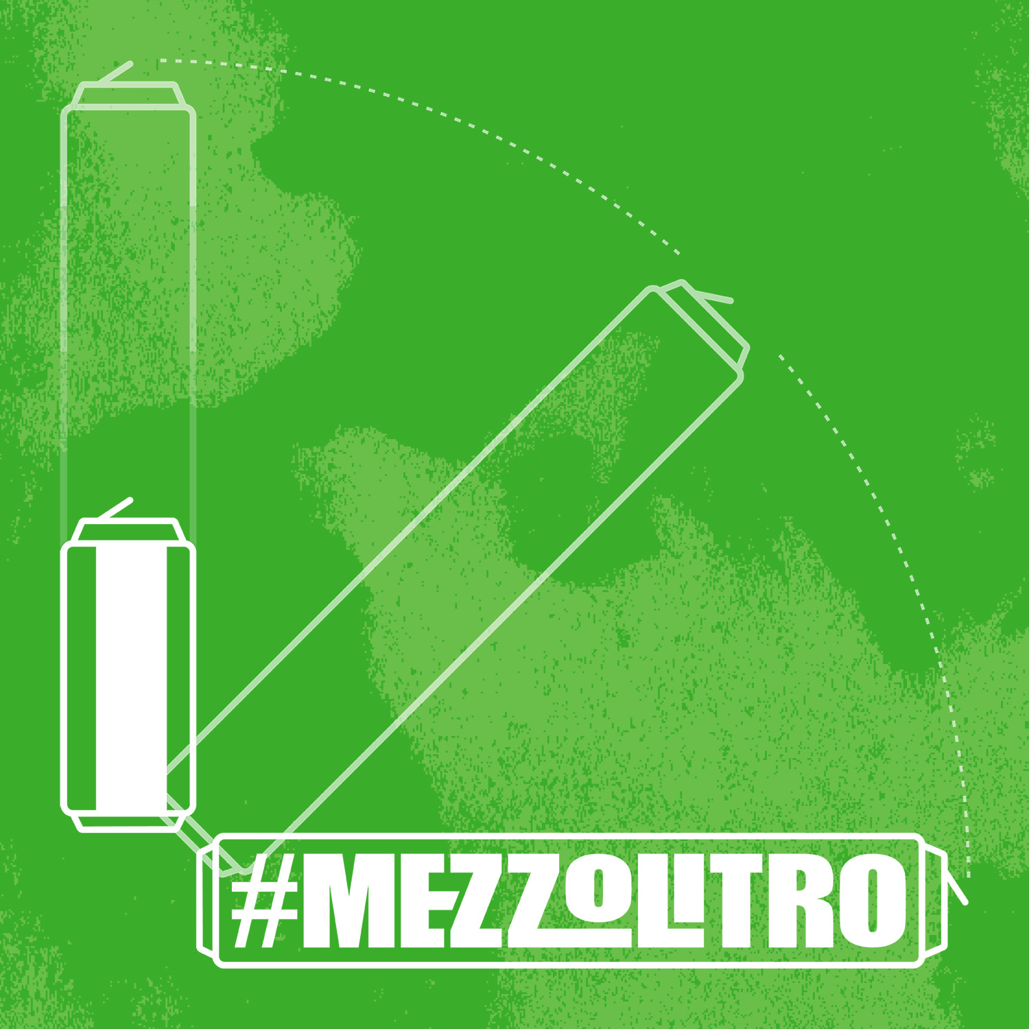
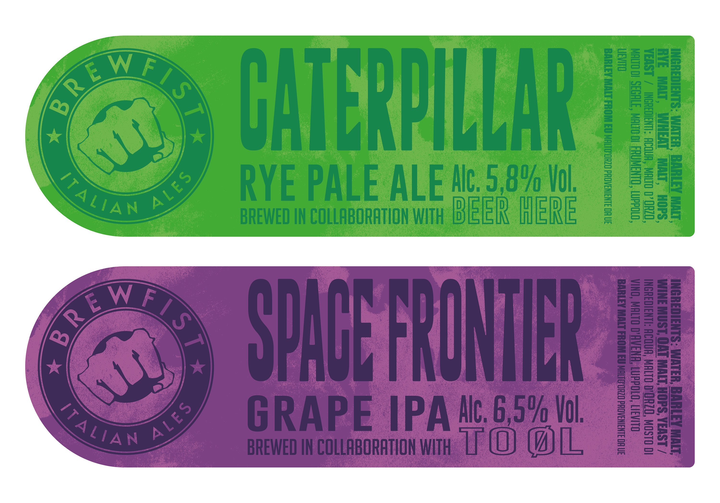
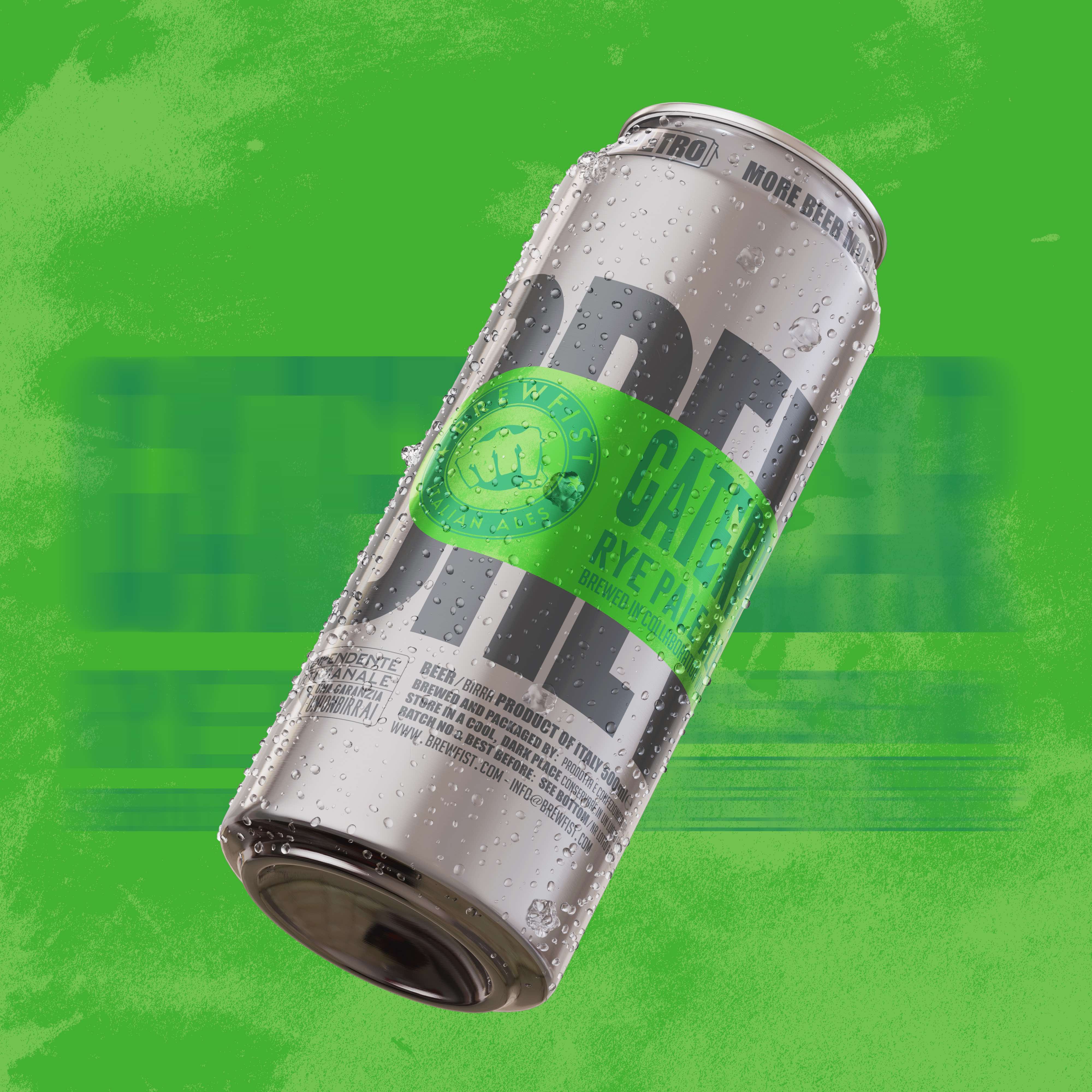
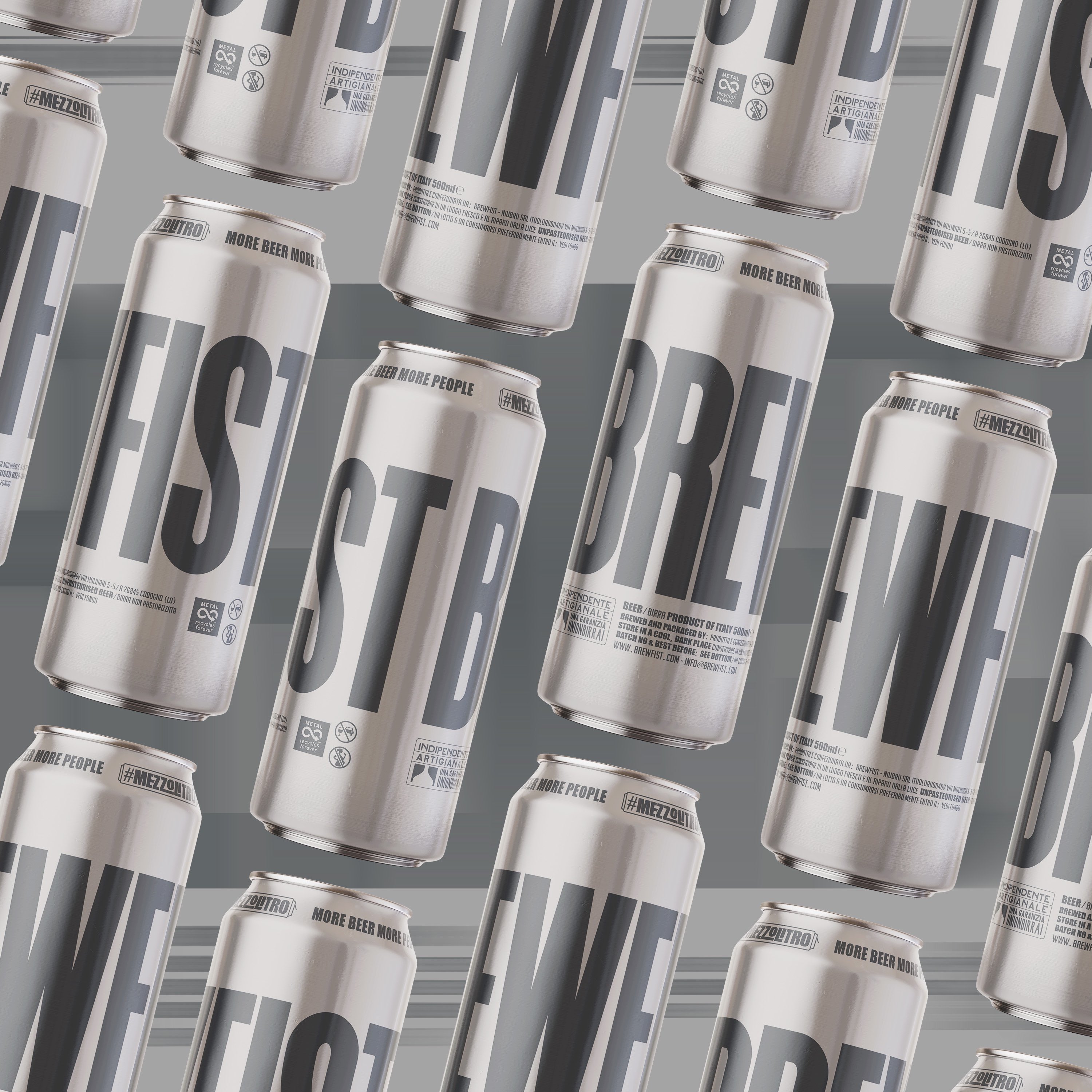
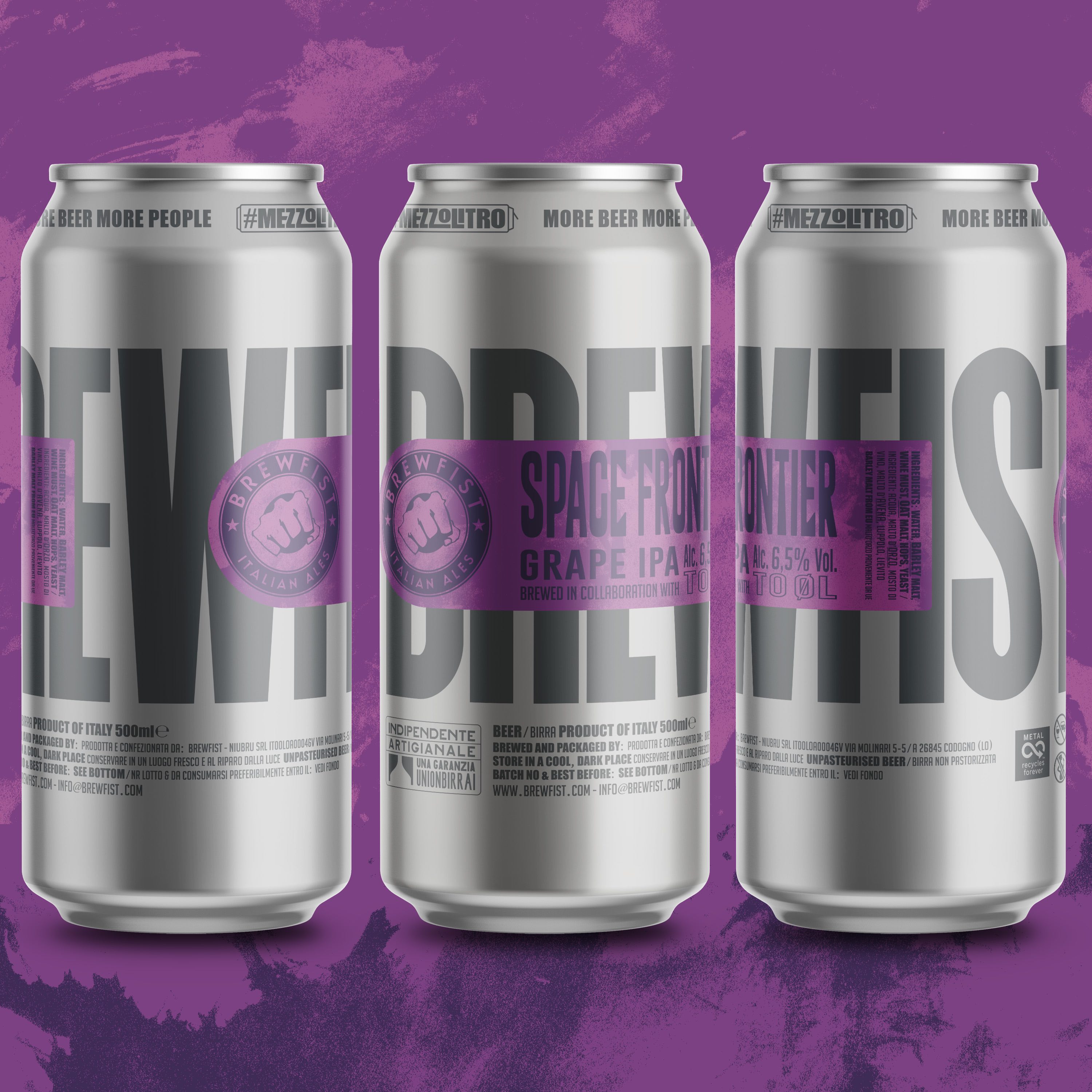
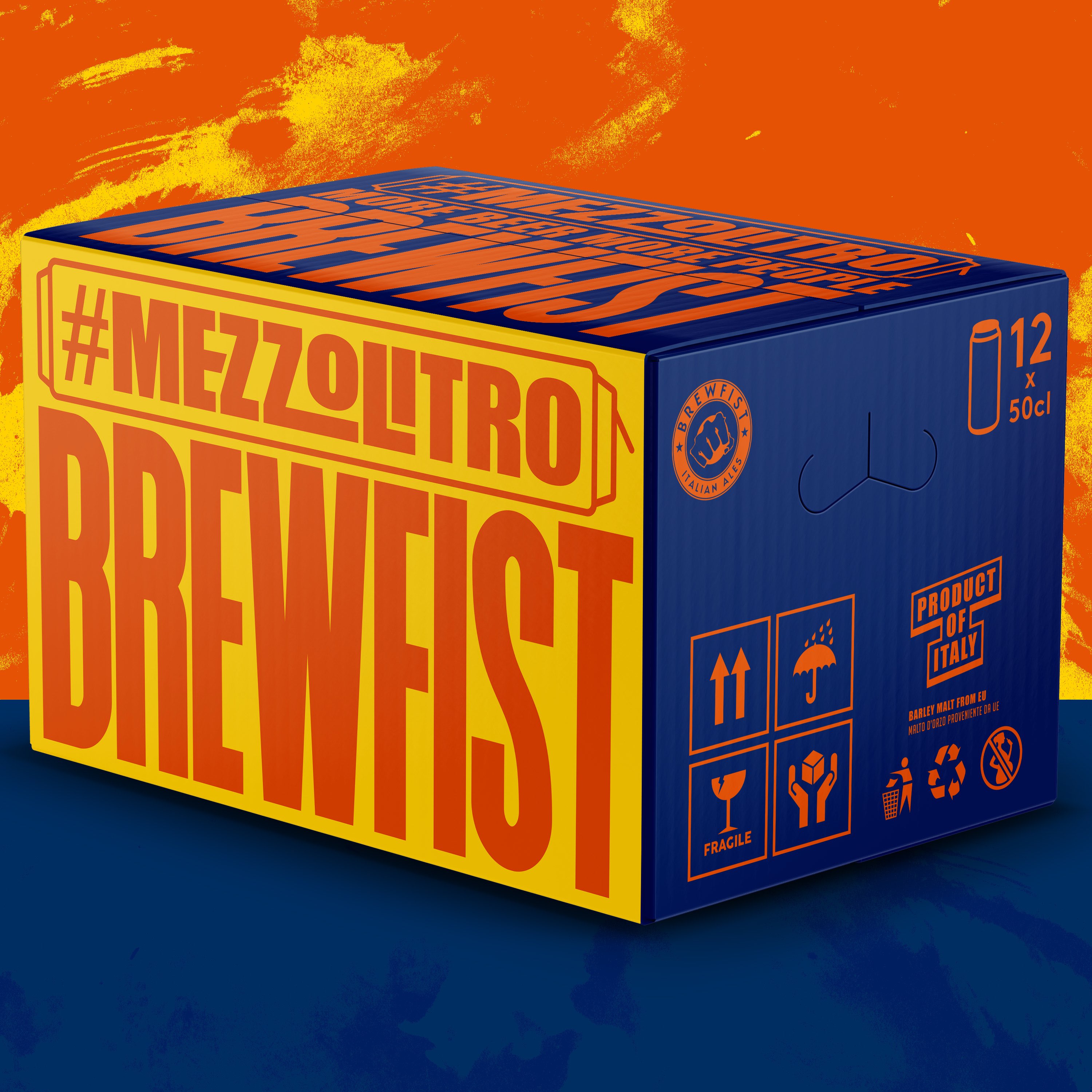
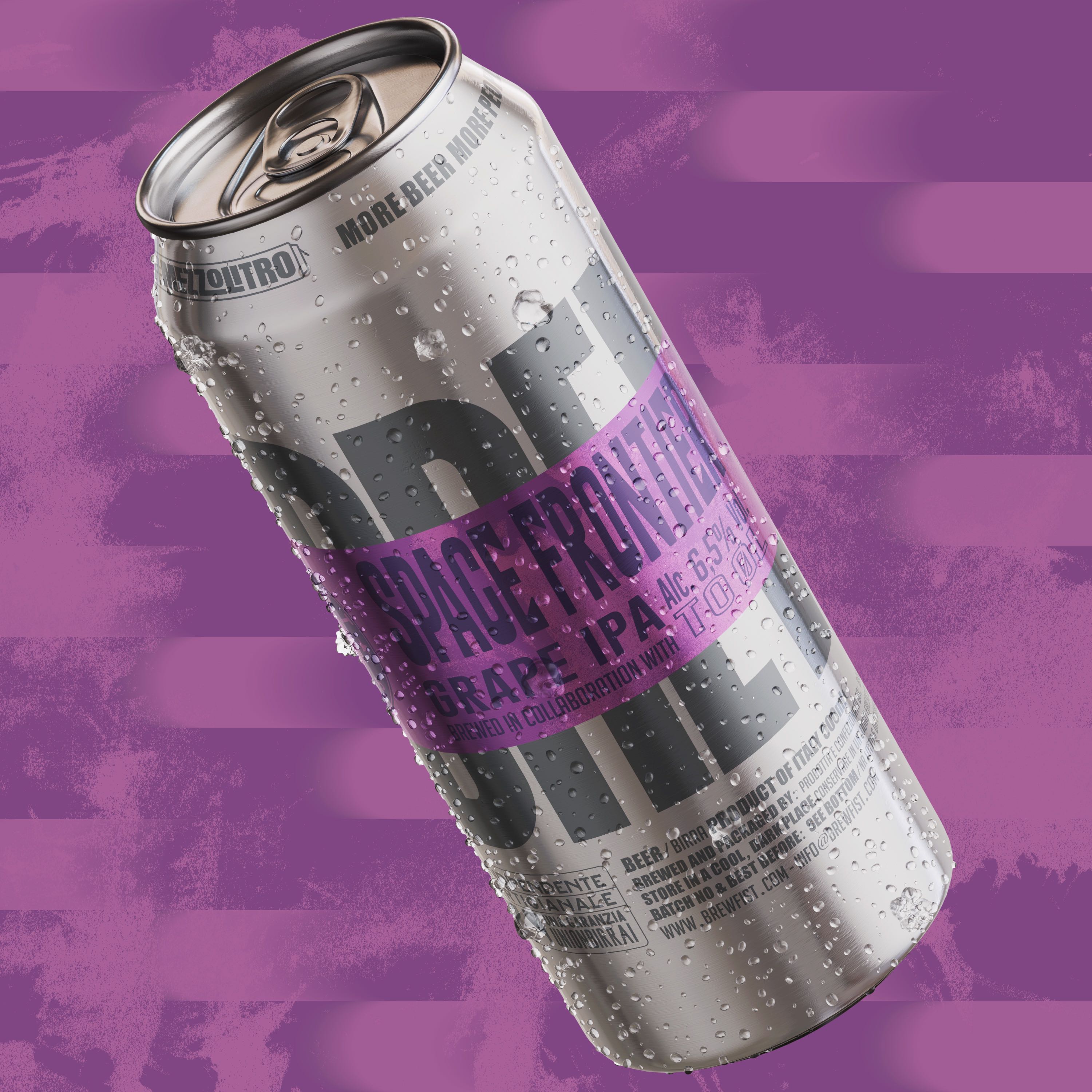
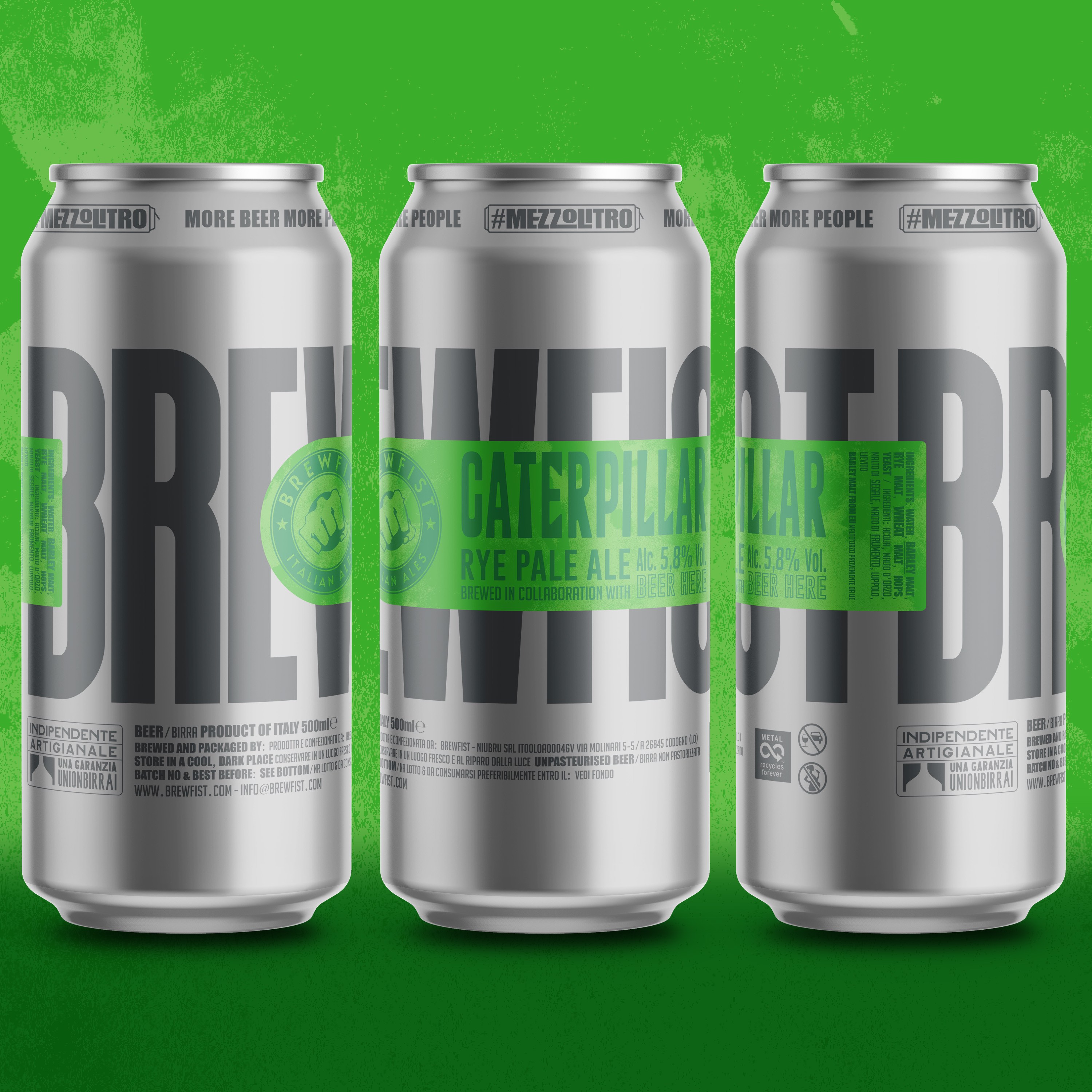
Key design features: We like the industrial look of a naked aluminium can and think not enough breweries take advantage of it and incorporate it into the design. We decided on a large scale Brewfist lettering printed in dark grey directly on the can and along its entire width. The lower area of the can features packaging information and requirements also printed directly on the can and that enhance the industrial look of the container. The most common can formats for craft beer in the domestic market are 330/400ml, so it was a very Brewfist move to decide for 500ml. We created the tagline #mezzolitro (half a litre!) to signify the uncommon size of the can and better define their entire range of canned beers. The new tagline now sits on the neck of the can alongside the brewery’s old slogan “more beer ore people”. The label is a monochrome strip that strikes through the name Brewfist on the can. Depending on application, this may let emerge different letters of the word Brewfist so that it’s always a snippet and never revealed in full. It enhances the craft of the product and introduces a unique oddity from can to can. The strip label is also finished with a raised spot gloss and varnish which make it stand out against the matt finish of the aluminium can.
CREDIT
- Agency/Creative: ByVolume
- Article Title: Raw Aluminium Cans with a New Bold Visual System for Brewfist Designed ByVolume
- Organisation/Entity: Agency, Published Commercial Design
- Project Type: Packaging
- Agency/Creative Country: United Kingdom
- Market Region: Europe
- Project Deliverables: Brand Architecture, Brand Identity, Brand Rejuvenation, Branding, Graphic Design, Identity System, Packaging Design, Research
- Format: Can
- Substrate: Metal


