


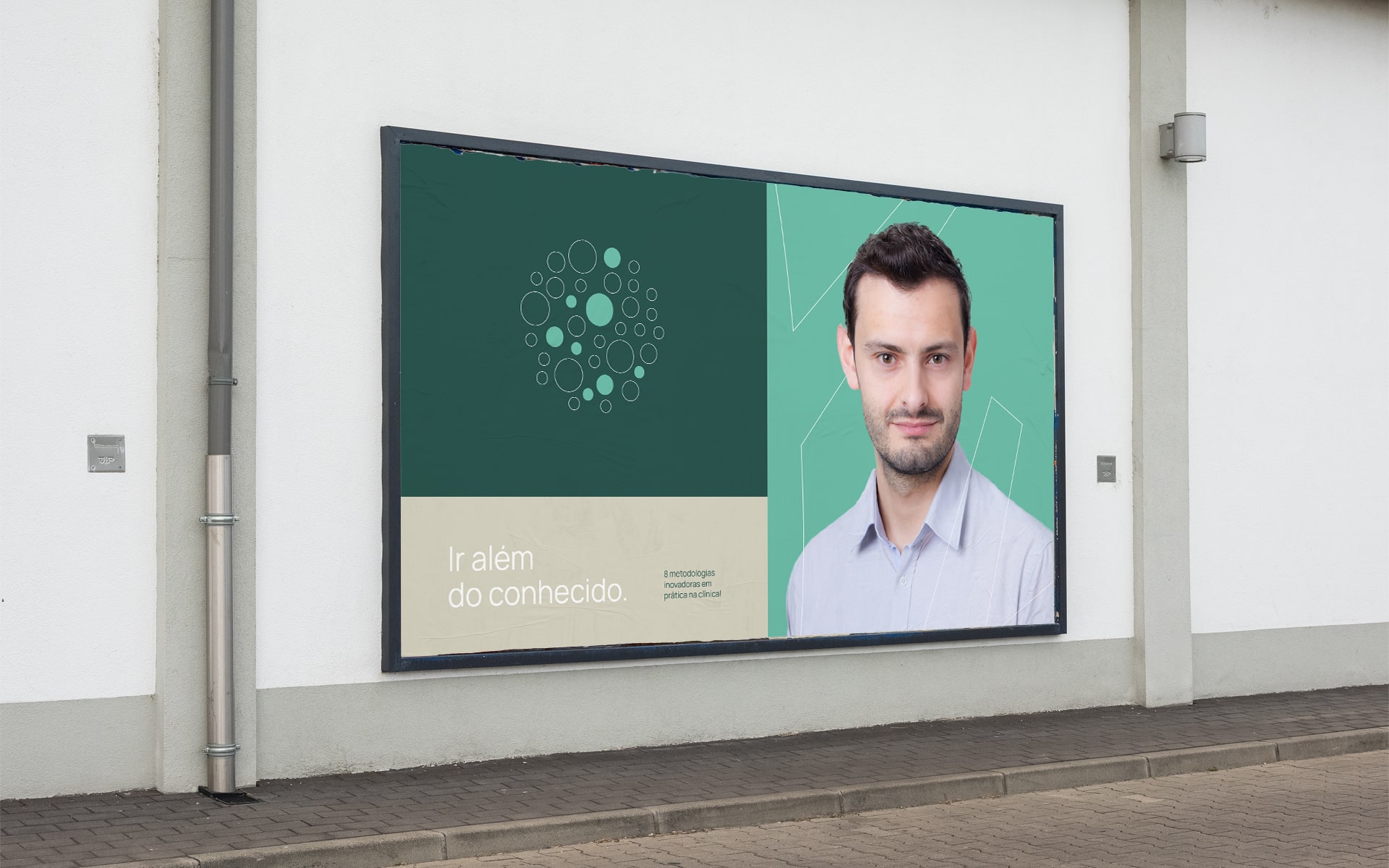
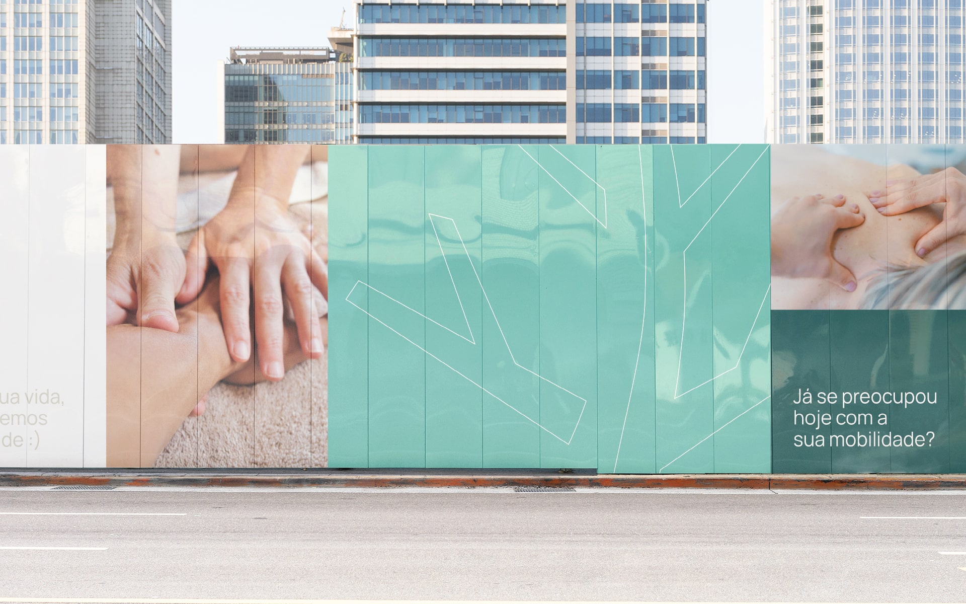
BioFisio is an autonomous physiotherapy clinic in the evolution phase. It aims to care for patients by applying completely natural innovative methodologies and knowledge.
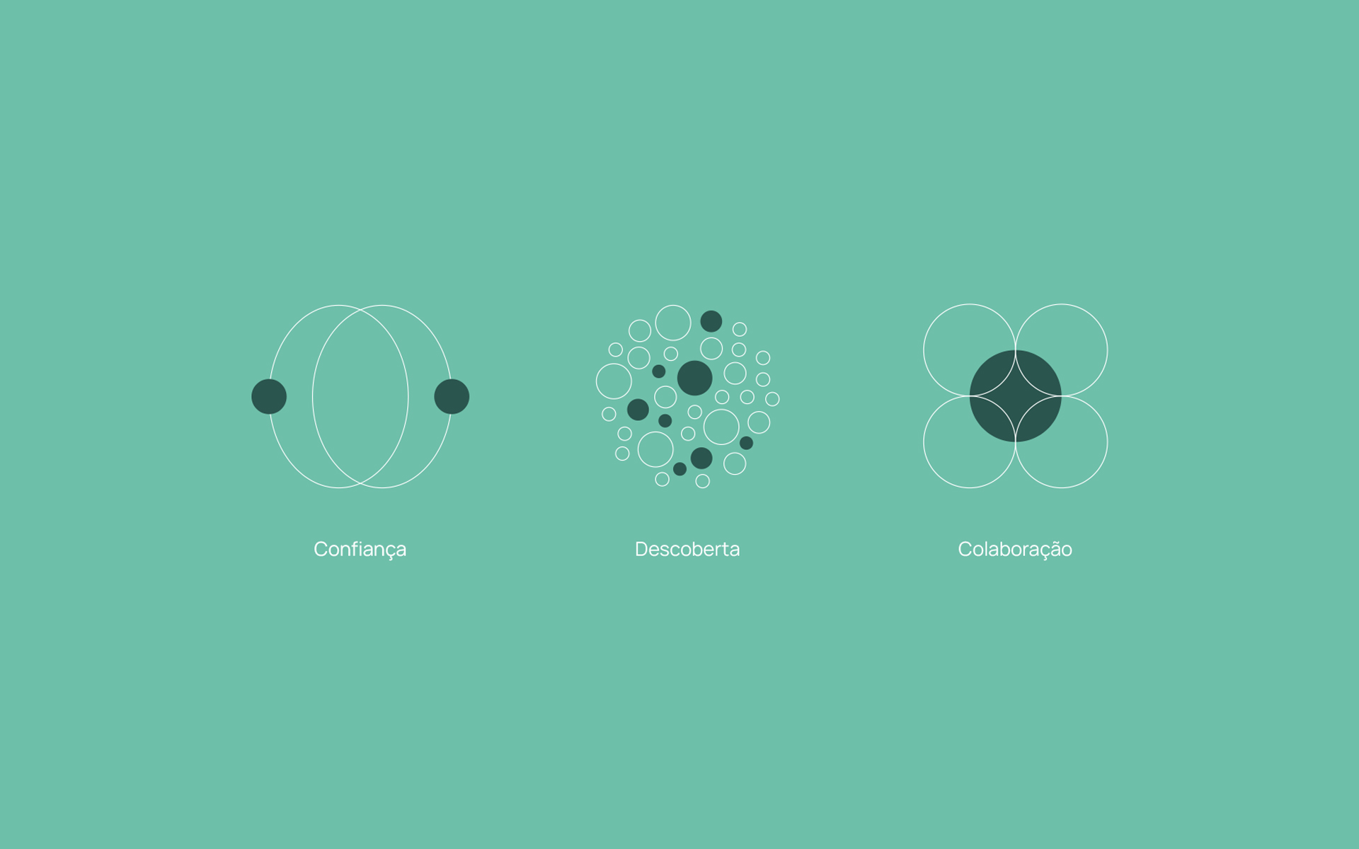
The spheres that make up the previous logo are like seeds that plant this new tree. The cultivation of knowledge and experience that created a beautiful structure ready to evolve without limits, and to expand wherever the future takes it. The tree not only means cultivation and evolution, but it also brings “Bio” to the visual side of the brand, giving clarity to the functioning of BioFisio and its methodologies.
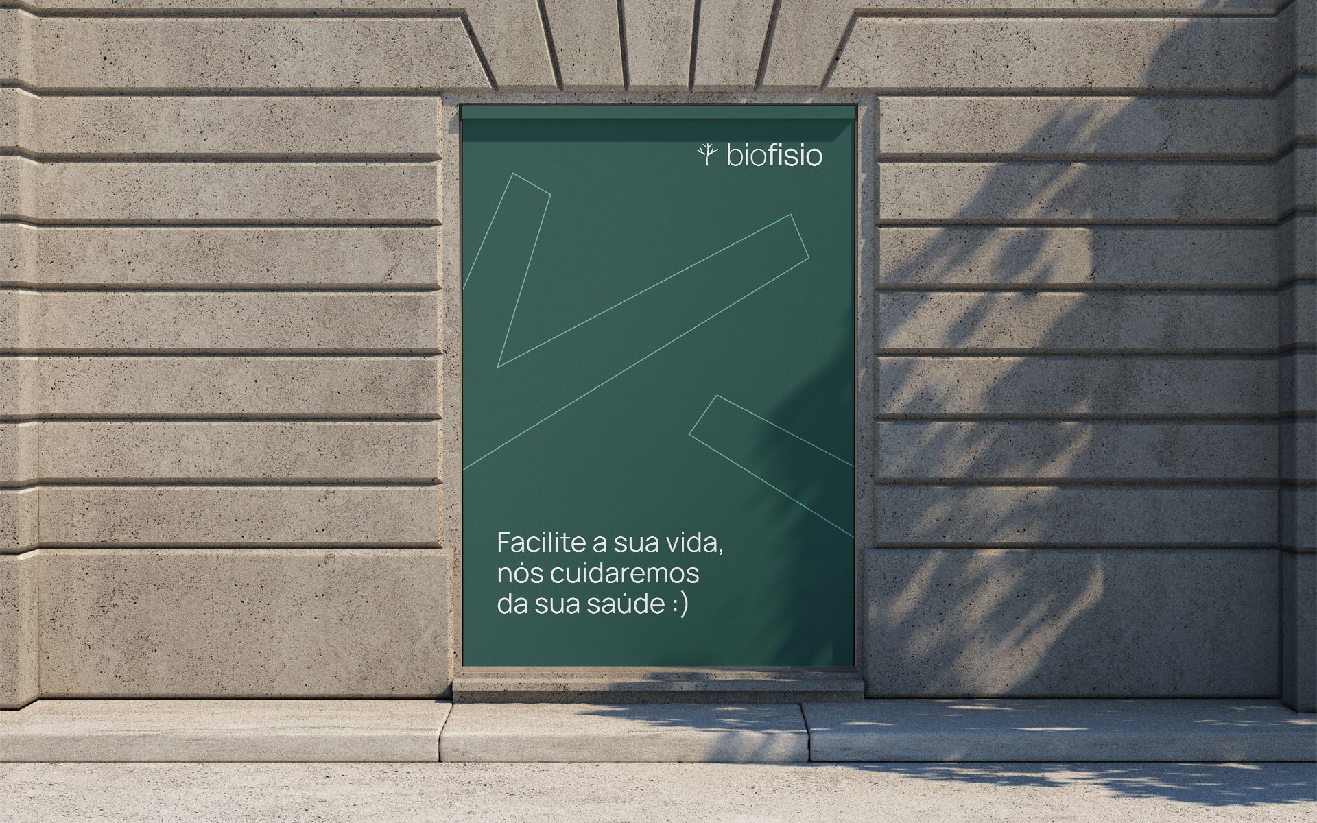
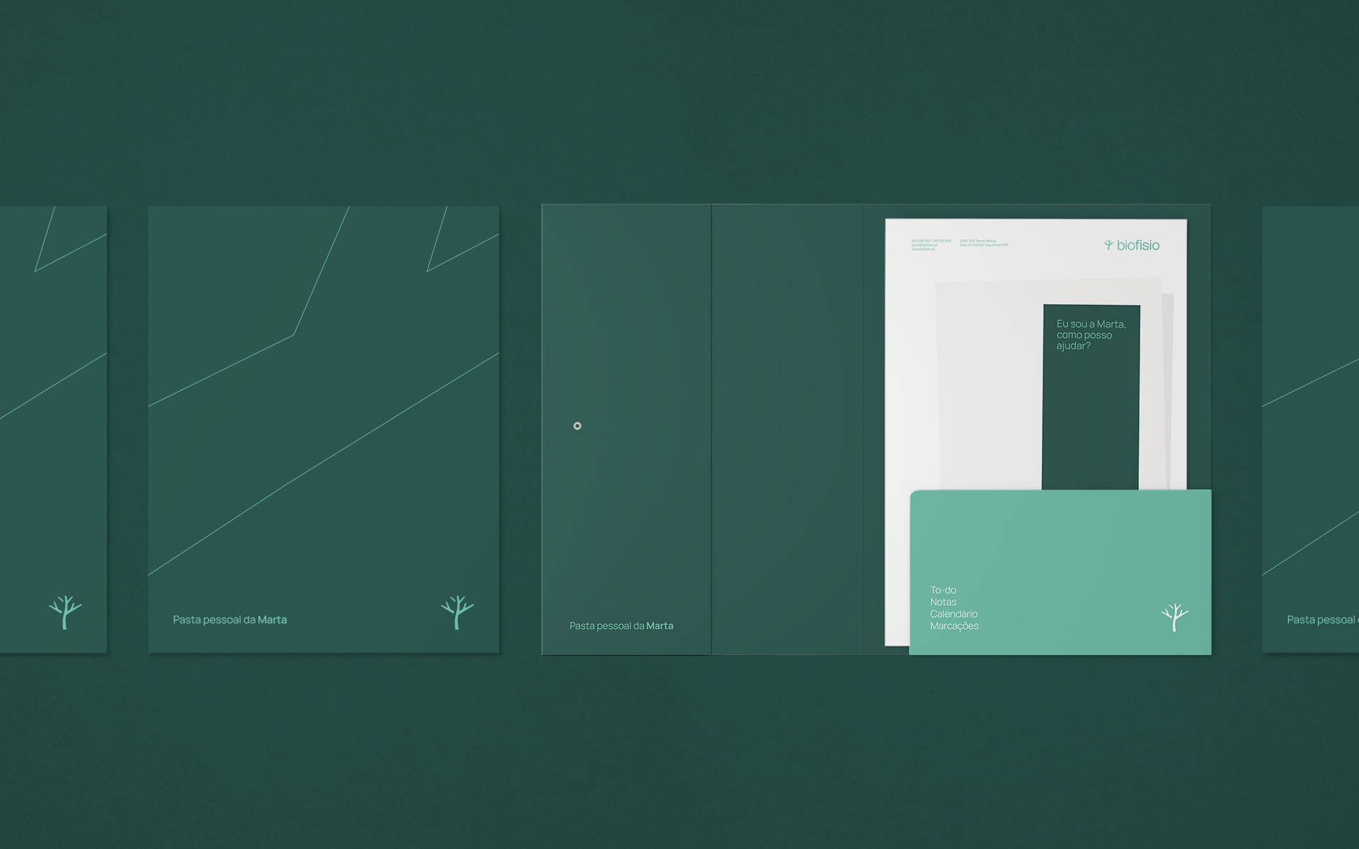
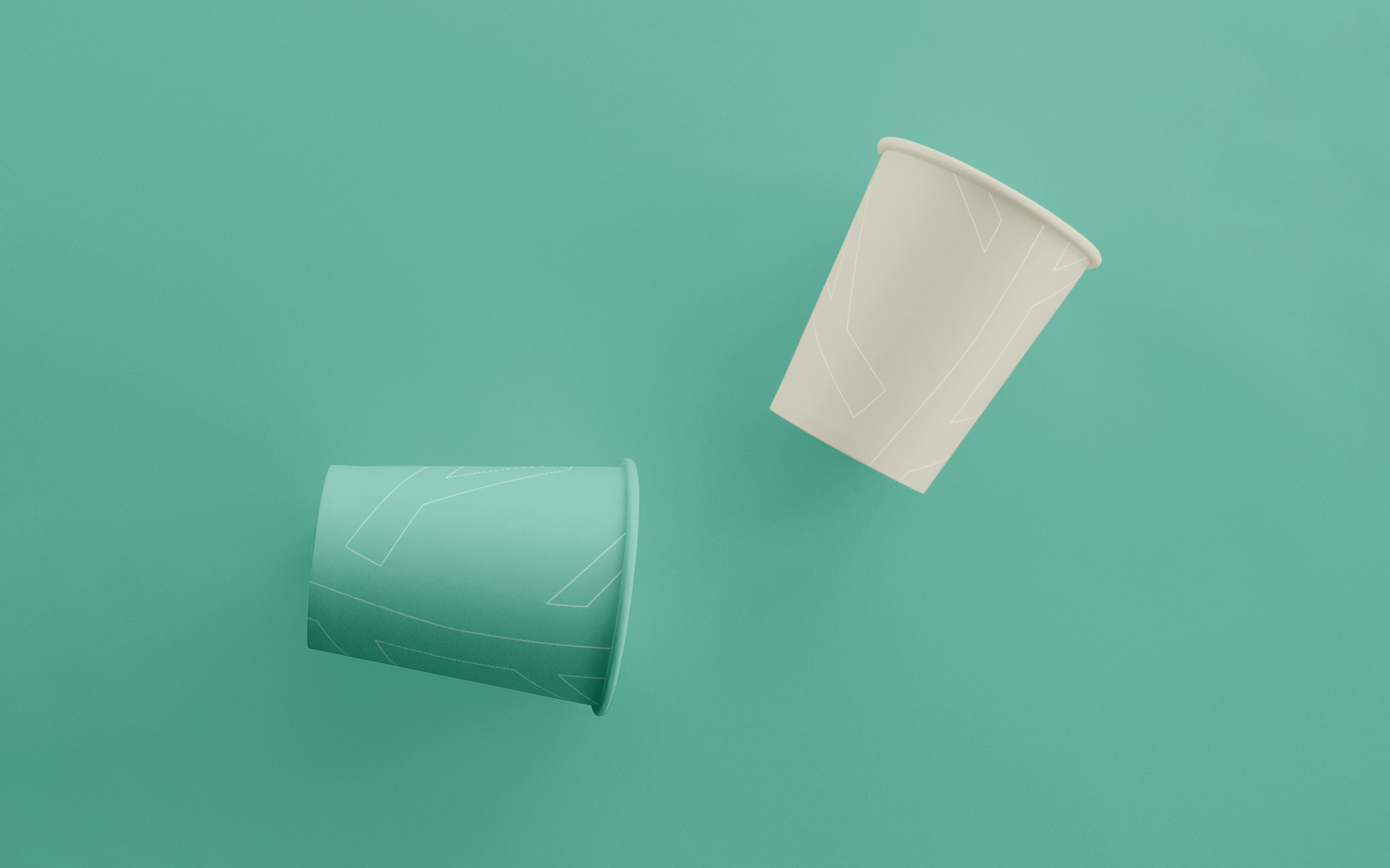
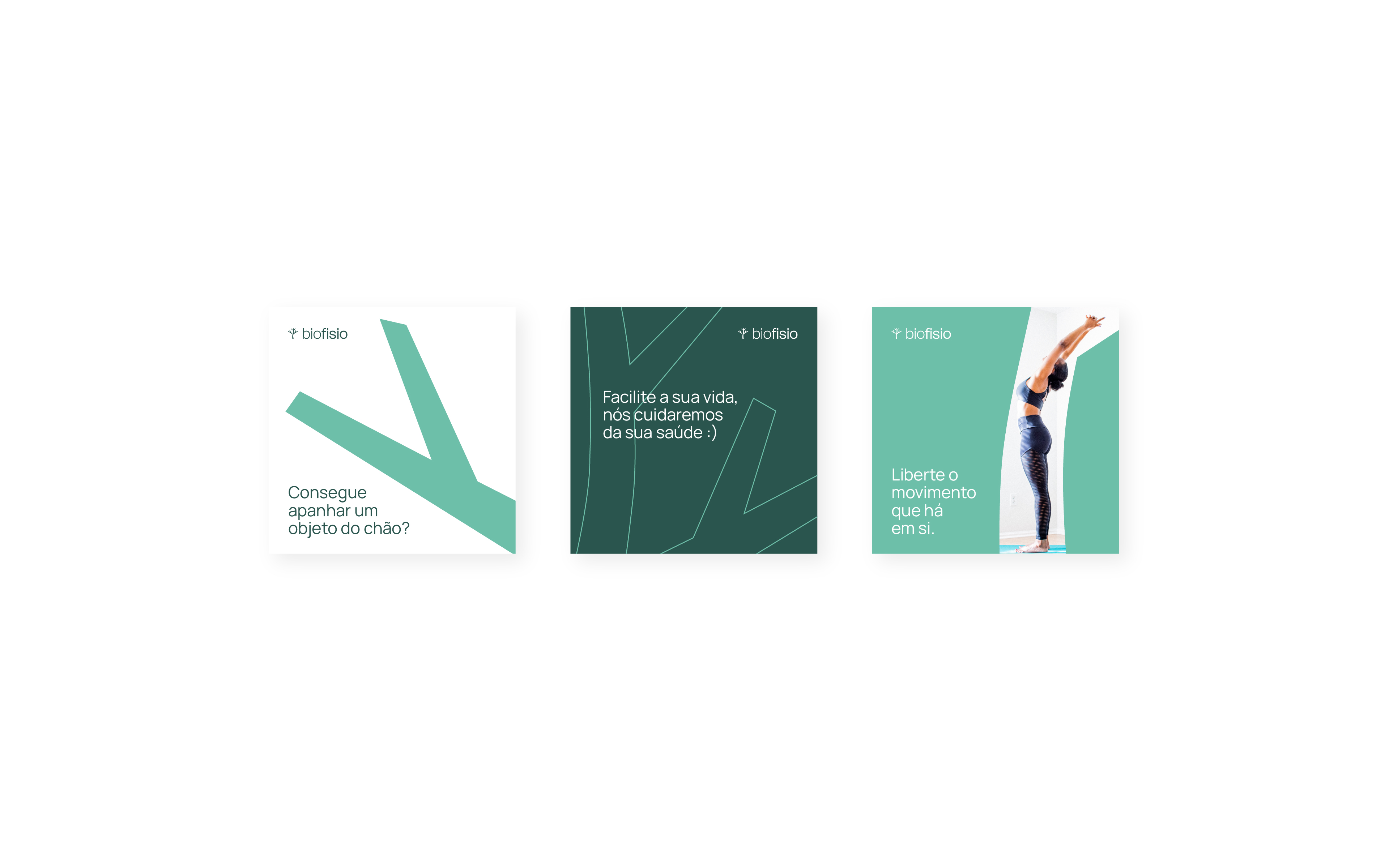
We made the green of the old BioFisio more mature, not only to assimilate that BioFisio is in a phase of transition and maturity in the market, but to make the color universal for all contact points, both physical and digital. We added a more sober shade of green to the palette, to complete the identity and facilitate its expansion. We now have a set of colors that allow us to make the brand more “Bio” in a delicate way and allow us to differentiate ourselves from competitors, especially brands that work with insurance companies. It also facilitates the public’s subconscious perception, without saying that the brand values natural treatments.
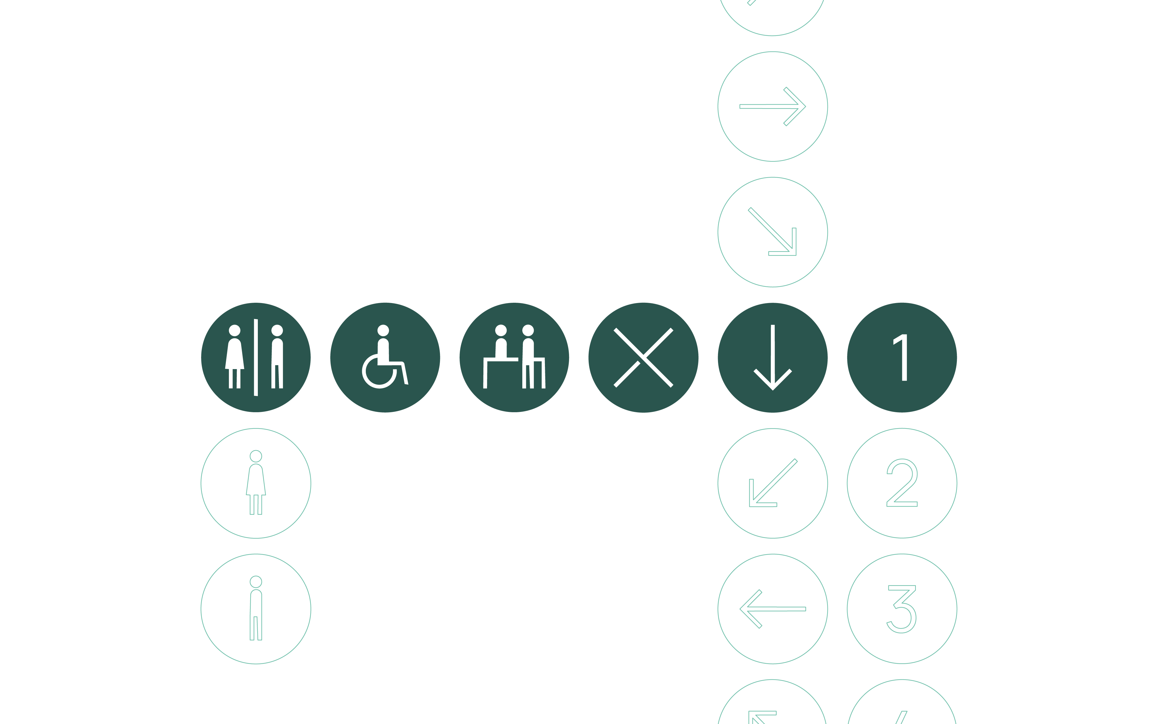
A system of pictograms was also created to facilitate client orientation in the clinic. Identifiers were created for the various rooms, maintaining consistency with the brand identity.
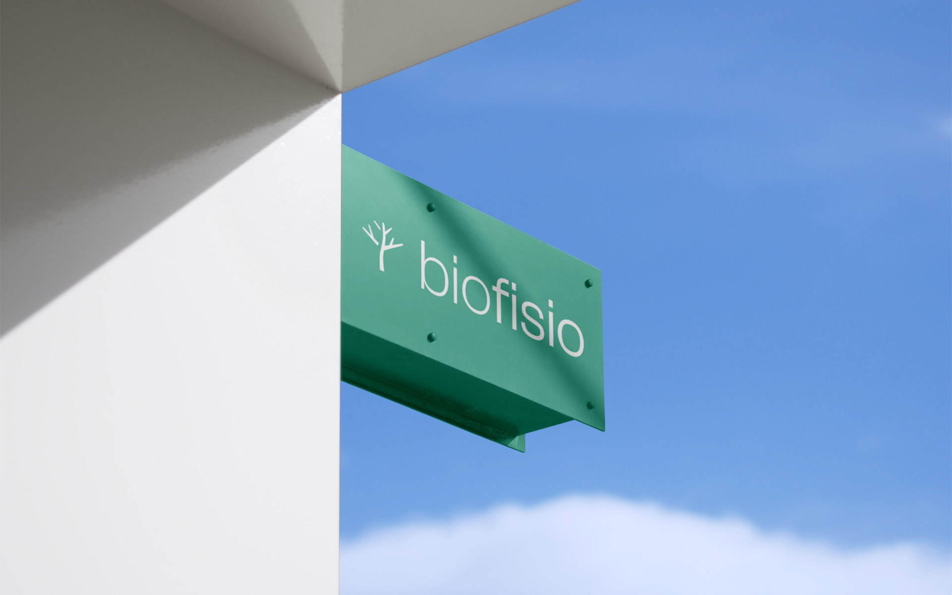
The project was completed with the redesign of the clinic’s facade. The main reason for developing a visual identity for BioFisio. The customer’s first point of contact with the clinic would be the decisive factor for a good and correct impression of the brand.

CREDIT
- Agency/Creative: Raquel Fernandes
- Article Title: Raquel Fernandes Shapes BioFisio’s Evolution: A Fresh Visual Identity for Innovative Natural Physiotherapy
- Organisation/Entity: Freelance
- Project Type: Identity
- Project Status: Published
- Agency/Creative Country: Portugal
- Agency/Creative City: Salir do Porto, Caldas da Rainha
- Market Region: Europe
- Project Deliverables: Brand Identity, Identity System, Logo Design
- Industry: Health Care
- Keywords: physiotherapy, health, medical, natural, bio
-
Credits:
Graphic Designer: Raquel Fernandes


