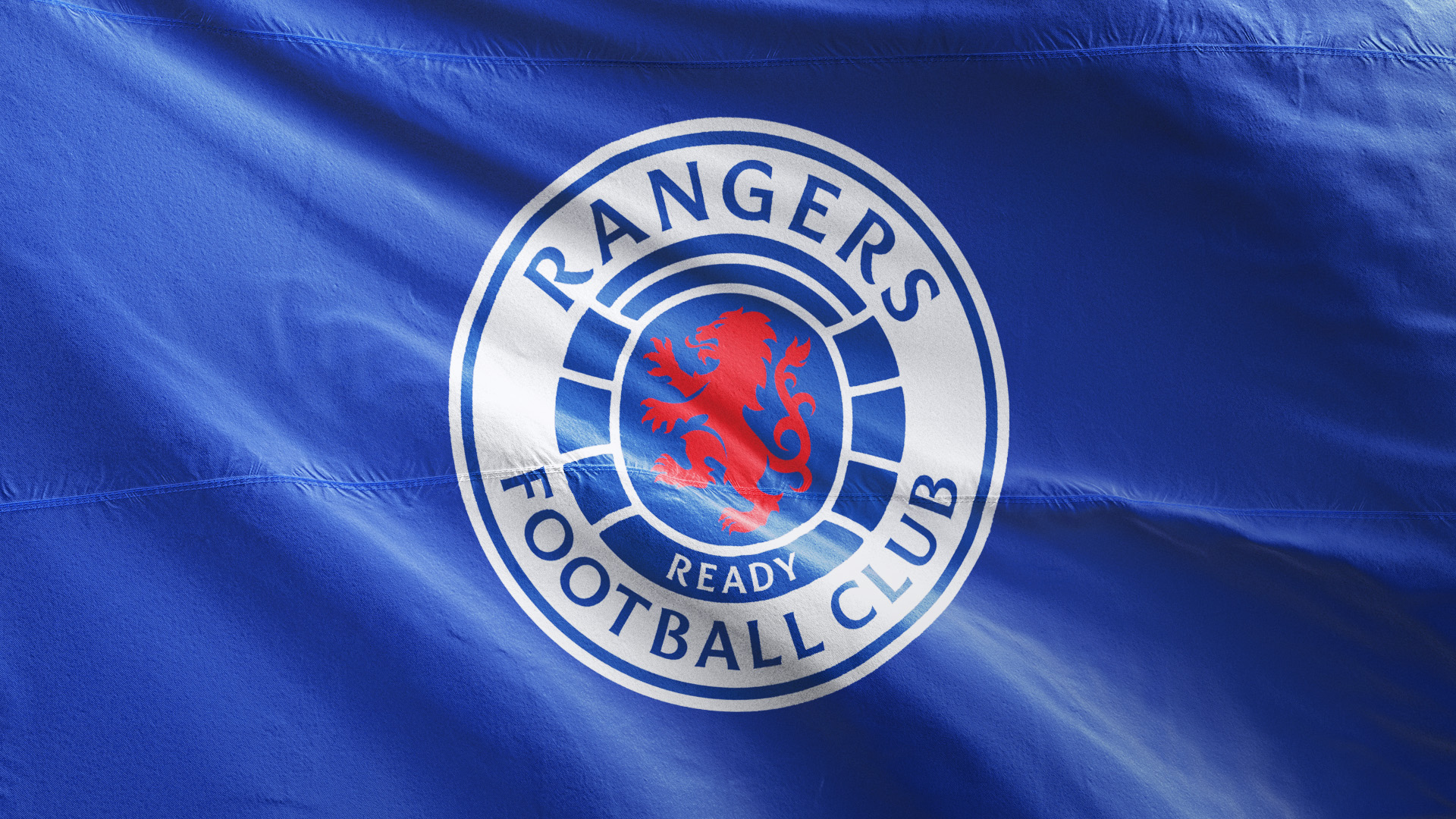
Scottish creative agency See Saw has rebranded leading European football club Rangers, as part of its goal of implementing an industry-leading and dynamic digital transformation strategy aimed at supporting the club’s continued growth.
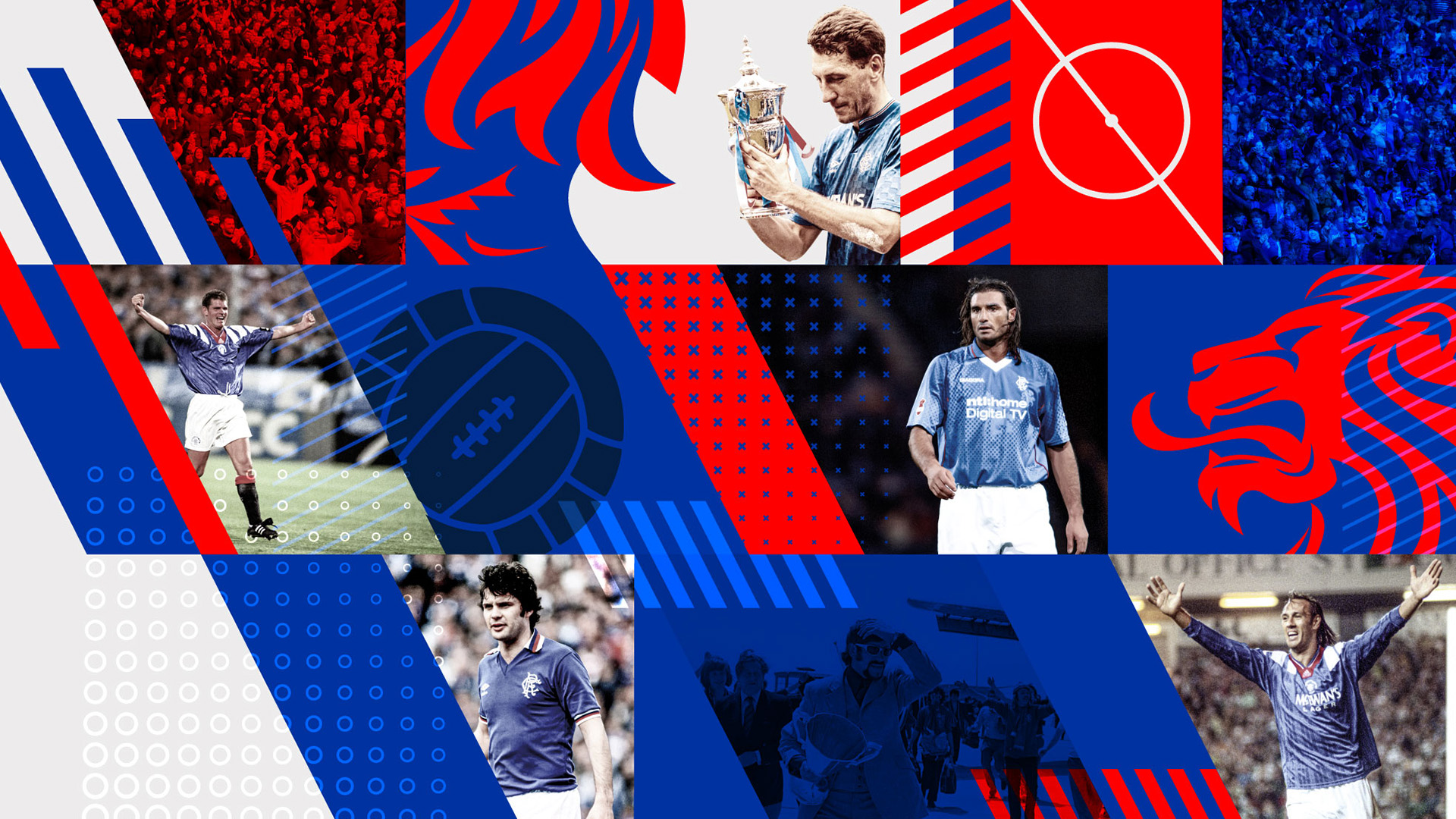
The new brand identity retains the core assets and heritage of Rangers, whilst modernising and evolving its visual style for a digital era and in support of the club’s international fan engagement ambitions.
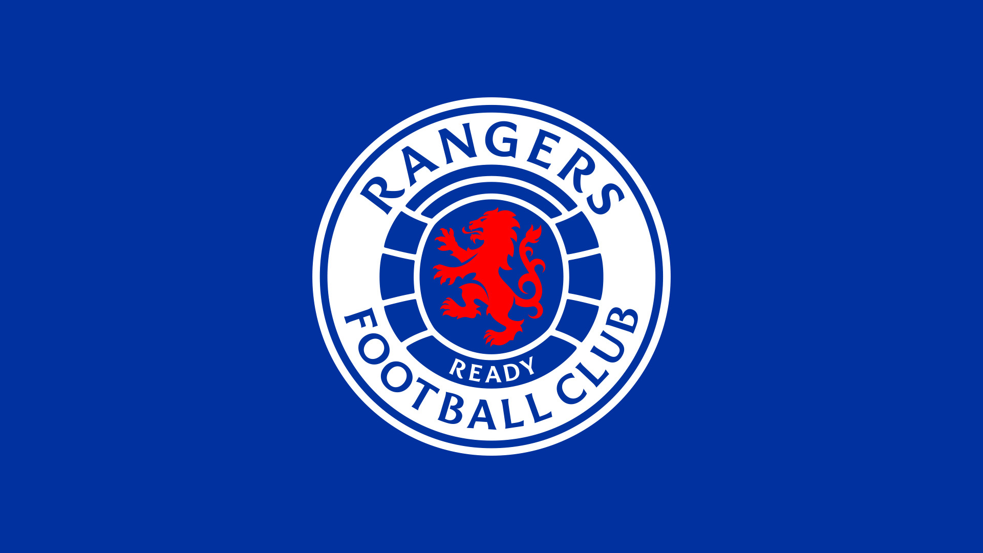
“The Rangers READY crest has been designed to add balance, power and a stronger presence to the well-known Rangers brand. Incorporating a new visual language for use in the digital age, a new custom typeface and re-energised colour palate has been created for perfect clarity, no matter where it’s applied.” says Maurice Hynds, See Saw’s Creative Director.
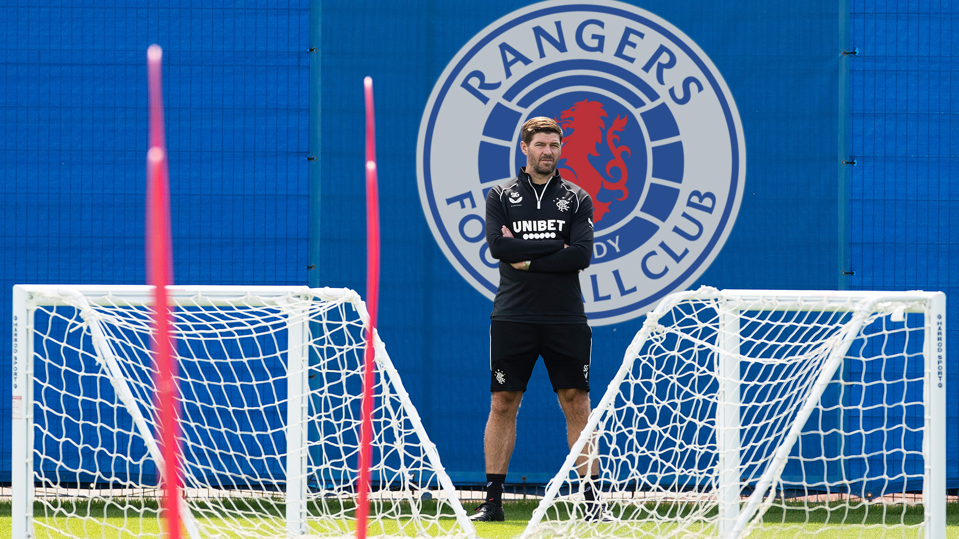
The new crest echoes the original READY crest introduced in 1959. It is one of two official club crests, the iconic scroll crest, found on the club’s team kit will remain unchanged, while the READY crest will continue to be used across all club branding and communications.
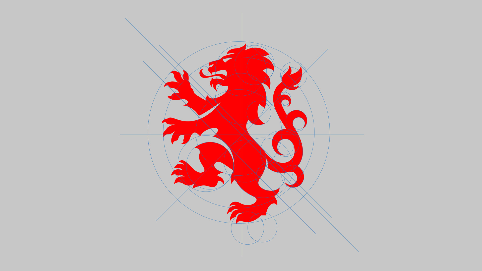
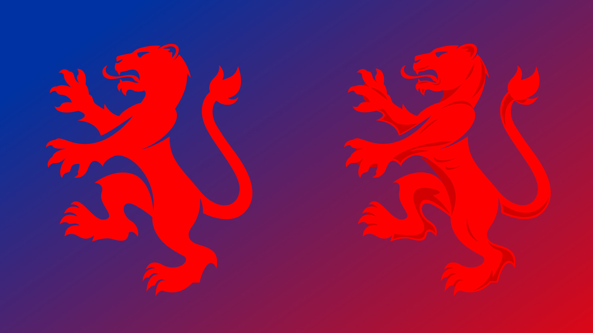
On the new design, the name ‘Rangers’ sits centered boldly at the top, while a revitalised lion rampant and ball sit larger, and even more proudly, within the design. It brings renewed vigour and precision to the logo, while staying true to the courage and history conveyed by the original club emblem.
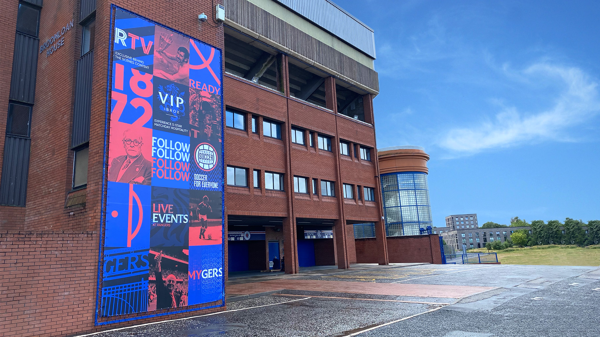
Famously and forever blue, Rangers’ colours are part of their DNA. Their existing colour palette has been revitalised to make a strong visual impact in particular across the busy digital environments. Replaced by a more vibrant “True Rangers Blue” and red tones alongside the introduction of a complementary secondary colour palette ensuring the club’s brand identity now stands out regardless of the medium to which it is applied.
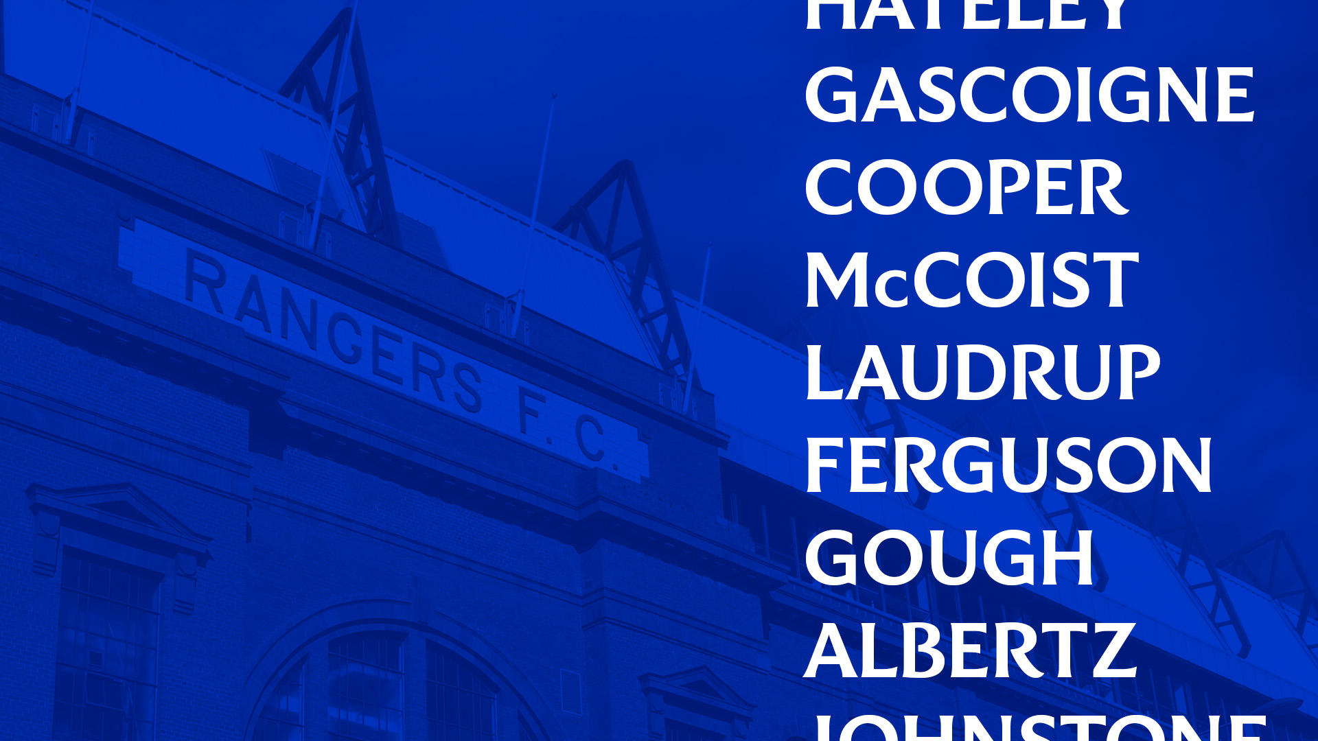
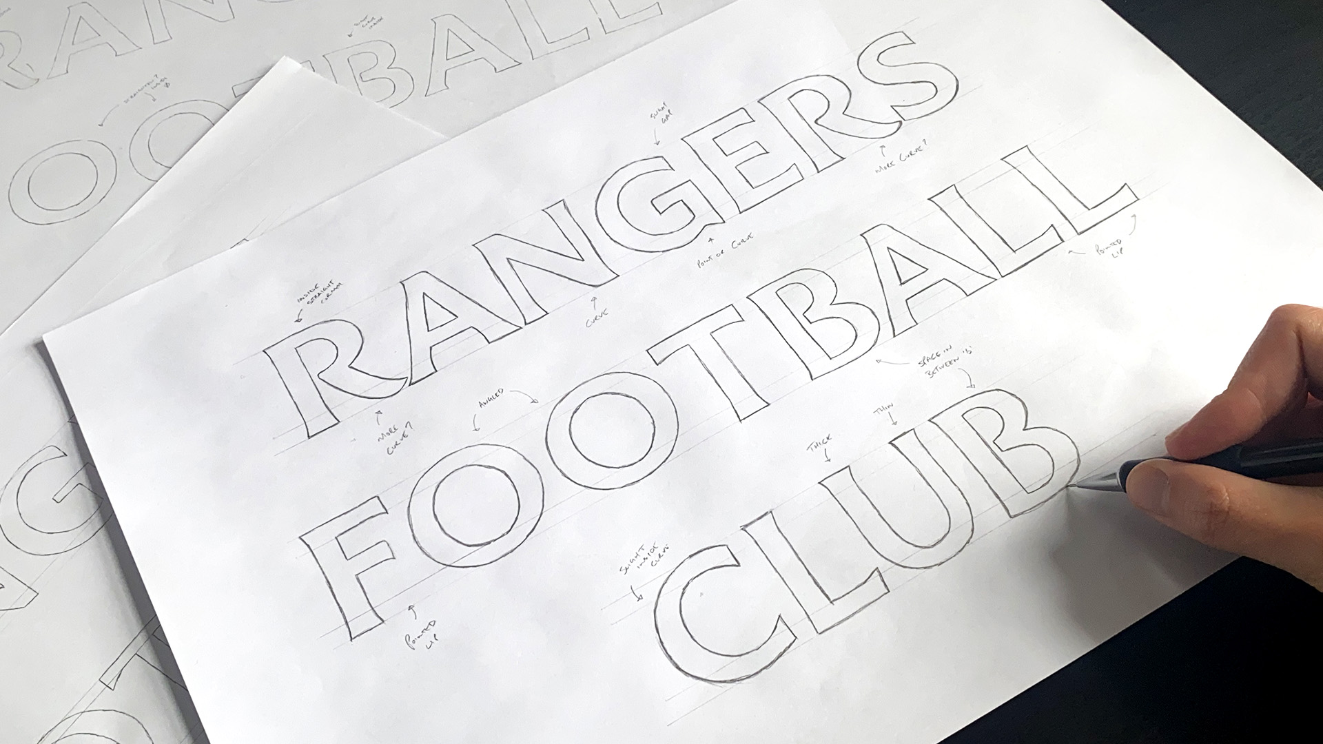
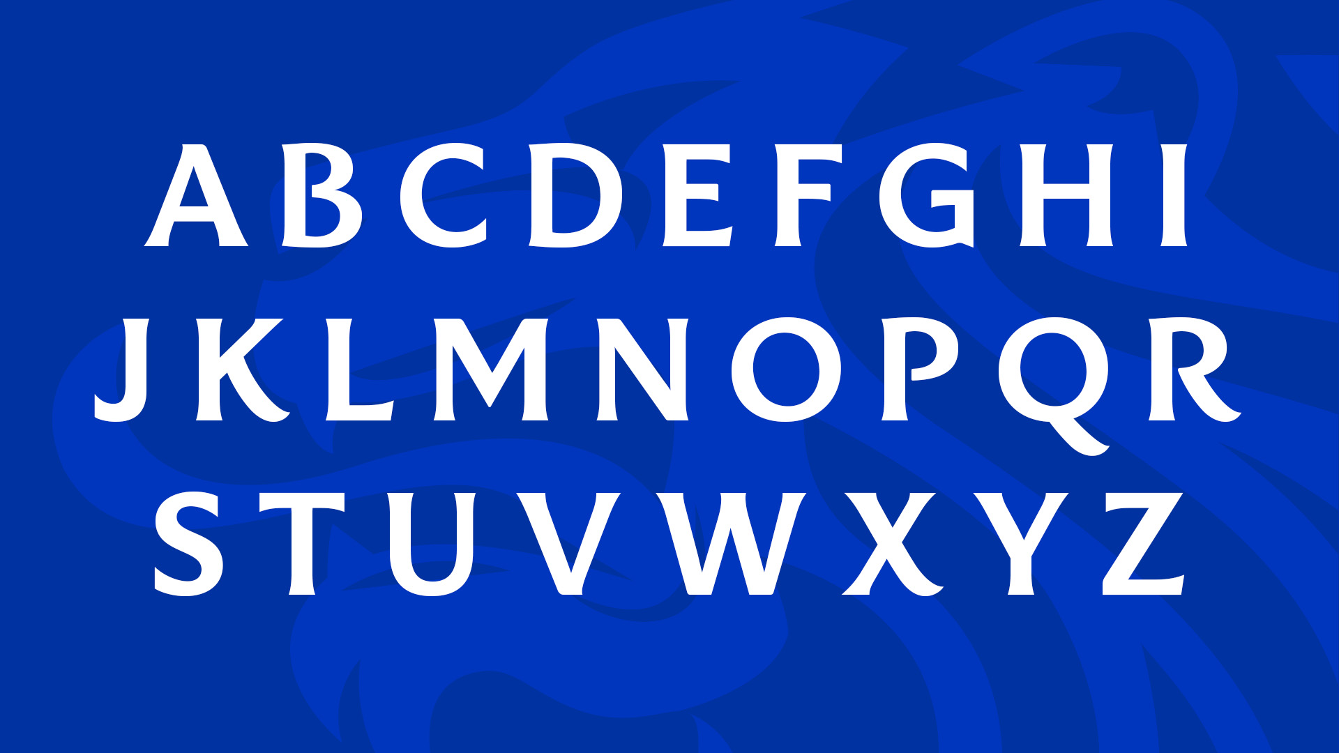
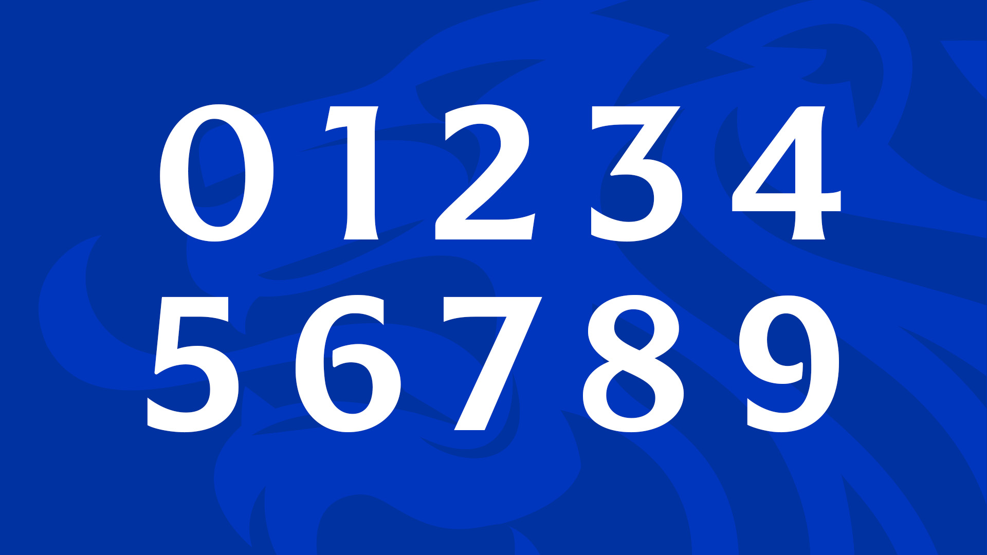
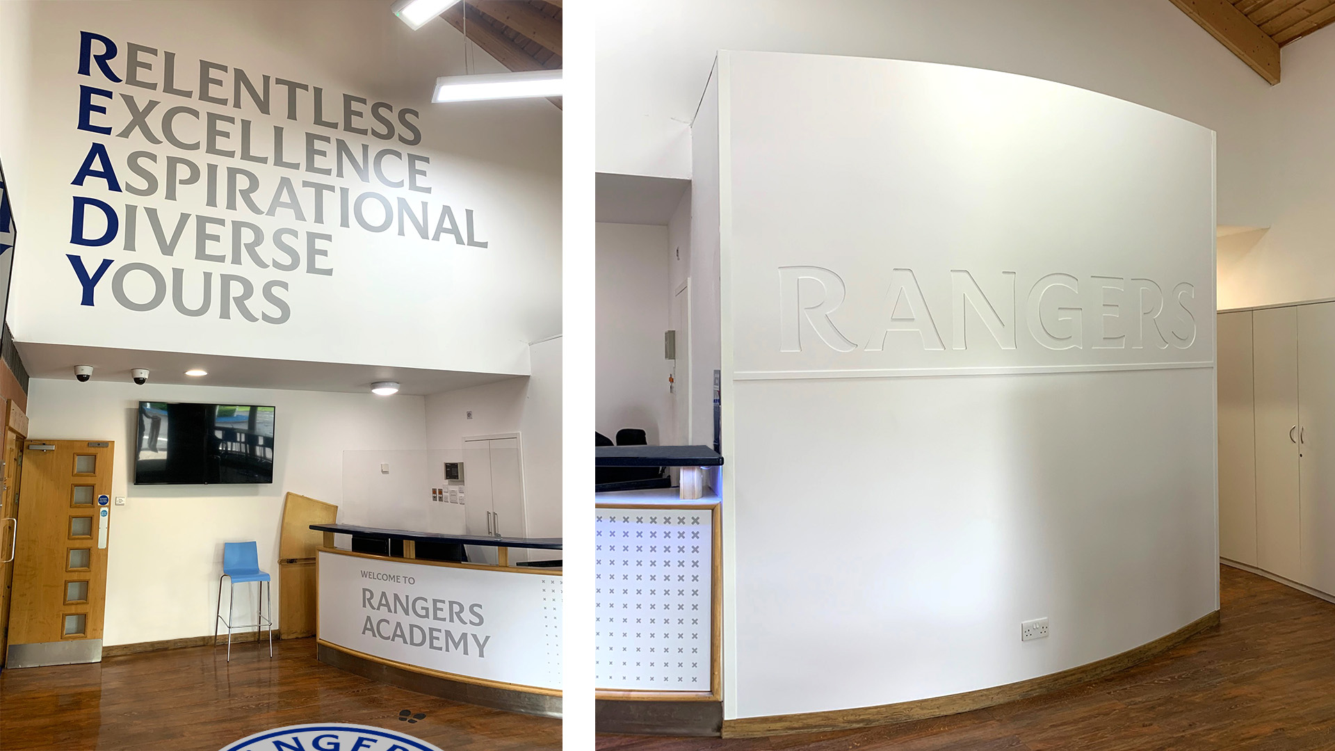
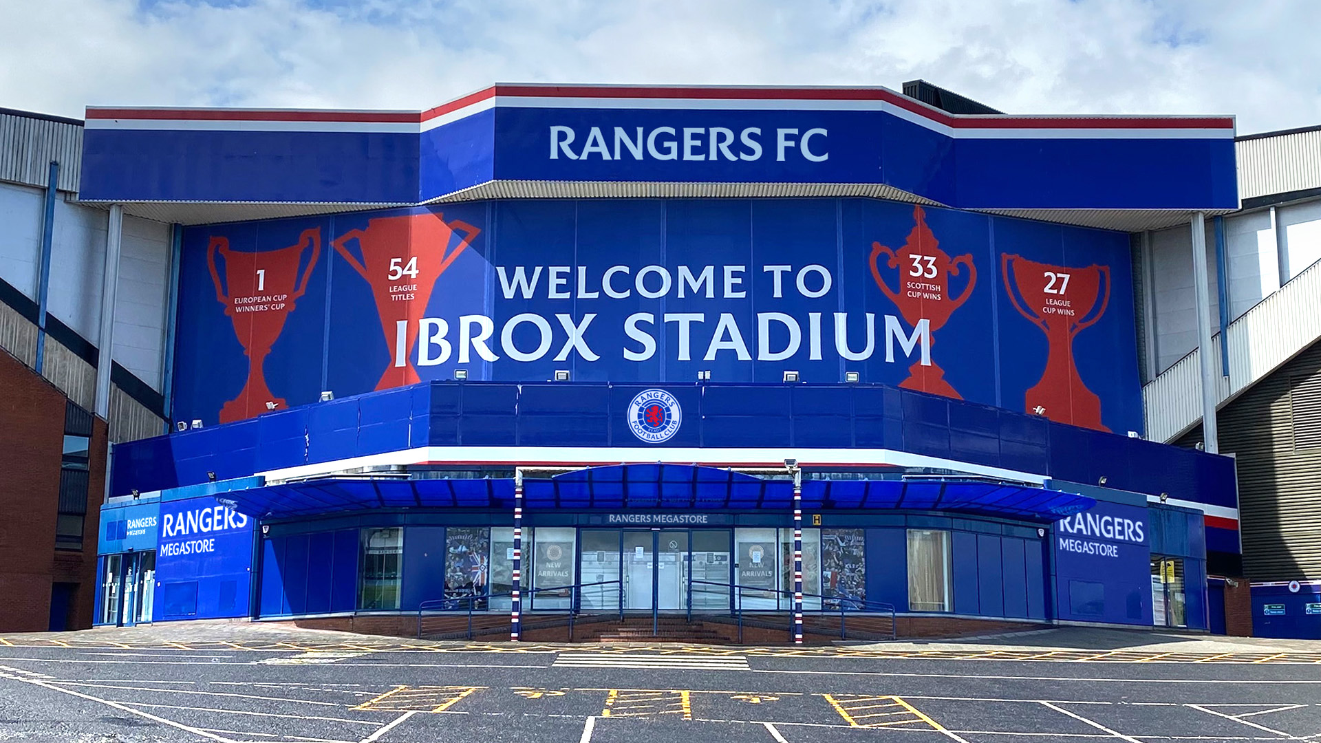
See Saw were also tasked with creating a typographic design for the club which would sit in the newly formed crest. Partnering with internationally renowned typographer, Craig Black, together they explored Ibrox, delving through the archives to craft a custom brand typeface, Rangers Display, which perfectly captured Ranger’s heritage and personality. With serif kicks that echo those of the bluebells at Ibrox’s iconic gates, the new typeface also takes cues from Ibrox’s entrance floor mosaic in addition to various letterheads used over the years.
A fully functioning brand typeface that represents the elite football status and manages to be both modern and fresh, yet instantly recognisable as Rangers — representative of not only the past, but the now and the future.
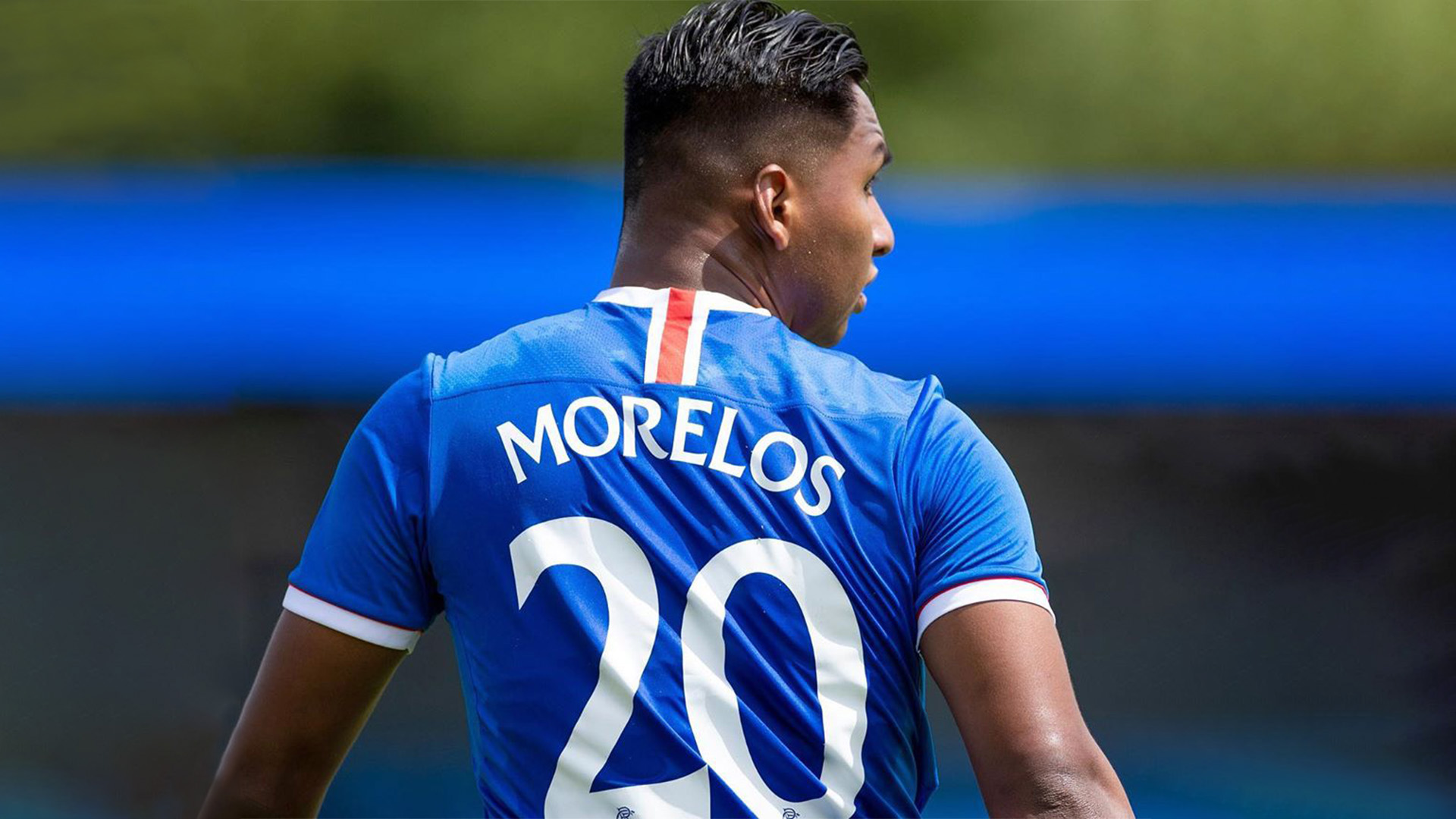
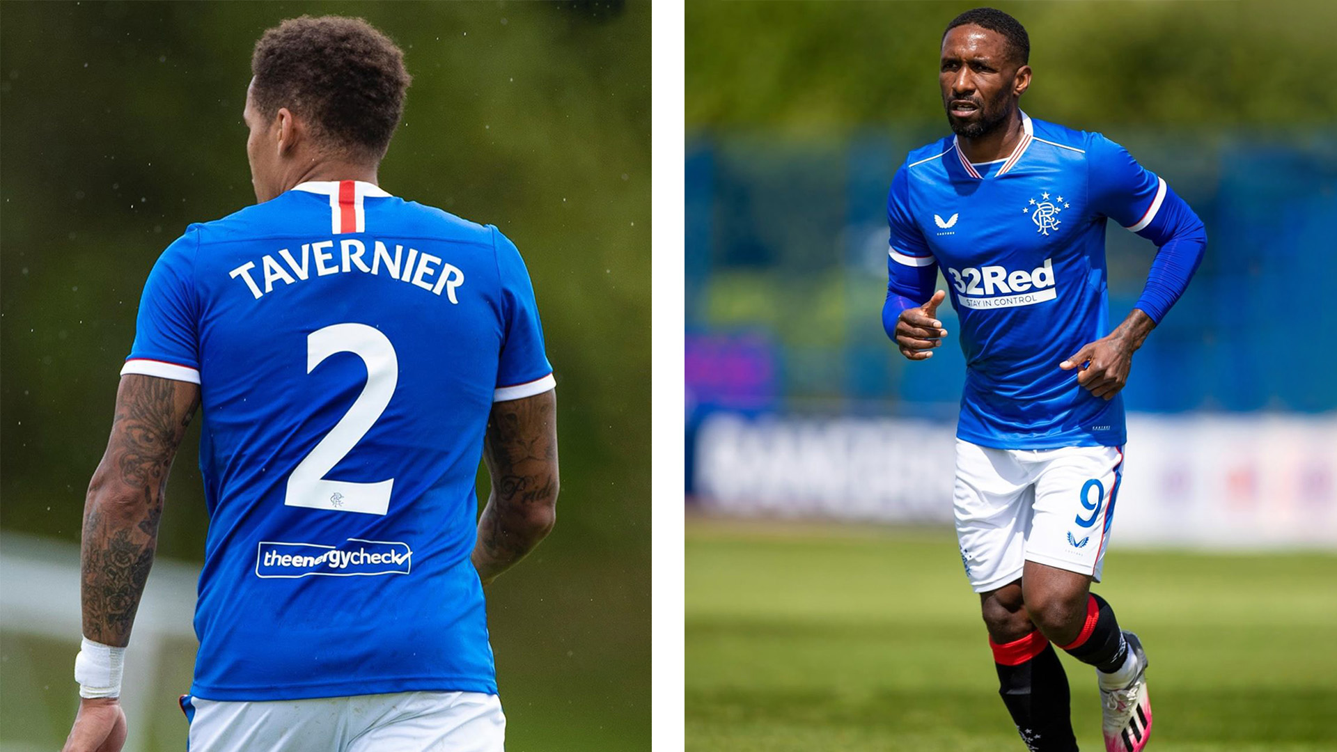
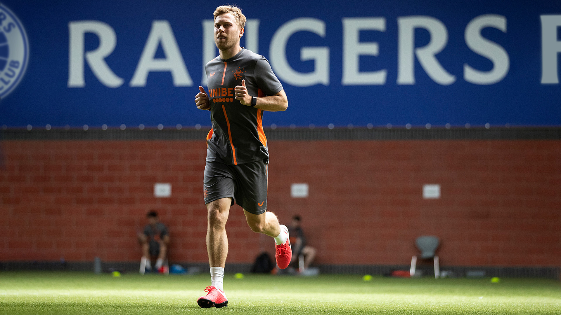
The typeface will be used across all elements of the Rangers brand from marketing, social media and signage to the players’ names and numbers on the back of the football strips.
“We have retained, restored and re-energised the original visual elements in order to make a transformative impact whilst remaining true to the club’s historic brand values that encompass historic and pioneering elements” says Cameron Syme, Director, See Saw.
The brand evolution was launched alongside the club’s digital transformation strategy, which includes the launch of a new industry leading club website and app.
James Bisgrove, Rangers’ Director of Commercial and Marketing Rangers FC added: “This evolution of our brand identity is underpinned by our rich heritage and aspirational mindset, all of which will provide us a springboard to grow global audiences and, ultimately, drive greater commercial revenues.”


CREDIT
- Agency/Creative: See Saw Creative x Craig Black
- Article Title: Rangers Football Club Rebrand by See Saw Creative and Craig Black
- Organisation/Entity: Agency, Published Commercial Design
- Project Type: Identity
- Agency/Creative Country: United Kingdom
- Market Region: Global
- Project Deliverables: Brand Advertising, Brand Creation, Brand Experience, Brand Identity, Brand Redesign, Brand Refinement, Brand World, Branding, Graphic Design, Illustration, Rebranding, Research
- Industry: Entertainment
- Keywords: Rangers Football Club, Football, Rebrand, Branding, Crest, Identity, Brand Typeface, Font, Glasgow, Scotland, Typography, Illustration


