” Russia is the country with the largest territory in the world. There are nearly 200 nationalities, which inhabit this territory. All of them have their own typical national features and traditions.
The symbiosis of our nature richness and the historical heritage of the nations have given birth to a great number of unique food products.
This idea became the main topic for the RANEPA design student’s project, which was aim at designing the packaging for a farmer’s product, typical for a region. There were two main conditions: the design had to be based on the cultural traditions of the region, and it had to be easily producible by farmers. It could allow the small business to create its own brandnames and contribute to the popularization of the Russian regional products.
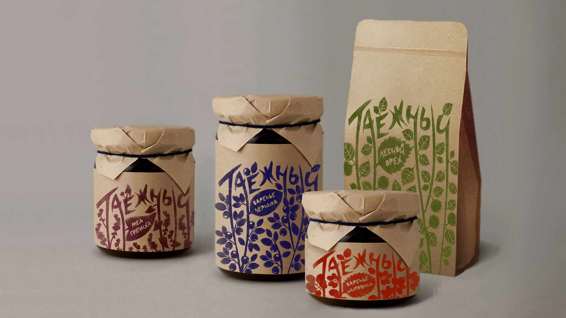
1. Package series for Siberian region
The main idea of the project is an ability to apply logo, trade mark or pattern to packaging by farmer. The logo and the illustration can be applied on the package using a stencil and a foam rubber roller.”

” 2. Package series of the Altai dairy products
Until nowadays many unique dairy products, typical for nomadic people of the region, have been produced in Altai.
A polyethylene airtight package in the shape of traditional leather jar of Altai was created for liquid products.
The package of Kaimak (rich cream) is a polypropylene box in the shape of casket. Kurut (hard smoked salty cheese) is not very fastidious about conditions of keeping, so this product is packed in paper.
The stencil technique is used to apply graphics on the package which made the package production cheap and easy. The main element in the center of the composition looks like a sheep’s head to show the origin of the product. ”

” 3. Package of the Belevsky pastilla
The national toy-bell of the city of Belev was taken as a symbol. The ensemble of these is joined in a round dance with the help of a single element-constant. The curved element is also used in the logo of the pastila.
Color differentiation was used for the distinction of tastes (cranberry, apple, raspberry). The figure-base and the logo are made in the stencil technique.”

“4. Package of the Bashkir honey
The logo, which represents a bee, was developed on the basis of the author’s font. Beewax was used as the print stamp material. The graphics was printed on textile instead of paper, which helped to achieve the necessary result. ”


” 5. Package series of the Khakassia traditional food
Talgan is a fried, ground grain of wheat and barley. Khakases add it to almost every dish, and bake buns and cookies from the yeast dough of Talgan. The graphic solution is based on the ancient petroglyphs of Khakassia. The package is made in linocut technique.”


“6. Package series of Evenk reindeer herder products
Evenks live in Yakutia region. The brand was given the name White deer. The symbols of a mountain and a deer are taken as a basis of the trademark logo. The birch bark is chosen as the material of the package because it has been used by Evenks to make a primitive container for keeping food. The construction of packaging is as simple as possible and all graphic elements are printed in the stencil technique which allows to make such packages without any special tools or equipment. ”

” 7. Package series of Khanty-Mansiysk canned products
Two local ornaments denoting fins of a perch and the jaws of a pike were chosen as graphic solution. The logo is stylistically similar to the original ornament of the region. Package series includes packaging for six products. The author’s technique combines stencil print and gyotaku technique (stamp of the fish on the paper).”

” 8. Package series of Karelian products
The graphics on the packings is made with help of the linocut technology. The choice of the method is not accidental: the graphics creates the feeling of wood bark. Karelia is considered to be a forest land. Labels are based on a color patch, the name of a product and the
corresponding illustration.”

“9. Package of pelmeni for Perm region
A combined technique is used to reflect the regional character of the product. The logo is made of dough (one of the product’s ingredients). A stencil technique is used for graphics. The illustrations are developed in traditional ornamental animal style, which is typical for Perm region. ”

” 10. Package series of products from Chukotka
The illustrations and the fonts are made by hand and stylized as carving-on-a-walrus-tusk graphics.
The meat labels are designed on the basis of traditional hunting scenes, the fish label shows the scenes of fishing and the canned soup label depicts the scenes of Chukchis’ everyday life.”


CREDIT
- Agency/Creative: RANEPA Graphic Design students Dasha Ivanova , Daria Perepelkina , Lera Shchetinina , Elena Astakhova , Liliya Pozhilova , Yulya Yarushkina , Maria Samotina , Eugenia Maximova , Dmitry Sidorov , Natalia Nikolskaya , Anastasiya Otradnova ,
- Article Title: RANEPA Graphic Design Students – Package Design for Regional Products (Student)
- Project Type: Identity
- Industry: Food/Beverage


