


Oliver Shilling – Edmunds Cocktails
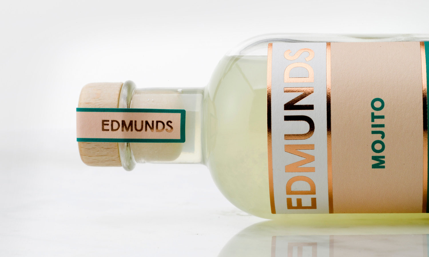
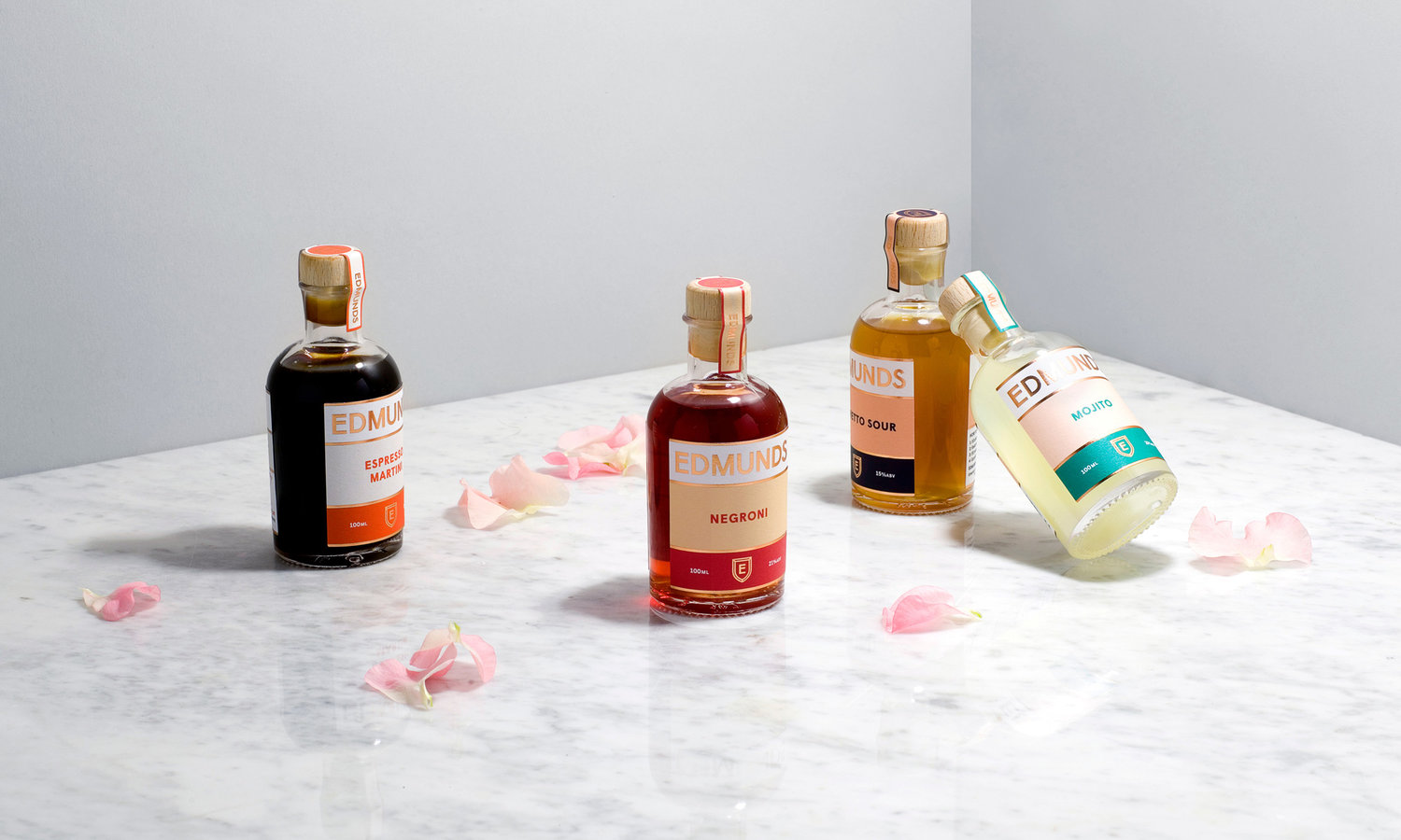
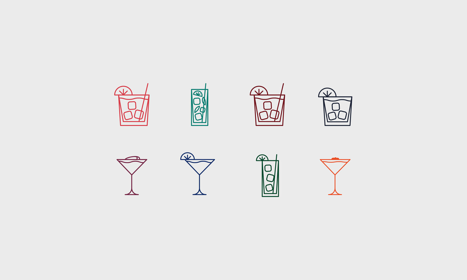
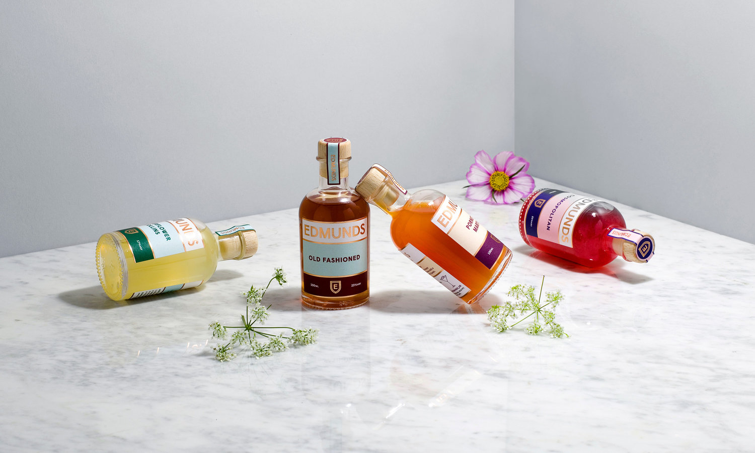
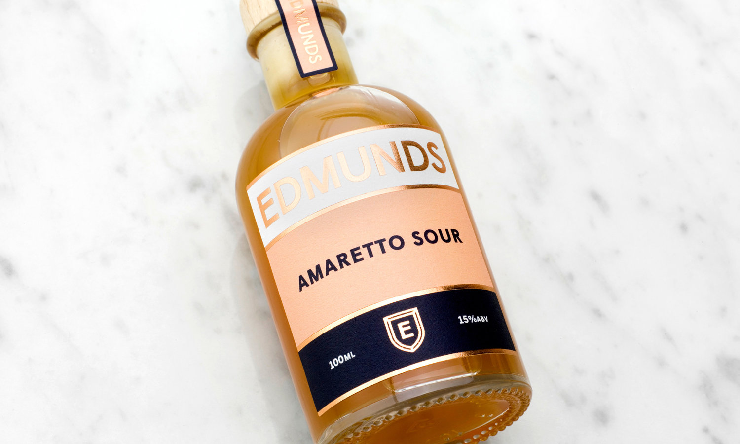
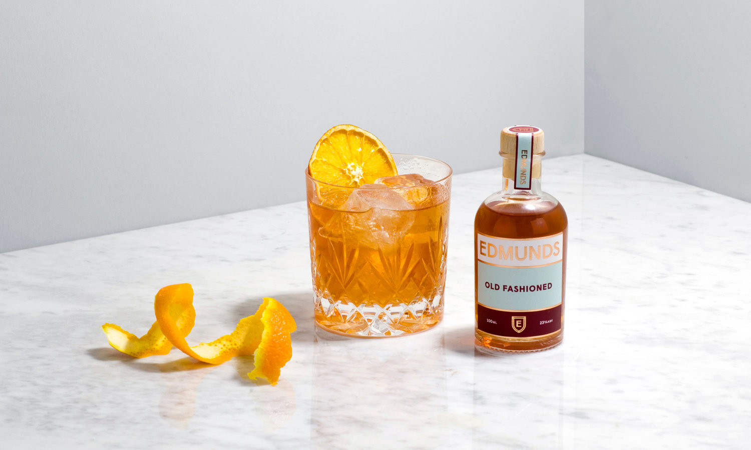
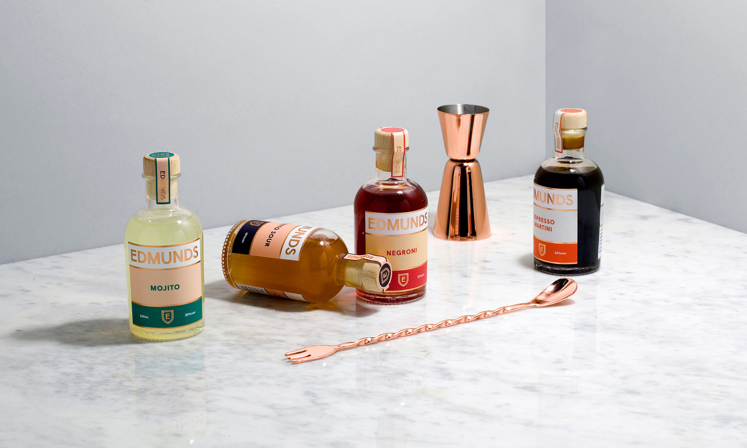
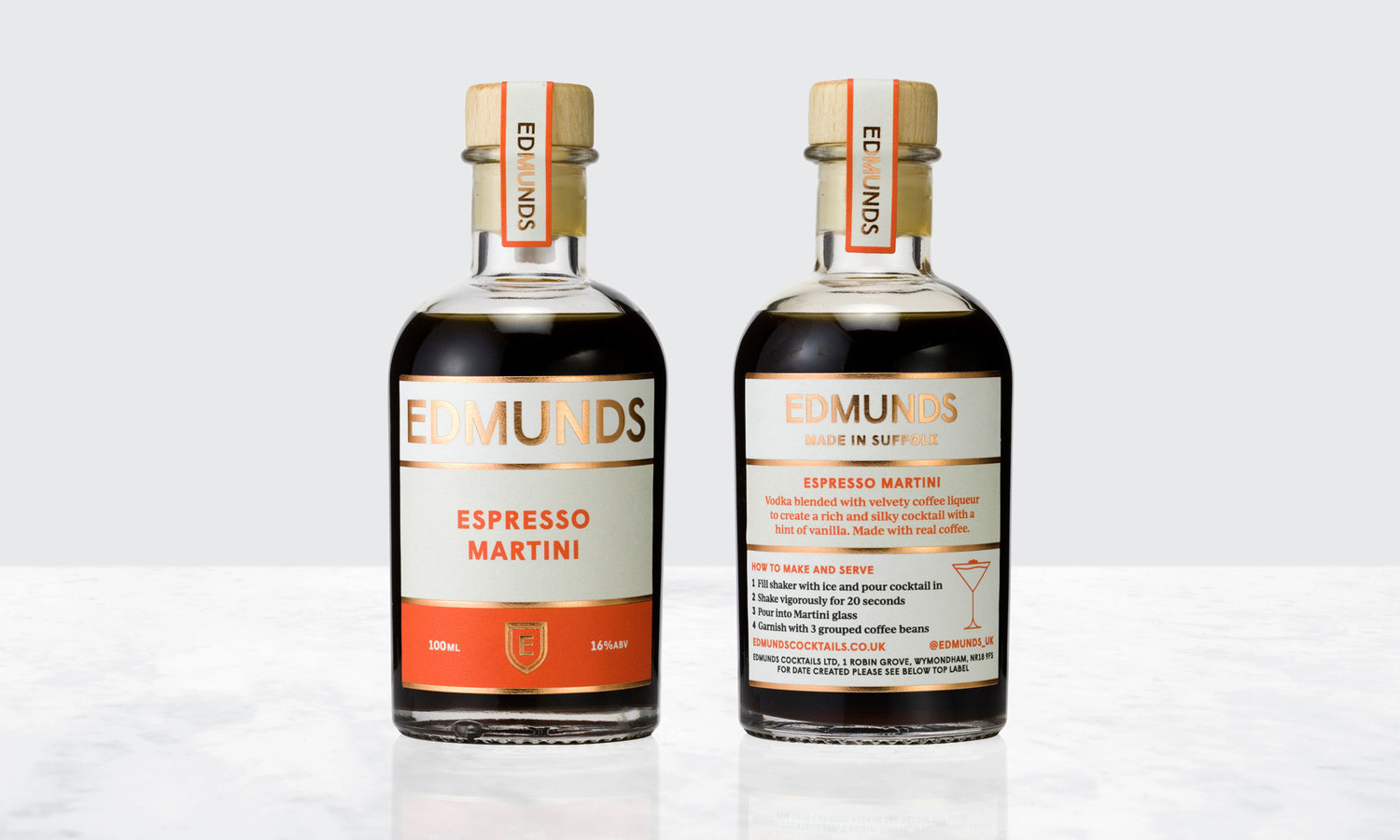
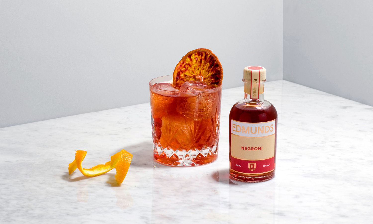
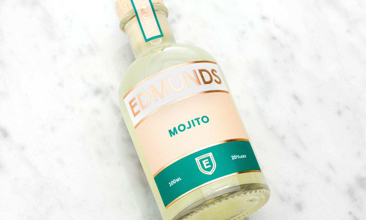
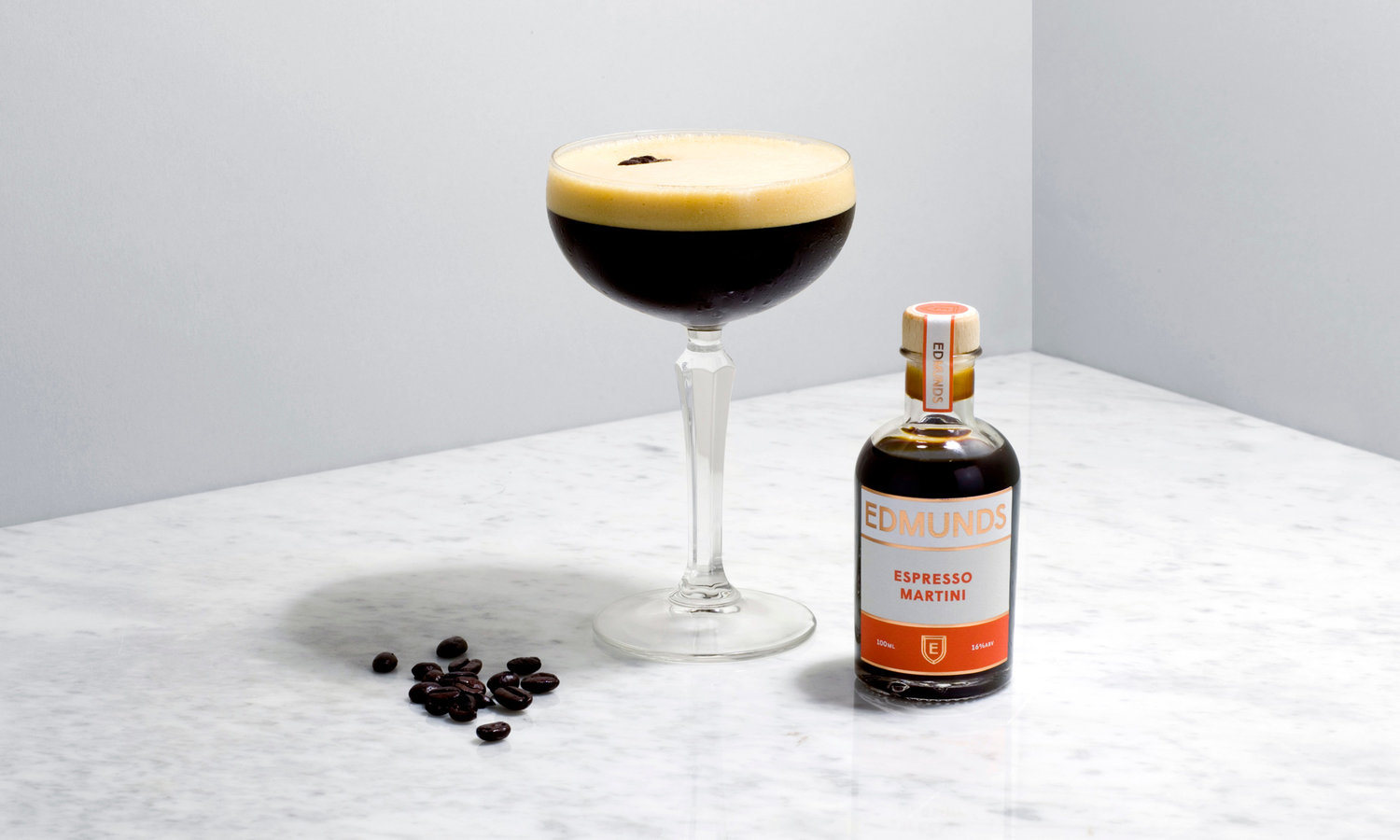
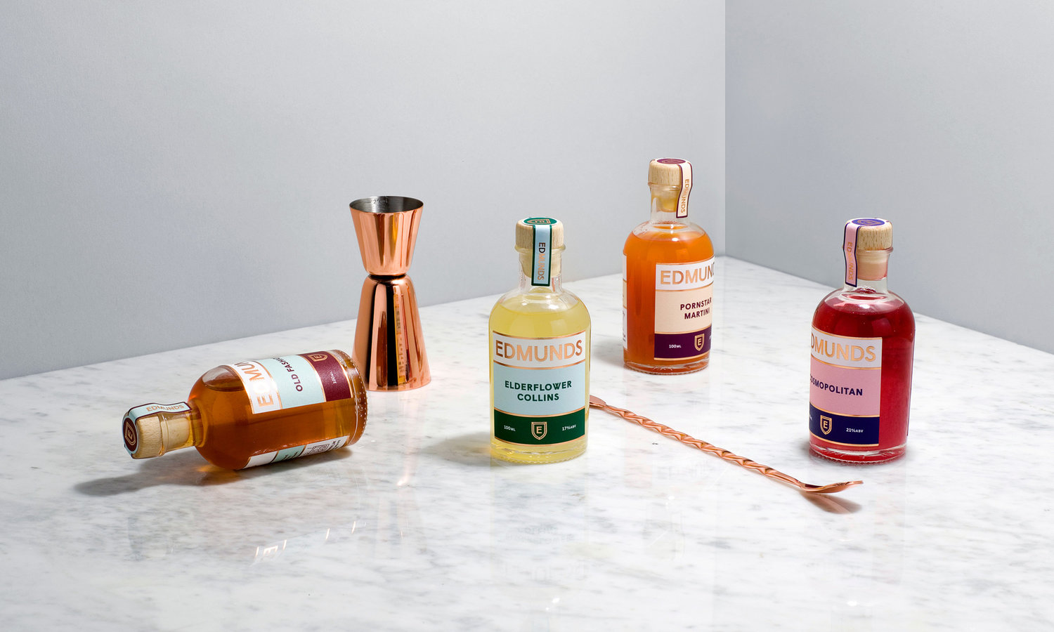
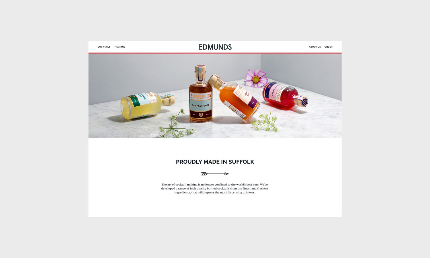
Founded on the belief that high-quality cocktails shouldn’t be confined to the world’s best bars, Edmunds offer a range of eight bottled cocktails. Working with the founders from the outset I developed the positioning, name, identity, packaging, art direction and website. Providing classic cocktails in this relatively new way, we wanted the brand to represent the meeting of traditional and contemporary values. The name is inspired by the company’s locality, Bury St. Edmunds, while the shield marque references the history of St. Edmund, the martyr whose name the town bears.The packaging is minimal and sophisticated, using distinctive colour pairings for each drink, while the website showcases the products through clean and elegant photography of both the bottles and the finished drinks.
CREDIT
- Agency/Creative: Oliver Shilling
- Article Title: rand and Packaging Design for Edmunds Bottled Cocktails
- Organisation/Entity: Freelance, Published Commercial Design
- Project Type: Packaging
- Agency/Creative Country: United Kingdom
- Market Region: Europe
- Format: Bottle
- Substrate: Glass


