


Holidu is a fast-growing travel tech company on a mission to make the search and booking of vacation rentals effortless and joyful worldwide. As a brand dedicated to innovation, simplicity, and memorable travel experiences, Holidu partnered with Ramotion to craft a distinctive visual identity that captures its vibrant spirit while building trust with a global audience of travelers.
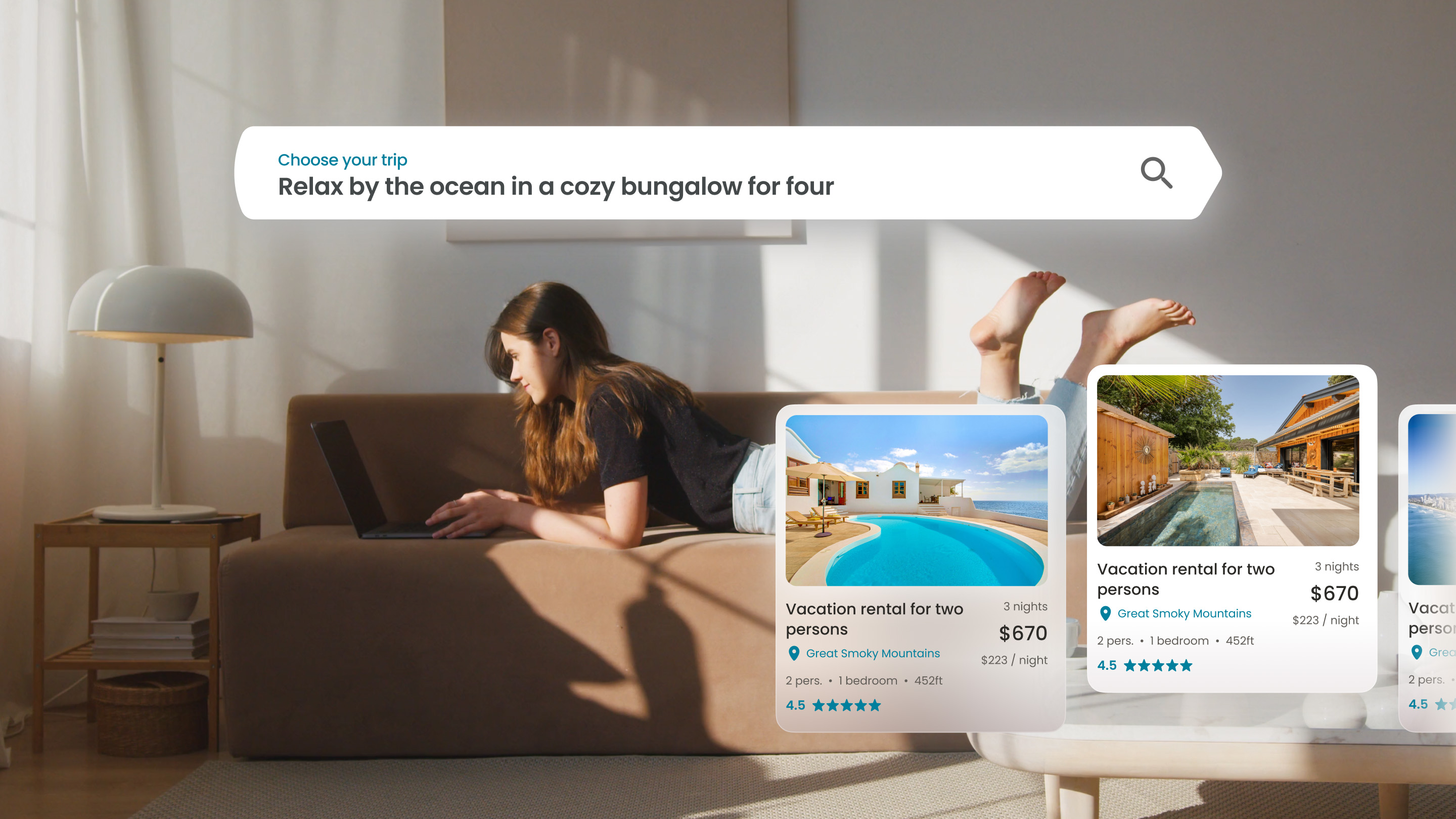
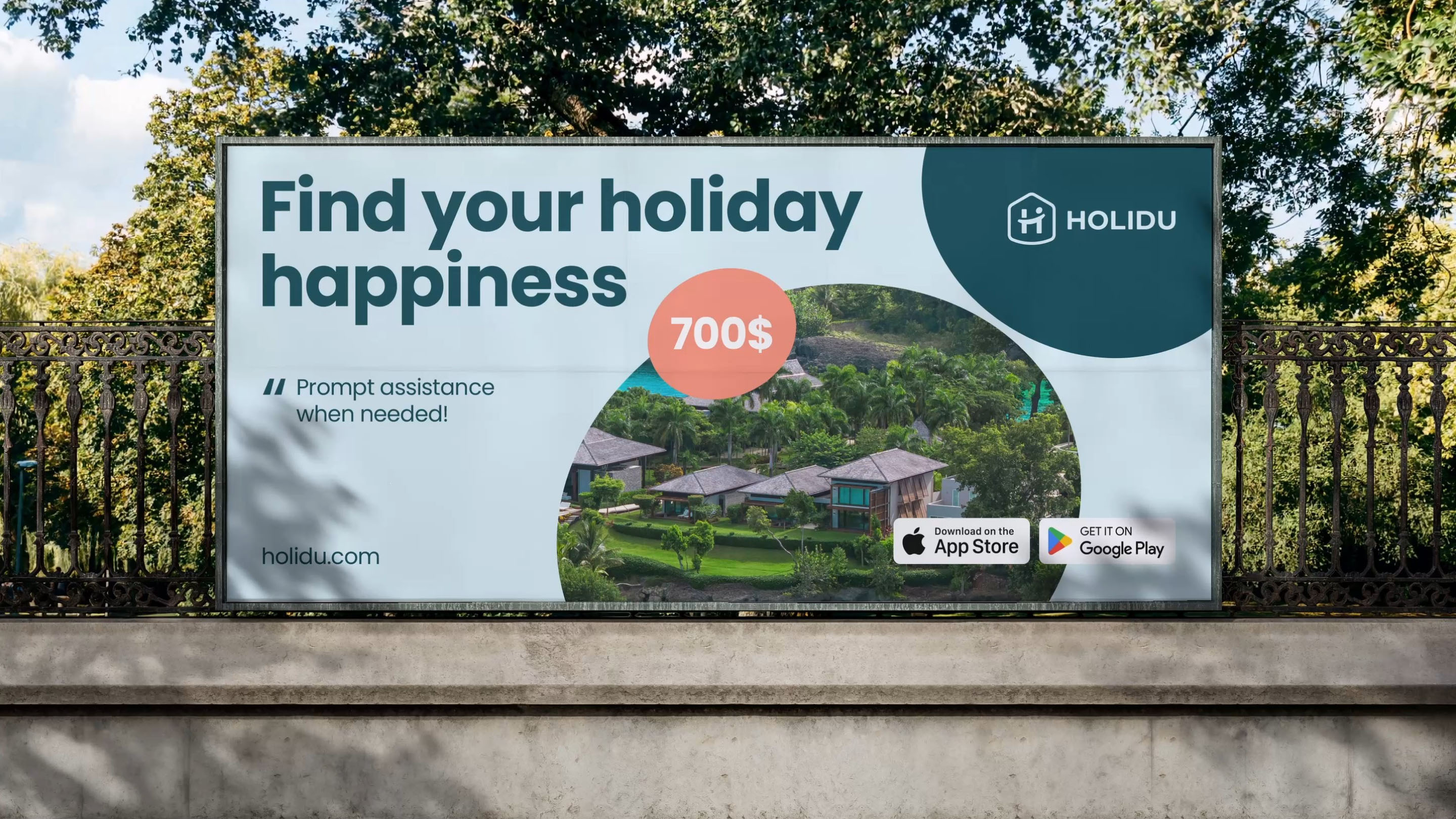
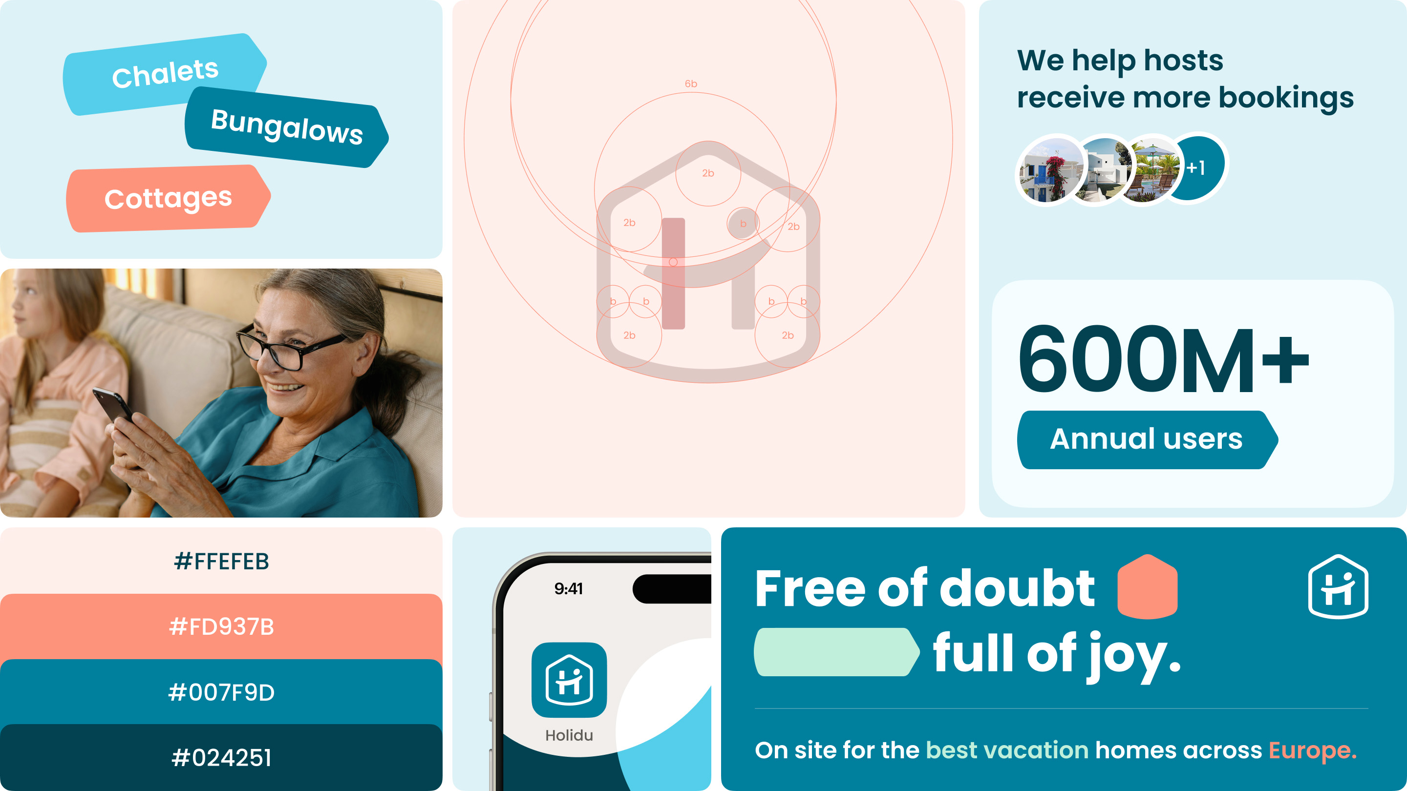
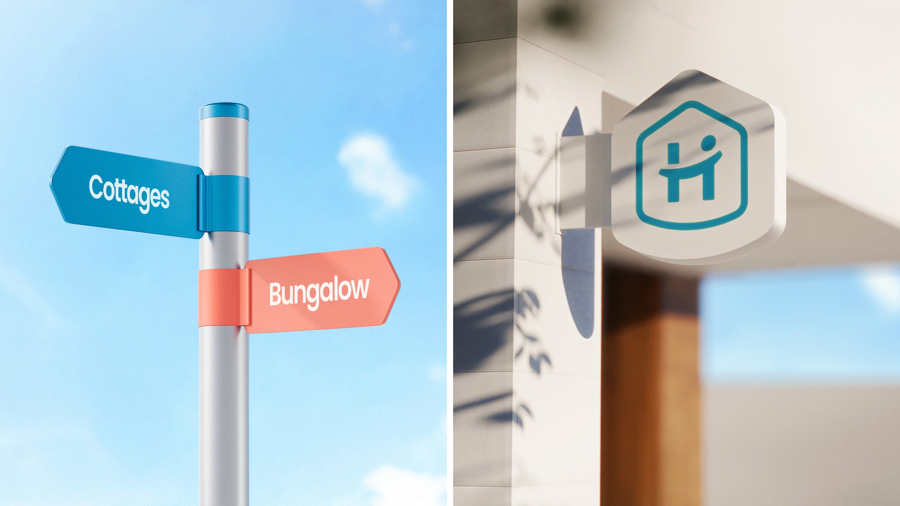
Ramotion developed a cohesive brand identity for Holidu that is playful, clean, and instantly recognizable. At the heart of this identity is the Holidu logo, which combines a geometric house shape with a pin icon — an intuitive symbol representing both “home” and “destination.” The logo’s minimalist design and balanced proportions make it adaptable across digital and print media, from mobile apps and websites to billboards and social campaigns.
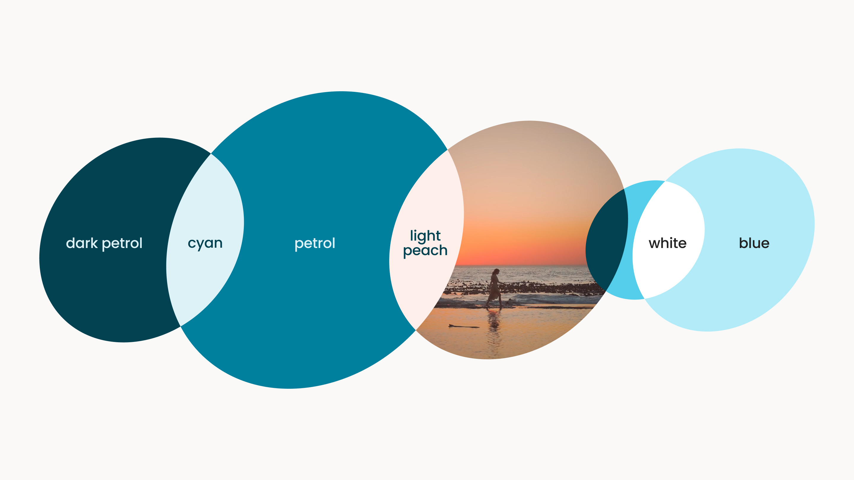
The color palette features a fresh, modern blue that conveys reliability and approachability, complemented by warm accent tones that bring energy and optimism. This combination reflects Holidu’s dual promise: making vacation rental booking both dependable and delightful.
Typography was meticulously selected to balance friendliness and functionality. A modern sans-serif typeface ensures clarity and legibility across all touchpoints, while subtle customizations in the wordmark add character and memorability. This typographic system extends seamlessly across marketing materials, product interfaces, and brand communications.
The design direction focused on lightness, clarity, and emotional connection — values that mirror the joy of travel and discovery. Spacious layouts, intuitive iconography, and a consistent visual language were embraced to create an inviting user experience, whether travelers are browsing listings on a mobile screen or encountering the brand in a digital ad.
What sets this project apart is its universal appeal and versatility. Holidu’s brand identity was designed to resonate with travelers of all ages and backgrounds, across dozens of markets. The result is an approachable, flexible, and personality-rich design system. Today, Holidu stands as a leading player in the travel tech space,


CREDIT
- Agency/Creative: Ramotion
- Article Title: Ramotion Redefines Travel Tech Branding with a Fresh Visual Identity for Holidu
- Organisation/Entity: Agency
- Project Type: Identity
- Project Status: Published
- Agency/Creative Country: United States
- Agency/Creative City: San Francisco
- Market Region: Europe, North America
- Project Deliverables: Brand Creation, Brand Design, Brand Guidelines, Brand Identity, Brand Mark, Brand Redesign, Brand Refinement, Brand Strategy, Brand Tone of Voice, Branding, Creative Direction, Logo Design, Rebranding, Research, Tone of Voice
- Industry: Hospitality
- Keywords: brand identity, rebranding, brand design, brand strategy
-
Credits:
Agency: Ramotion


