


Sol Grove is a botanical seltzer brand designed around a single idea: the energy inside you has a color, a rhythm, and a flow. Inspired by the thermal impressions and heat maps of the human body, Sol Grove translates internal vitality into an expressive visual identity system built on radiant gradients, glowing typography, and modern sensory design.
The brand name unites two worlds Sol, the warmth and illumination of natural energy, and Grove, the grounding purity of botanicals. Together, they form a wellness beverage that celebrates nature’s clarity while capturing the internal pulse of human life.
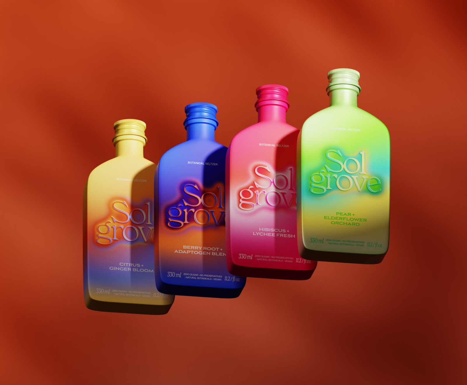
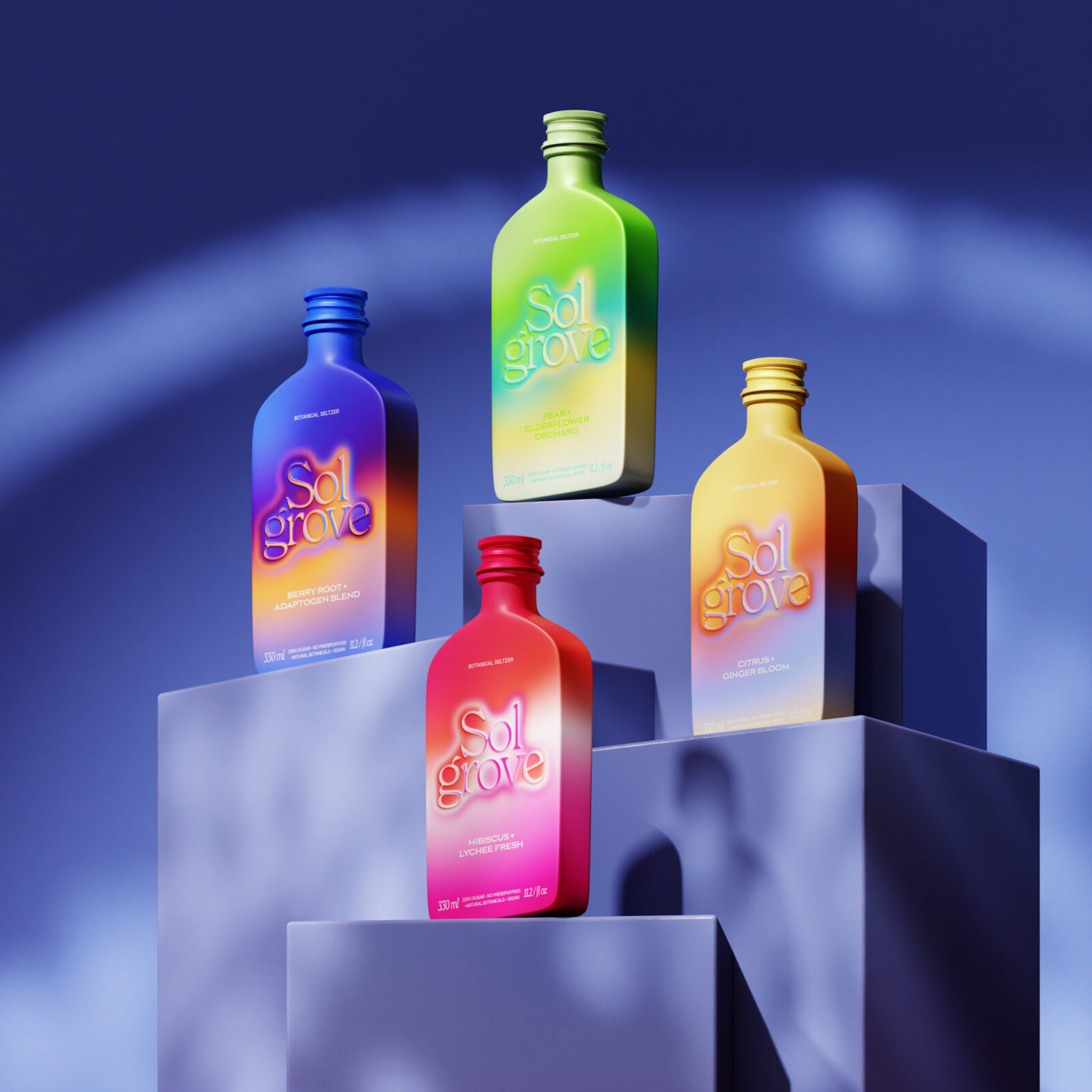
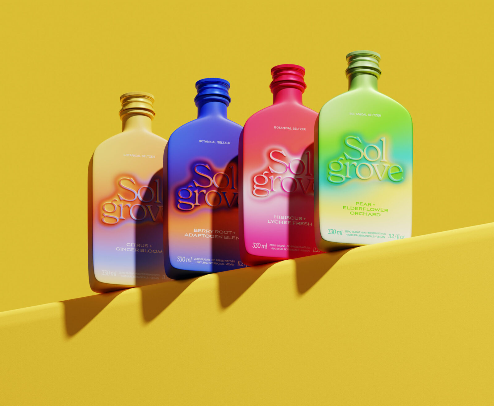
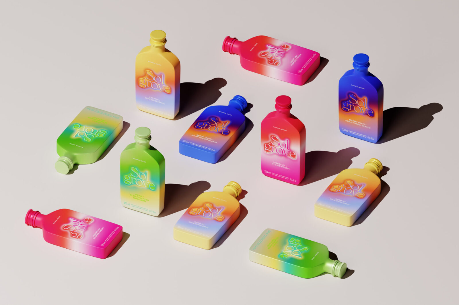
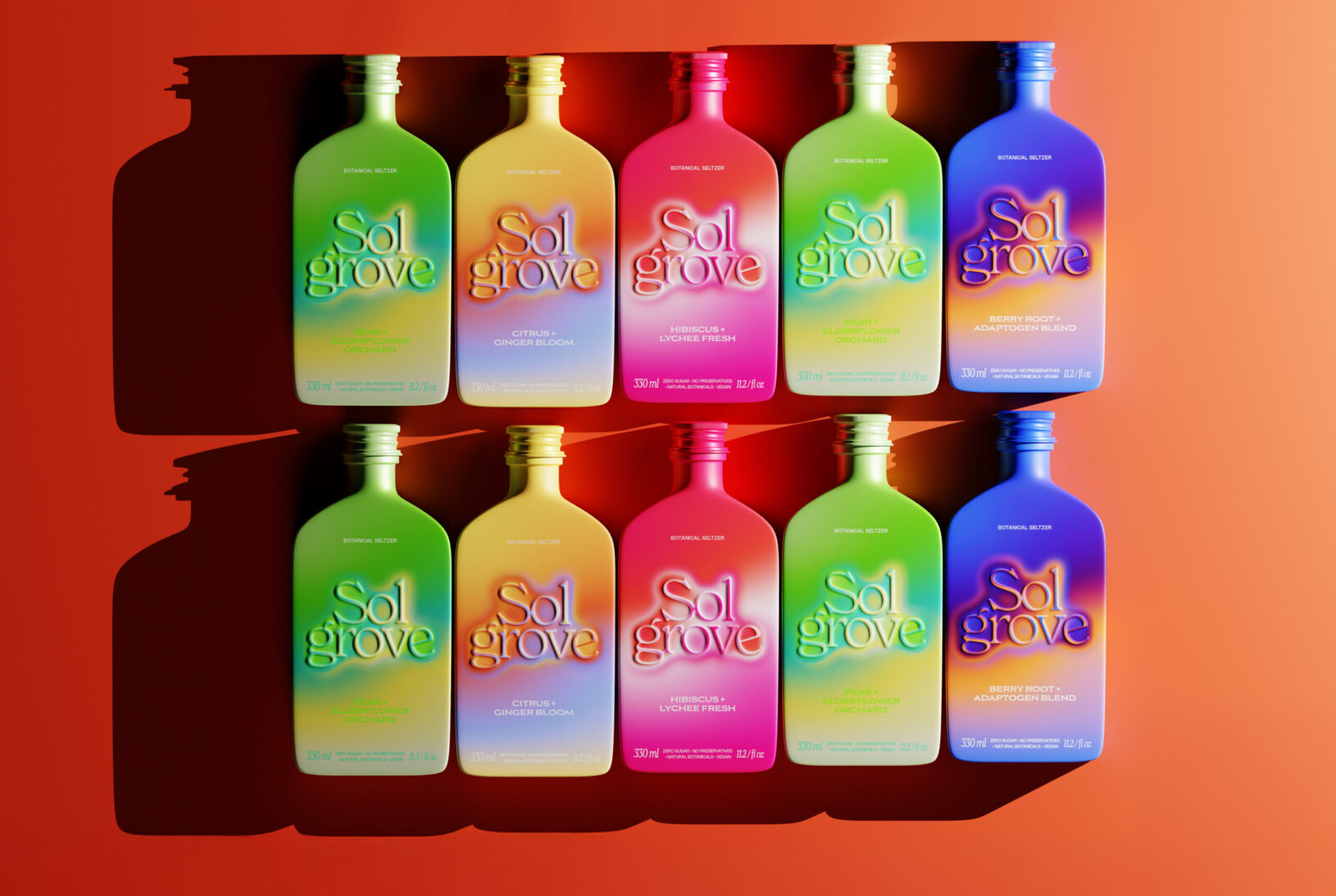
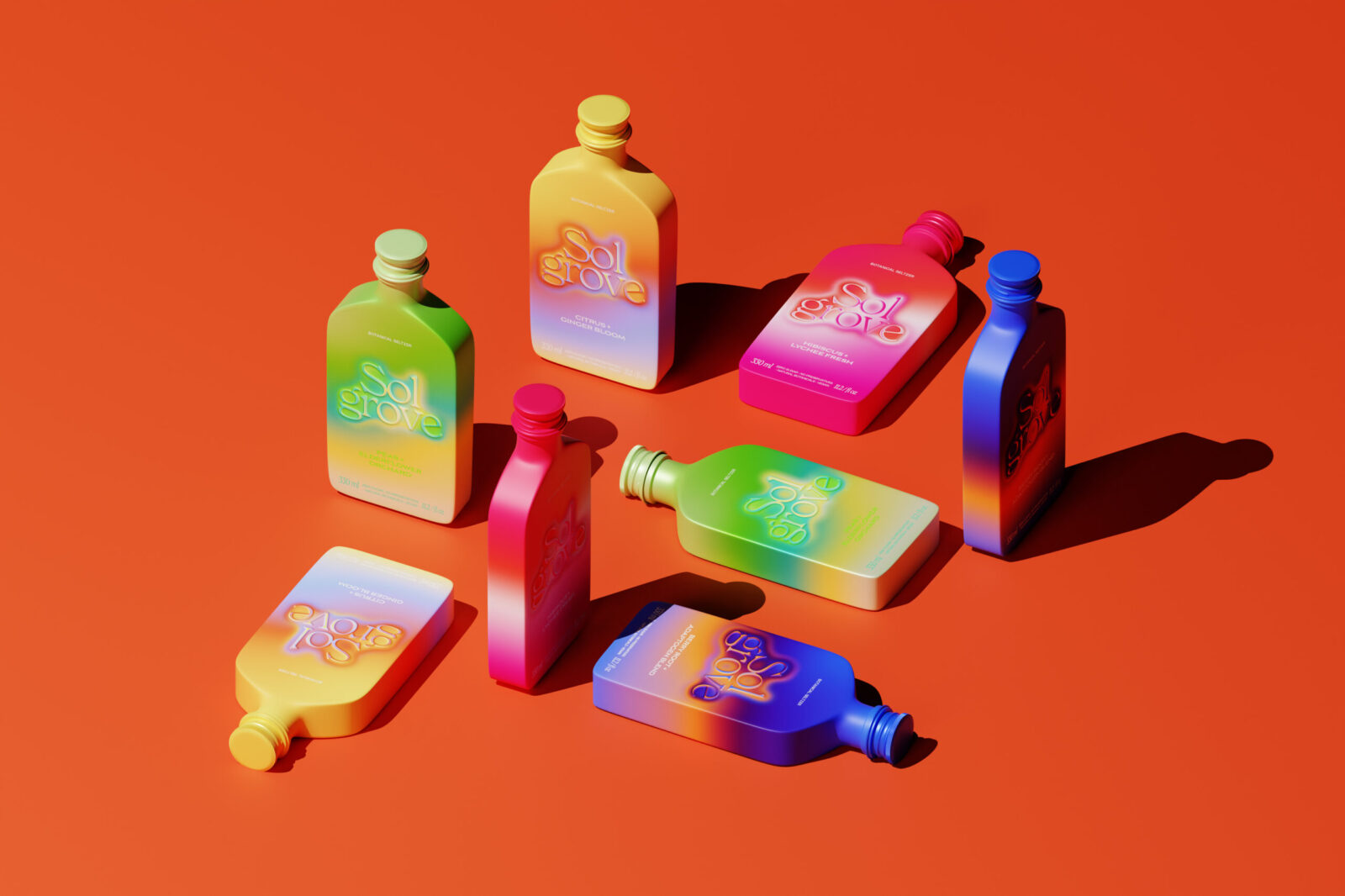
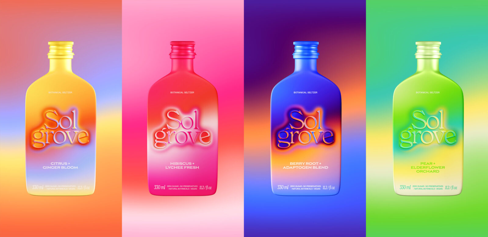
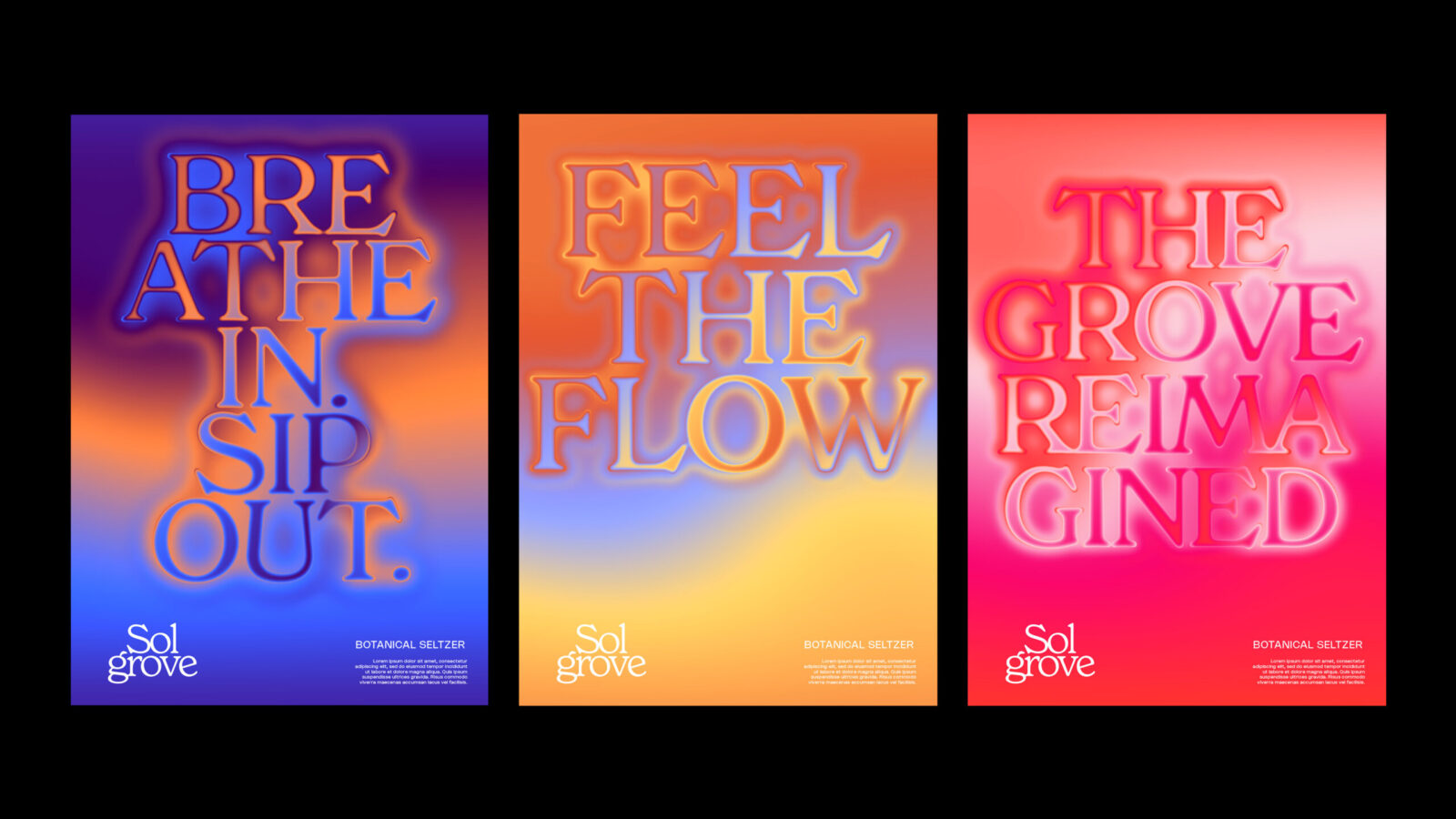
The design concept, Energy Flow, uses biomimicry to express how each flavor feels inside the body. Instead of traditional fruit illustrations, Sol Grove uses atmospheric gradients that mimic the diffusion of warmth, coolness, and vibrancy. Each bottle becomes a color-mapped expression of a botanical effect:
– Citrus + Ginger Bloom glows in warm yellows and oranges to signal activation and clarity.
– Hibiscus + Lychee Fresh uses bright pinks to express uplift and brightness.
– Berry Root + Adaptogen Blend pairs deep blues and purples to communicate grounding calm.
– Pear + Elderflower Orchard blends greens and soft yellows to evoke a refreshing balance.
Packaging Design: A Distinctive Bottle Shape
Sol Grove departs from the standard aluminum can or PET bottle seen across the seltzer category. Instead, it adopts a custom, sculpted bottle form that reinforces its sensory and energetic positioning.
The bottle features:
– Soft, rounded shoulders that echo natural curves and fluid energy movement
– A flat, modern front panel that becomes a seamless canvas for the thermal gradients
– A slim, ergonomic profile designed for comfort and ease in the hand
– A refined neck and cap that introduce a premium, almost tonic-like sophistication
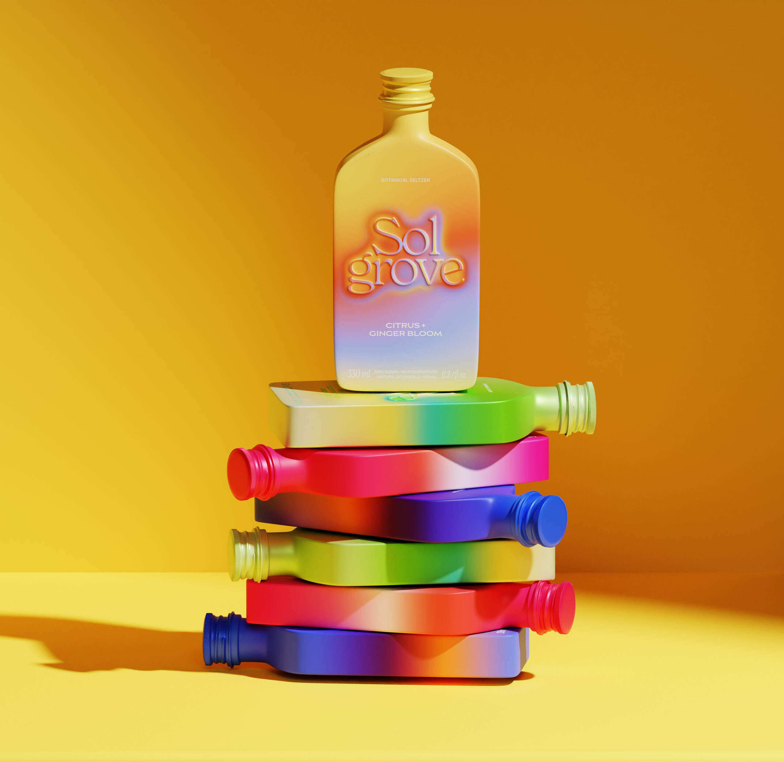
– A versatile silhouette that looks equally striking upright or lying flat ideal for still-life brand worlds, photography, and retail displays
This departure from conventional seltzer packaging signals that Sol Grove is not just another flavored drink it is a wellness-forward energy concept. The unique bottle shape becomes part of the brand’s storytelling, transforming the packaging into a visual and tactile representation of inner vitality.
Sol Grove stands apart in the seltzer category by replacing functional minimalism with emotional vitality. Instead of showing ingredients, it shows how they feel inside the body, in motion, and in color. This creates a modern wellness aesthetic that is both visually striking and conceptually original.
The result is a packaging system that feels alive, expressive, and deeply connected to human experience. Sol Grove is not just a beverage; it is a sensory interpretation of energy.

CREDIT
- Agency/Creative: Rakesh Khilare
- Article Title: Rakesh Khilare Designs Sol Grove as a Color Driven Wellness Seltzer Brand
- Organisation/Entity: Creative
- Project Status: Non Published
- Agency/Creative Country: India
- Agency/Creative City: Pune
- Project Deliverables: 3D Modelling, Art Direction, Brand Creation, Brand Design, Brand Identity, Brand Naming, Brand Strategy, Creative Direction, Design, Logo Design, Packaging Design, Product Design
- Industry: Food/Beverage
- Keywords: WBDS Creative Design Awards 2025/26 Packaging design, Graphic Design, Creative Direction
-
Credits:
Lead graphic designer: Rakesh Khilare


