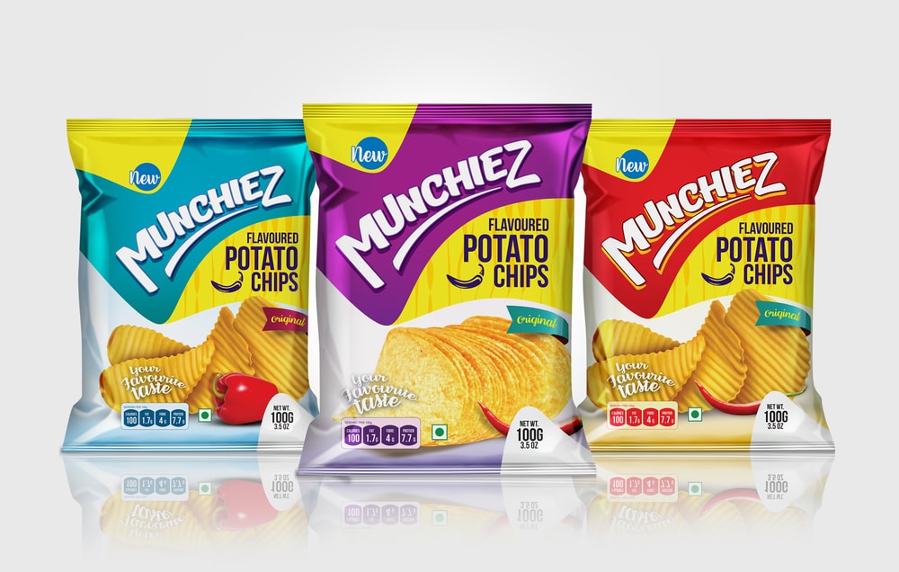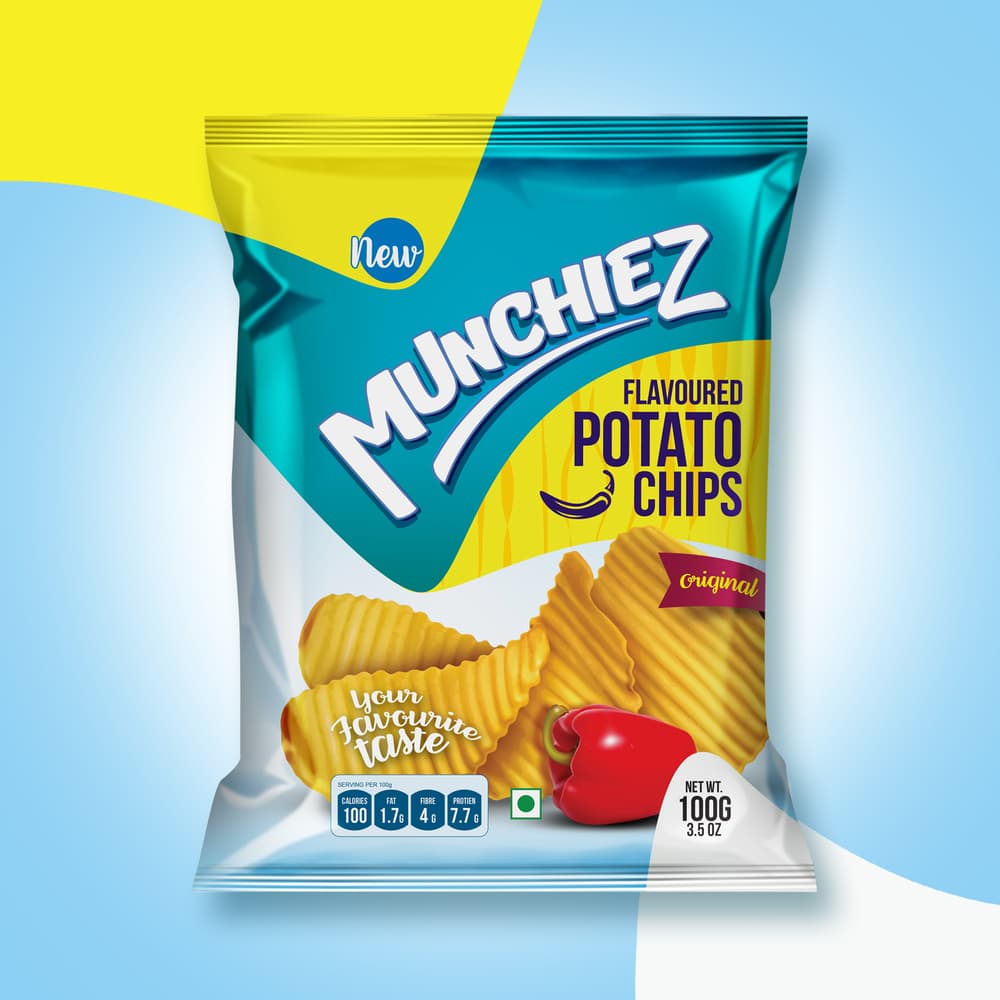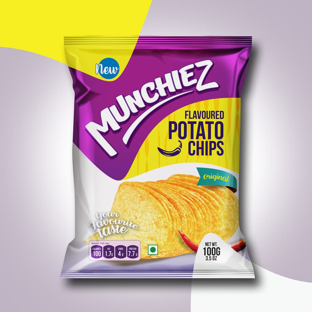
“I developed and designed Munchiez Logo and packaging from a rough scratch. I tried to make it more youthful and attractive. Vibrant colors and shapes made them charming look and feel. Different primary colors were used for each variant of potato chips. Cylinder changing technique is used for this. it will easily help consumers to recognize the product. It will vary from supermarket product stand by its primary colors.”


CREDIT
FEEDBACK
Relevance: Solution/idea in relation to brand, product or service
Implementation: Attention, detailing and finishing of final solution
Presentation: Text, visualisation and quality of the presentation


